Spatial analysis allows you to solve complex location-oriented problems and better understand where and what is occurring in your world. It goes beyond mere mapping to let you study the characteristics of places and the relationships between them. Spatial analysis lends new perspectives to your decision-making.
Have you ever looked at a map of crime in your city and tried to figure out what areas have high crime rates? Have you explored other types of information, such as school locations, parks, and demographics to try to determine the best location to buy a new home? Whenever we look at a map, we inherently start turning that map into information by analyzing its contents—finding patterns, assessing trends, or making decisions. This process is called “spatial analysis,” and it’s what our eyes and minds do naturally whenever we look at a map.
Spatial analysis is the most intriguing and remarkable aspect of GIS. Using spatial analysis, you can combine information from many independent sources and derive new sets of information (results) by applying a sophisticated set of spatial operators. This comprehensive collection of spatial analysis tools extends your ability to answer complex spatial questions. Statistical analysis can determine if the patterns that you see are significant. You can analyze various layers to calculate the suitability of a place for a particular activity. And by employing image analysis, you can detect change over time. These tools and many others, which are part of ArcGIS, enable you to address critically important questions and decisions that are beyond the scope of simple visual analysis. Here are some of the foundational spatial analyses and examples of how they are applied in the real world.
Spatial analysis lets you…
Determine Relationships
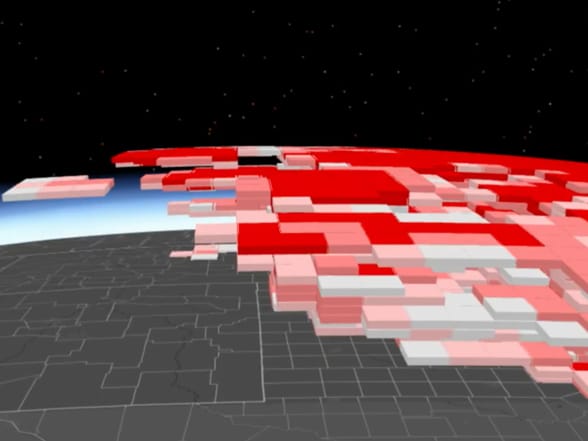
This 3D hot spot analysis of 20 years of storm cell data across the United States uses the vertical z-axis to represent time, so when tilted just right in a 3D viewer, it shows two decades of change in storm activity.
Understand and Describe Locations and Events
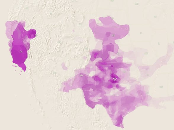
Using data compiled by the National Drought Mitigation Center from numerous agencies, this map focuses on the widely varying degrees of drought in Texas from 2011 to 2016.
Detect and Quantify Patterns
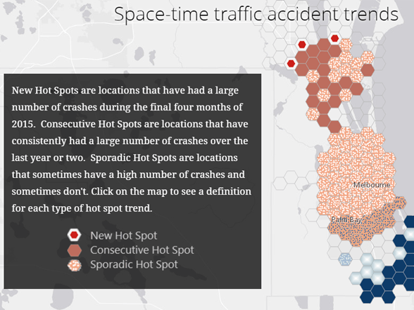
This space–time trend analysis of Florida auto crash data factors in time of day and underlying road conditions to identify new hot spots.
Make Predictions
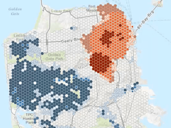
Statistical analyses can identify patterns in events that might otherwise seem random and unconnected, such as crimes in San Francisco.
Find Best Locations and Paths
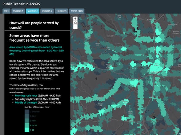
GIS analysis is used to explore how effectively the citizens of Atlanta are being served by public transit in this large urban community. Anyone who commutes understands that the time of day matters as well. You can use this story map to explore levels of transit service for different time windows.
How is Spatial Analysis Used?
Spatial analysis lets you pose questions and derive answers. It is used by people around the world to derive new information and make informed decisions. The organizations that use spatial analysis in their work are wide-ranging—local and state governments, national agencies, businesses of all kinds, utility companies, colleges and universities, NGOs—the list goes on. Here are just a few examples.
Ø Crime studies
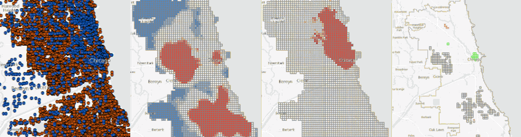
A spatial interaction model identifies the hot spots for crimes in Chicago.
Ø Drought analysis
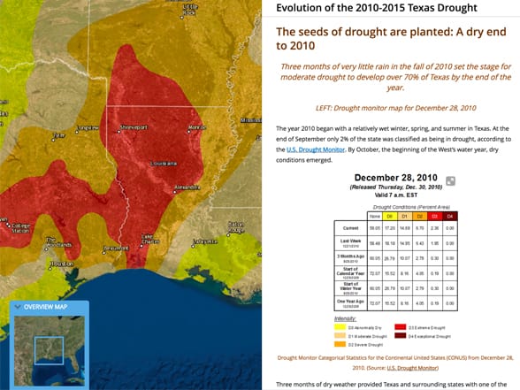
This temporal analysis of the evolution of the 2010–2015 Texas drought applies both raster and vector analysis methods. The project succeeds because of the attention to the final information product: a story map.
Ø Green infrastructure
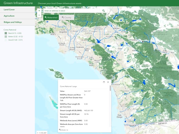
Esri’s green infrastructure initiative set out to develop data for the continental United States of critical 100-acre patches depicting “intact habitat cores.” It is making this data freely available as source data for land-use planning and to create information products that help everyone understand the importance of preserving the nation’s remaining natural heritage.
Ø Land-use planning
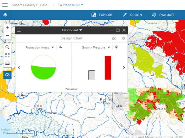
GeoPlanner for ArcGIS is a planning app used to evaluate opposing or competing land uses at local and regional scales. This screen capture shows a scenario where proposed protected areas (light green) are within areas of high projected population growth.
Ø Automatic data interpretation
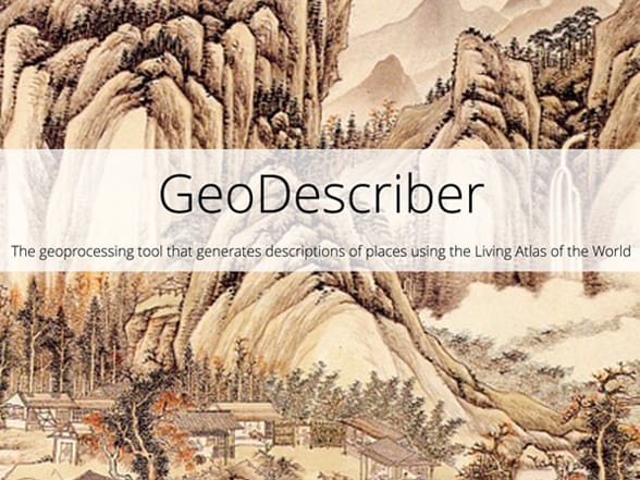
GeoDescriber analyzes landscape layers in the Living Atlas of the World to generate a short narrative of descriptive text to characterize the most important elements about a landscape.
Visualization: What Can My Map Show Me?
In many cases, just by making a map you are doing analysis. That’s because you’re making the map for a reason. You have a question you want the map to help answer: Where has disease ravaged trees? Which communities are in the path of a wildfire? Where are areas of high crime? It’s also because when you make a map, as with any analysis, you’re making decisions about which information to include and how to present that information. Effective visualization is valuable for communicating results and messages clearly in an engaging way.
Ø Visual and visibility analysis
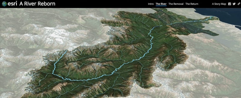
A surface displayed in 3D space has value as a visual display backdrop for draping data and analyzing it. This perspective scene shows a restored watershed and river draped on a digital elevation model of the terrain.
Ø Visualizing solar radiation exposure
Solar radiation tools in ArcGIS enable you to map and analyze the potential for solar panels to generate electricity. (Naperville, Illinois, shown here.)
Ø Assessing crop health
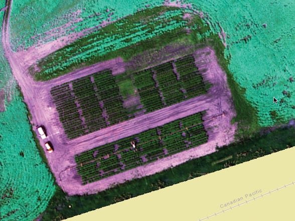
Multispectral imagery can provide a new perspective on crop health and vigor. The Normalized Difference Vegetation Index (NDVI) reveals healthy potato and canola crops in Saskatchewan, Canada.
Ø Calculating viewshed
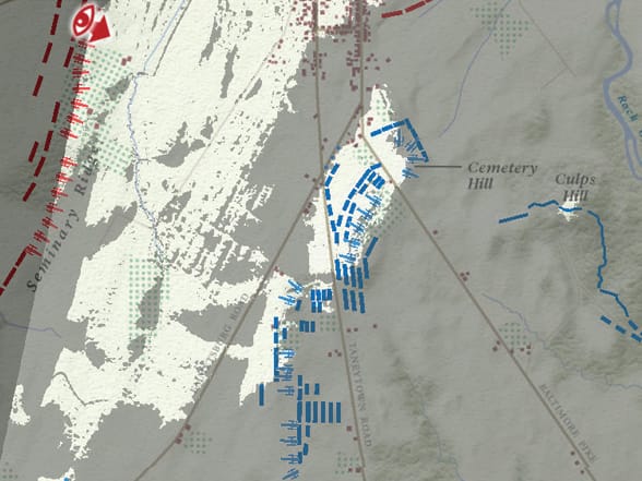
This historical story map uses GIS visibility analysis to tell the fateful tale of the Battle of Gettysburg in the American Civil War. At the moment General Robert E. Lee (at the red eye) committed to engage with Union troops, he could see only the troops in the light areas; everything shaded (the much greater part of the Union’s strength) was invisible to him at that moment. Historians using personal accounts, maps of the battle, and a basic elevation layer were able to unlock the mystery of why Lee may have committed to battle facing such poor odds.
—–
This post is excerpted from The ArcGIS Book, Second Edition: 10 Big Ideas about Applying The Science of Where, by Christian Harder and Clint Brown. The twin goals of this book are to open your eyes to what is now possible with Web GIS, and then spur you into action by putting the technology and deep data resources in your hands. The book is available through Amazon.com and other booksellers, and is also available at TheArcGISBook.com for free.
Commenting is not enabled for this article.