No data? No problem.
You can use Esri Demographics to add valuable context to your GIS analyses. The data will help you learn more about the people, housing, and businesses in your area of interest; see patterns of income; or understand how a population is expected to change over the next five years.
To see demographics on your map, use the Enrich Layer tool in ArcGIS Online, which adds demographics to any map. This results in a layer in your My Content page that can be used throughout the platform to analyze and visualize information.
Within five minutes, you can explore the demographics in any area by following these four steps:
Step 1: Sign in to ArcGIS Online.
Sign in to ArcGIS Online and click Map.

Step 2: Go to an area you are interested in.
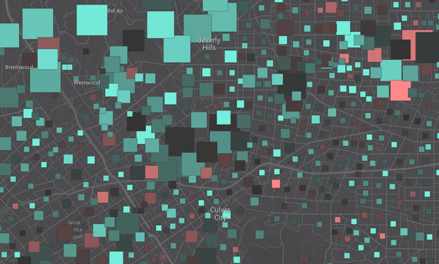
Using the search box within the map, zoom in to any area you want to examine. The area of interest for this tip is west Los Angeles, where growth and income will be explored. Select a neutral basemap such as the Dark Gray Canvas map. Why? Because a neutral basemap makes demographic maps easier to interpret and understand.

Step 3: Enrich your map.
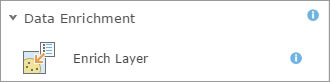
Once you have designated an area of interest on the map, choose the Analysis option at the top of the page, expand Data Enrichment, and select Enrich Layer.
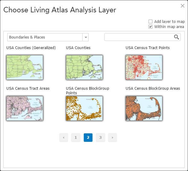
When you simply want to see the demographics of an area, choose block groups—they provide the smallest and most detailed geographic boundaries. Since those boundaries currently are not on the map, select Choose Living Atlas Analysis Layer and use the USA Census BlockGroup Areas layer.
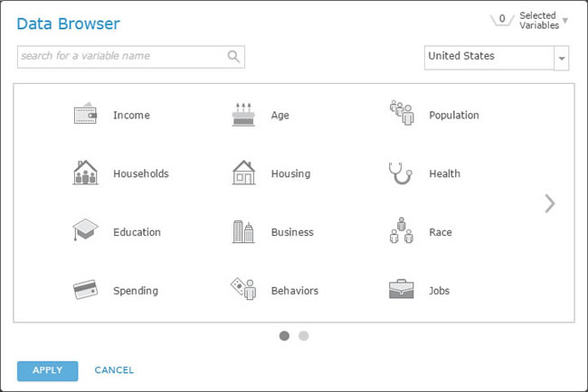
Click Select Variables to display the Data Browser, which categorizes thousands of demographic variables available for the United States. Using the Population and Income categories, choose variables that will help you understand the people living in this area. Click APPLY when you are finished selecting variables.
Create an intuitive title for your new layer and make sure to select the option to Use the current map extent. To see how many credits this analysis will consume, use the option to Show credits. Then compare that to the time it would take you to download similar data from a website, convert it to a layer, find the attributes you want to explore, and accept the geography availability. Choose the Enrich Layer tool for its ease of use, low cost, and flexibility.
Now run your analysis.

Step 4: Use smart mapping.
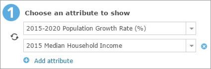
Once the layer is available, choose the Change Style option to explore the data. If you are interested in seeing areas of high income and future population growth, select those two attributes.
Adjust the color ramp and symbol size using techniques from the blog post 6 Easy Ways to Improve Your Mapsto produce the following map:
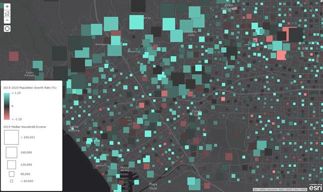
From this map, you can easily pinpoint areas of wealth by looking for the largest square sizes, and areas of significant population growth by the squares with the brightest shade of green. You can see from the map that, in general, areas of wealth are expected to have the most significant population growth in the next five years.
Within about five minutes, you can explore an area that’s unfamiliar to you and gain insight into the demographics of that area. Consequently, this technique can help your organization make better-informed business decisions. View the final map.
The following links provide more information about the tools and data used in this workflow:
- Esri Demographics
- ArcGIS Online Enrich Layer Tool
- Change Style (smart mapping)
Note: This workflow requires an ArcGIS Online subscription.