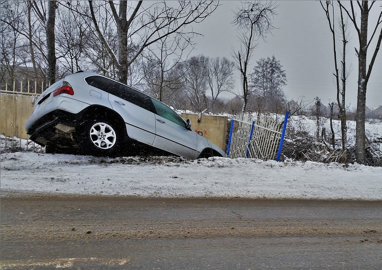
Accidents happen, with more than six million crashes occurring annually on roads in the United States. But what if a web app could show you, on a map, where and when the current traffic crash risk is high in your community? Would you change the route you take or be a little more cautious?
That web app is a reality for Indiana residents, who can visit the Daily Crash Prediction Map to find out the accident risk on roads throughout the state for the current day. The Indiana State Police (ISP) launched the interactive map last November as part of a statewide effort to reduce the number of traffic collisions—including fatalities—on Indiana highways.
The interactive map, compiled and deployed using Esri technology, shows the probability of crashes across the state by time of day, using a predictive algorithm. The machine learning algorithm uses historical crash data, road conditions and characteristics, annual traffic volumes, population and employer information, gas prices, position of the sun, time of year and day, and other variables to predict the probability of a crash. These factors can affect crash risk. For example, research has shown that low gas prices cause people to drive more often and generally increase the likelihood of traffic accidents, including fatalities.
“The map brings multiple datasets together in a consumable format that citizens, law enforcement officers, and first responders can interact with and weave into their daily routines,” said Ashley Schenck, an analyst for the State of Indiana’s Management Performance Hub (MPH), which helped to create the web app for the ISP. “Map users will have predictive information at their fingertips to promote safe driving behavior.”
The ISP uses the interactive map as part of a statewide effort to reduce the number of traffic fatalities on Indiana highways. Law enforcement officials can check the map to see where the crash risk is high and low and, in some cases, adjust patrols accordingly or station first responders in the high-risk areas so they can reach accident scenes more quickly. The public can use the map to find out if the routes they plan to take to work, school, or the store are in high-risk zones.
“We’ve gotten emails complimenting us on the map saying, ‘This is neat. It’s given me pause about the route that I take,’ ” said Captain Larry Jenkins, commander of the ISP’s Criminal Justice Data Division. “Some folks say they have adopted new routes and are getting out of the high-risk crash areas.”
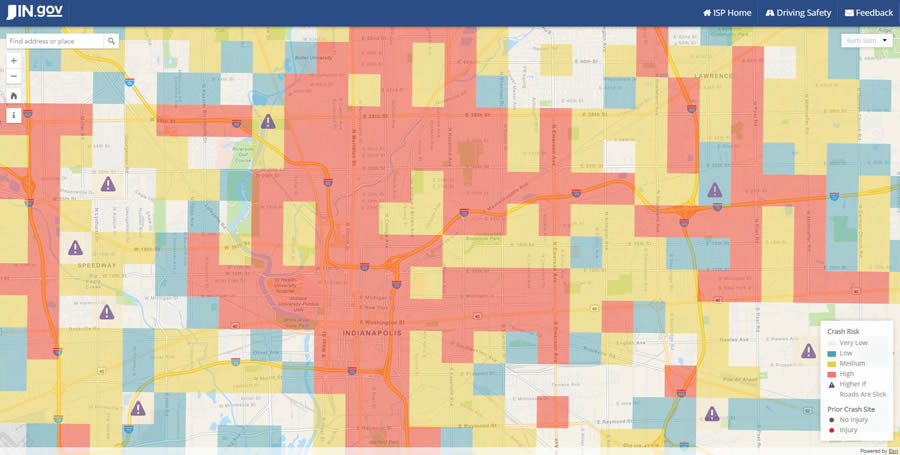
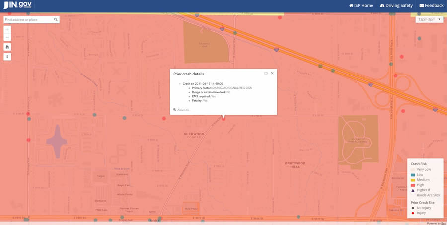
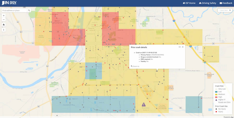
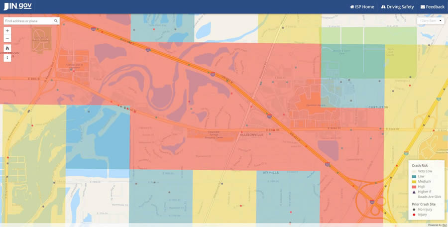
The Daily Crash Prediction Map shows the crash risk throughout the state by time of day, using color-coded, one-square-kilometer grids overlaid on the street network. Grids marked in red denote a high crash risk, yellow grids carry a medium risk, while blue and white grids indicate a low and very low risk, respectively. Map symbols (a purple triangle with an exclamation point) warn motorists about areas that are high risk when roads are slick due to snow, rain, or ice.
The map also shows the locations of relevant traffic accidents dating back to 2004. For example, crashes that occurred recently, at the same time of day or in the same month, are more relevant than those that did not. Red dots signify that someone was injured or killed, while gray dots denote noninjury crashes.
Each mapped crash includes a pop-up that contains information collected about the accident, including the primary cause (e.g., following too closely or unsafe speed), whether anyone was killed, and if it was drug or alcohol related.
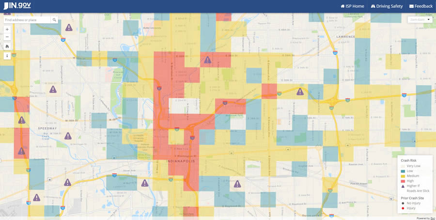
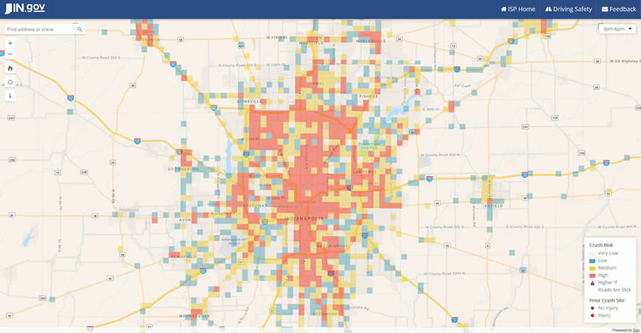
Here’s how the interactive map works. After zooming in to an area of interest on the map, the user checks the crash risk by selecting a three-hour period to study on the current day (e.g., midnight to 3:00 a.m., 3:00 a.m. to 6:00 a.m., 6:00 a.m. to 9:00 a.m.). For example, on May 3, 2017, the crash risk on a short stretch of US Route 40 east of Interstate 70 in downtown Indianapolis was deemed high from 6:00 a.m. to 9:00 a.m., whereas it was moderate from 9:00 p.m. to midnight. Crash risk in the suburb of Lawrence was typically moderate from noon to 3:00 p.m. on May 3, but it became high in more areas from 3:00 p.m. to 6:00 p.m. as commuters headed home.
Users also can view crash risk trends for an entire urban area. Again using May 3 to illustrate, the crash risk was moderate in many Indianapolis neighborhoods and suburbs from 3:00 a.m. to 6:00 a.m. But as the morning wore on, many grids on the map changed color from yellow to red, meaning that the risk was now high. Accident risk downtown began to drop slightly after 6:00 p.m. as commuters headed out of the city center to their suburban homes. Interestingly, some grids that include high traffic areas, such as major interstate highways and shopping centers, remain risky from midnight to 3:00 a.m.
Map users can also zoom in to get detailed information about accidents in their neighborhoods or anywhere else in the state. For example, the map shows that a fatality occurred on June 17, 2011, in Sherwood Forest, with the primary factor for the accident being disregard for a traffic signal. In some cases, trends can be spotted. For example, on a very short stretch of North Old Interstate 37 north of Bloomington, the map shows three accidents involving vehicles that ran off the road in 2012 and 2015.
“Officers can use the drill down functionality to pinpoint where dangerous intersections are within the grid and what the primary factors of crashes are,” said Schenck. “For instance, ISP now has information that can assist troopers in proactive enforcement efforts based on the primary cause of crashes in a particular area.”
The Daily Crash Prediction Map was based on a similar map created for Tennessee’s Integrated Traffic Analysis Network (TITAN), a private portal the state’s law enforcement agencies use to collect and manage information about accidents. Indiana’s implementation was developed by the ISP and Indiana’s MPH, with assistance from Esri via the Esri Enterprise Advantage Program (EEAP).
While at a law enforcement conference, Major Michael White from the ISP learned about TITAN’s mapping app and was impressed. He thought Indiana could do something similar and offer broader access—and benefits—by creating a public web app that could be used by commuters and law enforcement officers alike.
A Great Web App Starts with Great Data
ISP approached MPH last year, requesting help in building the web app. “MPH provides custom analytics solutions to answer complex management and policy questions,” Schenck said.
The initial development of the map consisted of a two-month discovery phase in which MPH evaluated the data based on the availability, completeness, and significance in the predictive model. Data for the project includes crash statistics dating back 17 years through the current day collected via the State of Indiana’s traffic collision repository, the Automated Reporting Information Exchange System (ARIES), along with the daily traffic volume from the Indiana Department of Transportation’s roadway sensors. After the discovery phase and completion of the initial predictive model, work began on building the map using the Esri ArcGIS platform, with EEAP consultants aiding in implementing the extract, transform, and load process for updating the map.
Exactly what type of data is used in the predictive model? When crashes happen, officers collect a lot of information for accident reports. This includes the date, time, and location of the collision; if a fatality or injury occurred; if drugs or alcohol were involved; and weather conditions. All this information is included plus average daily traffic volumes, population and employer information from the United States Census, and historical gas prices for the state.
ArcMap was used to create the map layers, which are published and hosted in ArcGIS Online. A custom app was built that uses ArcGIS API for JavaScript to display and interact with the map.
The web application is dynamic, and the crash locations and risk grids are updated nightly for use on the following day. Using Python scripts, the map is updated behind the scenes, ensuring that the latest traffic accident information is always displayed.
The accident and crash risk data covers all of Indiana, from the interstates and streets of large cities such as Indianapolis to small communities like Evansville and all the roads in between. The map is particularly useful to ISP troopers, city police, and sheriff’s deputies who patrol rural areas, Jenkins said.
“In urban areas, the troopers see a lot of crashes [daily] and know where the worst spots are located,” he said. “But in the rural areas, the crash volume is lower, and it is harder over many years’ time to see where the high-risk areas exist. Now they can see the information on the map.”
Prediction and Prevention
The ISP and MPH hope the Daily Crash Prediction Map will serve as one of the tools that can be used to reverse a troubling trend.
“Indiana has seen a growing number of crashes since 2011,” Schenck said. That trend, however, began to reverse in early 2017, with the number of accidents decreasing over the same period last year, she said.
Deaths in traffic collisions rose 7.5 percent from 2014 to 2015 in the state and by 9 percent nationwide during that same period. What’s at the root of the problem? According to the National Safety Council, it’s likely that many factors are contributing to the increase in traffic deaths, with an improving economy and lower unemployment at the core. Another factor is that gas prices have been lower than in the past, resulting in increased driving.
“When gas gets cheap, the accidents go up,” said Jenkins. “People aren’t as fuel conscious and are less likely to stay at home.”
He hopes that in the hands of citizens and law enforcement officers, this map-based predictive analytics web app will bring positive change and cause traffic collisions and fatalities to tumble. “Education is the key to making this program work,” Jenkins said. “The way MPH set [the web app] up, it’s easy to use. Visualization is important to understanding [data] quickly.”
The web app, which can be used on a desktop or a mobile device, might instill more caution in people or lead them to adjust their travel habits.
“Some people say they are not going to the store at certain hours or [are] changing their route for their work commute,” Jenkins said. “If it is raining and they had planned to drive in a high-risk area, they decide they are going to go on another day.”
To learn more about the ISP’s web app, watch this video.
