Skip to Content

Smart Mapping

Interactive data and map exploration

Quickly create beautiful and informative maps

Discover and communicate your data’s stories

Leverage intelligent default, data-driven visualizations and innovative workflows

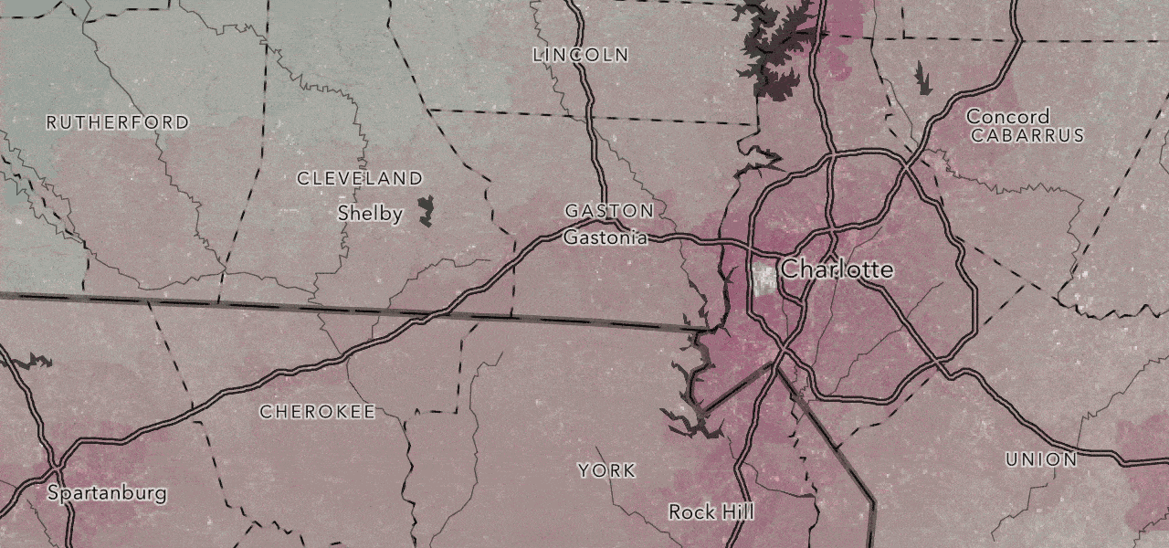
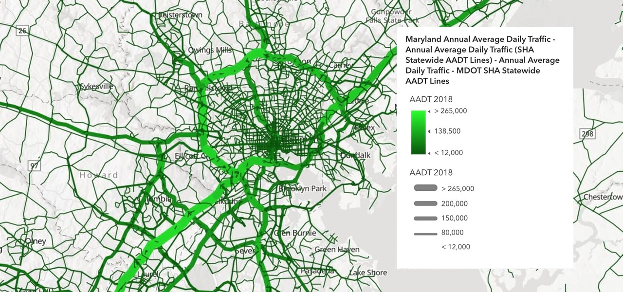
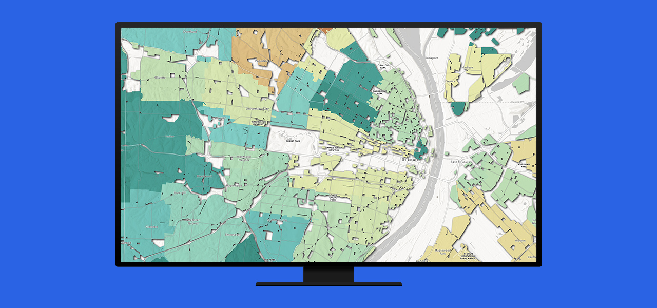
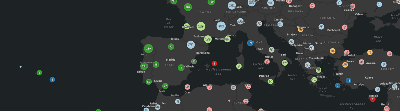
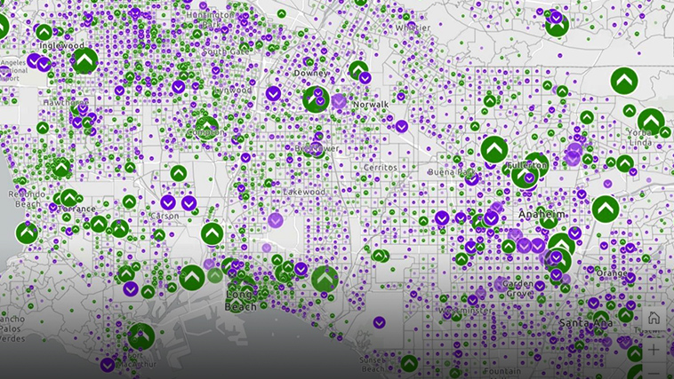
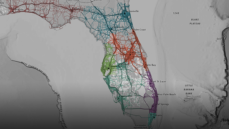
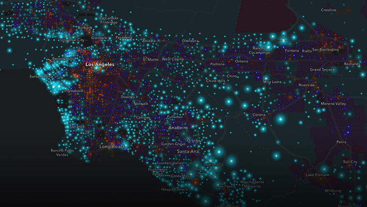
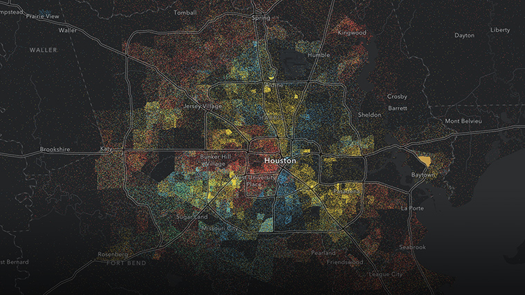
Smart mapping, Esri's interactive data exploration and mapping software capability, helps you uncover patterns and stories inside your data. No matter where you are in your mapping journey, smart mapping enables you to quickly create beautiful and informative maps.

A dot density map showing percent change in owner occupied housing, with green dots representing greater change and purple dots, less change

Be empowered by smart mapping

Discover stories
Dynamic visualizations encourage data exploration
Communicate effectively
Data-driven visualizations show what's important
Increase productivity
Map styles provide a meaningful starting point
Create high-quality maps
Cartographic intelligence is built into the styles
Increase confidence
Smart workflows intelligently guide map creation

Explore data at the speed of thought

Smart mapping enables interactive data exploration. It is a visual-thinking tool that rewards your curiosity. The interface dynamically visualizes the settings and styles you select, so you can immediately see the results. Streamlined workflows guide your exploration, and one data discovery will quickly lead to another. 

A GIF showing a map of Charlotte, North Carolina, shaded in pale tones of purple and blue that become more saturated

Skip ahead to the good choices

Expedite your journey to beautiful and informative maps with smart mapping. Intelligent defaults provide an excellent starting point for visualizing and exploring your data. Rather than leaving you to sort through many options, smart mapping evaluates your data and suggests map styles that work with that type of data. The styles help you uncover patterns by emphasizing what's most important and deemphasizing what's less important.

A map of Maryland showing average daily traffic, with light green lines representing areas with more traffic and dark green lines showing less traffic

Share useful and informative maps

Elevate your maps by building on the work of others. Use color ramps, which are designed by experts in color theory; map symbols that look good at any scale; and symbology that is directly tied to the distribution of your data. Each of these interconnected settings intelligently guides you to create beautiful maps you can confidently share with your audience.

Computer screen showing a green and white city map of St. Louis representing a 2021 Diversity Index

Start mapping and understanding your data

There are many ways to access Esri's mapping capabilities, including cloud-based software as a service (SaaS), self-managed infrastructure, developer tools, and desktop software. Identify how you would like to access the capabilities, and learn more about the corresponding product.

Contact sales

Contact us

Outside the United States