With the 2018 US midterm election occurring tomorrow, politics is on top of everyone’s mind. As prognosticators and pundits dial in their forecasts and start setting their narratives, we wanted to see how visualizing selected variables from Esri’s vast demographic data could help add some context to the approaching elections.
To begin, we grabbed updated congressional districts for the 115th Congress from ArcGIS Living Atlas of the World (including recently redrawn districts in Pennsylvania) and 2016 voting results aggregated to the congressional district level. We also segmented the districts in two additional ways using filters in ArcGIS Online:
- Highlighted the districts where President Trump received more votes than Hillary Clinton in 2016
- Highlighted key battleground races (69 in all) as identified by the Washington Post
Once we had our datasets configured, we simply appended Esri’s demographic and psychographic data to these layers through geoenrichment. The result? Seven different maps that analyze the 2018 election through the lens of key indicators:
- The propensity to “Buy American”
- The importance of government’s focus on the environment
- Predominant educational attainment levels
- Employment in a blue-collar industry (agriculture, mining, manufacturing, and construction)
- Predominant generation and Millennial rates
- Minority population percentage
- Quantitative and qualitative financial standing measures
While each of the maps is fascinating in its own right, the Financial Standing map in particular reveals some interesting (and seemingly contradictory) insights.
A Deeper Dive into Financial Standing
After President Trump’s unexpected victory in 2016, political observers advanced several theories to help explain the outcome. One of the most common refrains was that as a candidate, Trump did a better job of appealing to the economic anxiety voters felt.
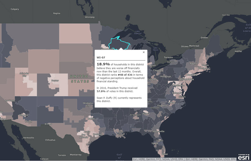
To explore this, we created the Financial Standing map, which visualizes four different measures related to financial standing: the unemployment rate in each district, the median household income in each district, the median household net worth in each district, and the percentage of households in each district who believe they are worse off now than 12 months ago. Together, these variables provide a perspective on an area’s economic well-being that is rooted in the facts on the ground as well as the perceptions of the people that live there.
Each tab of this map visually tells a different story:
- Unemployment is sharpest in the Southwest and pockets of the Southeast but significantly lower in the Midwest and part of the Rust Belt. PA-02 has the nation’s highest unemployment rate at 12 percent, while WI-06 recorded the lowest rate at 2 percent.
- Pessimistic attitudes about households being worse off now financially are very pronounced in parts of the Rust Belt, Southeast, and Appalachia, while positive attitudes tended to center around urban areas. KY-05 is the most pessimistic district in the nation, with 20.5 percent of households having negative feelings. HI-01 is the least pessimistic, with 13.8 percent of households reporting negative sentiments.
- Median household incomes are the highest in more metropolitan and some suburban areas, while the lowest median household incomes can be found throughout the Southeast and Appalachia. VA-10 has the highest median household income at $120,212, while NY-15 reported the lowest total at $26,982.
- Median net worth broadly tracks with median household income, though popular retirement areas like Florida and Arizona show a relatively higher median net worth in places with lower median household incomes. NY-03 led all districts, with a median net worth of $500,001. Another NY district, NY-09, reported the nation’s lowest median net worth at $22,482.
Overall, the most interesting thing about this map is the lack of harmony between all four tabs. While each of these measures looks at a different component of financial standing, it’s reasonable to assume that broad patterns would mostly hold from measure to measure. There are several districts in states like Minnesota, Wisconsin, and Indiana that exhibit a high degree of pessimism about their financial standing despite relatively strong-to-good numbers for unemployment, median household income, and median household net worth. And if you toggle on the Trump districts across each of these views, you’ll see these same districts consistently voted for the president in 2016. The data suggests that the president was able to animate voters in the places where the disconnect between quantitative and qualitative measures was highest.
Try It Yourself
Want to explore the data yourself? We’ve published the enriched congressional districts to Living Atlas, which you can access here. But don’t just stop at elections. Between the thousands of authoritative layers in Living Atlas and the more than 13,000 demographic and psychographic variables for the US alone, anyone can create eye-catching visualizations that analyze everything from homelessness to real estate.
And if you’re a reporter or member of the media, we encourage you to reach out to us anytime at media.help@esri.com to request complimentary data and assistance with your maps.