After 40 years of rapid expansion of its more than 1,700-acre campus, Washington State University (WSU) found that its utility maps—which were primarily paper based—had become inaccessible and inaccurate. Leveraging Esri GIS technologies and Microsoft Silverlight development tools, the university created a crowdsourcing web app that enables every member of the 375-person facilities department to look at the same maps and data. More important, this data can be updated as facilities staff members work in the field.
Growing Pains
Throughout its 124-year history, WSU has experienced several large construction booms. Over the last 15 years, WSU has built or performed major renovations to nearly 40 facilities on the main campus in Pullman, Washington, causing massive changes to the utility systems. The university’s utility maps became terribly out of date and led to many “surprises” in the field. To get by, crews resorted to creating and redlining their own paper maps.
In 2011, WSU Facilities Services was formed by bringing the Facilities Operations and Capital Projects departments together. New leadership and new department priorities opened the doors for further development of the department’s existing GIS. At the time, GIS had been used for tracking university-owned real estate. While utility data was populated in the GIS, it had not been incorporated into the departmental workflow.
Developing a Solution
The goal was simple: create an easy-to-use mobile app so that all staff could view and query the same geospatial data as well as contribute information back into the university’s GIS.
To accomplish this required upgrading ArcGIS for Server from 9.3 to 10.2.1. In addition to the many benefits of the newer architecture, upgrading was necessary so staff could perform data edits and data collection using feature services, which were available with 10.2.1.

Creating a user interface that would make for a rich and inviting user experience was a top priority. Getting people who were more comfortable with paper maps to use the mobile app was already a challenging proposition. Facilities Services wanted them to not only use the app but also use it to correct data.
Luckily, Facilities Services was already using Microsoft Silverlight and the Expression Blend IDE, so creating a unique and engaging user experience was relatively easy.
Embracing the use of touch screens for the app was important so users could make edits to utility data in the field on a tablet device. Menu items had to be easy to select and interact with while holding the tablet. The menu structure allows users to choose all menu and menu subitems using their thumbs. This not only made the app easy to use, but also allowed the maximum amount of screen real estate for the map.
The menus were designed as a stack of cards located off screen. To transition between menus, clean, fluid animations “fly” the card in and out of view as needed. Using this method had the added benefit of creating infinite scalability because the app isn’t limited to a finite menu content area. If menu content is needed, a new card flies in. It flies out when the user is done with it. App functionality can be continually added without constant reworking of the entire user interface—another bonus. It also makes for an engaging and entertaining user experience.
Creating Familiarity
Good design only goes so far when enticing people to use an app. This is especially true when users’ accustomed workflow must be replaced with a new one. In this case, users had kept their own paper utility maps with handwritten markups (redlines) for many years. Showing them an app containing different map data wasn’t going to cut it.
To get around this, the paper maps users had been working with were scanned and georeferenced by an intern so they could be converted to a mosaic dataset. After publishing this mosaic dataset as an image service, users could view their old maps in the new app. This created instant familiarity. The added bonus was that it allowed everyone in the department to see all the maps for the first time. Previously, these maps were available only to a small group in the organization.
Starting to Correct Bad Data
Policy changes on how as-built drawings were handled and incorporated into records after a project is completed were a necessary first step for correcting current and future WSU utility data. However, this didn’t address the many decades of sporadic and missed updates to utility maps.
The GIS team consists of just two full-time employees and several student interns, so there was no way they could update errors in old records while keeping up with new construction projects. The team turned to crowdsourced cartography. Facilities Services staff members know the utility systems better than anyone and could update the maps while they worked out in the field. Data could be fixed efficiently and accurately while providing everyone in the organization with access to the corrections immediately.
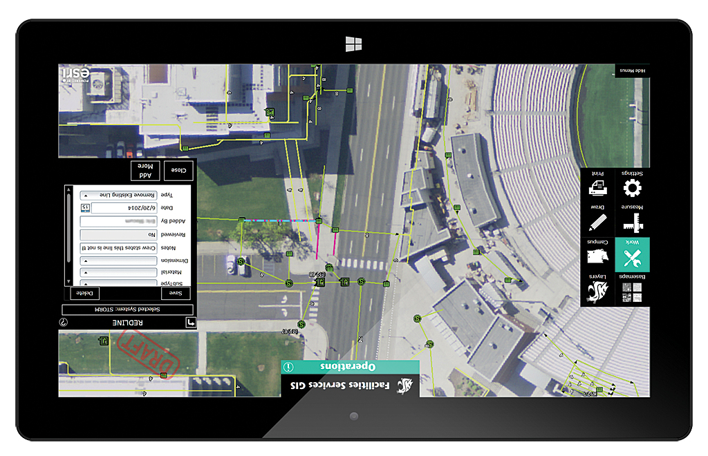
Corrections made in the field are called redlines. When a utilities crew member finds a feature in the field that isn’t in the GIS, that feature can be added by simply opening up the Redlines menu in the app, selecting the appropriate utility system, selecting the component to add or remove, and placing the feature on the map. The user can also add attributes to the new feature.
Redlines are saved to their own feature class in ArcSDE and appear on the map as red symbols. This lets any user know that this is a redline feature that has not had its exact location verified or committed to the permanent record.
The CAD manager, using a specially designed GIS dashboard, can see when a redline feature has been recorded. He investigates the addition or deletion to determine if it exists in an old as-built drawing that was never incorporated into the GIS. If he is unable to find any record of it, he sends out a student intern with a GPS unit with centimeter accuracy to capture its exact location. Next, using AutoCAD Map 3D, he transfers the redline feature into the proper ArcSDE feature class.
It’s an easy, efficient, and effective process. Using this method, 118 features in one system were located and corrected in just four days. What’s more, crews now have the power to make a difference for the whole organization.
Filling in Data Voids
Crowdsourced cartography has proved extremely successful in correcting project-related changes from the past. However, the time it takes to receive as-built drawings after a major construction project is completed was still an issue. Depending on the complexity of a project, it may take years to receive the as-built drawings. This delay can lead to situations in which Facilities Services has performed remodeling to a facility before it has received the original as-built drawing.
To fill this data void required coming up with a different way for showing project-related changes to the utilities systems for a site. The latest construction set civil drawings were turned into an image service by scanning them and displaying them in the app. This let users overlay GIS data onto the civil drawings and see what changes were potentially made to utilities for that site. By showing the complete civil drawing, the user can see that it was part of the construction set and not an official as-built drawing.
Results
The app took a year to develop and has been deployed for eight months. To date, approximately 200 users have been trained, and there are more than 175 active users of the GIS. GIS is accessed by all four main campuses and used as a planning and discussion tool during meetings. By spending extra time designing an inviting and intuitive user experience and adding features like access to old paper maps, the app easily met the goal to have it adopted within the organization. There are plans to release GIS offerings to other WSU departments and continue incorporating GIS into departmental workflows across the university.
Future Development
Because Silverlight is classified as a mature technology, WSU is planning to develop a new app using ArcGIS .NET API. Using this new Esri technology should greatly enhance data collection efforts by letting users take maps and data offline. In addition, the .NET API allows developers to tap into device hardware, such as an internal GPS receiver or a laser range finder connected by Bluetooth.
For more information, contact Bob Nichols.
About WSU
Washington State University (WSU) was founded in 1890 as Washington State’s Land Grant institution. It operates statewide with four campuses, five research and extension centers, four research and extension units, and one research station. WSU is home to more than 26,000 undergraduate, graduate, and professional students. The main campus is located in rural eastern Washington in the small town of Pullman. Due to the size of the main campus, WSU owns and operates its own utilities with the exception of a few natural gas and electrical lines shared with a local utility provider. This adds up to over 70 miles of streets and sidewalks, 43 miles of electrical lines, 22 miles of steam lines, 30 miles of freshwater lines, and more than 6 miles of chilled water lines making WSU—in many ways—its own municipality.