The Equal Earth projection was created in response to a wave of news stories in 2017 following the Boston Public Schools announcement that it was switching to the Gall-Peters projection for all classroom world maps. These articles erroneously asserted that the Gall-Peters projection was the only equal-area projection that shows land features at their true relative sizes, despite the consensus about inappropriateness of this projection for small-scale mapping.
About a week after these stories started to appear in the news, Tom Patterson, a cartographer who has since retired from the US National Park Service, began looking at equal-area projections to identify an alternative to Gall-Peters. When he didn’t find any good options, he contacted Bernhard Jenny and Bojan Šavricˇ to find if they would be interested in developing a more visually acceptable equal-area world map for schools and socially conscious organizations. Jenny is an associate professor of immersive visualization at Monash University in Australia. Šavricˇ is a software development engineer on the Projection Engine team at Esri.
Jenny and Šavricˇ readily agreed, and all three looked at existing equal-area projections. They liked pseudocylindrical projections because these projections better mimic the earth’s spherical form with arcing lateral meridians. Some pseudocylindrical equal-area projections, such as sinusoidal and Mollweide, show the poles as points. While Antarctica retains its circular shape with this projection, the extreme compression in high latitudes where meridians converge means there is not enough room to place labels. Putninš P4’ and Eckert VI have short pole lines instead of pole points—an improvement—but map readers find the outward bulge of the lateral meridians of these projections displeasing. Eckert IV and Wagner IV came closest to meeting the team’s design preferences but still had aesthetic issues.
The team decided that a new projection was needed that would have some of the characteristics of these projections. It should have a shape similar to the popular Robinson projection but possess area equivalency.
Having adopted a catchy name—Equal Earth projection—they began creating a hybrid that blended traits of Eckert IV and Putninš P4’ using a web application developed by Jenny for designing the new projection. The team incorporated feedback from the cartographic community on the graphic design of the projection. With the graphic design determined, Šavricˇ wrote the equations for the Equal Earth projection, and the work of developing the projection was done.
Comparison to the Gall-Peters Projection
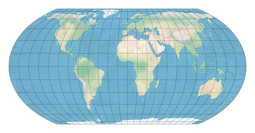
The Gall-Peters projection is cylindrical with straight parallels and straight meridians, while the Equal Earth projection is a pseudocylindrical projection with straight parallels and curved meridians. The rounded outer shape of the Equal Earth projection graticule gives the impression that the planet is a rounded object.
Although both projections maintain true relative sizes, the Gall-Peters projection greatly deforms features on the earth’s surface in the tropical and polar regions: Africa is extremely elongated from north to south, and Antarctica is highly compressed and stretched along the bottom of the map. These distortions are significantly reduced in the Equal Earth projection.
Comparison to the Robinson Projection
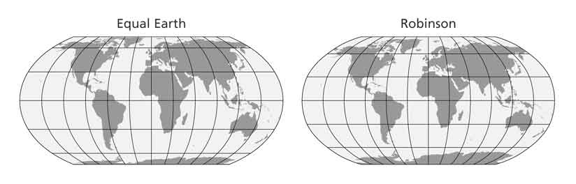
At first glance, the Equal Earth projection seems similar to the popular Robinson projection. Both projections have a similar graticule shape, but on closer examination, the differences between the two become obvious.
Unlike the Robinson projection, the Equal Earth projection is an equal-area projection. It shows the continental outlines in a visually pleasing and balanced way. The landmasses in the tropical and mid-latitude areas are less elongated, and areas along the poles are less flattened and compressed as they are on similar equal-area world maps.
Slightly wider than the Robinson projection, the Equal Earth projection’s meridians are equally spaced along every straight parallel line of latitude. Lateral meridians do not excessively bulge outward, loosely approximating arcs that mimic the overall appearance of a globe. The projected equator is about 2.05 times the length of the projected central meridian of the map. The poles are projected as lines that are 0.59 times the length of the equator.
Its equations are simple to implement, fast to evaluate, and also available for ellipsoidal earth models. These differences are the result of the Equal Earth projection maintaining the true relative sizes of the earth’s features, unlike the Robinson projection, which exaggerates areas that are farther away from the equator.
Widely Noted and Quickly Adopted
A paper describing the Equal Earth projection, written by Patterson, Jenny, and Šavricˇ, was published in the August 2018 issue of the International Journal of Geographical Information Science. The Equal Earth map projection became one of the journal’s most read papers, with more than 12,000 views. The projection has been featured in numerous science magazines including New Scientist, Popular Mechanics, xyHt, and National Geographic Magazine. It was also the subject of news articles in the Daily Mail, Newsweek, Metro, and CityLab; and was a trending topic on social media channels.
Patterson and Šavricˇ also introduced the Equal Earth projection in a presentation at the 2018 annual meeting of the North American Cartographic Information Society (NACIS) in Norfolk, Virginia.
Widespread adoption of the Equal Earth projection started immediately after it was announced. About a week after the projection was published, the NASA Goddard Institute for Space Studies started using the Equal Earth projection for its monthly maps of global mean temperature anomalies. The International Association of Oil & Gas Producers also included three coordinate reference systems that use the Equal Earth projection in its EPSG Geodetic Parameter Registry just two months after the projection was published.
The Equal Earth projection is already available in various open-source and commercial GIS and mapping software such as Flex Projector, G.Projector, Panoply, GeoServer, QGIS, ArcGIS Pro, MAPublisher, Geocart and code libraries such as PROJ and D3.
Equal Earth Political Wall Map
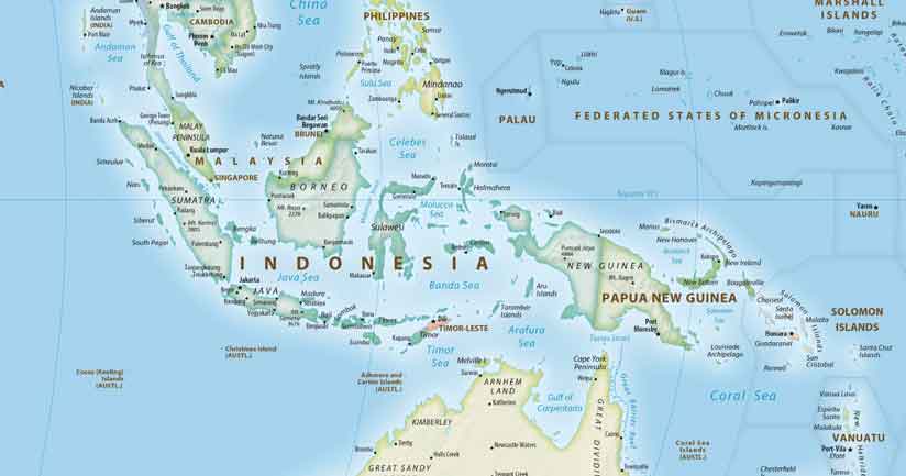
In addition to publishing a paper about the new projection, Patterson created a political wall map that used the Equal Earth projection and was designed for schools or anyone needing a map that shows countries and continents at their true sizes relative to each other.
Because schools are the target audience for this map, Patterson chose bright and appealing colors. The map includes light shaded relief, labels for major physical features, and select populated places as well as country boundaries and capitals. It makes extensive use of vignettes. Scattered island groups are bounded with soft gray lines for clarity, although these do not represent actual maritime boundaries.
Because this is an equal-area map, less space was available for labeling features in Europe. Getting labels to fit in this area was challenging. Myriad Pro, in condensed and regular type, was used throughout.
Three versions of the map were created: one centered on the Greenwich meridian, one centered on 150 degrees east to shift the focus to east Asia, Australia, and the Pacific, and one centered on 90 degrees west with the focus on the Americas.
All three versions of this map can be downloaded for free at
equal-earth.com.