ArcGIS Online users can now use basic spatial analysis tools built directly into the ArcGIS.com map viewer. Tools, such as Correlation and Hot Spot detection, help you find patterns. Other tools, such as Enrich Layers, retrieve information about people, places, and businesses to help you make better decisions. You can combine many tools together to answer questions about your data.
You can analyze your own data or data that’s publicly available on ArcGIS Online or a combination of both. This makes ArcGIS Online a powerful platform for analysis.
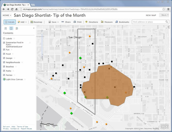
This tip uses the popular San Diego Shortlist web map. The web map was created mainly for people who attend the Esri International User Conference to help them find food, fun, and points of interest in downtown San Diego, California. This tip was designed to help a group of attendees find a restaurant to eat at before going to see the San Diego Padres baseball team play at Petco Park. The restaurant needed to be close to the baseball stadium and easily accessible from the San Diego Convention Center, the site of the conference.
The Summarize Nearby analysis tool and some built-in web map tools were used to help locate restaurant options.
Follow the steps below to do this yourself.
Step 1
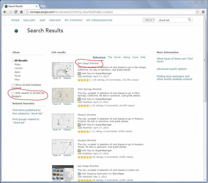
In a web browser, log in to your ArcGIS Online for Organizations account with Publisher or Administrator privileges and search for “short list” using the search box. You may have to Uncheck “Only search in ArcGIS for <organization> to make it appear. Click the San Diego Shortlist web map.
Step 2
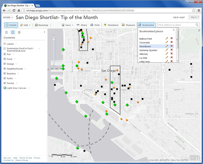
Open the map in the ArcGIS.com map viewer by clicking the OPEN dropdown. You’ll see the map with several layers that show the locations of points of interest or restaurants in San Diego.
In the map, click the Bookmarks tool and select Downtown.
Step 3
Turn off all the layers except Fun and Food by unchecking them in the table of contents in the Show Contents of Map icon.
Step 4
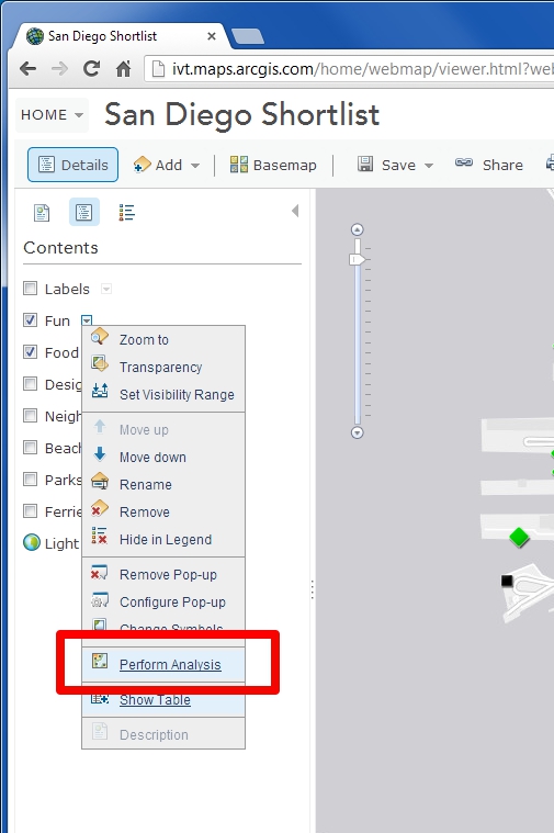
In the table of contents, click the small arrow next to Fun and select Perform Analysis. This will bring up the analysis tools.
*Note, if Perform Analysis is not listed in the drop down, you need to login with Publisher or Administrator privileges. See this Help link. If you are logged in as a publisher or administrator and still do not see it, you need to create a seed feature service. Read this forum post.
Step 5
Click Summarize Data and click the Summarize Nearby tool to bring up the tools dialog box, where you’ll specify the analysis parameters.
This tool finds features within a distance of another feature. For this tip, those features will be all the restaurants within a distance specified from the Fun layer. The tool gives you three options to find restaurants from Petco Park: straight-line distance, driving distance, or drive time.
You want to find approximate driving distance, since walking around city blocks is the method of travel. Your inputs should be as follows:
- Choose Food as the layer to summarize in the first drop-down menu.
- Select Find nearest features using a driving distance of .15 miles. Choosing .15 miles captures the Gas Lamp Quarter, which will offer some good dining choices.
- Leave set to the defaults.
- Leave set to the defaults.
- Give the Result layer a name.
Make sure the box for Use current map extent is checked.
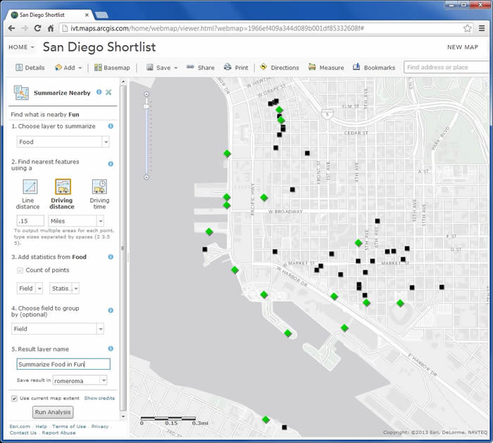
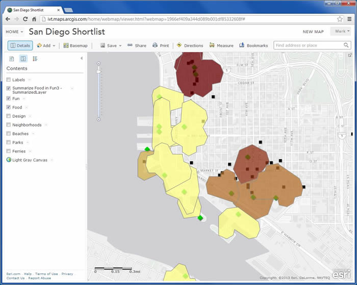
Click the Run Analysis button on the bottom of the analysis dialog box. When it’s complete, you’ll see a new layer in the map with the results showing .15-mile drive times from the Food and Fun layers. The polygons are color coded by the total number of restaurants that fall within each area. Dark colors have more restaurants, and light colors have fewer. It should look similar to what’s in the screen shot below:
Step 6
Next, you’ll focus on the polygon representing drive times from Petco Park by using some of the built-in web map tools.
First, search for Petco Park in the Address and Place search box located in the top right part of the map. This should center the map and bring up a pop-up window to help you identify where Petco Park is located.
You can change the basemap to Imagery with Labels to view the satellite imagery if you wish.
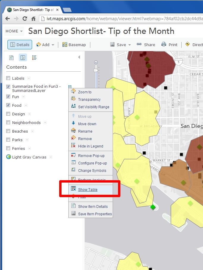
Next, in the table of contents, click the arrow next to your results layer and select Show Table. The table should open at the bottom of the map.
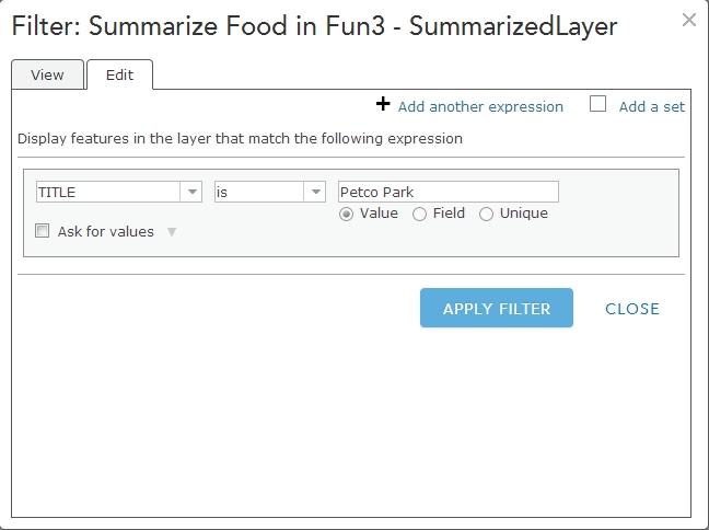
In the table window on the far right, click the Table Options drop-down arrow and select Filter:
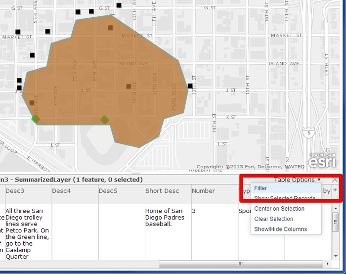
Change the filter with the expression TITLE is Petco Park and click the blue APPLY FILTER button:
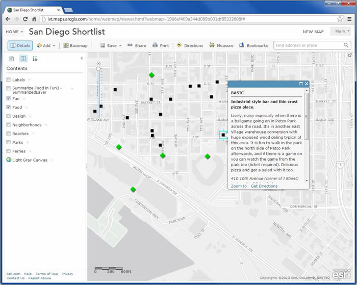
Now that you’ve narrowed the focus to Petco Park and the results have been filtered, it’s easier to see the restaurants that fall within the specified distance.
Now simply click the black points representing restaurants to identify each one. After clicking the black dots and reading the descriptions of the restaurants in the pop-up window, it looks like the restaurant BASIC on 10th Avenue and J Street, which specializes in thin crust pizza, would be a good option given its liveliness and proximity to Petco Park.
Read about performing analysis in ArcGIS Online in the help documentation.
