
September 28, 2017 |
July 9, 2019
Where press badges and notepads were once the common tools of the trade, today’s journalists are just as likely to be found behind a computer, scrolling through rows of data in spreadsheets and databases. The proliferation of data and the rise of digital media has enabled new techniques and channels to engage readers. Recognizing that data fluency is now critical to journalism, outlets like the New York Times have even taken to hosting data bootcamps in their newsrooms to help reporters and editors on every desk become more comfortable navigating, analyzing, and understanding data.
But data fluency does not matter if readers can’t understand the analysis results or relevance. Enter the maps.
Seeing What Others Can’t
On many of today’s leading stories, the first thing that jumps out at the reader are the maps—they show the nexus of incidents and trends in a way that relates to people’s sense of place. That’s part of the power of maps. In a visceral way, maps immediately provide context and help people understand. Maps can surface patterns and spark insights that wouldn’t be apparent as a series of rows and columns. And, maps are popular. Outlets like CityLab and WIRED have devoted entire editorial sections to highlighting new and interesting maps and cartographic techniques.
Maps help us see what we otherwise couldn’t.
Take this recent example from the Washington Post visualizing repeat weather events across the US. Nearly all the data in these maps could have been (and likely was) summarized in some spreadsheet format. Yet, on a map it is much easier to see the information in context. Part art and part science, these maps tap into an innate curiosity people tend to have about the world around them, especially around where they live. And maps can amplify almost any topic or story, from immigration and the border to the best places on the basketball court to take shots. When paired with additional data like demographics or pollutants, maps can help us understand why things happen where they do, connecting the where and the why.
The result? A reader better understands a topic, and the story becomes more powerful.
In Their Own Words
Journalists across the media industry are seeking out more insightful and engaging data reporting tools. Here, reporters and editors share their thoughts about why maps are important in the media.
John Duchneskie – Graphics Editor, Philadelphia Inquirer
Working with data is great and is increasingly vital for any reporter trying to make sense of his or her community. But spreadsheets and databases can only go so far. For data-driven stories, there is no substitute for visualizing the results of your reporting and research. For census stories, for example, it’s easy enough to download data on population trends in your coverage area. You can use a spreadsheet to calculate changes over time, and to sort the results to identify trends.
Mapping the trends, however, brings the data to life: You can see where the clusters of population are rising and falling, share it with your colleagues, and use the map to identify where to do more reporting. Here’s an example of this process in action, explaining why residents are continuing to leave South Jersey, and how San Antonio is primed to pass Philadelphia in population, in part through gobbling up its nearby suburbs.
Another time GIS is a great tool for reporters is during election season. A recent primary election in Philadelphia brought the surprise defeat of a council member who had held office for 27 years. You can map the results by voting district and see what parts of the council district voted for the incumbent and her challenger. You can then look at the patterns on the map and use your knowledge of the city to infer that gentrification and changing demographics affected the vote.
But what if you wanted to do more than just make educated guesses? You can turn to the power of GIS and pull demographic estimates by voting district, add that data into your spreadsheet of vote totals, and clearly show that the challenger rolled up huge margins in areas that are wealthier and better-educated, and with more expensive housing. Here is the story that was prompted by that GIS-fueled analysis.
David Herzog – Print and Digital News Professor, Missouri School of Journalism
GIS can be a powerful reporting tool for journalists looking to uncover geographic patterns in their data. Traditional data journalism tools, such as spreadsheets and database managers, often fall short in their ability to show where a story is happening.
Journalists can create simple shaded area maps that allow reporters to communicate patterns to an audience. They can use GIS programs to dig deeper and discover hidden spatial relationships.
For example, a student journalist for the Columbia Missourian newspaper used GIS to test whether registered sex offenders followed the law by living more than 1,000 feet from schools or day care centers. She mapped the locations and offenders statewide and found 32 living within 1,000 feet of a school or day care. One was living as close as 135 feet, according to the analysis. (The newspaper is part of the Missouri School of Journalism, where I work, and the story started as a class project with me.)
Determining the number of offenders living too closely to schools would have been impossible without using a GIS program.
Ted Mellnik – Database Editor, Washington Post
Mapping is important in reporting if you seek and use facts. Mapping is important in stories about what people do or what happens to them or around them, and the patterns in those events. Mapping helps you find and portray patterns in data. That may not be sufficient for a wonderful story, but it’s a strong start.
To get a big picture, build groups. Plenty of good stories are focused on one person or just a few. Add data, and you can show how many similar people those few represent. For a reporter exploring data, one of the first steps is looking for categories based on key attributes that you can use to simplify and summarize. A group adds context and scale to your subject. Groups (plural) help answer that pesky editor question, “Compared to what?” Comparisons can include how closer things are, or how farther away, in time or space, with GIS.
“By the way, your map is way too complicated.” Perhaps the biggest challenge for GIS in reporting is that a map is usually too complex, in the context of a story. How can you slow a map, break it down like elements of a narrative? You can direct focus with annotation. Or start off with a legend, or with insets that show examples of how key comparisons work. You can take maps apart and present them as multiples that highlight a different view through the same window.
The repeated map approach came in handy in a June 2018 piece about which communities could be hardest hit by a trade war with China. The legend came first in a project about how and where half of homicides were going unsolved.
“How could that even happen?” The question itself is often overlooked. But a story’s credibility can hinge on letting a reader know not just what happened, but also how it was possible. We used maps for that in a GIS project that found thousands of Virginia voters mistakenly assigned to state districts they didn’t live in. The mistakes were enough to flip the state House.
Dreaming may be part of a reporter’s job. It’s sifting through the daily rush of events for possibilities, with a combination of insight and imagination and hope, for something new that will make an impact. What would you look for? A story that holds the promise of a compelling narrative of someone’s experience? A story with data that could yield facts, changes or trends, patterns and maps? How about both?
Lauren Tierney – Graphics Reporter, Washington Post
Spatial analysis is incredibly important for my work as a Graphics Reporter and cartographer at The Washington Post. In order to communicate complex information visually, GIS software is incredibly useful for analyzing data and visualizing the results of an analysis. It provides the base for assessing what information is available and what patterns exist that tell a story about a particular phenomenon, and also provides cartographic tools that are crucial for visualizing spatial data in an understandable way.
Explore Esri-powered maps about current topics and visit the ArcGIS Living Atlas of the World to view the wealth of data that reporters have access to. If you’re a reporter looking for data and tools, reach out to media.help@esri.com
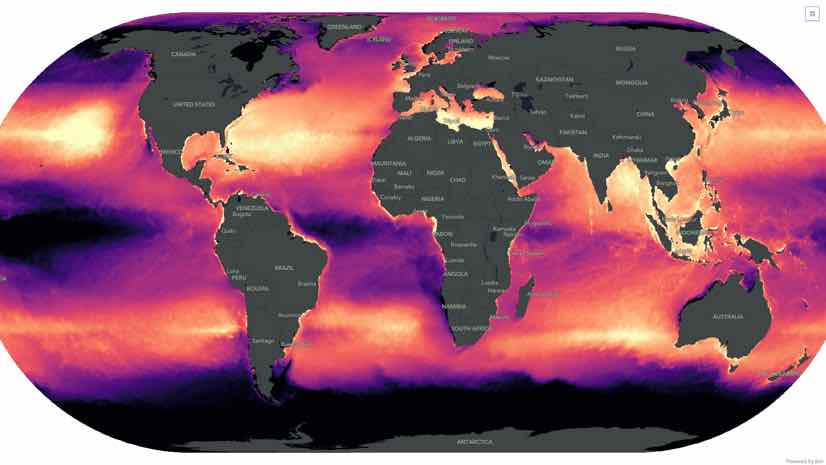
(Note: The map at the top depicts areas with high concentrations of ocean trash. An interactive map allows you to compare plastic and sea surface temperature anomalies.)

September 28, 2017 |

March 21, 2019 |
February 21, 2019 |