Territorial Empathy Maps Racial Inequality to Take Action
By Margot Bordne and Clinton Johnson
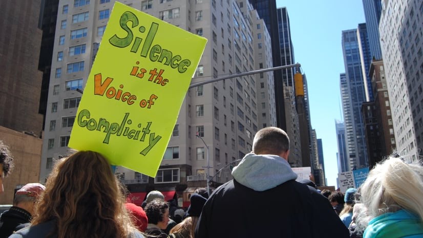
Maps, like all media, can be used for misinformation, but they can also be used to uncover and communicate the truth. Right now, old maps that perpetuated systemic racism in American cities are informing critical debates over racial prejudice and economic inequality.
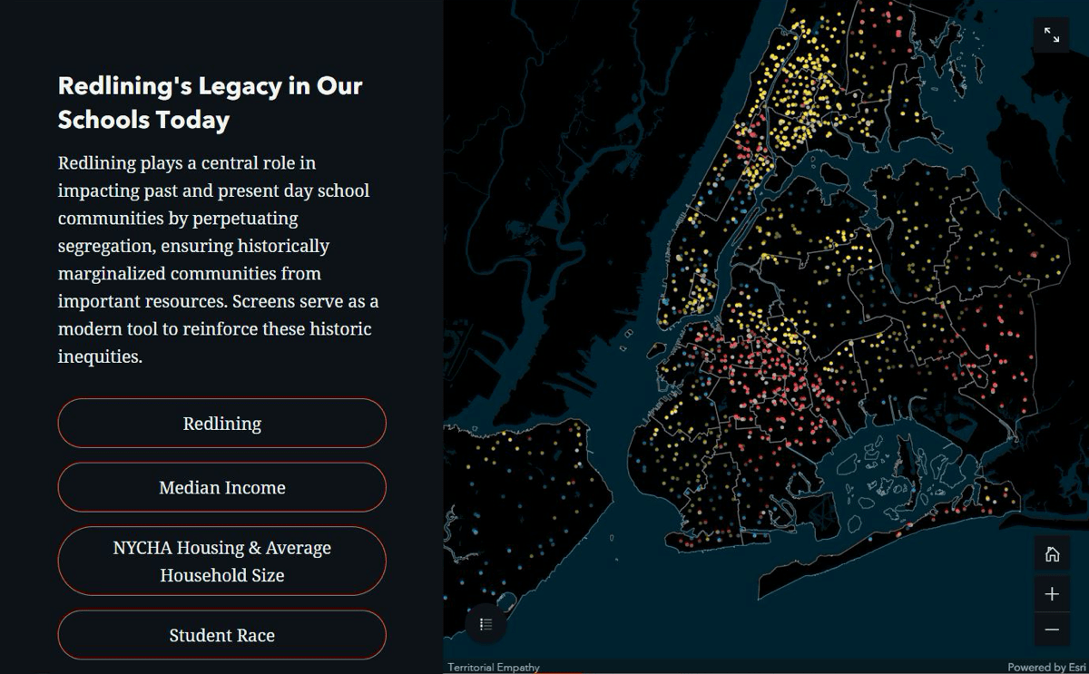
Zarith Pineda, an architect who advocates for social justice, works to confront the issue of historically marginalized communities one map at a time. Pineda’s focus involves two types of maps. First, there’s a government map that made home loans, healthcare, and high-quality education difficult to access for some communities of color for decades. The second map uses the power of a geographic information system (GIS) to layer data for discovery and explore changes over time. The modern map tells a disturbing story about prejudices traceable to government ‘redlining’ maps produced by the Home Owners’ Loan Corporation in the 1930s that created a neighborhood ranking system built on racism.
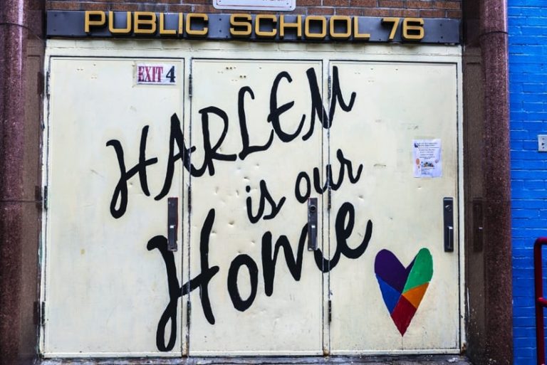
While that may not sound like traditional architecture, exposing the truth about a place is one reason Pineda was motivated to start Territorial Empathy, a nonprofit design firm in New York City. The group looks beyond building designs to examine the very architecture of racial inequality and provide a voice for people who live in neighborhoods where mounting frustrations are not surprising.
“The work that we do is definitely very emotionally charged, and it’s intense,” Pineda said. “But we feel that if we don’t do it, no one else will. The folks in our communities don’t have the resources to put the money forward, the tech forward, the software forward. And so, we do what we can to help.”
Pineda and her team believe that location intelligence—the data-driven analysis powered by GIS—can help solve crises and create empathy. When Pineda and her team encounter arguments and conflicts, they see these not as a sign to abandon the project but a signal to keep going.
Data-Driven GIS Analysis and Empathy
Redlining maps grabbed Pineda’s attention. On these maps some neighborhoods are surrounded by red borders, which label them as bad risks for home loans. The labels, Pineda believes, became self-fulfilling prophesies because they perpetuated bias against communities of color.
The practice of redlining and labeling any neighborhood with Black residents meant those residents could not obtain mortgages to build financial security. The label also meant many businesses and stores hesitated to open branches where the local economy is unpredictable, government services are generally lacking, and the neighborhood suffers from decades of frustration.
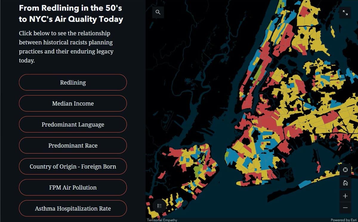
Using the newer, smart maps powered by GIS, Pineda and her team can show how current and historical policies interact to create economic obstacles beyond the control of families and residents in the affected area.GIS, with its ability to analyze hundreds of layers of factors at once, appealed to Pineda.
“I’ve been really curious about spatial justice,” Pineda said. “I’ve often said, primarily with my work in New York, that over the past five years I’ve been drawing some variation of the exact same map. That no matter what I look at, the areas that seem to be affected are always the same ones. And to me, those areas almost perfectly align with redlining maps.”
Whether she looks at educational attainments, financial status, or food insecurity, the patterns all too often matched the old maps.
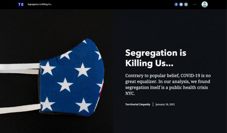
A series of maps in the “Segregation is Killing Us” project show how disparities follow past racist practices.
...
...
Territorial Empathy in an Age of COVID-19
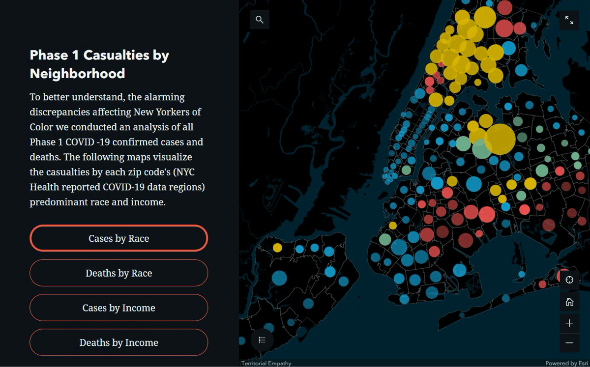
Pineda predicted that many marginalized neighborhoods with limited access to fresh food and affordable health care would be places where COVID-19 hit hard.
“Looking at all of these issues for so many areas, I just had the hypothesis that the same would be true for the spread of COVID-19,” Pineda said. “COVID just threw lighter fluid on inequities and exacerbated them. We started reaching out to our activist colleagues, and we started ringing alarm bells that, ‘Hey, this is going to be significantly worse for students of color. This is going to be significantly worse for low-income families. How do we even set up remote learning when folks can’t even pay for Wi-Fi?’ These were questions we had really early on that no one was asking.”
The Territorial Empathy team found that compared with White New Yorkers, Black and Latinx New Yorkers are 1.5 times more likely to be infected by COVID-19 and 2 times more likely to die from the virus.
Especially after this year, I think people are starting to see the value of spatial science. The Johns Hopkins dashboard and seeing the spread of COVID-19 on a map have made the case for this type of analysis.
founder & executive director, Territorial Empathy
Zarith Pineda
In relation to fundamental causes of inequity, the team looked at the practice of seeing people who live in “undesirable locations” as fundamentally different, something other than human, normal, or valid. As the Territorial Empathy group notes on its website: “Racial conflict cannot exist without dehumanization. It fundamentally relies on ‘othering,’ the systematic use of a device that demarcates a difference between an ‘us’ and a ‘them’—the logical antidote to conflict is empathy.”
This dehumanization leads to hate and conflict. But it’s also the spot where data and location intelligence can help us explain decades of marginalization. Plotting data on easy-to-read smart maps makes it easier to see how communities of color have been disadvantaged.
Segregation, Border Problems, and GIS
The wide-ranging work of Territorial Empathy illustrates Pineda’s drive to apply data and analysis, using GIS and artificial intelligence, to break down boundaries between people.
Territorial Empathy has worked on projects in the Middle East, including “No Man’s Land,” a look at how Syrian refugees are coping in the border zone between Syria and Jordan.
Aerial view over Anata Refugee Camp, East Jerusalem, Israel.
It has mapped cases of reported child abuse among refugees who have been separated from their families and detained at the southern US border. “Unaccompanied Assault” tries to bring light to a terrible situation that has been little reported.
“We put together a team that with some machine learning was able to digitize a treasure trove of documents and map them, showing exactly what happened to these kids,” Pineda said. “There’s an interactive map that shows the facilities where it happened, and you can see the cases that were reported. Some of them are very graphic and disturbing, but we felt it was really necessary to show where these things happened.”
Members of the team also worked on data analysis that looks at the way public schools are funded, which was central to The New York Times podcast Nice White Parents.
“I’ve been doing work around the integration of public schools in New York City for almost four years,” Pineda said. “New York City has the most segregated public schools in the country, but it’s also the wealthiest city in the world. I think it’s so much harder now to make the case to sustain segregation in a school system that caters to some of the wealthiest folks in the world precisely because of all the things that we’ve experienced with COVID-19.”
Disparities were also the focus of the “Segregation is Killing Us” project, which examines the challenges that low-income New York City families have in keeping their children engaged with school through platforms like Zoom.
With all this work, Pineda noted the need for GIS. “We are looking at why people of color have been systematically ghettoized (segregated) or excluded from policy, and all of that research has been done with GIS.”
The spatial analysis considers who and where people are uninsured, experiencing childhood poverty, are in linguistic isolation, and suffering COVID-19 casualties. Maps also contribute to compelling narratives. “We will show maps for that storytelling component,” Pineda said. “You really can’t understand a place until you look at it from both angles.”
Impacting Individuals
Pineda’s research includes learning about challenges from the people in that location. At one school, a woman Pineda was working with told her how her son repeatedly was getting written up for being late to school.
“She was telling me, ‘I don’t understand. He has to travel so much longer than his classmates to get to school, and the MTA (Metro Transit Authority) is unreliable, and he’s just doing the best he can. He’s committed to going to school,’” Pineda said.
Then Pineda looked at the data and shared her findings with the concerned parent.
“I proved that what she was saying was right and that it was totally unfair,” Pineda explained. “And that not only was it happening to her kid, but it was also happening to most Black children in the city. And I’ll never forget her face when she saw the analysis and saw the map and saw the distances that roughly show Black students have to travel three times longer to get to school than their White counterparts.”
Explore more facets of how GIS supports equity and social justice work, visit the Racial Equity GIS Hub.
Share this article
Equity & Social Justiceadvocacyinvestigationmappingsocial justice
Margot Bordne is an account manager on Esri's Global Business Development team. Margot supports organizations across industries who leverage GIS to improve their operations and decision making capabilities, with a focus on the use of GIS for advancing equity and social justice. Margot also founded and leads Esri's Women's Enablement & Career Advancement Network (WeCan) and is currently working toward a Master's Degree in Diversity & Inclusion Leadership at Tufts University.
Clinton Johnson is Esri's Racial Equity and Social Justice Lead. Joining the company in 2016 as a Solution Architect, he now helps organizations create geospatial strategies for equitable outcomes, taking an empathic approach to technology, and implementing practical solutions for the real-world challenges of diverse communities. Clinton writes articles and blog posts about these topics for Esri, and is the founder and leader of NorthStar of GIS, a community organization focusing on racial justice and advancing equity and belonging for people of African descent in GIS and geography since 2017.
Prior to joining Esri, Clinton worked for the city of Philadelphia for 17 years. He spent four years as Deputy Chief Information Officer and Chief Enterprise Architect Officer.