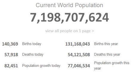
By the time you see the image below it will be way out of date.
From Worldometers, it’s snapshot in time of the current world population which, depending on your source, is growing at a rate of somewhere between 75 and 140 million people each year. Proving, if nothing else, that humans are quite prolific.
What’s the geography of global population? We can learn more using some recently published story maps.
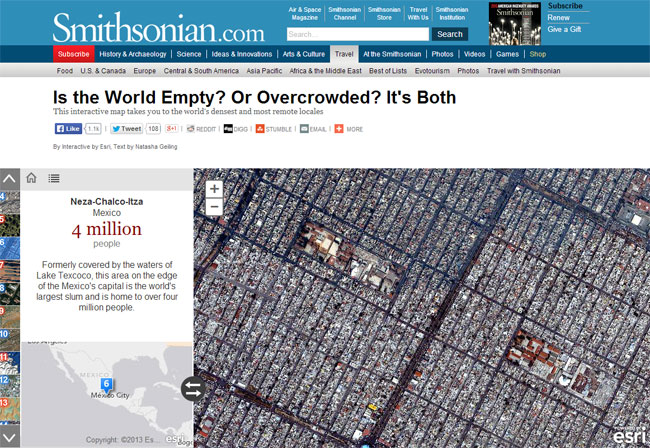
Smithsonian.com asks the question, is the world empty? Or overcrowded? It turns out the answer is both. The story map provides a compelling combination of maps and imagery (from ArcGIS Online) that underscore where concentrated populations live, and also where they don’t.
The story map can also viewed in standalone mode.
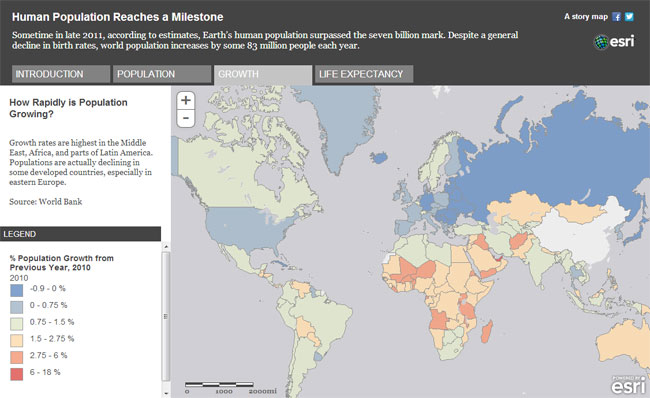
Another story map delves into related territory, exploring the 7 billion population milestone (passed in 2011) with a collection of maps comparing global population, population growth, and life expectancy.
With U.S. focus, other story maps have delved into different population topics such as comparing unemployment and population change and population growth and diversity.
To view more story maps, visit the Storytelling With Maps website.


