Eat your fruits and veggies. Drink plenty of water. Exercise 30 minutes a day. That’s the perfect recipe for good health, right? Well, not quite.
The truth is, your health depends on much more. Thanks to advances in mapping technology, today’s health professionals know that where you live, work, learn, and play has an incredible impact on your well-being.
Interactive maps paint the picture of community health, showing the spatial relationship between disparities, illness, and location—like visualizing how a neighborhood with no playgrounds influences childhood obesity. Maps offer rich insights that can help drive positive change in Americans’ lives.
Check out these four maps to explore the health challenges that permeate the United States and how place plays a pivotal role.
Education and Health
According to the Centers for Disease Control and Prevention (CDC), “education is one of the strongest predictors of health; the more schooling people have, the better their health is likely to be.”
Understanding and communicating the health benefits of an education may help increase graduation rates. This interactive map explores the spatial relationship between high school completion and health quality.
Access to Health Care
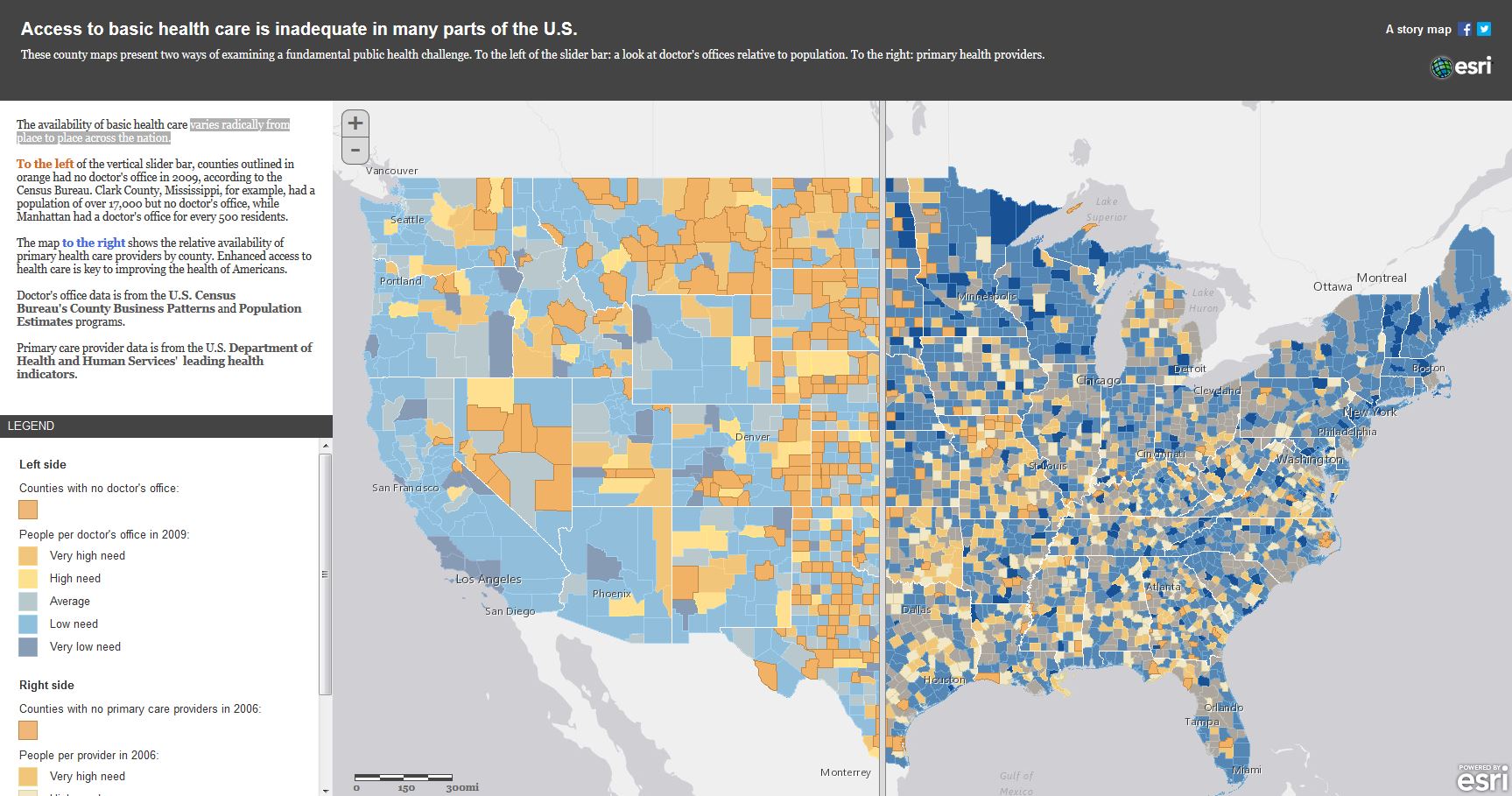
Access to basic health care varies radically from place to place across the country and is inadequate in many parts of the nation. These county-level maps present two ways of examining a fundamental community health challenge: to the left of the slider bar is a look at doctors’ offices relative to population: to the right, primary health providers.
Linking Obesity and Diabetes
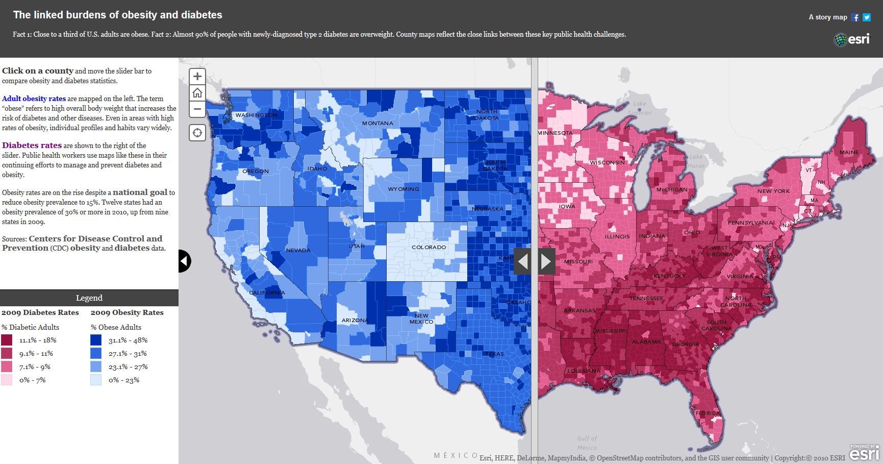
Fact 1: Close to one-third of US adults are obese.
Fact 2: Almost 90 percent of people with newly diagnosed type 2 diabetes are overweight.
These county-level maps reflect the close links between these key community health challenges.
Poverty and Health
Poverty can have a significant impact on health. Poverty among school-age children (5 to 17 years old and living with families) increased in more than a quarter of US counties during 2007–2011. This map shows how poverty in school-age children in the United States has changed during 2005–2011 by school district.
Learn More
Find out how healthy communities start with Esri.


