Location analytics lets you visualize your key performance indicator data on maps.
Russ was one of my favorite bosses. He was the president of the utility I worked at. I ran electric operations. Russ was an accountant, a bean counter by training. I was (and am) an electrical engineer. Yet we agreed on almost everything about running a gas and electric utility.
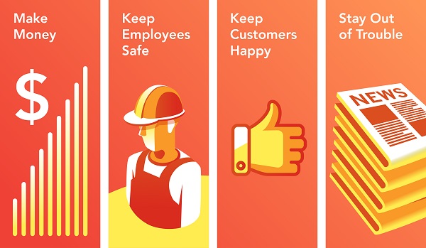
Russ once told me that there are only four things you have to do to be successful at running a utility. Only four? Yes. Make money, keep customers happy, keep employees happy and safe, and stay out of trouble.
Keep Them Together
But you can’t separate those things, Russ warned. They’re all interrelated. If you tried to make more money just by cutting costs, employees would balk and customer service may suffer. Plus—who knows?—something bad could happen. A dog could get electrocuted, and the utility might end up on the front page of the newspaper (which really happened once). You must balance money, customers, employees, and zero trouble-making to be successful, Russ warned.

In effect, Russ had defined the company mission. A proper bean counter, Russ made sure he could measure how well the company complied with his rules. In effect, each rule defined a critical stakeholder in the utility: the shareholder (money), the customer, the employee, and the community (staying out of trouble). Metrics correlate too. Money is measured in earnings per share and spending on operations and maintenance, capital improvements, and overtime. Customer happiness gets measured by reliability (e.g., SAIDI, SAIFI), power quality (MAIFI), and service (meeting in service dates). Employee happiness and safety is measured in accidents, union grievances, and turnover. Staying out of trouble? That’s measured by complaints to the public utility commission, fines for ruining a vegetated wetland or some other nasty environmental violation, customer satisfaction ratings, and negative press.
We all recognize these metrics as key performance indicators (KPIs). However, what Russ understood was the relationship of these metrics to one another. Creating real insight into the business depends on understanding these KPIs—not individually but as they relate to each other and their causes and effects.
Visualizing KPIs
What do KPIs have to do with geospatial technology? The best example lies in SAIDI, a common metric for measuring reliability. SAIDI measures average system interruption. It equals the total number of minutes all customers are out of power during the year divided by the total number of customers. The average SAIDI in the US is roughly 120 minutes or about two hours per year. What SAIDI doesn’t measure is customer happiness. So even if the SAIDI for a utility is above average (lower than 120 minutes), there may be pockets of the territory that have terrible reliability. Is there a correlation between customer satisfaction and poor reliability? Probably. Even if our average reliability was good, Russ knew he might still have to face an angry mob at town meetings to explain why their service was so bad. An angry mob at a town meeting always made the newspapers, too, thus violating Russ’s fourth rule: Stay out of trouble. Russ actually sent me to meet the mob sometimes. Location matters, let me tell you.
Location analytics breaks down to visualizing your KPI data on maps. Spatially enabling KPI data like this provides new insights. Plotting SAIDI, for instance, with geospatial technology reveals the location of big problems, such as where those angry mobs are likely to be waiting to ambush you.
Location analytics answers the question where. However, it also sheds light on why. If SAIDI is poor in a small area, perhaps tree-trimming history, or maintenance spending, or even equipment age could shed light on localized reliability issues. The more data, the more clarity.
Clarity and Decision
Looking at Russ’s metrics, nearly all of them have something to do with location. Where are we spending on O&M? Where are there the most employee motor vehicle accidents? Where are we getting the most contractor complaints? Where are the high bill complaints? Where are people not paying bills? Where is the highest area of theft? Location analytics takes the KPI data and makes it accessible like this.
The upshot is that location analytics helps utilities make the right decisions. It enables proper reaction and proactivity toward improving metrics. It clarifies where problems are, why they are, and what can be done to fix them.
Old Russ was a numbers guy. But even he knew averages rarely tell the full story. To run a power company, he needed insight beyond just the numbers. Sure, we stayed above average in reliability, but customers still complained. Because the true story lay in the relationship of factors that influence KPIs. Location analytics reveals those connections. It visualizes customer, employee, community, and asset distribution all over the service territory. And it helps utilities stay the hell off the front page.
—–
You can learn more about location analytics here.
