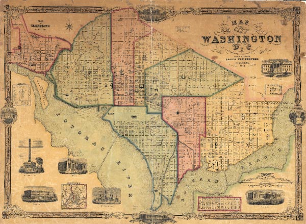
There’s something about a good map.
It’s hard for me to describe exactly what that something is, but like many of us involved with GIS and geographic information, I’ve always been drawn to and fascinated by maps.


These maps had many advantages that are elusive even with today’s best technology. They were portable and I could use them anywhere; I could easily fold them up and stuff them in my pack or pocket. They were perfectly compatible and interoperable with any pen or pencil (and also bright yellow highlight markers). They were great for communication and collaboration; I could mark places of interest and share them later with others, or mail them to far-off colleagues. Between the creases and folds I found not only adventure, but authoritative information that I could trust.
These maps were reliable and never failed, never ran out of power, never needed a plug-in or software update, and they’ve survived the test of time (the map tube in the far corner of my closet is proof). Those torn and dog-eared USGS topo maps are probably why I eventually ended up where I find myself today.

Someone, I can’t recall who, once said:
“Stones are simple. But craftsmen with the right tools
can make works of art from stones.”
In many respects GIS maps are our works of art. They capture our knowledge, our tradecraft, and our skills. They enable us and others to gain understanding from disparate data, and understand their relationships.
Simple and effective maps are powerful, and can make the communication of complex things easy. Through simple and effective maps sometimes the most powerful “GIS analysis” can be accomplished intuitively just by viewing one. And like a great sculpture, a great map may be hard to define precisely, but we clearly recognize one when we see one.
Though GIS has changed and evolved vastly over the years in almost unimaginable directions, and converged with other factors like the Web, social media, mobile devices, and the cloud, the map has always been, and remains today, the primary substrate for our work. It’s the canvas upon which our GIS art and craft is painted, and shared with others.
A colleague sent this page from an early overview of the ARC/INFO system, dated April 1, 1982 (by Scott Morehouse):
Captured in that early GIS document is the importance of a map:
A GIS is about making, using, and sharing maps for many purposes, empowering GIS professionals, and often more importantly, empowering anyone to gain geographic knowledge using maps as the delivery vehicle.
Our ability to make, use, share, and communicate using GIS maps has grown exponentially since I purchased my first USGS quad sheet, and since Scott Morehouse documented the ARC/INFO System. Now, many years later, ArcGIS 10.1 and the evolution of ArcGIS Online represent significant mileposts in the history of GIS maps.
These latest steps make it easier than ever before to deliver GIS maps to the Web, to mobile devices, and via the cloud where they can reach a vast audience. This ultimately means that even more people can discover their powerful simplicity, and will agree with me that there’s just something about a good map.

