In many cases, just by making a map you are doing analysis. That’s because you’re making the map for a reason. You have a question you want the map to help answer: Where has disease ravaged trees? Which communities are in the path of a wildfire? Where are areas of high crime? It’s also because when you make a map, as with any analysis, you’re making decisions about which information to include and how to present that information. Effective visualization is valuable for communicating results and messages clearly in an engaging way. Here are three key decisions that affect the information a map presents and the story it tells.
Choose Scale
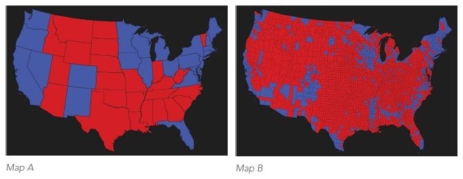
The scale of the map itself (the area you’re showing) and the scale of the data you use both affect what your map will show. A classic example of how your choice determines the question answered is whether to show presidential election results by state or by county. While the state-level data does show a distinct national pattern, the county-level map reveals much more nuanced local and regional patterns. Map A answers the question, What is the pattern of states (and electoral votes) won by each candidate? Map B, about voting by county, better answers the question, What is the distribution of Republican and Democratic voters in this election?

Of course the area you’re analyzing—your town, county, region, or state, for example—often determines the scale of data you use. But even at the city or county level, you might be choosing between mapping information using census tracts, block groups, blocks, or even lots.
Select Style and Attributes
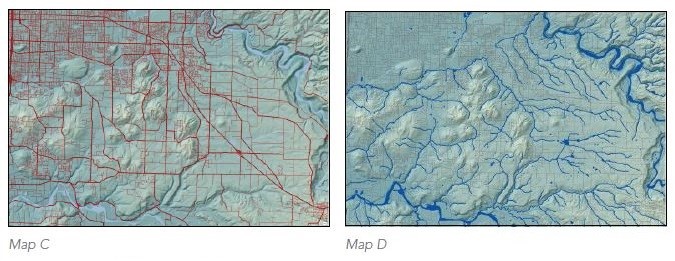
The way you display the features on your map, the colors, line widths, and so on, is another decision that, while seemingly straightforward, helps clarify (or obfuscate) the information your map conveys. These two maps show the same location and the same features. Map C shows streets and highways in red, and streams and lakes in light blue. Map D shows streets and highways in gray, and streams and lakes in dark blue. Is the area highly developed or relatively pristine?

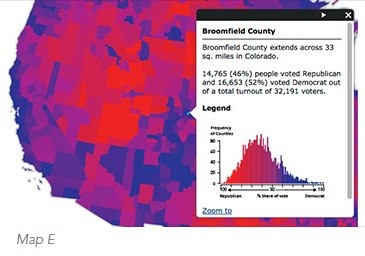
The same holds true in how you label the features on your map and the attributes you display in tables, pop-ups, and charts. Each selection is an opportunity for you to emphasize the information you need from the map and communicate that information to others (Map E).

Determine Classification Scheme
Phenomena with similar values can be grouped together into classes so that similar areas can be seen clearly on the map. Visually, this can send an immediate message and allow you to gain a better understanding. The classification scheme you use defines which features fall into each group and, therefore, how the map appears. Once again, selecting an appropriate scheme is based on your data and the question you’re asking. New smart mapping can help you make a suitable choice.

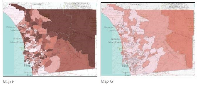
ArcGIS shows you the distribution of values and suggests an appropriate classification. But you can override this and choose from a number of standard classifications, or create your own scheme. These maps show the percentage of senior citizens in each census tract (dark red means a higher percentage). Map F displays the percentages using a continuous color scale, while map G uses five classes of equal range (known as “equal interval”). How much variation is there in the distribution of seniors across the county? From map F it looks like quite a few tracts have a high percentage of seniors while others have a very low percentage. Map G seems to indicate that most tracts have about the same percentage of seniors.
—–
This post is excerpted from The ArcGIS Book: 10 Big Ideas about Applying Geography to Your World. The twin goals of this book are to open your eyes to what is now possible with Web GIS, and then spur you into action by putting the technology and deep data resources in your hands. The book is available through Amazon.com and other booksellers, and is also available at www.TheArcGISBook.com for free.
