You may have noticed that Esri has been using several terms to describe maps that are enabled for the web and mobile via ArcGIS Online.
We’ve described web maps as one of the key features of ArcGIS Online. We’ve told you how you can create web maps that combine a base map, your own map services, previously published services, and point data derived from spreadsheets. They’re the suite of capabilities that enable maps to be internet-enabled, mashed up, shared, and published while retaining links to data sources. The core of a web map is a small set of instructions that pull together basemaps, services, and other items. They can be widely distributed by embedding them in websites or enabling them on tablets and smart phones.
We added the term “intelligent maps” to emphasize that web maps can do smart things, and that, skillfully constructed, they can be useful and effective information products for a variety of audiences—especially non-technical audiences. In particular, intelligent web maps incorporate elegantly-configured popups that include text, photos, and graphs that help bring geographic data to life. For more on building great popups, see our white paper.
 Most recently, we’ve been touting story maps as exemplars of the increasing importance of ArcGIS as a communication platform. My team has been producing story maps to help inspire users to tell their own stories. Our story maps also serve as a sort of public testbed for a variety of map-based functionalities and user experiences.
If our use of these terms has caused confusion, we apologize. To some extent our terminology reflects the fact that our own thinking about maps and storytelling has been evolving. Lately, we’ve been realizing that the differences among these terms are a matter of nuance, and that conceptually it might be better to think of all web maps as storytelling maps.
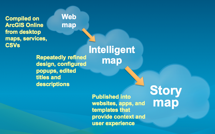
We’ve been pretty consistent in equating web maps and intelligent maps. How are web maps intelligent? In a couple of key ways, they’re intelligent by default: When you make and save a web map, it’s published on ArcGIS Online as both a map and a description; the details page lists the map contents as server links, and it includes tags or keywords that you’re required to add.
Web maps become more intelligent if you, the map creator, put some effort into them: creating descriptive map names and summaries, being thorough about describing data sources, and, most importantly, designing a beautiful and descriptive map. Just as an uncommunicative person may be perceived as mentally challenged, a map that obscures its message behind poor design choices and needless complexity will not be intelligent, no matter how sophisticated the data it presents.
So a web map becomes “intelligent” through thoughtful editing and design. An intelligent map becomes a story map by being given context and supporting information that makes it understandable and useful as a stand-alone resource. A story map is an integrated set of map(s), related content (legend, text, photos, video, etc.), and functionalities (pan/zoom, pop-ups, swipe, time slider, etc.) that make it a fully functioning information product.
A good example of this process is our recent story map on obesity and diabetes. To produce it, we started with…
A web map: A county map of the U.S. showing rates of diabetes was web-enabled on ArcGIS Online. We worked to enhance the map as an…
Intelligent map: We refined the cartographic design to represent diabetes rates in attractive colors that can be easily interpreted. We used the gray-scale base map to provide enough geographic context to orient the user without unnecessary distractions. We configured the map’s pop-ups to clearly summarize county data with a descriptive sentence and pie chart.
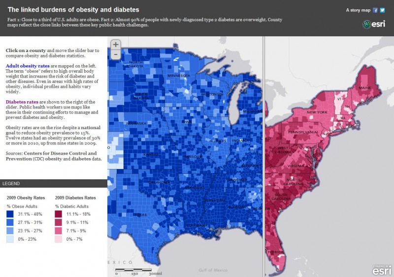 Story map: We added a second map showing rates of obesity, giving context to the diabetes map, and telling a story of potential cause and effect. We edited our title, text, and legends support the story and guide the user. We published the maps into our “swipe” template to enable the user to quickly compare the two maps in an engaging way.
Now that I’ve made such an effort to distinguish among these terms, I’d like to suggest (as has my boss, Clint Brown) that we think about “web maps” as embracing all these concepts. Most of us create web maps because we want to share them—whether it’s with colleagues, friends, stakeholders, or constituents. A shared map is intended to communicate—to tell a story. Some web maps may be rough drafts, or pieces of larger stories. They may be intended for a tiny audience, or a very specialized group. But they’re still intended to communicate.
If we consider ourselves as communicators first, GIS users second…if we want people to understand our work and the issues that motivate us…if we want to make and share maps that make a difference, then…
web map = intelligent map = story map.
insider