displaying
Use # to search tags and @ for authors

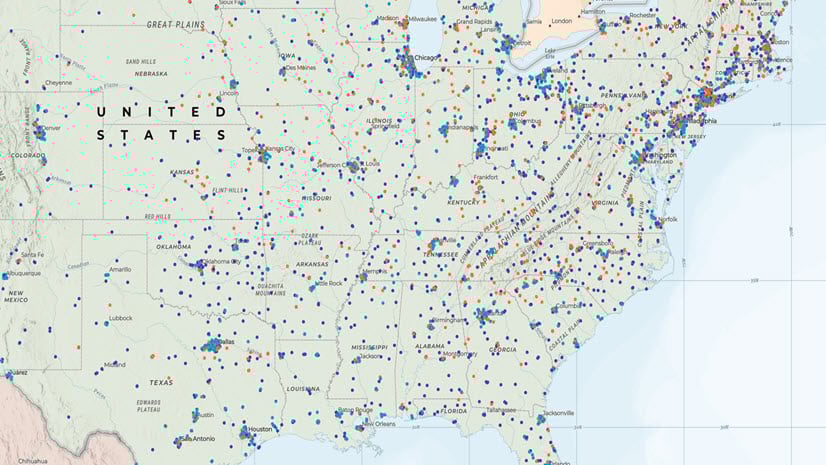
By Lauren Ballantyne | ArcGIS Online |
Emphasize trends and elevate your maps by customizing pop-up chart colors.
By Belle Pandya | ArcGIS Instant Apps |
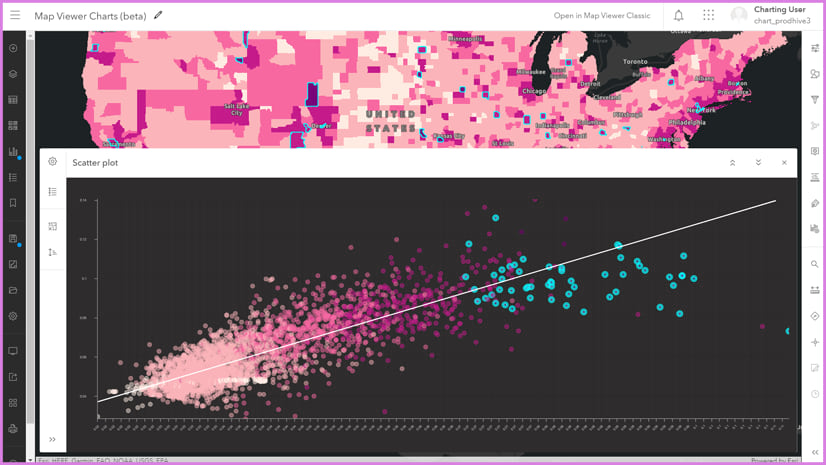
A frequent question we are asked is how can we display multiple charts alongside the map in a template. This guide will show how.
By Flora Vale | ArcGIS Online |
Create bar charts, histograms, and scatter plots in Map Viewer.
By Multiple Authors | ArcGIS Online |
Help your audience spot trends and engage with your map through pop-up charts in Map Viewer.
By Vicki Lynn Cove | ArcGIS Insights |
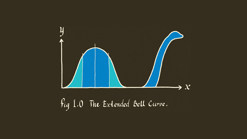
A histogram shows the frequency of your number data, but how do you know if it's "normal"?

By Vicki Lynn Cove | ArcGIS Insights |
Box plots are a simple chart type that helps you to understand the distribution of your data. They also happen to have a lot in common with cats.
By Vicki Lynn Cove | ArcGIS Insights |
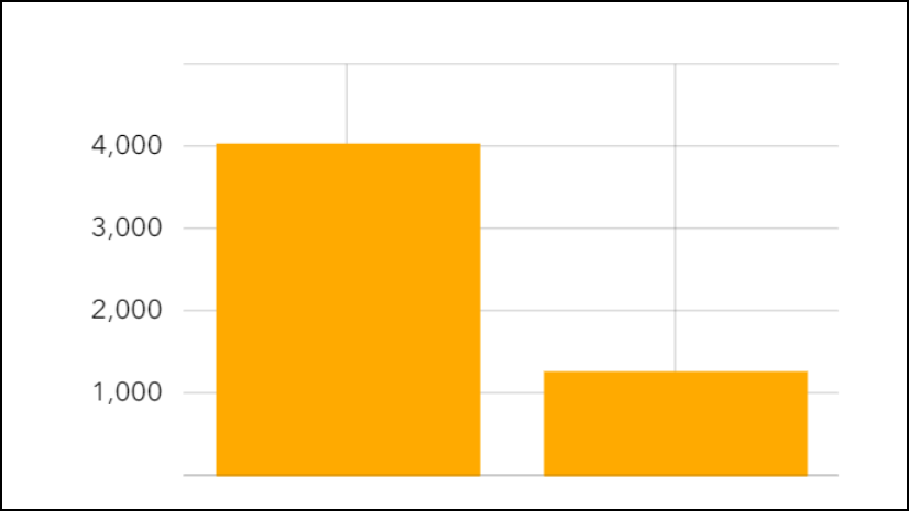
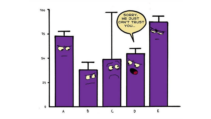
Learn everything you need to know about bar charts, including what happens when three statisticians walk into a bar.

By Lucas Danzinger | ArcGIS Runtime SDK for Qt |
One of the great things about our ArcGIS Runtime SDK for Qt is that we provide an API that seamlessly plugs into a rich framework that is...