John Nelson
Connect:

I have far too much fun looking for ways to understand and present data visually, hopefully driving product strategy and engaging users. I work in the ArcGIS Living Atlas team at Esri, pushing and pulling data in all sorts of absurd ways and then sharing the process. I also design user experiences for maps and apps. When I'm not doing those things, I'm chasing around toddlers and wrangling chickens, and generally getting into other ad-hoc adventures. Life is good. You might also like these Styles for ArcGIS Pro: esriurl.com/nelsonstyles
Posts by this author
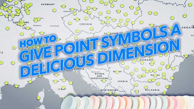
Give point symbols a delicious dimension

Here's how to brew a sweet sweet sense of depth into point symbols. And why. Plus candy.

Continue Reading

How to make a globe that you can pose for endless stock photos

Give a designer a stock art globe, they design for a day; give a designer a fully posable globe, they design for a lifetime.

Continue Reading

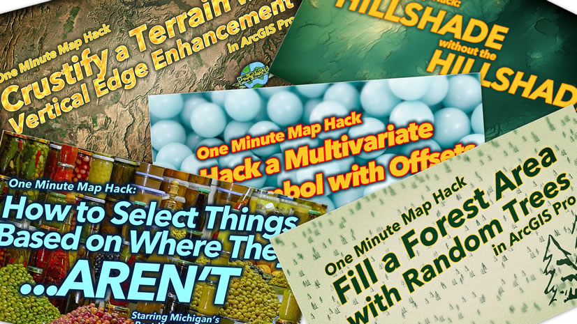
One Minute Map Hacks: 51-55

Five one-minute videos totaling over six minutes. Map hacks flout basic math!

Continue Reading

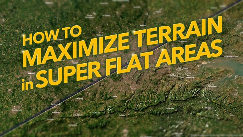
How to show terrain in even the flattest areas

Here's how to add a wrinkle to even the smoothest of landscapes!

Continue Reading

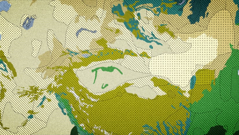
Hatched fills and how to sneak them into ArcGIS Online

How to create (or just use) a hatched fill symbol that will work in ArcGIS Online.

Continue Reading

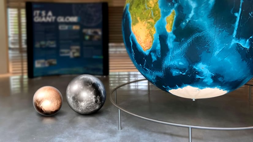
Big globe, small world

Musings on the scale of earth and the solar system, in the context of a large globe.

Continue Reading

Steal this ArcGIS Pro sunrise hack, please

A handy ArcGIS Pro project package with the Living Atlas elevation layers all set up to fake a global sunrise/set at all scales.

Continue Reading

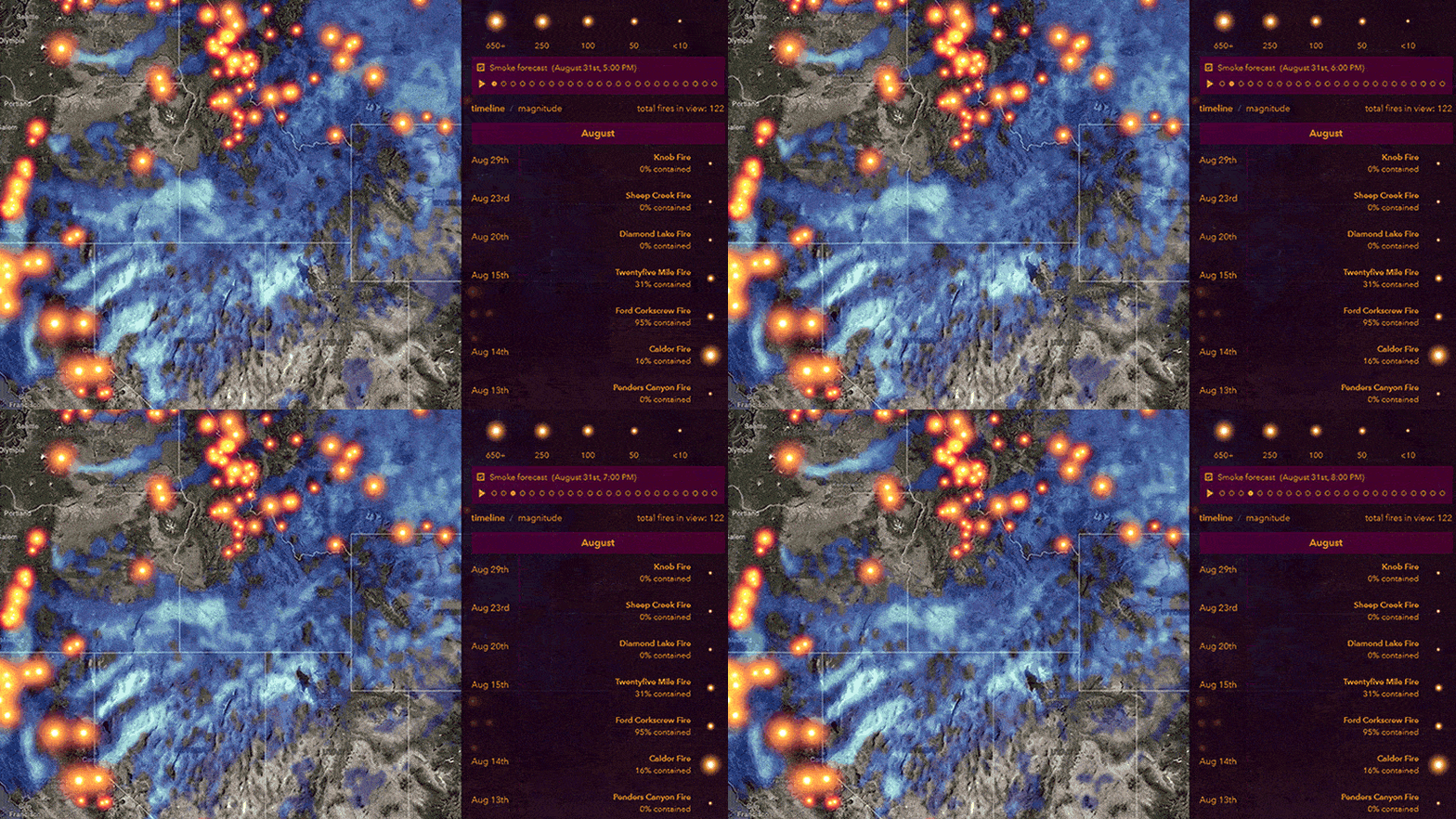
Improvements to the USA Wildfires map’s Smoke Forecast

Improvement to the smoke forecast layer's design make it easier to visualize.

Continue Reading

How to visualize uncertainty for lines

Brew some visual uncertainty into overconfident vector line features.

Continue Reading

1 8 9 10 11 12 37