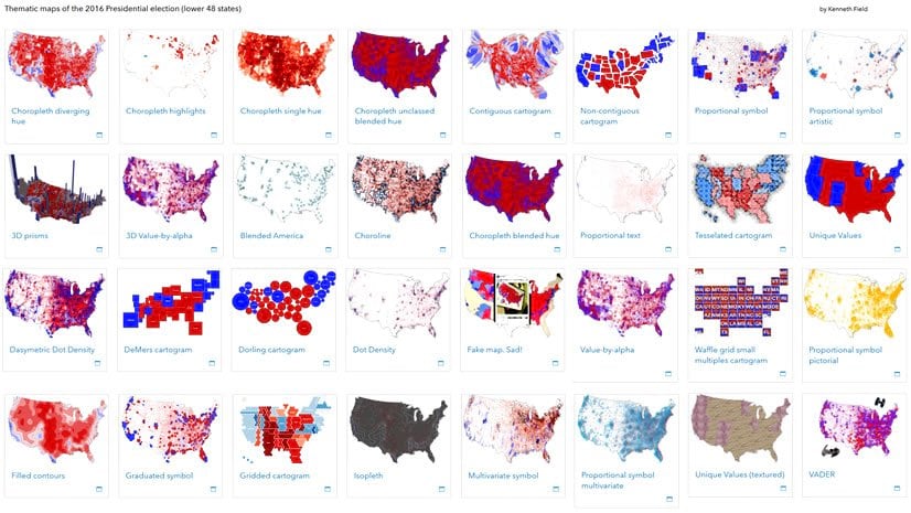
Kenneth Field
Connect:

Ken is an academic cartographer and geographer from the UK, and since 2011 he teaches, talks and writes about cartography, and makes maps to demonstrate map design at Esri. He considers himself a professional 'cartonerd', educated with a Bachelors in cartography and a PhD in GIS and health geography, and over 30 years experience designing curricula, and teaching map design and GIS. He has presented and published an awful lot and is in demand as a panelist and keynote. He blogs (cartoblography.com), tweets (@kennethfield), is past Editor of The Cartographic Journal (2005–2014), and past Chair of the ICA Map Design Commission (mapdesign.icaci.org 2010-2018). He’s won a few awards for maps, pedagogy and kitchen tile designs. He is author of the best-selling books 'Cartography.' and 'Thematic Mapping' and leads the Esri MOOC on cartography which has been taken by over 200,000 students interested in making better maps. He snowboards, plays drums, builds Lego and supports Nottingham Forest.

Posts by this author
Rotating pictograms

A simple method to incorporate direction into the design of POI symbols

Continue Reading

The style of Émile Cheysson

Recreation of the late 19th century statistical thematic maps of Émile Cheysson, including ArcGIS Pro styles, fonts, and digital twins

Continue Reading

Experiments with dot density – Part Two

Part two of a two-part article exploring options for dot density maps, including use of blend modes and dasymetric techniques.

Continue Reading

Experiments with dot density – Part One

Part one of a two-part article exploring options for dot density maps, including use of blend modes and dasymetric techniques.

Continue Reading

Map-making decisions to a deadline

Making a map quickly, and getting it right is all about piecing together small decisions to meet the deadline.

Continue Reading

Something in the water: the mythology of Snow’s map of cholera

A brief analysis of John Snow's research into cholera in Soho, London in 1854 and the role his famous map did or didn't play.

Continue Reading

Mapping coronavirus waffles

A technique to create multivariate thematic map symbology using waffle grids

Continue Reading

Mapping coronavirus coxcombs

Exploring the use of Coxcombs as a way to map the coronavirus pandemic

Continue Reading

Mapping coronavirus, responsibly

Access to almost real-time data and the need to communicate drives rapid mapping. But thinking remains crucial.

Continue Reading

1 2 3 4 5