Last week I, along with the rest of the news-aware world, learned about an intercontinental ballistic missile test performed by North Korea, assessed to have reached an apogee (how high) of 2,300 miles.
Wait, what?
2,300…miles? To an aeronautical nobody like me, this seemed bananas. How could something go that high…in space…and then fall back down? I wanted to know what that looked like. How high is that in the actual context of the planet?
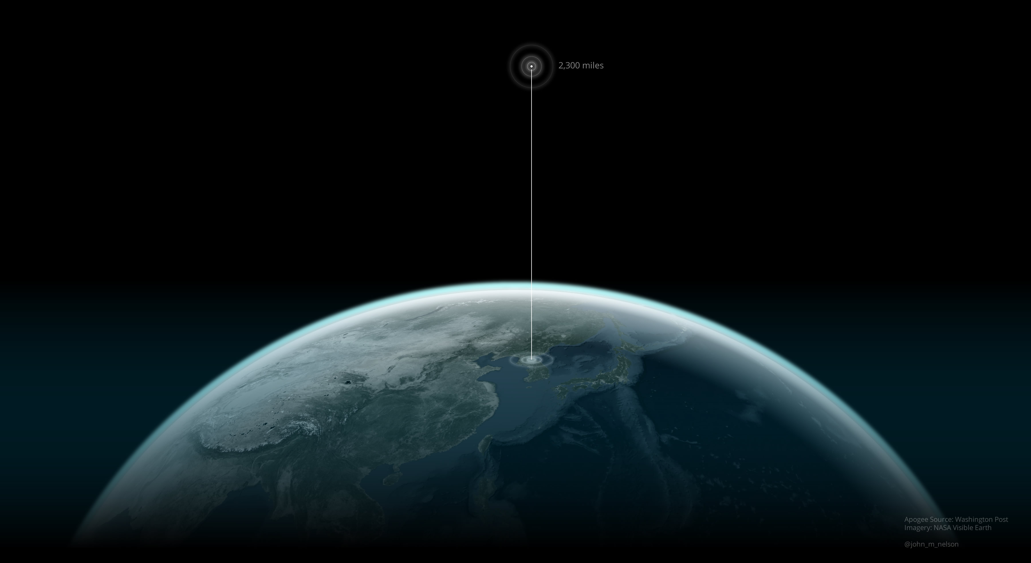
To satisfy that curiosity, I decided to make that diagram for myself. The following graphic took about 15 minutes to conceive and create, in ArcGIS Pro. As such, I decided to wrote a blog post describing that process for you! Alternatively, you can jump over to the Cascade Story Map version of this how-to for a bigger-imaged, scroll-tastic, experience!
If you prefer to jump right into the source and reverse-engineer it, then feel free to download the ArcGIS Pro project (57MB).
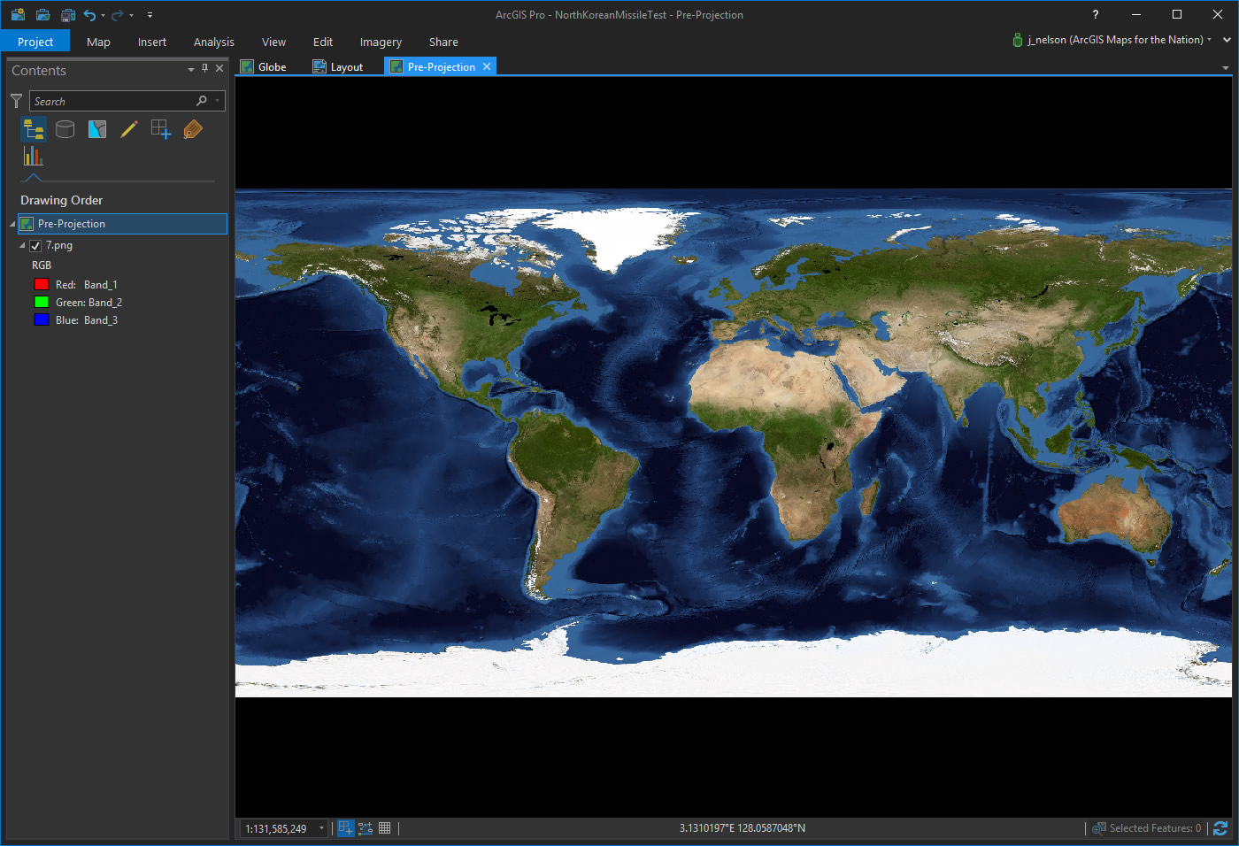
Here is a NASA Visible Earth cloud-free image mosaic for the month of August. I downloaded it from their site and georeferenced it -to breathe into a geographically-unaware image the breath of spatial life. You can download the projected version of this image here.
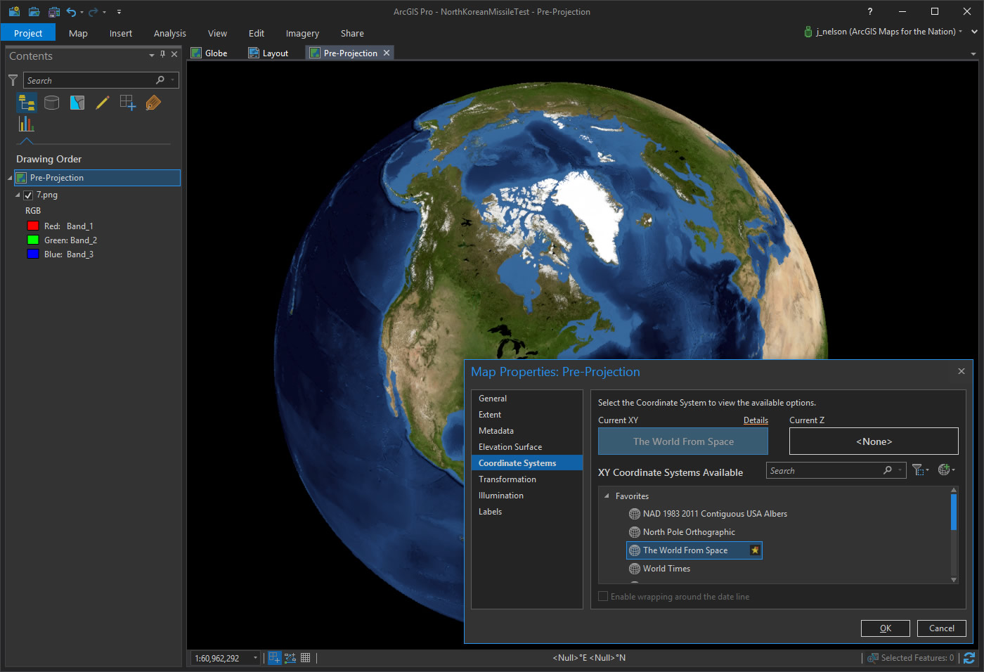
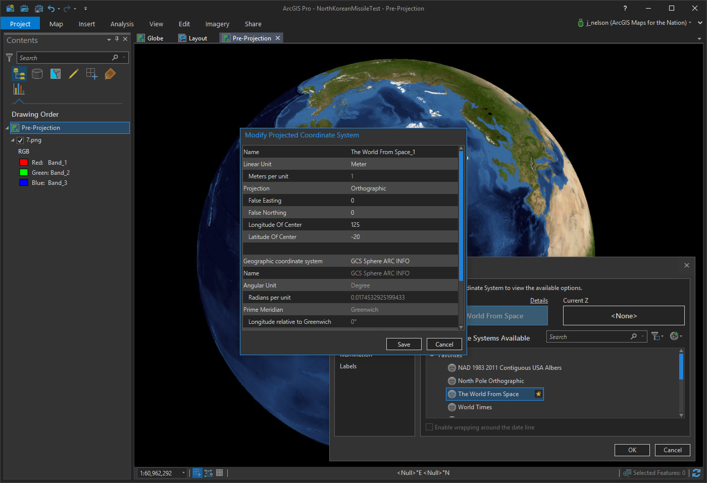
To make this imagery come alive, and to help it provide actual distance-context, we can re-project it to something more tangibly earth-like. So, I’ve chose the “World from Space” projection.
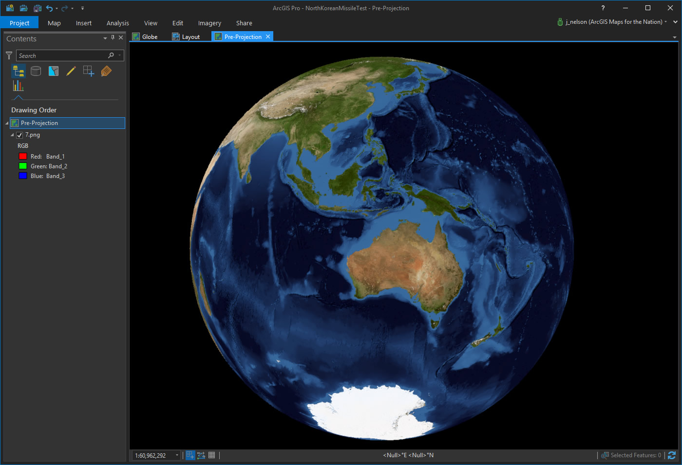
The Korean peninsula isn’t visible from this perspective, but we can alter the projection’s parameters to center it wherever we like. So I’ve changed toe Longitude of center to 125 and the latitude of center to -20.
Wait, -20? Isn’t that below the equator while the Korean peninsula is in much higher latitudes in the Northern Hemisphere? Yes! With this projection, the Korean peninsula will appear high atop the earth, near the peripheral edge of our global view.
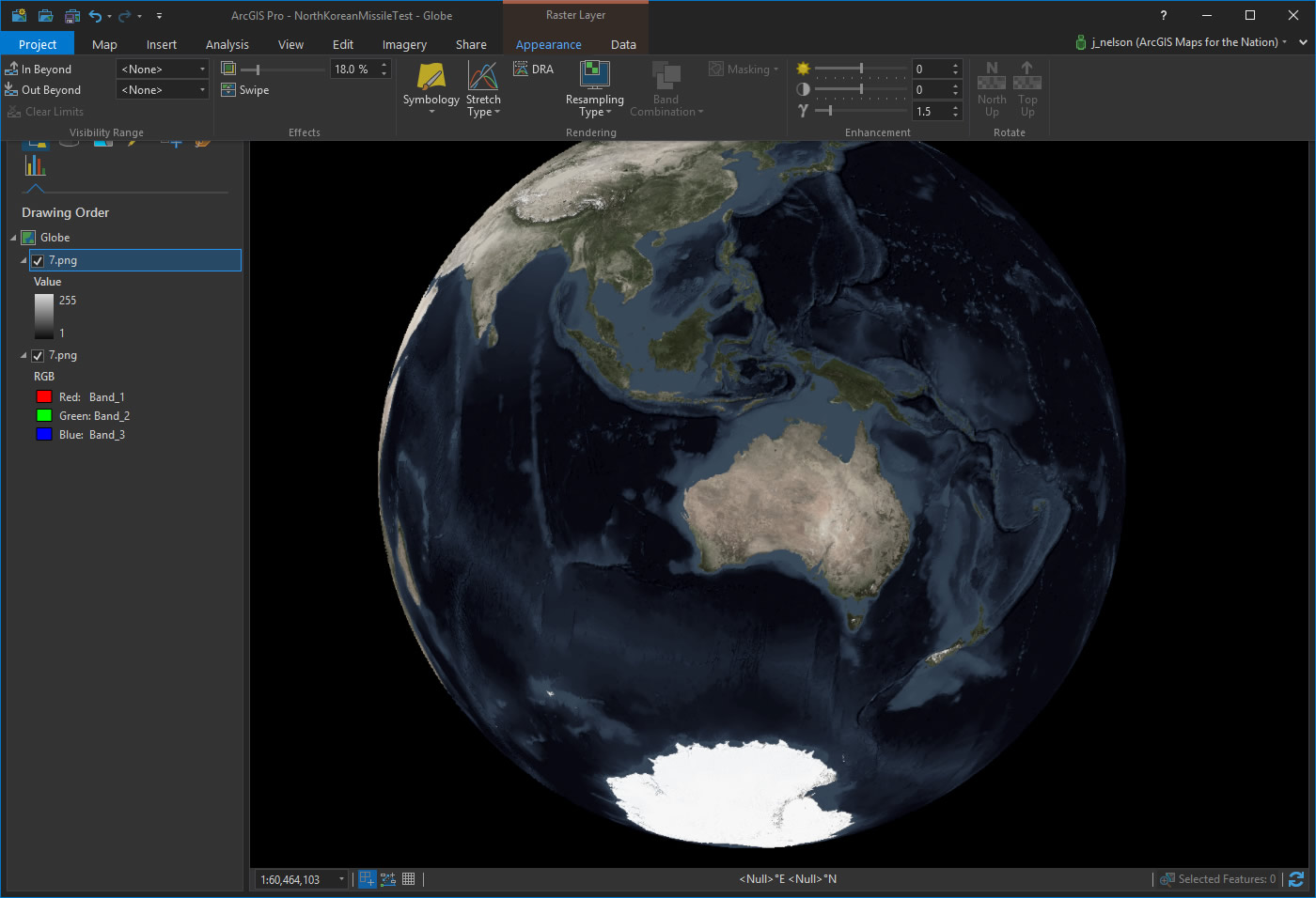
Time to make this imagery basemap more dramatic. I don’t need all that color stealing the show. So, I make a copy of the imagery layer, give it a black-and-white color scheme, and make it semi-transparent to allow a bit of background color to bleed through.
There we go. Looks much better now. More on this way of thinking here. Also, help yourself to a tiled basemap in this style.
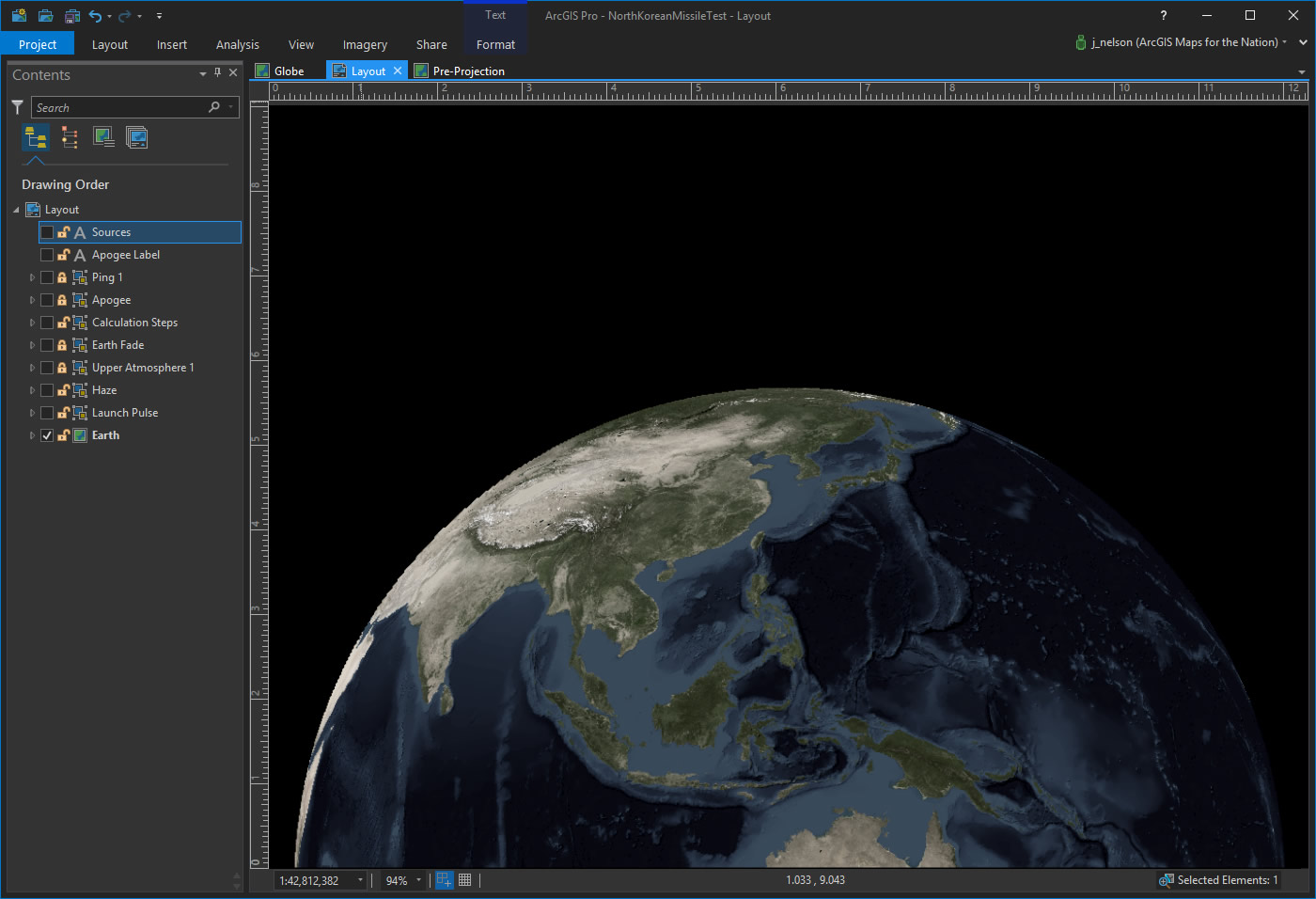
Time to move into the rich and rewarding domain of the ArcGIS Pro Layout. Here, I dragged our wonderful collective home (take a moment to reacquaint yourself with Carl’s speech. I still get chills when the piano kicks in) down in the composition, to make room for my forthcoming missile height line and also to create a more intense earth-rise sort of layout.
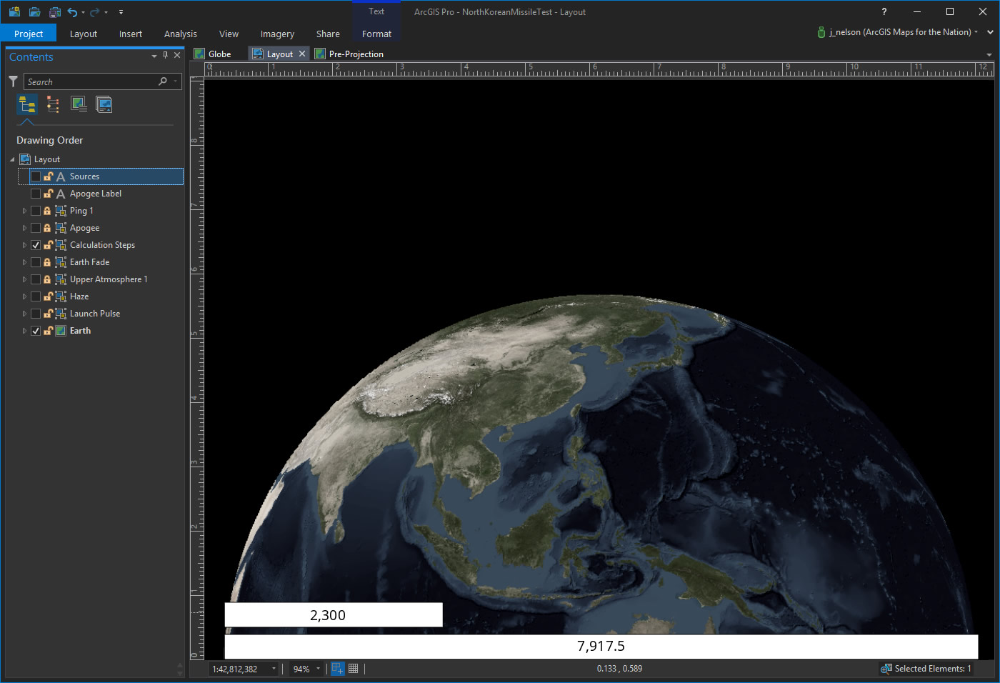
So how do I know how long to make the reference line for how high the missile went? What does 2,300 miles look like, compared to this map of earth? Ok, here’s my hack:
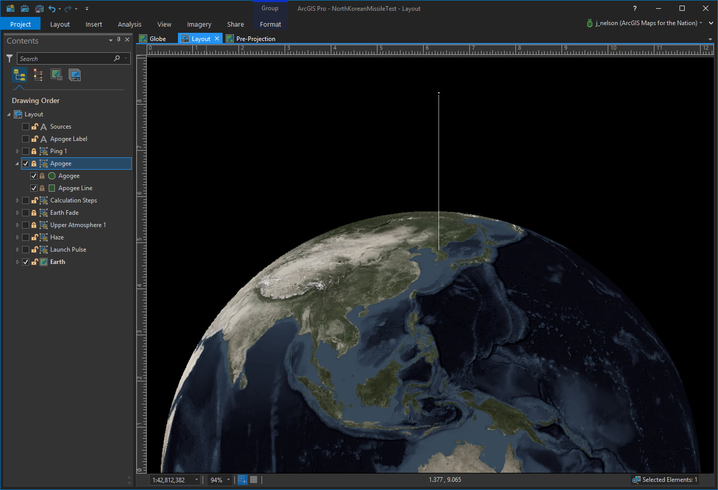
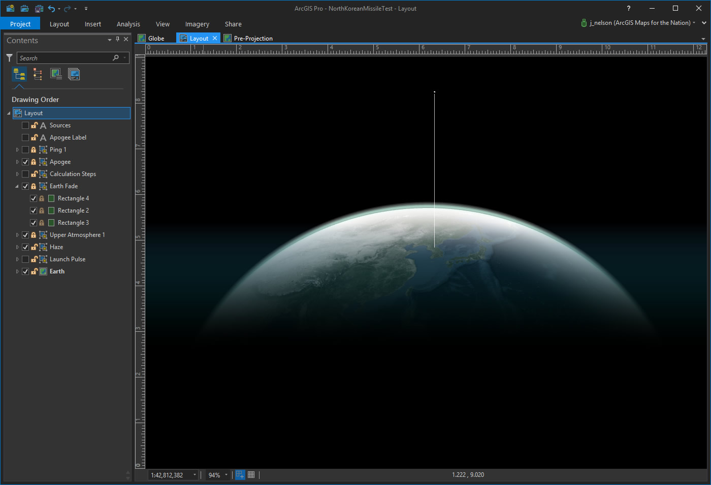
I know that the diameter of the earth’s equator is 7,917.5 miles. And I know that the apogee of the missile was 2,300 miles. That’s 29.05% of earth’s diameter. So I drew a line across the diameter of earth and then drew a second line that was 29.05% as long. There’s my apogee line!
This line, when positioned from North Korea, and oriented straight up into space, looks like this…
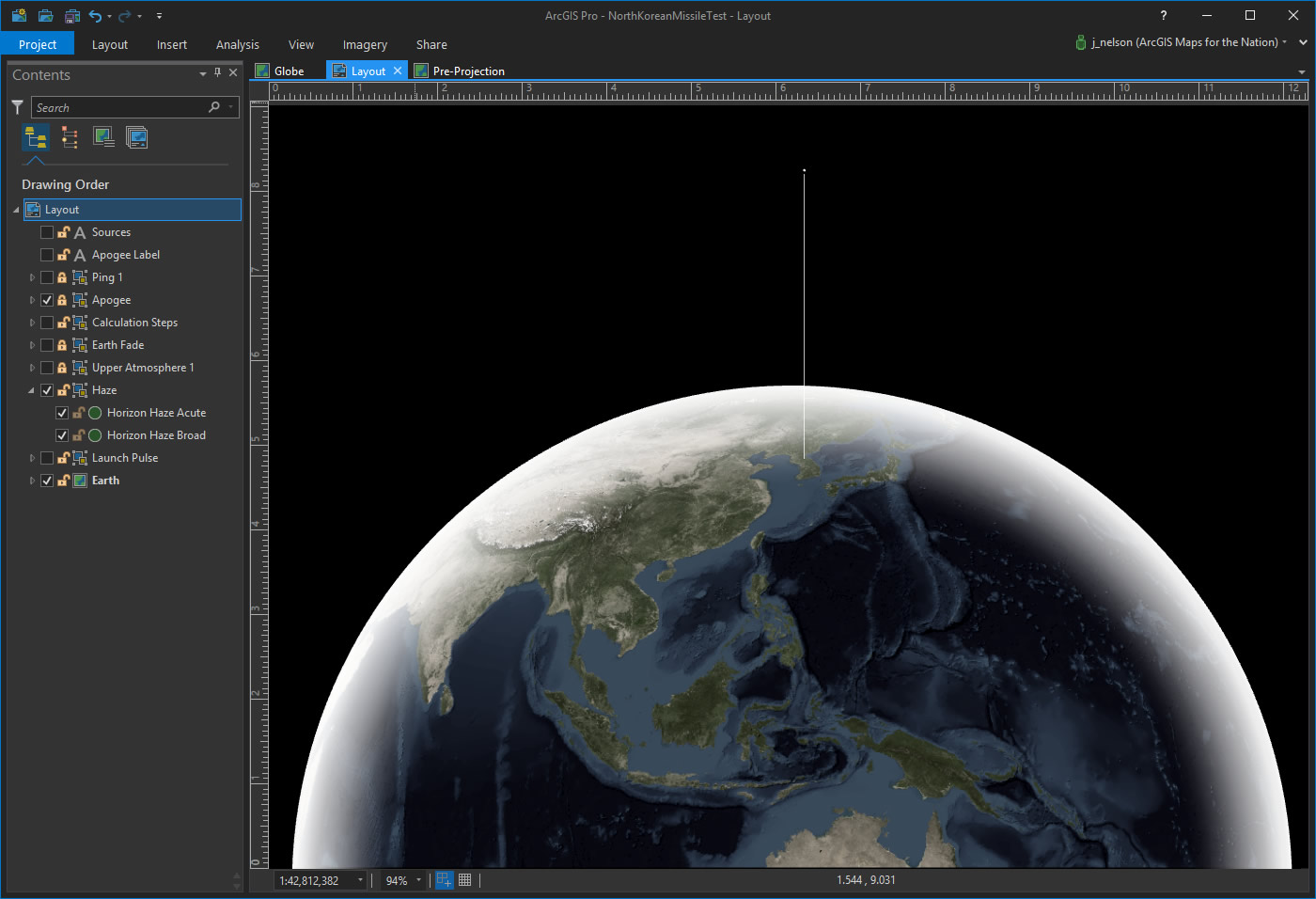
Ok, we got the structure of our diagram in place. Now it’s all sauce from here on out. Time to make this picture of earth a little more realistic. I drew a couple circles over the earth, and filled them with a circular gradient; white at the perimeter fading to transparent.
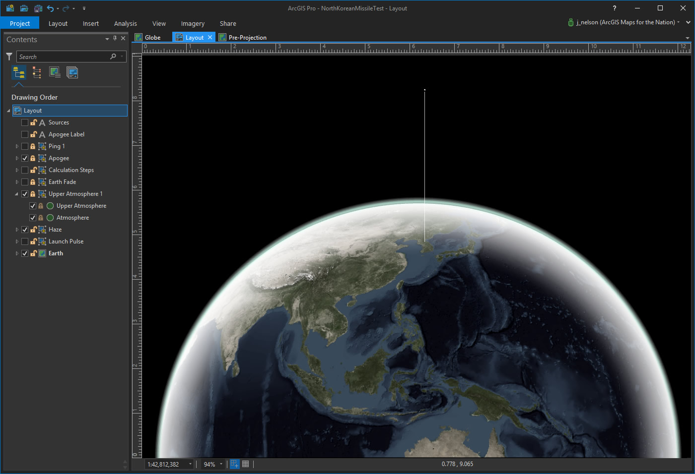
That’s a pretty abrupt line at space, though. Shouldn’t the atmosphere look a little more atmospheric? Sure! So I drew a couple more circles with buffer gradients and shifted them up off the planet a bit.
Sweet. Now to help establish the figure (the missile apogee line) from the ground (the big detailed distracting globe). We just need the earth to provide context for location and scale. Extra points if it looks like something you might have seen on a Kubrick film poster. I added a couple rectangles over the globe and gave them a linear gradient of transparent cyan shifting to fully opaque black…
Yeahhhh! To further draw the eye to an origin and destination effect on the apogee line, I added a launch pulse at the bottom and a ping at the top. These are circles and ellipses with a semi-transparent stroke, doubled up with thicker more transparent versions to give a simple glow effect.
Lastly, I added a label (2,300 miles) and source info (Washington Post and NASA), and signed it. As my Mom said, “Always sign your work.”
There it is. A really quick geographic diagram to give me perspective about how high that missile actually went. Numbers are incredible things, but they are abstractions. When something is placed into context there’s a much richer prospect for understanding. That’s the key to why maps are so good and so right.
Happy (or, perhaps, worrisome) mapping! John


Article Discussion: