Open data is an awesome thing nowadays. It’s amazing how many organizations publish their data to allow citizens to learn more about the city they live in. Examples of such datasets are the New York 3D city model and the Housing Information published by the New York City Department of Information Technology and Telecommunications. However, to get to explore New York buildings, users should have access to the software that reads and visualizes the 3D models, which is often not the case. Therefore, building a web application based on such data seems like a natural solution to empower citizens and people around the world to find out more about the buildings in New York.
This was also my goal when I started building the Manhattan Skyscraper Explorer. I focused on Manhattan, because I was mostly interested in the highest and most popular buildings in New York: when were they built? how tall are they? what do they look like? what are they currently used for?
I built an application looking for answers to these questions using ArcGIS API for JavaScript. All the new features in version 4.4 contributed to making this a really fun to use and intuitive app. 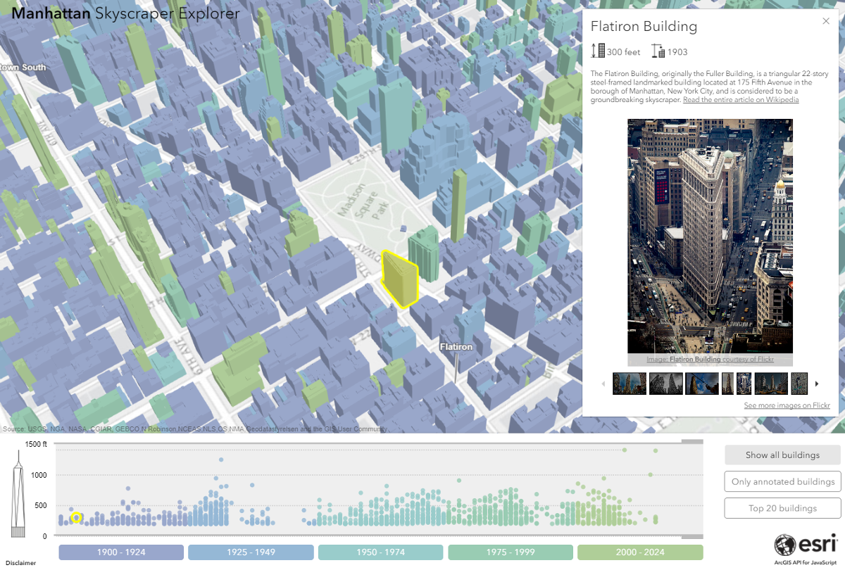
I started by coloring the buildings based on the time period they were built in. This way I could identify the areas with newer or older buildings, discover which buildings were built in the same period or see that in some neighbourhoods like Soho most of the buildings were built before 1925. Then I was curious to correlate construction year and height, so I built a timeline with Y axis representing the height. In this timeline each building is a circle with the color given by the construction period. It was interesting to confirm that fewer skyscrapers were built during the Great Depression and almost none during World War II.
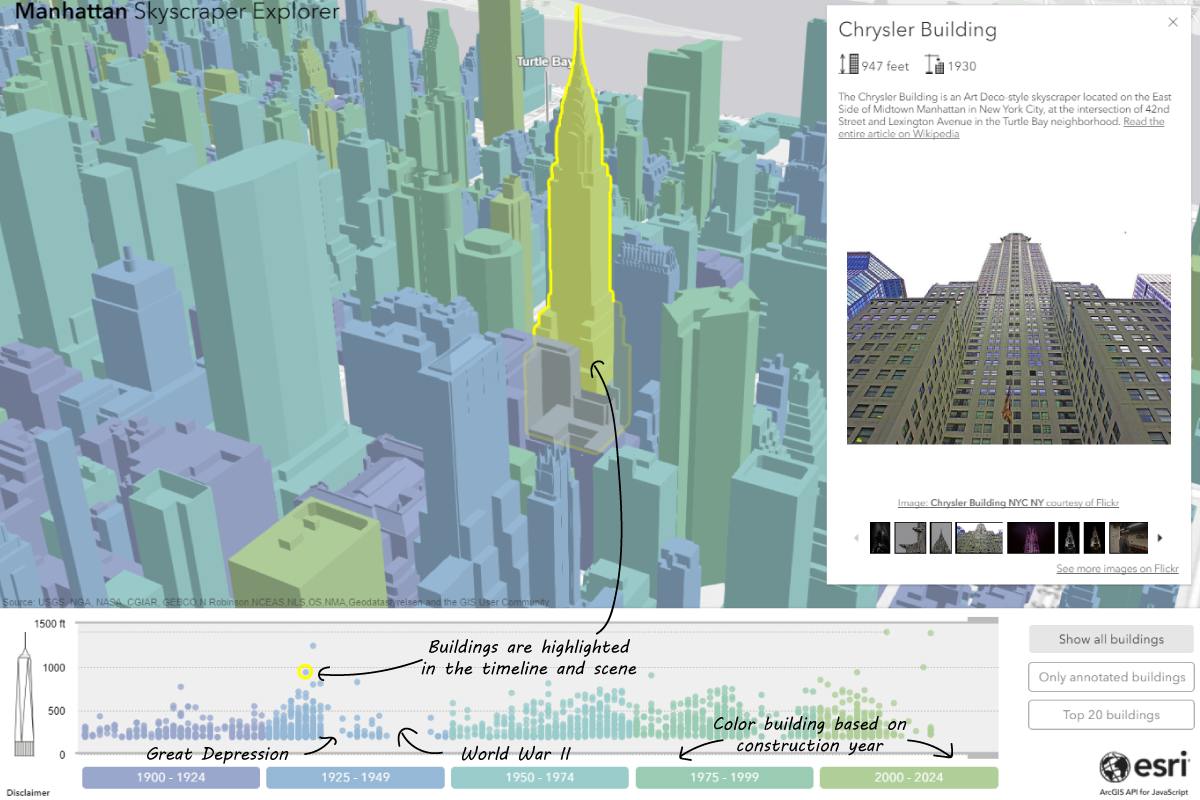
The timeline is connected to the map: if a user selects a building on the map, the corresponding element will be highlighted in the timeline. If a user selects a building in the timeline then the app will zoom to that building and display more information about it. Highlighting is a new functionality in the version 4.4 of the JavaScript API. Here is a basic example on how it works.
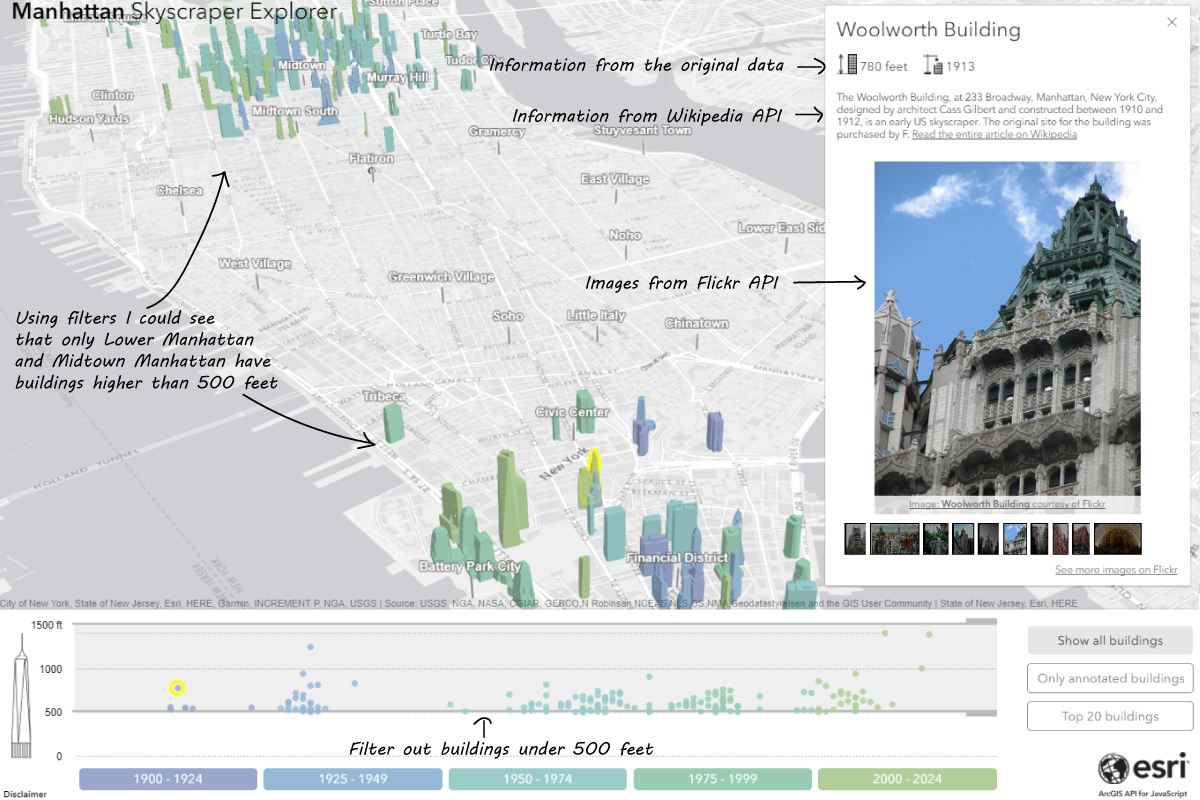
Immediately spotting the tallest buildings on a 3D map is not straightforward. That’s why I added a filter to the SceneLayer that would allow me to only display buildings that exceed a certain height. Let’s say for example I’m only interested in buildings above 500 feet. Filtering out buildings below 500 feet leaves only skyscrapers in Lower and Midtown Manhattan.
You can filter features in a FeatureLayer or a SceneLayer by using definitionExpression. Here is a sample on how it works.
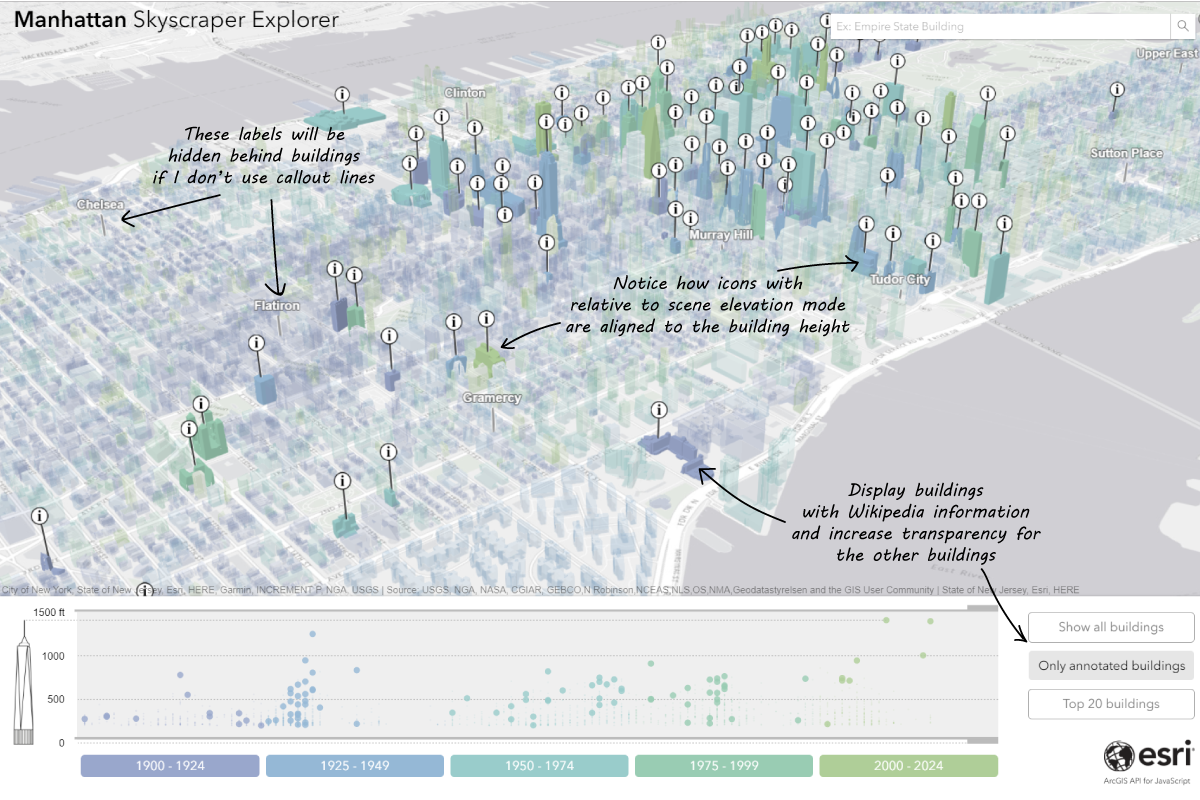
Although the original dataset was enriched with attributes like building name, construction year and building height, I was curious about some more information like what’s the current use or how does it look like. That’s why I decided to use the Wikipedia API (called MediaWiki) and the Flickr API. Most of the skyscrapers are very famous and have their own Wikipedia page, so I used MediaWiki to search for it and get the abstract of the page. Not all the buildings have a Wikipedia article so I wanted to mark the buildings that have such information. That’s why I added an extra point layer with information icons that show which buildings have extra information. The problem was that these icons were hidden by the buildings and were overlapping quite a lot. I used several new features, among which the relative-to-scene elevationInfo mode and featureReduction to solve these problems. For more information about styling points in a city, have a look at this sample.
I was pretty happy with the result so far, but realized that I needed to add more tools to help users easily find the buildings and orient themselves on the map. In a first phase I decided to add the names of the most important negihbourhoods in Manhattan. Adding labels on a 3D map can be tricky because from most angles they will end up being hidden by buildings. One solution is to set a vertical offset to lift them up and add a line callout to make sure the location of the label is still clear to the user.
Another very useful feature is the search functionality. Finding the Empire State Building just by looking at the map can be very difficult for users that are not familiar with Manhattan, so searching by name is what most people would do. So I added the search widget and set the feature layer with the buildings as the source. Here is a sample that explains how to do that.
You can see the live application here. In case you are curious to know more details about a specific implementation process of this app, write it down in the comments below and I’ll follow up with a more detailed blog post.
Happy 3D mapping!
Raluca

Commenting is not enabled for this article.