Real-time geofencing in ArcGIS Velocity
One of the most common use cases in real-time spatial analytics is geofencing: determining when an asset you’re tracking shares a spatial relationship with some geographic location. The most frequent example of this is when a moving asset such as a vehicle, airplane, or ship is inside – or outside – an area of interest such as a specified delivery area, restricted airspace, or designated shipping lane.
While point-inside-polygon is perhaps the most common scenario, geofencing can leverage other types of geometries and spatial relationships. For instance, you may want to determine when a hurricane track forecast cone (represented as a moving polygon) intersects a county (polygon) or transmission line (polyline), or if it contains a hospital (point).
In this blog, we’ll explore some of the ways you can apply geofence detection using a real-time analytic in ArcGIS Velocity.
The scenario
To convey these concepts, we’ll explore a scenario in which we want to determine when a city bus is within a certain proximity to a bus stop. In this case, the buses are the tracked assets while the bus stops are the geofences. This kind of analysis is useful in workflows such as updating a city’s transit dashboard with real-time information or alerting riders their bus is approaching. If the resulting data is stored, historical analysis can be performed later to gain insights, for example, into whether bus delays occur more often at some locations than at others.
The data we’ll be using is from two open source datasets available for the City of Charlotte, NC. The bus stop data is directly from the Charlotte Open Data Portal, while the bus location observation data was captured from OpenMobilityData and will be simulated back into Velocity . So let’s get started!
Ingest the real-time feed
Velocity provides many ways to ingest real-time data using feeds. For this scenario, we’ve configured the Azure Event Hub feed type and used it to ingest the bus location data obtained from OpenMobilityData. To enhance the data a bit, we added a route_pt_time field to the data so each bus feature will have the current time. The schema of the data is illustrated below.
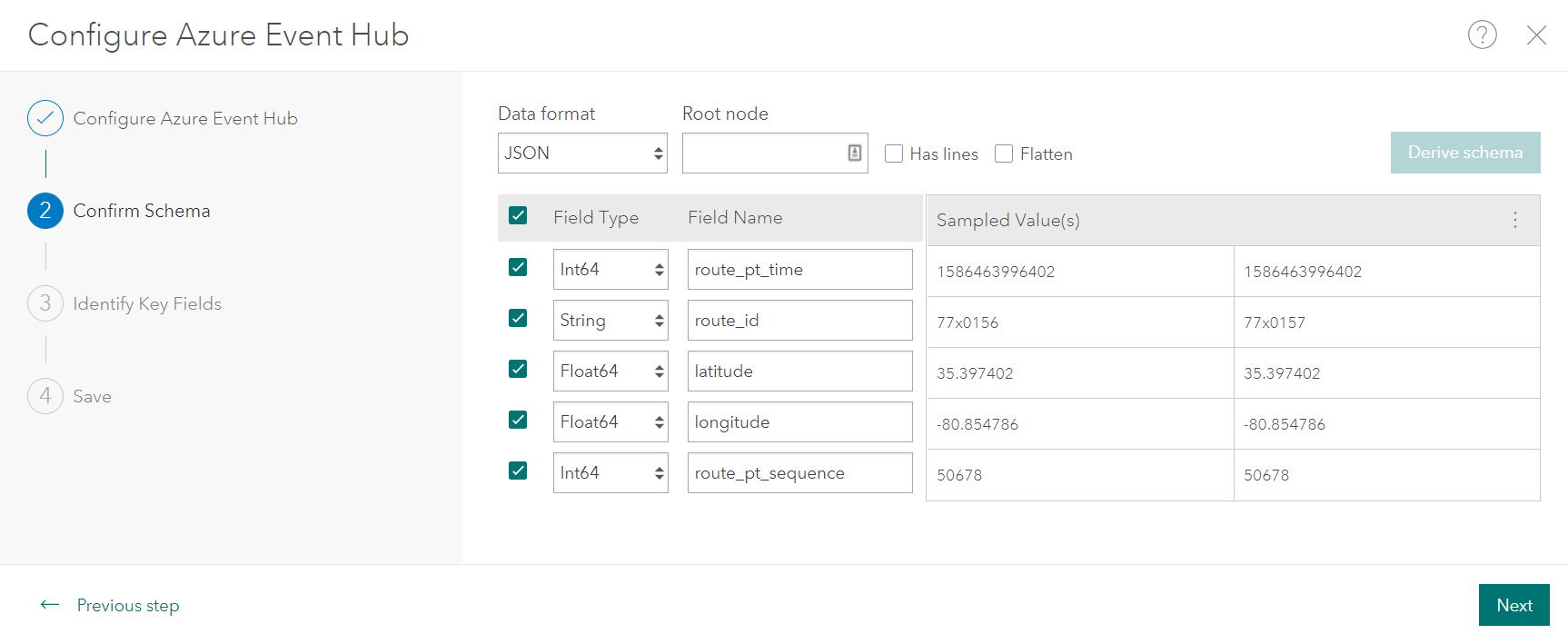
Creating and configuring a feed is outside the scope of this blog. For details on doing so, review the available feed types as well as work through the Create a feed quick lesson.
Geofencing in a real-time analytic
With the Azure Event Hub feed ingesting the bus location data, we’ll now use this feed in a real-time analytic to spatially analyze the data as it’s received. Real-time analytics support any number of use cases, allowing you to transform, enrich, analyze, and store incoming event data as well as take different kinds of actions on the data.
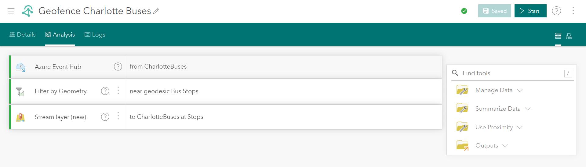
The first step is to add our feed to a new real-time analytic. By default, the analytic editor opens in the workflow view, meaning each step, or node, in the process is listed top-to-bottom.
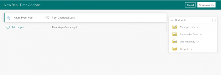
Now we can add tools to the analytic to perform the geofencing. Multiple tools exist that support different types of geofencing. The Filter by Geometry tool filters incoming data in a feed using a static data source as the geofences, emitting event data without any changes to the schema of the data.
The Filter by Geometry tool is available in the Manage Data folder. Once added to the analytic, you can select the data source that contains the features to be used for the geofences.
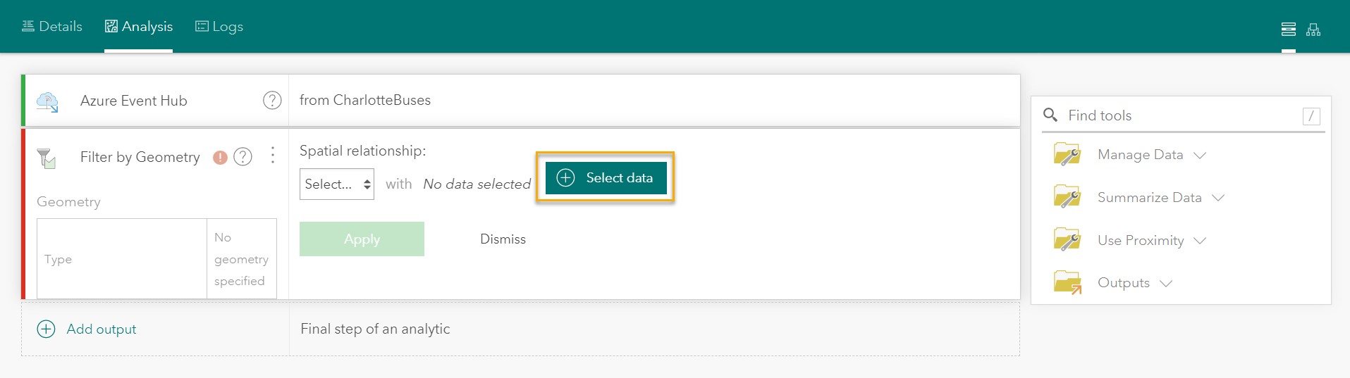
For this scenario, the data source will be the bus stops layer available on the Charlotte Open Data Portal at:
https://gis.charlottenc.gov/arcgis/rest/services/CATS/CATSMasterService/MapServer/0/
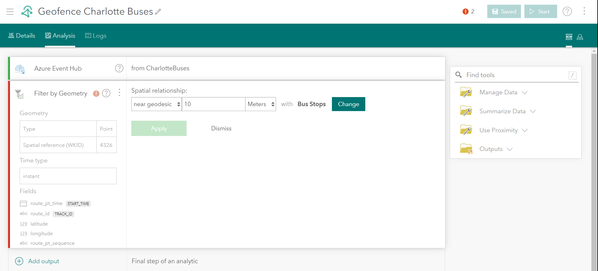
Since the geofences – the bus stops in this case – are point features, we’ll not use inside or intersects as the spatial relationship like we would if these were polygon geofences. Rather, we’ll filter the streaming data feed for any buses within a defined distance threshold of 10 meters to determine when any of the buses are in proximity to a bus stop.
The spatial reference of both of these features is GCS WGS 1984, so near geodesic is an appropriate choice for the Spatial relationship parameter. If we were working with projected data, you could choose the near planar option. It’s worth noting that the available spatial relationships in the Filter by Geometry tool, and any other Velocity tools that evaluate spatial relationships, is tailored to suit the incoming geometry types. In this case, the available spatial relationships are appropriate for comparing point geometries. The list excludes options such as crosses or overlaps which are available if comparing polygon geometries (read more about spatial relationships here). The final configuration of the Filter by Geometry tool is illustrated below.
Disseminate and visualize the data
With the feed and analytic configured, we can now add one or more outputs to disseminate the data. Since one of our initial objectives was to view the data in a transit dashboard, a Stream Layer output will be added to allow us to visualize the data as it’s received in a web map.
Again, creating and configuring an output is outside the scope of this blog. For details on doing so, review What is an output? and work through the Design a real-time analytic quick lesson.
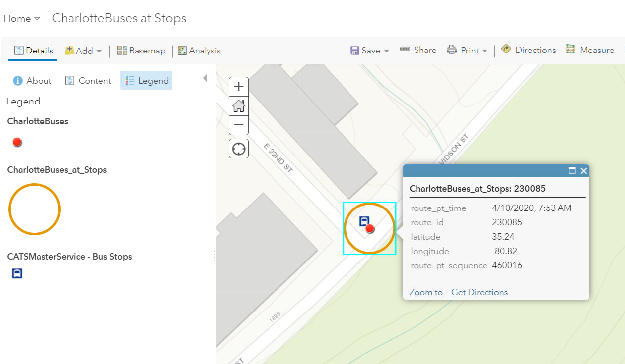
With the CharlotteBuses at Stops stream layer output added and the Geofence Charlotte Buses real-time analytic saved, as illustrated below, we can now start the real-time analytic. Note that, when starting real-time analytics, it’s important to ensure the input feed(s) are running as well.
With the analytic running, the CharlotteBuses at Stops stream layer and other supporting layers, including the bus location feed and the bus stops, can be added to a web map for visualization and to see how the three sets of data interact.
After saving the web map you can then add it to an ArcGIS Dashboard. For details on doing so, see Create a dashboard.
Enrich the bus feed with geofence data
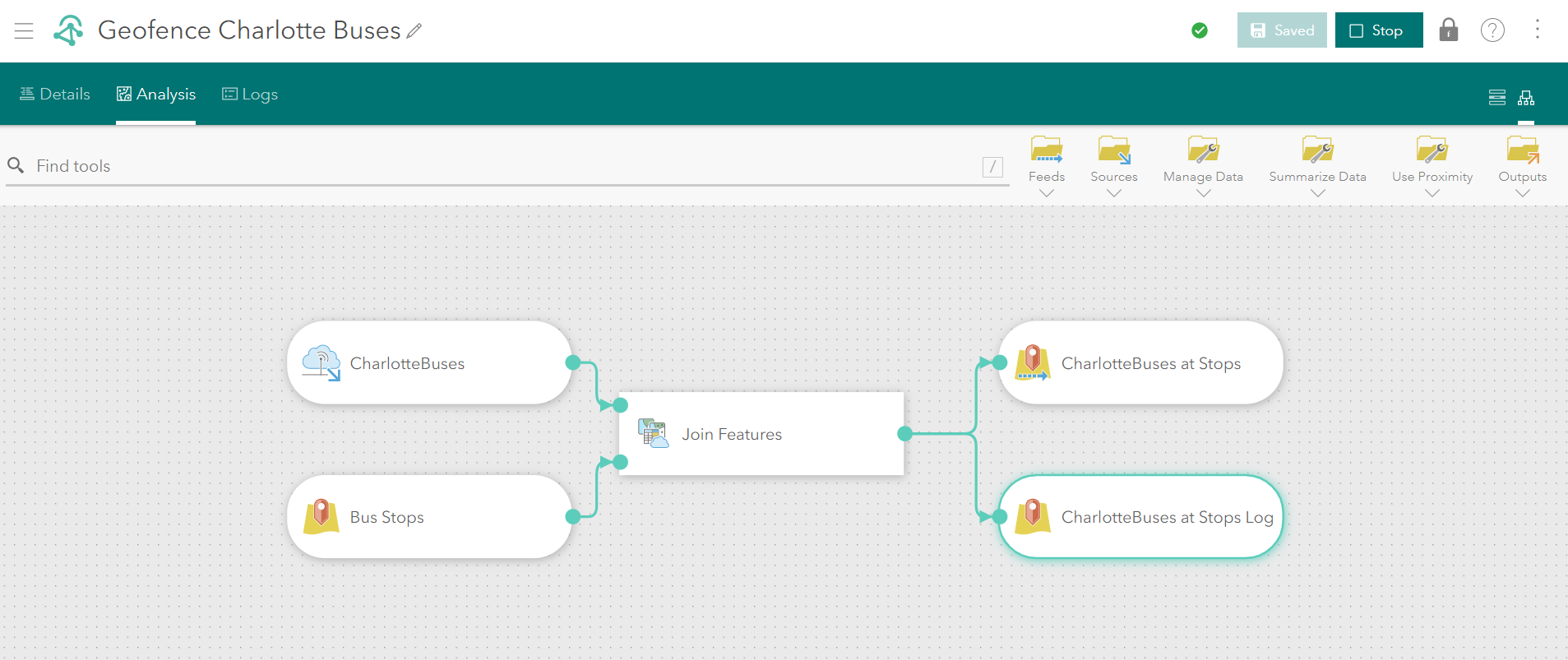
The attributes of the CharlotteBuses_at_Stops layer has the same attribute information as the CharlotteBuses layer from which it was generated. If your geofencing workflow requires you to enrich the incoming event data with attribute information from the geofences, you could use the Join Features tool instead of the Filter by Geometry tool to enrich the streaming data.
The Join Features tool joins geofence data, or join data, to the streaming data according to spatial, temporal, or attribute relationships, or any combination of these. Only event data that satisfies the join condition will pass through the tool. In this way, Join Features filters the streaming event data, but it can also enrich features with attributes from the join data.
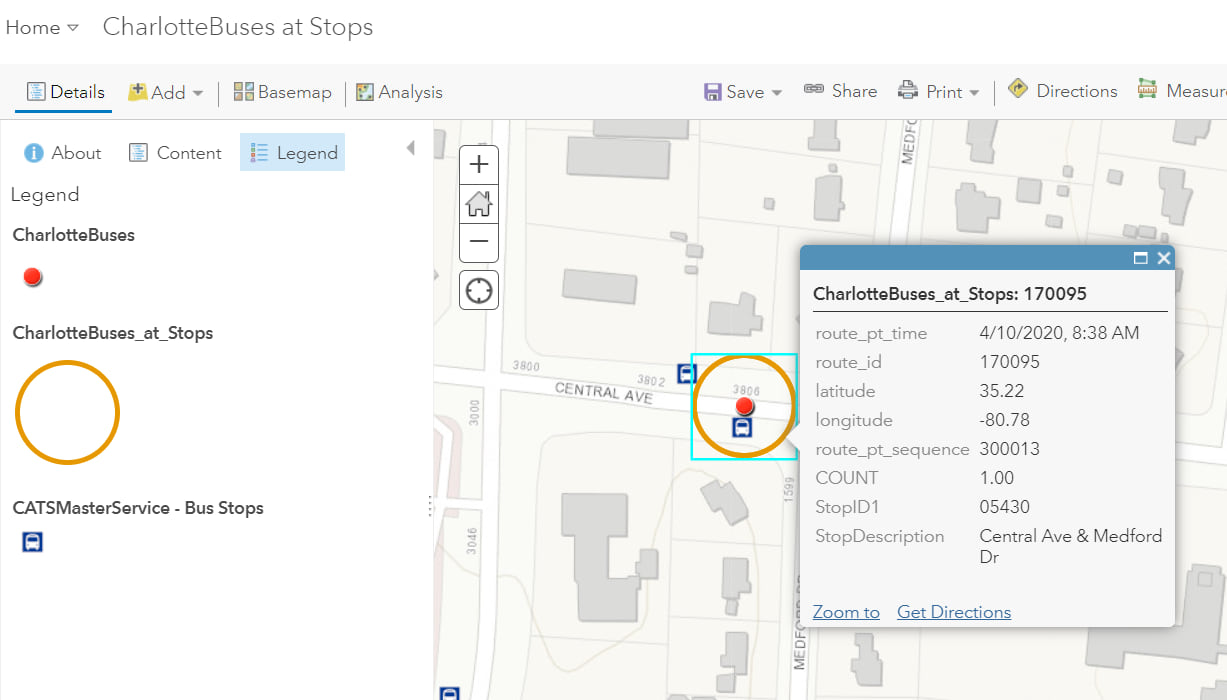
In this scenario, the Join Features tool will be used to enrich the bus locations with the StopID and the address of the current bus stop.
Returning to the analytic, we’ll switch the analytic editor to the model view, remove the Filter by Geometry tool, add the Join Features tool from the Summarize Data folder, and connect it to the pipeline in place of the Filter by Geometry tool.
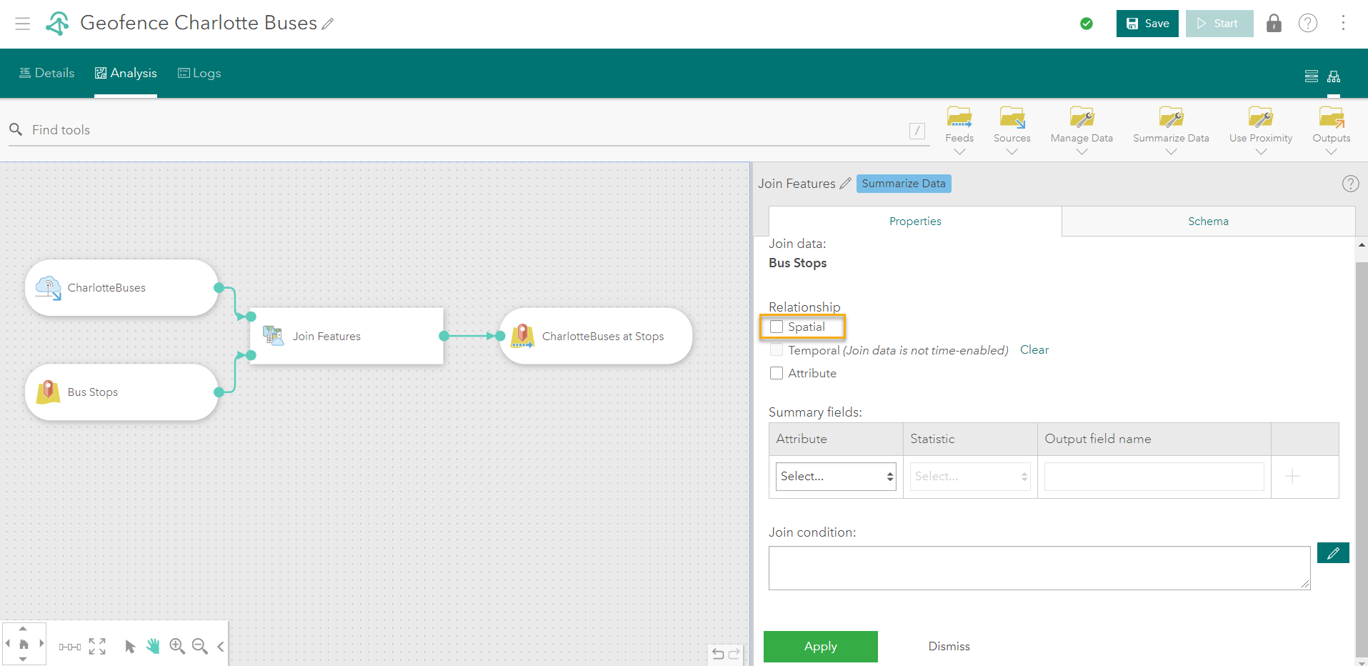
When configuring the Join Features tool, we’ll use the same near geodesic spatial relationship as above, but now we can define a spatial join that will enrich features with information from the bus stops layer. For the Summary fields, we’ll configure them as illustrated below.
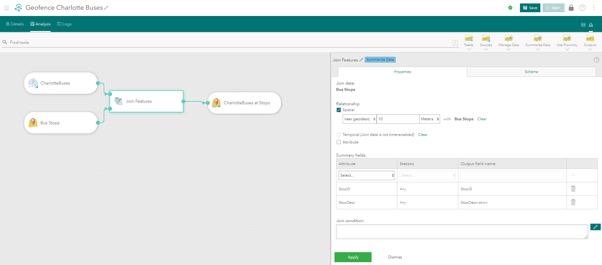
Note that, the Any statistic type simply joins the value in the selected field(s) to any of the events that satisfy the spatial relationship. Join Features only supports 1:1 joins in a real-time analytic, so if the analysis could result in multiple geofences matching the incoming events, Any is not an appropriate statistic to use. In this case, all the bus stops are more than 10 meters apart, so a bus’s location would only join one bus stop at any given time.
After applying these changes, restarting the analytic, and adding the updated stream layer to the web map, notice the attributes of the CharlotteBuses_at_Stops layer now includes the bus stop ID and address information.
At this point, additional outputs could be added to the analytic such as storing the data so big data analysis could be performed later using a big data analytic. We could compare, for instance, the buses’ expected arrival times to when they actually arrived at stops, which would provide a clear picture of where delays tend to occur most frequently.
Summary and next steps
Time and again, geofencing has proven to be one of the most common types of analysis in real-time spatial workflows – understanding when and where assets interact with areas or locations of interest is powerful. Using Velocity , there’s a myriad of ways to apply it to different use cases, from tracking personnel or vehicles and detecting patterns of interest at work sites to understanding when and where critical infrastructure will be impacted by a severe weather event. Performing real-time spatial analysis empowers your organization with new insights, allowing you to make better and more informed decisions that will truly impact your operations.
To learn more about Velocity, explore the resources below:
- Learn more on esri.com
- Get started with ArcGIS Velocity discovery path
- Explore the ArcGIS Velocity documentation
- Connect with others on GeoNet

Article Discussion: