If you orbit anywhere near GIS, you probably saw the seminal cultural comment on non-normalized mapping from the one and only Randall Munroe. If you are a cartographer, you probably took it to heart and gave it a gleeful barbaric YAWP. If you are anything like me, you also perhaps were emailed this link a dozen times by well-meaning friends and family or readers who thought your maps violated it.
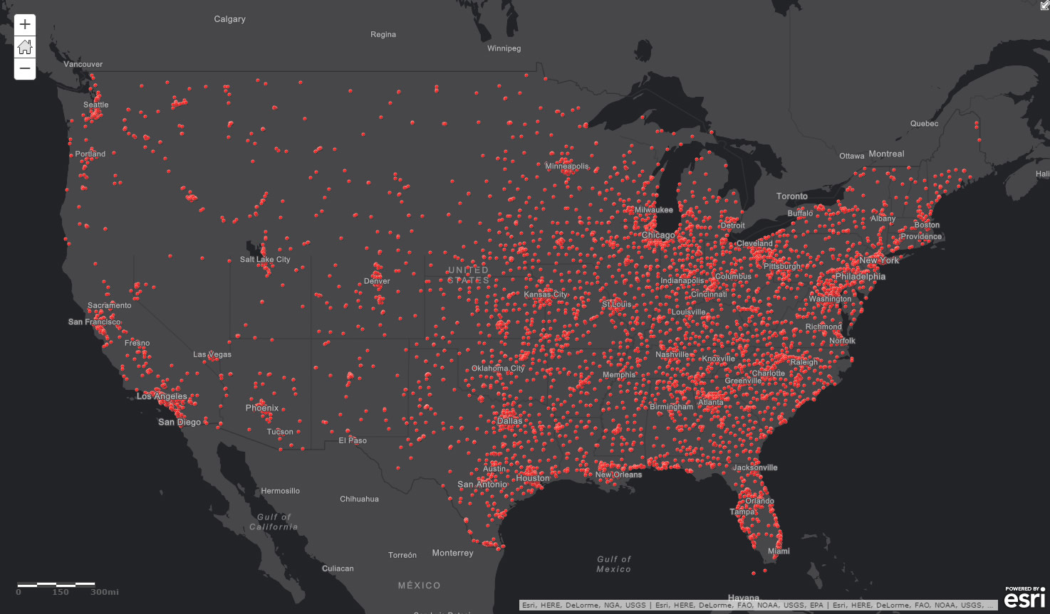
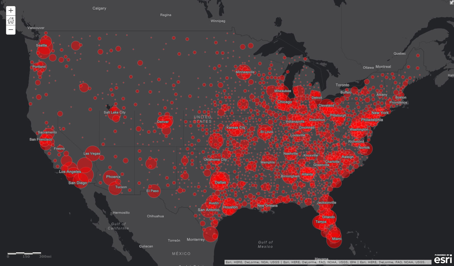
For example, here is a map in ArcGIS Online showing the locations of a popular pizza franchise in the United States (I am a big fan of their deep dish veggie lover).
It’s an inadvertent population map, of course, since these things tend to exist pretty exclusively where humans do. An ordinary mistake –but don’t let your maps be ordinary.
Normalize!
To avoid the pitfall of letting your mapped phenomenon (in this case, pizza joints) get swallowed up by the larger patterns of its parent phenomenon (where humans are), you can calculate the proportion of the phenomenon –that’s normalization. It involves whipping up a ratio of the thing you care about to the thing that clouds it. A normalized map is interesting because it says something unique and revealing –not just a rubber stamp of population or a misleading emphasis on bigger geographic areas.
Ken Field does a typically great job of describing the need and nuance of normalization, both for normalizing by land area and normalizing for an underlying population. Pro tip: when reading Ken, if your inner-narrator assumes an English accent, your experience will be heightened.
But How?
So here’s that map with the pizza joint point layer on. We know that at this point it looks indistinguishable from a population map and Randall’s followers would eat us alive.
I’d like to see that pizza map as a rate of locations per person. This way I’m showing the rate of pizza joints relative to the number of locals. Locations per capita. Way more interesting.
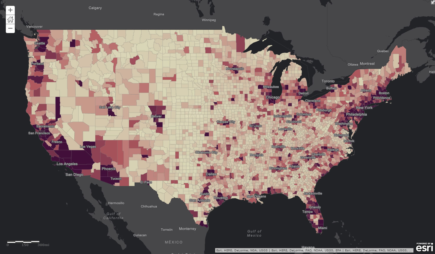
To do that, I’ll need a layer that has a population value that I can use to normalize the pizza places. Counties are a handy enumeration unit in this case. Here’s one I found in the Living Atlas.
Usually you can just use the Field Calculator to create a new normalized column (like population divided by area for population density, or magazine subscriptions divided by population, or amount spent on durable goods divided by average income –stuff like that). Or you could use the “normalize by” feature built into ArcGIS Pro‘s symbology editor.
My challenge is that I’m trying to normalize the features of one layer (point locations) by the attribute of another (population of county polygons). Sounds tricky, but it’s not! Here’s how to smoosh the goodness of two layers together in ArcGIS Online.
Summarize Within
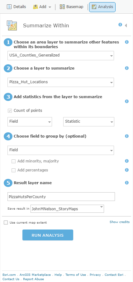
How do I get the pizza point data into a county polygon layer, just like my population data? ArcGIS Online lets you count up the features of one layer into the areas of another using “Summarize Within” in the Analysis tools. Such a handy thing. I don’t just love it. I’n in love with it.
Here, I’ve set it up so that the pizza places are counted up within the county areas. You can set up all sorts of aggregation rules and preferences, but we just need the good old default “Count of points” field.
This analysis will consume credits. How many? I am summarizing 10,724 points, so it will take 10.7 credits, total. You can always see how many credits a process will take by clicking the “Show credits” link.
The result is a copy of the counties layer that now includes the number of pizza joints per county. Awesomely, ArcGIS Online smartly defaults the style of the resulting layer (county polygons with a count of pizza places within each) as circles placed in the middle of each county, scaled by the count of pizza locations (instead of shading the county shapes themselves). By using that thematic map style, we are pretty-much-sort-of quazi-pseudo normalizing for the underlying geographic area (a tender trap of so many election maps), putting us one step closer to normalization zen.
Nice, but it’s still just a de-facto population map. We still need to yank out the overwhelming influence that raw population has on the map. It needs to be normalized for the underlying population. Time for phase two.
Symbolize
The new shapefile has an attribute for pizza joint counts, and population. We just have to symbolize by a ratio of the two. ArcGIS Online is super helpful in that you don’t have to pre-calculate the ratio as a new field -you can just normalize the pizza joints right in the symbology menu. Don’t bother rolling up your sleeves, this is still going to be easy…
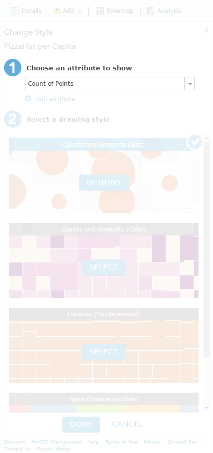
Step one. Choose the “Count of points” field generated earlier.
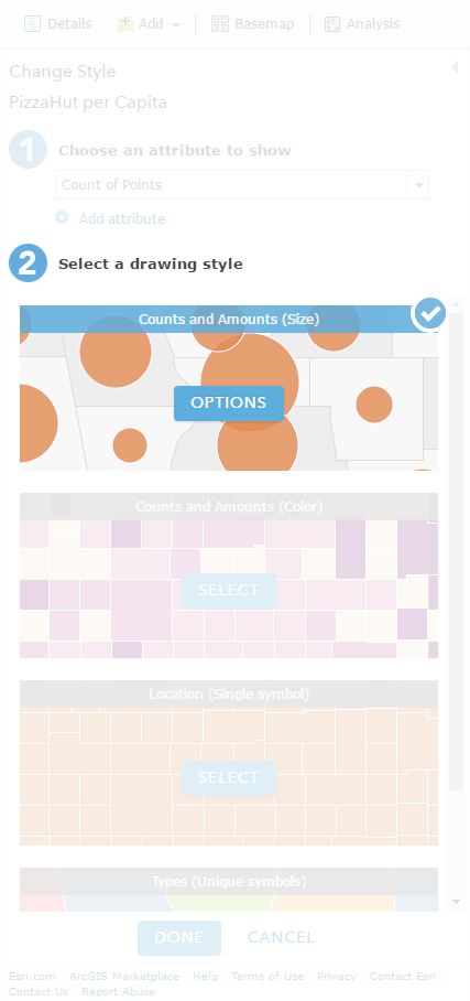
Then choose the “Counts and Amounts (Size)” style. I love that that rhymes.
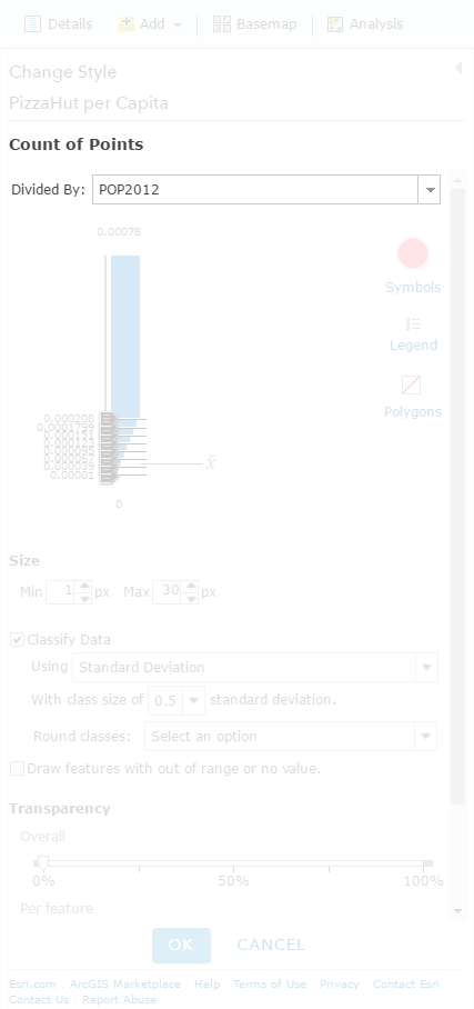
Now, the seemingly-magical ability to “Divide by” (AKA normalize by) presents itself. Just pick the population attribute. The symbols will respond by adapting to the ratio of counts to population. The good stuff.
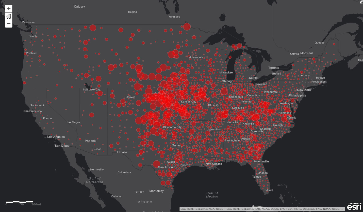
The result is a map of pizza joints per person. We’ve swept away the noise of the underlying population to show a true per-capita map of this pizza franchise. So many insights. So much meaning.
Now, we can see that, proportionally, this pizza chain is mega-popular in Kansas (turns out, it’s the home state of the chain –I wouldn’t have known to look that up if the map didn’t suggest it to me). There is a band of popularity heading east, through Kentucky and Virginia, and an interesting pocket of popularity in southern Georgia. The proportional presence west of the Rockies is really low.
Thank you, map. And thank you, by extension, normalization.

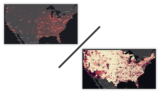
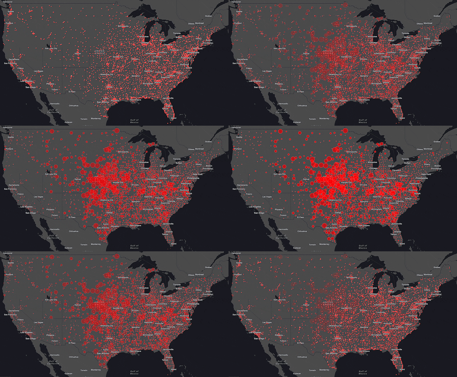
Here’s a quick comparison of the difference between a raw totals map, and the one that has been normalized by county population:
While there are plenty of locations in California, Florida, and New York, there are also tons of people there –so while a raw count looked like a lot, the underlying population is massive and these pizza joints are rare compared to other places in the country. Same for all of the large urban areas. Insight through clarity.
Check out the popularity of this pizza chain on the Eastern Seaboard of Virginia! That’s a pretty populous place, so large circles there mean that there are just loads of franchises.
What’s the deal with the occasional big bubble in sparsely populated counties up north? That’s because when the population is very low in a place, it doesn’t take too many locations to have a big impact. The smaller the denominator, the more unstable the ratio. Still interesting, though.
Hungry for More?
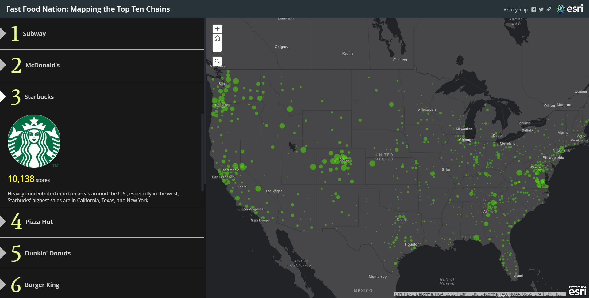
Gobble up this story map of the top ten fast food chains in the United States, all mapped proportionally in the same manner. You’ll feast on some amazing trends and patterns…at a bargain price.
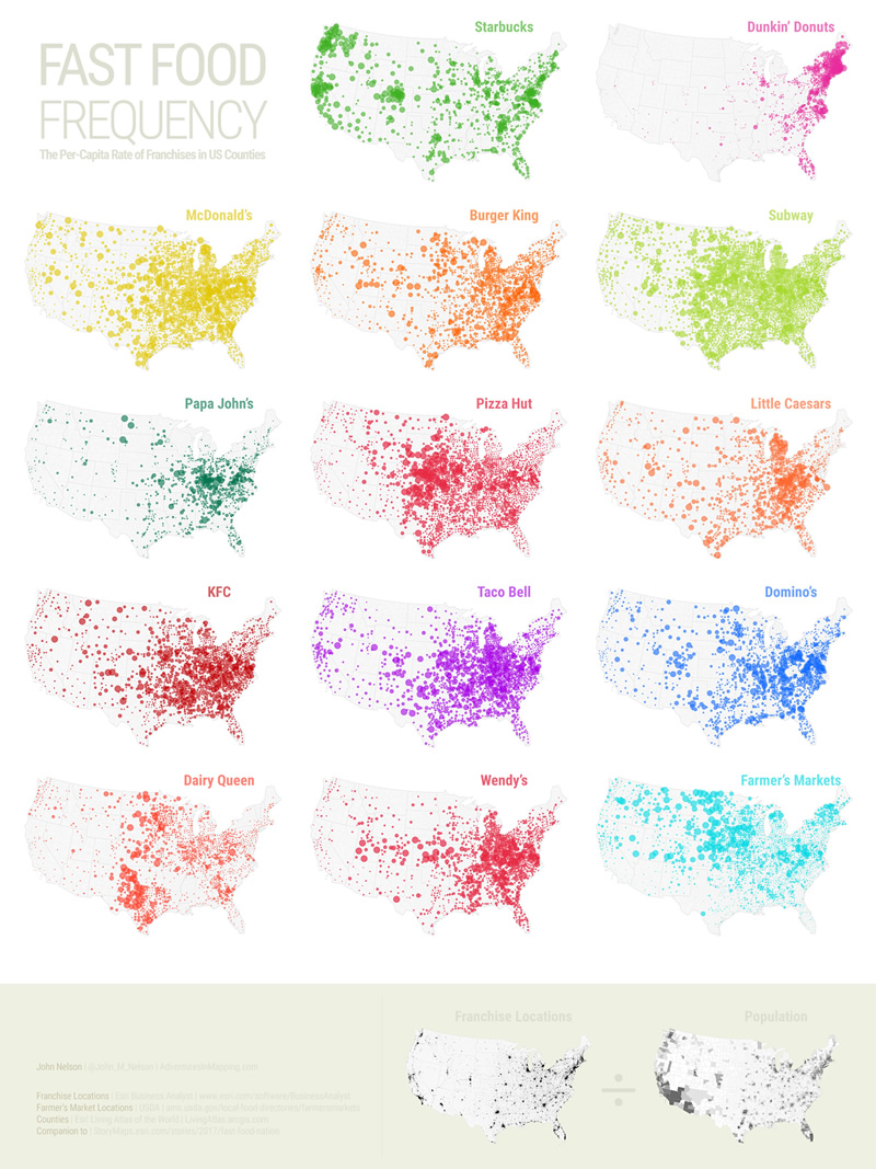
And here is a small-multiple of these guys, for a handy at-a-glance comparison of per-capita trends.
Happy mapping! John


Article Discussion: