A staggering wealth of geospatial information has emerged regarding the COVID-19 outbreak. Dashboards, near real-time services, and GitHub repositories have built the foundation for an extraordinarily transparent response effort.
At this point, most cases of COVID-19 are outside of the United States, so most information products are at a global scale. As cases begin to surface domestically, your GIS division might be asking: “How can we apply this information to prepare locally?”
The best analogy to make here is going grocery shopping before making dinner: First you pick a recipe. Then you take an inventory of your pantry. For whatever gaps are identified, you go grocery shopping. The same methodology applies to making the information products necessary for an effective response to coronavirus. Figure out what you are trying to do, leverage the information already available, then acquire what is missing.
What question are you trying to answer?
It is incredibly easy to jump directly into building dashboards and start adding layers, maps, indicators, and bar charts. While this might result in a “one-stop-shop” for important information, remember that GIS can be leveraged in other powerful ways if the right questions are asked. Some examples that might guide the process are:
- Do we have schools in socially vulnerable areas?
- Which neighborhoods are distant from a COVID-19 testing clinic?
- Do we have communities at a greater risk?
- Which facilities and staff are in harm’s way?
Like with dashboards, answering these questions results in highly actionable information. They can dictate which schools need enhanced monitoring, which neighborhoods need access to a mobile testing clinic, where to target outreach and how to modify operations. These answers tell us where to deploy resources and, equally important, where not to waste resources. It also tells us what ingredients we need to start looking for.

What data do you already have?
Now that you’ve identified the questions to be answered, look into the metaphorical pantry for the data and resources you already have available. As mentioned before, this outbreak has been largely data-transparent, and a variety of information products already exist. The challenge is selecting data that is authoritative, reliable, and updated. With that in mind, data can be sorted into three tiers:
- Tier 1 (Excellent): This often comes from government-sponsored sources and agencies and includes (but is certainly not limited to): CDC, FDA, state and local health departments, US Census Bureau, and WHO. These agencies are mandated to provide quality data, and they often make it available to the public.
- Tier 2 (Pretty Good): This would include data that is highly documented from a reliable source, like major companies, universities, and trustworthy media outlets. Expect to find information like sales data (e.g. prescriptions) or media alerts on the relevant topic. While the data may be of an extraordinary quality, these groups are typically not mandated to provide it.
- Tier 3 (Use for reference): This is the data that is typically provided by individuals. While it might contain actionable information and be easily accessible, it should only be used to corroborate with Tier 1 and Tier 2 sources. This may include casual survey data or crowd-sourced information. Trust but verify.
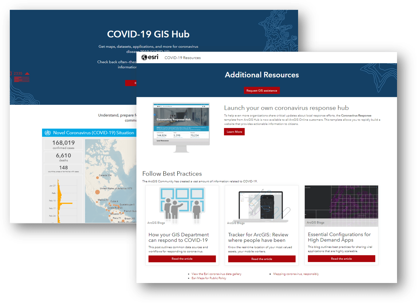
Esri has aggregated a large store of Tier 1 and Tier 2 data and information products on the COVID-19 GIS Hub, ArcGIS Living Atlas of the World, and Maps for Public Policy. This includes the leading international dashboards, sorted by categories, and their underlying layers. Additionally, Esri has aggregated a variety of other layers that can help answer the questions asked previously, like:
- Where are the latest-reported COVID-19 cases?
- Where are the most socially vulnerable populations?
- Where are the most densely populated areas in the US?
- Where are the healthcare facilities in the US?
- What areas are under travel restrictions around the world?
This data can be used with the technology your organization may already own, like ArcGIS Dashboards and Business Analyst to provide an overview of the situation. Meanwhile ArcGIS StoryMaps, ArcGIS Hub, and ArcGIS Experience Builder can be leveraged to provide transparency to the public.
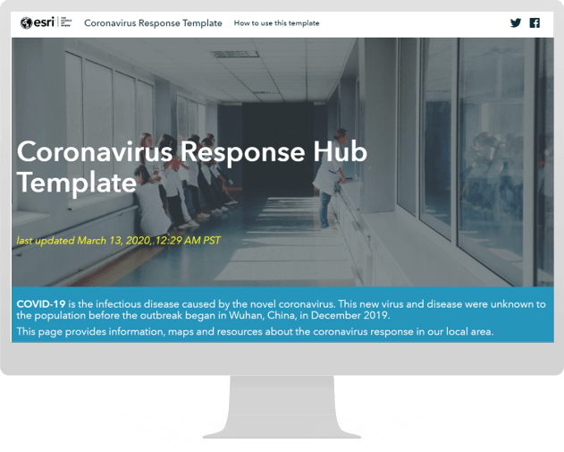
The Coronavirus Response Solution
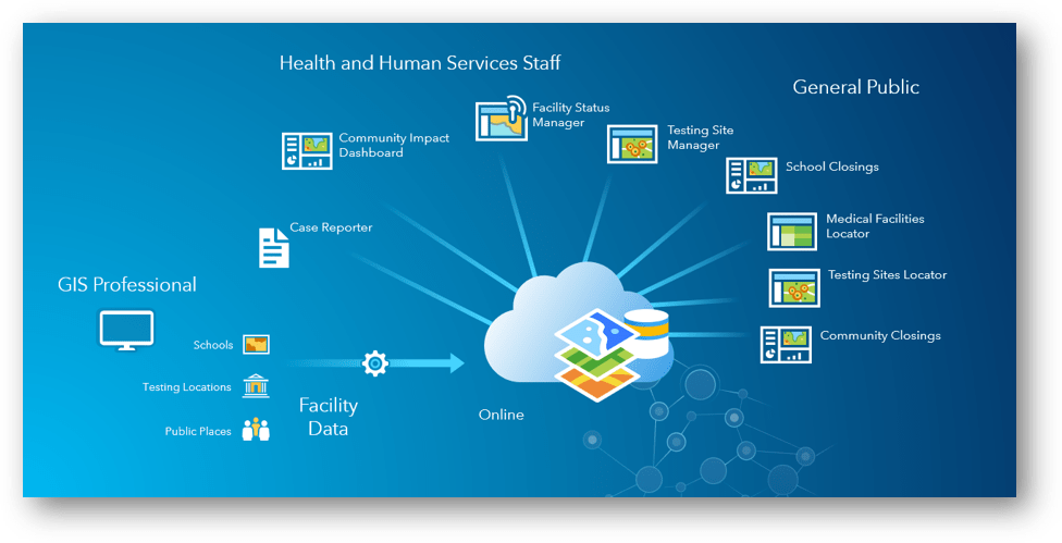
Fortunately, Esri has made the process even easier, and released the Coronavirus Response Solution. Deploying the solution results in a collection of maps and apps that can be used by Public Health agencies to understand the impact of the coronavirus (COVID-19) and share authoritative information about the pandemic with your community.
It includes the following tools to compliment the Coronavirus Response ArcGIS Hub Site:
- Community Impact Dashboard
- Case Reporter
- School Closings
- Medical Facilities Locator
- Community Closings
- Testing Sites Locator
- Facility Status Manager
- Testing Site Manager
What data do you still need?
Even with these federal, local, and international resources, no one knows your community better than you. This means the best sources of information are in your office or the office down the road. It’s finally time to start grocery shopping for data, so start knocking on doors—this is the time to be bold in your outreach and requests. Information on school closures from the local board of education, the locations of anonymized case clusters from the local health department, and the location of care facilities from the local healthcare licensing agency or health system are vital to the success of your response.
Geography, as a science, has tremendous value since it can act as a glue that binds various and sometimes disparate datasets together. By its nature, it is something all of our datasets have in common. In this way, the approach can also facilitate widespread collaboration in the face of an emergency.
The school board can update their facility statuses using the tools from the new solution. The local health department can mask PII from their datasets and keep a feature service up-to-date. And the local government can upload their authoritative datasets to ArcGIS Online, so the most accurate layers are present for everyone to use. This information can be shared to the entire community, kept within the organization, or maintained to a select group of decision makers.

Geographic Information Systems can be the tool that helps local communities regain control of this crisis, because location is the common denominator between every department. GIS teams across the country should be front and center as coordinators for pandemic preparedness and response. Taking a chef’s approach to GIS ensures you are strategic and successful in this endeavor.
Additional Support
As always if your organization needs support, we are here to help. Esri would be glad to provide guidance, examples, and connections to ensure you can be effective in your response. Reach out to your account team, contact us online, or email us at HealthInfo@esri.com.
More information on Esri’s Disaster Response Program can be found online.


Article Discussion: