In the blog, “A Technical Approach to Large Feature Datasets”, we demonstrated methods to display large amounts of data quickly and without layer drawing errors. Although tools are available to draw a bazillion features quickly on the web, does showing every individual feature allow you to visualize the data in a way that can be easily understood?
The app below compares a feature layer and tile layer with 95,039 points representing earthquakes that occurred between 2014 and 2017. Maps are used to gain understanding about geospatial phenomena. Although the Firefly Cartography looks great (Thanks John Nelson), what kind of understanding can be gained about worldwide distribution of earthquakes from these maps?
Earthquake Distribution 2014-2017
*Author’s Note. Okay, it’s not exactly a Bazillion points, but there are enough feature to make the Point… get it… Point features…
- Where have the most earthquakes occurred?
- Where have the strongest earthquakes occurred?
- Where are earthquakes relatively rare?
- How many earthquakes happened in Canada?
- Were any caused by mining?
From a visualization standpoint, it is very difficult to answer these questions based on the above app. There are many of overlapping features and it is difficult to visually understand density of points. Did you notice that there are three times as many features displayed in the right map than the left map? A wise and noble Wizard, Albus Dumbledore once said, “It is our choices, Harry, that show what we truly are, far more than our abilities.” Although using a tile layer makes it is possible to display a bazillion* points on a map, this blog will review four other strategies to display large data sets—such as those used in this earthquake example—that will help your users easily gain understanding from your maps.
Author’s Note. For the strategies below a dataset with 17,358 points displays earthquakes that have occurred in 2017. This smaller dataset makes it easier to see the differences between the examples but the concepts can be applied at larger datasets.
Strategy 1: Display data that is important
Use a filter to display the features that you want your users to view and explore.
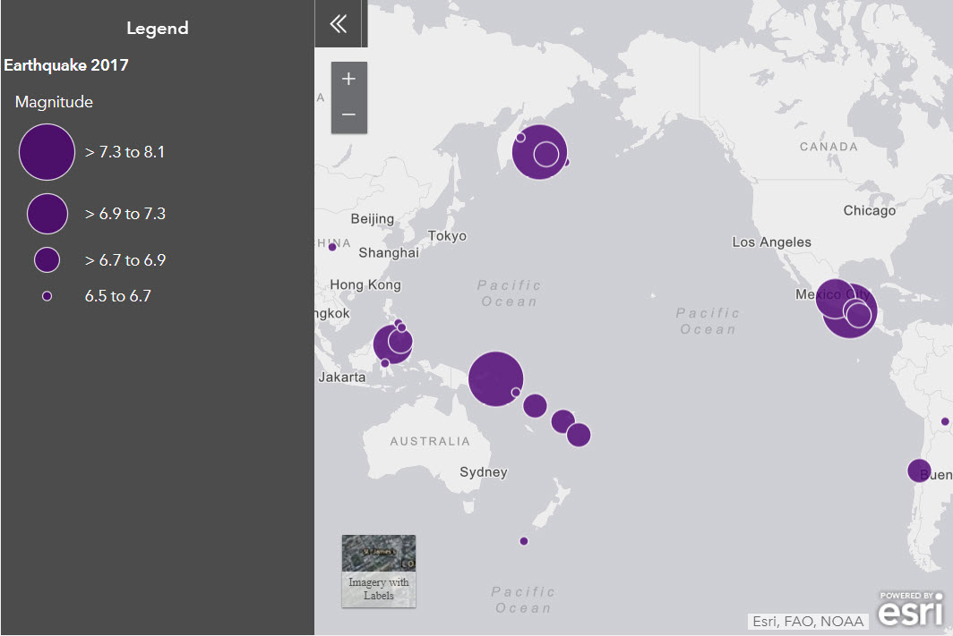
This app displays earthquakes with a magnitude above 6.5. Users can visually identify and explore large earthquakes that occurred in 2017 without being distracted by smaller earthquakes in the display.
Strategy 2: Aggregate the data into equal-sized hexagons (hexbins) to visualize patterns
Use the Aggregate Points analysis tool to create a new layer with a count of all of the earthquake features within a hexagon polygon. This displays clusters of earthquakes across regions in equal areas, which can be used for thematic mapping.
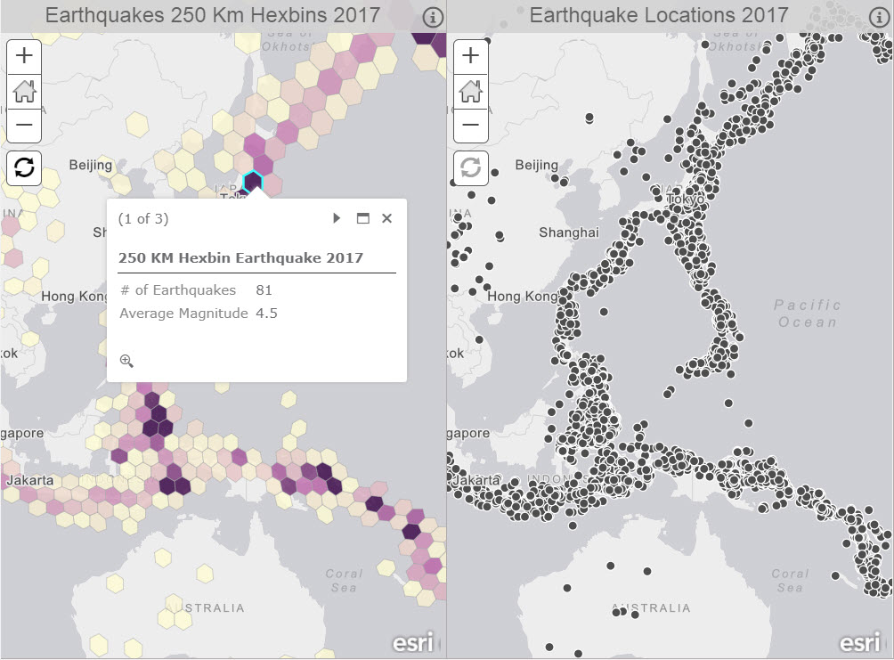
On the left, each hexagon represents the number of earthquakes that occurred within the 250 KM hexbin. The average magnitude of the earthquakes within the hexagon was also calculated. This shows clusters of many earthquakes in Indonesia and Japan. The map on the right displays earthquake data that has not been aggregated.
Strategy 3: Use scale visibility and/or multiscale rendering to show information when it is visually helpful.
Set a visible range to display the relevant data appropriate scales. Display detailed data at large scales, allowing it to draw when features can be visually identified. Make the detailed data not visible at small scales to remove the possibility of viewing heavily overlapping data. Consider using aggregated data to provide context to your audience at small scales.
Multiscale Rendering
This app uses 100KM Hexbins to provide context of where clusters of earthquakes are located. Zoom into the dark purple hexagons until the point features appear in Oklahoma.
Strategy 4: Use clustering to group points into one symbol and apply Smart Mapping Styles
Clustering is new functionality that is available for datasets of up to 50,000 features (larger datasets coming soon). Enabling clustering groups points that are within a distance from one another on a screen into one symbol. As users zoom in, clusters are dynamically updated to show relevant clusters in the current view of the app. Smart Mapping can be applied to show the predominant type for categorical attributes and averaged values for numeric attributes.
For example, the map on the left shows where many earthquakes have occurred, represented by the large clusters, and predominant types of earthquakes in each cluster. The map on the right app shows the distribution earthquake locations and the type. Continue to zoom into the Mining Explosion clusters to find out more about the types of earthquakes within the cluster.
What’s Next?
Use these four strategies and tile services to show many features in a fast and informative way that are appropriate to communicating your message to users.
Check out these helpful blogs for more details about the strategies above:
Use A Binning Technique for point based multiscale web maps
How to Smart Map with Clustering
Creating Thematic Maps with Hexagons
Fast Display of Beautiful Symbology in ArcGIS Online
How to Display a Bazillion Features on the Web


Commenting is not enabled for this article.