Smart mapping allows you to choose two attributes, and show them both within the same map. This is a valuable trick which can showcase your data in new ways, and also display relationships and patterns you might not have seen otherwise. This guide shows examples and steps for getting started with this mapping technique. To follow the detailed version of this guide interactively, visit this story map.
In some cases, using color to represent data values just makes sense. Other times, the size of a symbol creates a clear story for the smallest and largest values. Smart mapping allows you to choose two attributes from your data, and visualize the patterns from each attribute within a single map using both color and size (also referred to as bivariate mapping). This can be valuable for exploring your data, and allows you to tell a story using one map instead of two.
Why map with color and size?
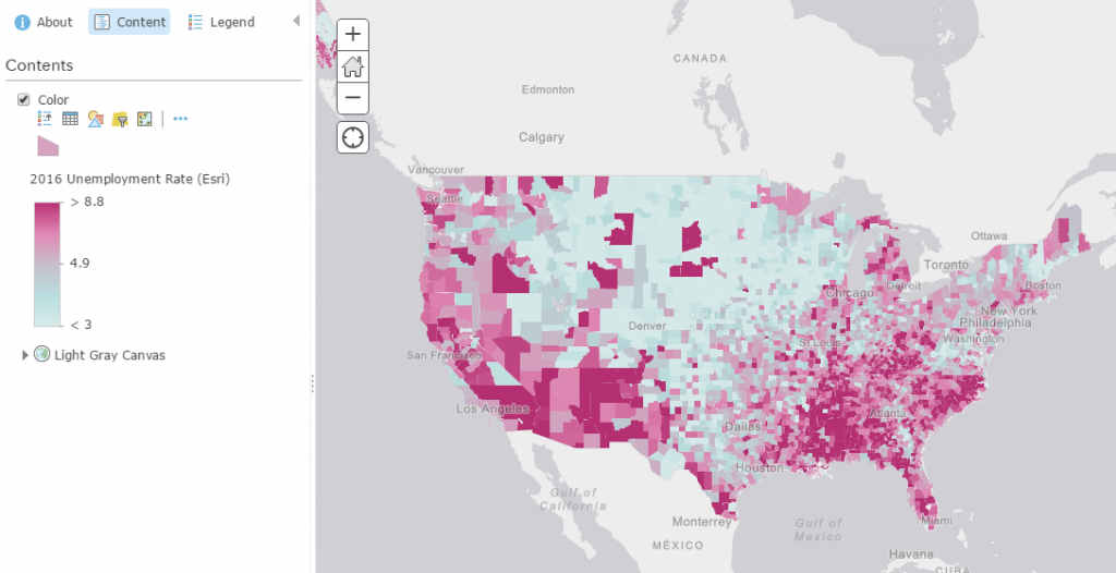
Imagine we have a map of unemployment rates in the US, which as represented by percentages. Using a color map is a useful way to represent these percentages in an understandable way.
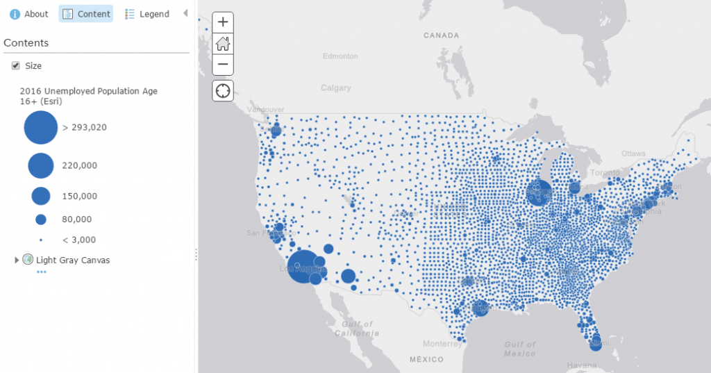
Now, imagine that instead we want to represent the amount of people who are unemployed. Using size is a great way to show quantities.
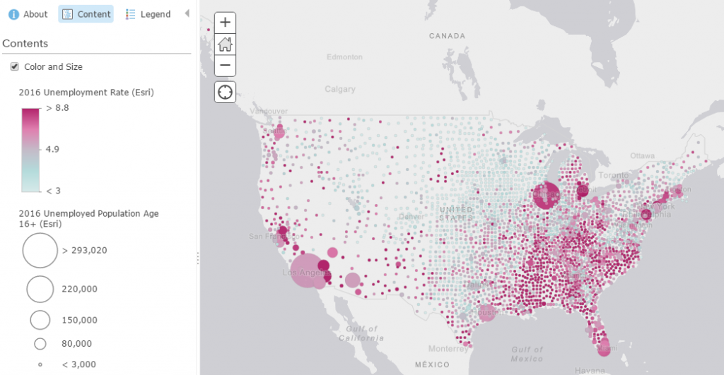
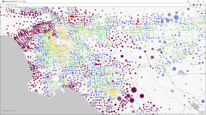
With smart mapping, you can select both of these attributes within the Change Style interface, and get a map where they are shown within the same map. This can highlight interesting relationships between attributes and represent patterns that tell interesting narratives. In this case, the map shows how high unemployment rates don’t necessarily follow the same pattern of high unemployed population. Stand-alone, these are important maps, but together, we can better understand what the numbers mean.
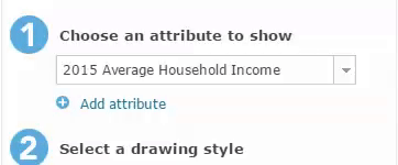
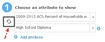
To make a color and size map, go to the Change Style for your layer within ArcGIS Online or ArcGIS Enterprise and select the two attributes you want to show in your map. The first attribute will be shown with color, and the second attribute will be shown with size.
Once you select the attributes you want to show, you have the opportunity to dive into the options for both the color and size settings for your map. This allows you to use your own knowledge of the data in order to make your map as clear as possible.
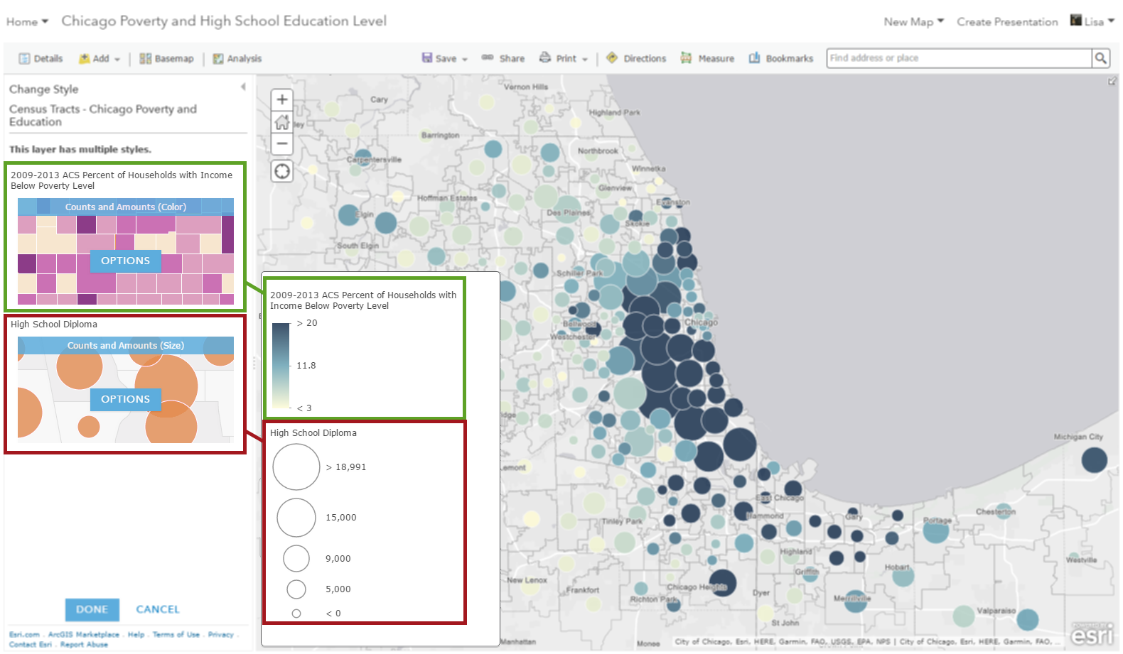
If at any point you want to try viewing the attributes where the color and size attributes are switched, simply swap them using the symbol to the left of the attributes.
Mapping with both size and color opens the door to endless possibilities of maps. You’ll see patterns and relationships within your datasets that you may not have found otherwise.
It is easy to try on your own datasets! Explore patterns by choosing different combinations of your attributes.
For additional tips and inspiration, visit these smart mapping resources:

Article Discussion: