We recently updated GeoPlanner for ArcGIS to version 2.6. Since our last release, we’ve made significant improvements to GeoPlanner for ArcGIS and the Suitability Modeler Widget in the Web AppBuilder. At this update of GeoPlanner, we’ve made it easier for you to explore your data by allowing you to access attribute tables and use more layers in the dashboard. We also made it easier to organize Key Performance Indicators (KPIs).
View, sort and rank attribute table data
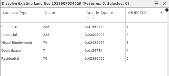
At this update, you can now access attribute tables of design and feature layers. This will help you better understand your data by allowing you to view, sort, and get statistics on your data. Need to rank your data by an attribute value? It’s easy at this update – just open the table and sort on a field to find the highest or lowest values within a layer. If you have editing privileges, you can also update attribute values in your layers.

Key performance indicators
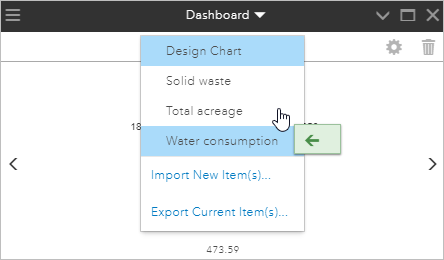
Do you have lots of key performance indicators in a GeoPlanner project? We just made it easier to manage KPIs. Now you can sort your KPIs into your preferred order by dragging and dropping them in the Dashboard’s KPI dropdown list. The will also update the display order of KPIs in the Dashboard.

More layers in summary chart
When using a chart for your projects, reviewing the summary can provide great insight into your data. The summary chart reports on areas of overlay between two layers, to better help you understand the impact between them. For example, what’s the impact of wildlife on areas where development is a possibility but the area is not under conservation efforts?
With this update, you can use layers with simple, unique values, classified and visual variable symbology in the summary chart. The benefit of this is that it will allow you to use certain tools in the summary chart directly. Tools such as Create Travel-Time Areas, Aggregate Points, Calculate Density, and more.
Summarize model score in the Suitability modeler widget
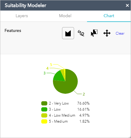
At this update to the Web App Builder’s Suitability Modeler Widget you can view a summary chart of model scores. This chart resembles the summary chart in GeoPlanner in that it enables you to summarize model scores within a sketch, graphic or feature. This will help your users analyze and gain insight into how an area behaves or performs.

Don’t have GeoPlanner? Don’t worry! You can try it for free. Follow these instructions on how to access a free trial. Click on the Don’t have an ArcGIS Online subscription link.
Commenting is not enabled for this article.