Welcome to Week 3 of ArcGIS Hub’s Civic Analytics Notebook series. Last week we observed how spatial analysis tools from the ArcGIS API for Python can be used to perform proximity based analysis. In one of the notebooks we observed how accessibility to important locations and services around us can be gauged. The other notebook walked us through the process of identifying statistically significant outliers in our area of study. This week we focus on the attributes of a dataset to understand how relationships between attributes can be detected and interpreted. We also extend that understanding further to spot hidden patterns in our data. Let’s delve deeper!
Finding correlation between variables of a dataset
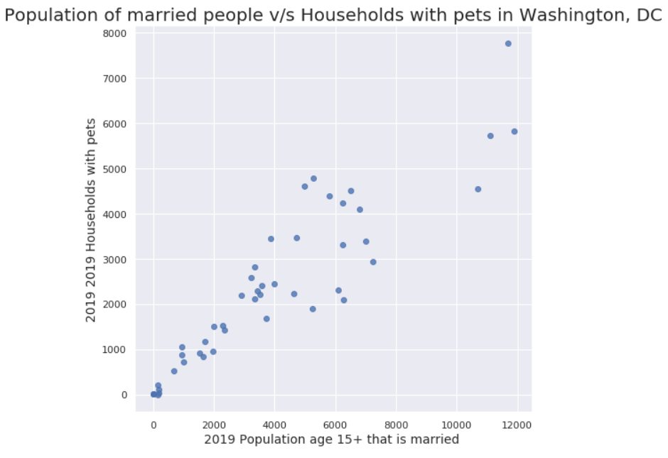
In this example we fetch neighborhood boundaries for Washington, DC to observe correlation in socioeconomic factors. We enrich the neighborhoods layer with a few socioeconomic variables such as, variables for Population, Median Household Income, Households below poverty levels, to name a few. We then display the data as a scatter matrix , i.e. a collection of scatter plots. A scatter matrix displays the relation of each numerical variable with the other to see if changes in one variable are reflected as changes in the other variable in some way. Having obtained a visual understanding of these correlated variable pairs, we then use statistical tests from the scipy (Scientific Python) library of Python to numerically compute this correlation for a few variable pairs.

While we touch upon two correlation coefficient techniques in this notebook, I invite you to explore more and investigate which one suits your needs best with the kind of data you are working with.
Identifying and exploring hidden clusters in civic data
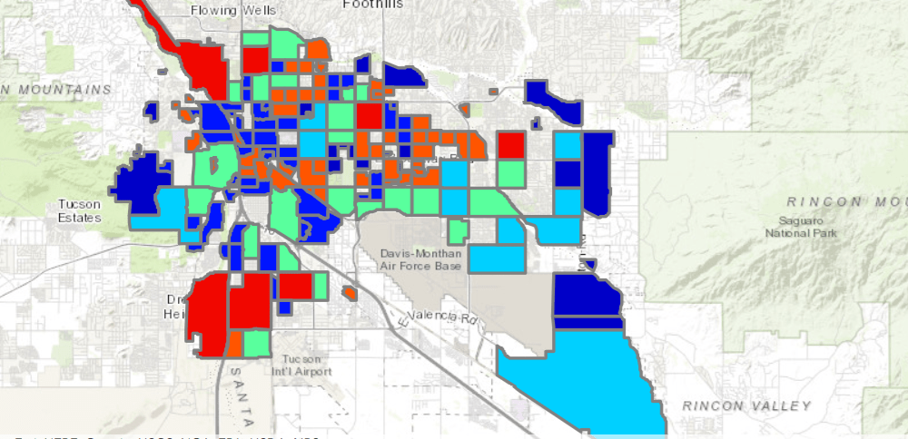
This notebook demonstrates two different techniques of detecting clusters or patterns in data. We begin by fetching data for rodent inspection and treatment sites in Washington, DC for the last 30 days. We use this data to detect point clusters if any, which helps inform strategies for follow-up treatments and inspections. The second example we look at checks to see if neighborhoods within the city of Tucson can be grouped together based on similarities in income variables. We read in data and then extract variables of interest in a separate dataframe after data preprocessing. This data is used as the input for the KMeans unsupervised learning method from the scikit-learn library of Python. This helps us detect neighborhood clusters that exhibit similarity in our variables of choice.

While we have used the HDBSCAN and KMeans Clustering algorithms here, there are several other algorithms that could be used instead based on your data and application and the way the algorithm scales to your data.
You can download these notebooks and add them to your ArcGIS Online organization to work with using ArcGIS Notebooks. Come participate in our Geonet conversation about these notebooks and share your thoughts and results from your experiments with our notebooks using your data of preference. We look forward to hearing from you on your feedback and ideas.
Links to notebooks:
Click here to learn more about Week 4 of Civic Analytics with Hub.

Article Discussion: