The demand for electricity has been steadily rising across the United States, driven in part by the surge in data center operations and the growth of AI technologies. With this rise in electricity demands, there are increasing concerns about the impact on electricity cost for households and small businesses as a rapid demand growth of electricity is felt by utility companies. After years of relatively modest increases in electricity costs, electricity rates have been increasing as utilities are catching up on deferred maintenance and hardening grids for extreme weather. As further utilities investment are needed to meet the energy demands in the future from data centers and AI, electricity rates are predicted to increase substantially.
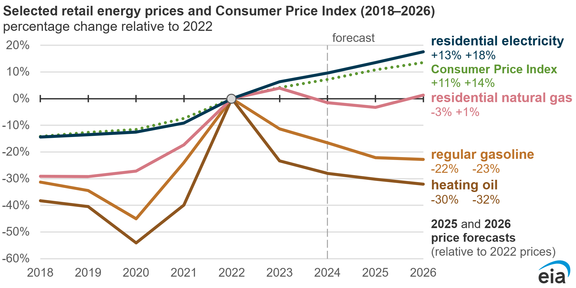
According to data from the U.S. Energy Information Administration (EIA), residential electricity costs are on a steady rise nationwide, with the average price of electricity in America has increased almost 10% from 2022-2024, with a projected 13% increase from 2022-2025.

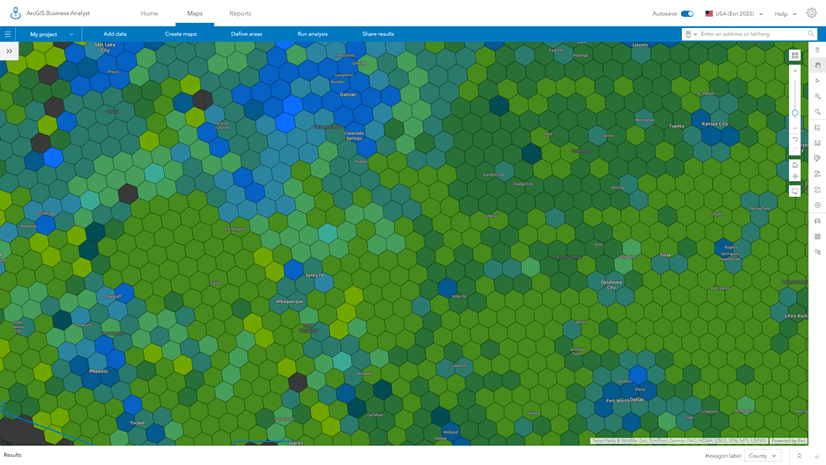
In order to see how the electricity rates are trending over time across all areas in the U.S., we’ll explore a new layer in ArcGIS Living Atlas that visualizes electricity rates from 2000 to 2024. This new layer, USA Electricity Rates – Electric Retail Service Territories and Hexagons, contains electricity rates data in the United States from the U.S. Energy Information Administration (EIA) from 2000 to 2024. This layer will be updated annually as new values are added in October of each year.
This feature layer contains four sublayers, one for the source boundaries – Electrical Retail Service Territories, and three hexagon layers created from Uber’s H3 hexagons in order to show a more granular level of scale.

Understanding the Feature Layer:
Source Data
This layer was created using data sourced from the U.S. Energy Information Administration’s (EIA) Form 861 – Sales to Ultimate Customers tables for years 2000, 2005, 2010, 2015, 2020, 2021, 2022, 2023 and 2024. These data tables were joined to a Electric Retail Service Territories boundaries layer that are used to show where each utility operates.
Why use H3 Hexagons?
Electric Retail Service Territories boundaries are difficult to visualize due to a number of reasons:
- Varying Sizes – Polygons can range from being smaller than cities, to large enough to span multiple states.
- Overlapping – Polygons can overlap one another A state might have investor-owned utilities (IOUs),electric cooperatives, municipal utilities, or power authorities. Each has its own territory, and sometimes their areas interweave around annexed city limits or rural service areas.
- Discontinuous – Polygons can be discontinuous, where they have multiple parts.
- Complex – Polygons don’t follow clean geographic features. Boundaries can be irregular, jagged, and difficult to align with common map layers.

H3 Resolution 5 hexagons grids from the Generate Grids and Hexagons (Business Analyst) tool in ArcGIS Pro were created to show a more granular level of scale with a consistent-size grid area of 252.9 km² (97.6 miles²). Since H3 hexagons never change their geometries and contain unique grid ids, they can be used to compare over time without worry of boundary changes and can be easily joined with other H3 hexagons created layers.
The descriptive statistics of median, mean and max were used to show the middle, average, and max blended electricity rates values derived from the Electric Retail Service Territories. Resolution 5 hexagons were chosen as good fit for visualizing areas sizes between cities and county unties, although any hexagon resolution can be used in place of resolution 5.
 Electricity Rates by H3 Resolution 5 Hexagons")
Nominal and Inflation-Adjusted Electricity Rates Attributes
- Electricity rates were calculated by dividing revenue in thousands of dollars by energy sold in megawatt-hours (mWh). This value was multiplied by 100 to get a cents per kWh electricity rate.
- Electricity rate fields include both nominal and inflation-adjusted values. Inflation-adjusted values are in 2024 dollars. These were calculated by multiplying each year’s electricity rate values by their CPI inflation-adjusted value (CPI 2024/ CPI Year of data).
Highlighting Key Trends in Residential Electricity Rates:
While nominal electricity rates (without accounting for inflation) have generally increased over the past two decades, and especially in the years since AI have gained popularity, inflation-adjusted rates present a more nuanced picture. Nationally, we see from the EIA that residential electricity rates have outpaced inflation (Consumer Price Index). In some regions, real (inflation-adjusted) rates have either stagnated or even decreased.
This trend is important because it reflects the broader economic forces at play, such as shifts in energy production, changes in energy efficiency, and government regulations. For example:
-
Nominal Rate Increases: Overall, many areas have seen consistent increases in the cost per kilowatt-hour (kWh) of electricity, reflecting the growing costs of energy production, infrastructure maintenance, and the rising demand for electricity across various sectors.
-
Inflation-Adjusted Decreases: In some regions, the increase in nominal electricity rates has been outpaced by inflation, meaning that electricity in real terms is actually cheaper than it was in the early 2000s. This could be attributed to the adoption of more energy-efficient technologies, renewable energy sources, and market competition, all of which have helped mitigate price increases over time.
Visualize Electricity Rate Changes (2022-2024):
In addition to a residential electricity rates web map, we’ve also created maps to show percentage point changes in electricity rates from 2022 to 2024, as well as cents per kWh changes during the same period. These maps provide a detailed view of where electricity costs are rising most rapidly and where they have remained relatively stable. Each set of web maps has a nominal and inflation-adjusted version in to see how trends compare relative to inflation.
Percentage Point Change Maps (2022-2024):
-
These maps highlight the regions that have seen the largest percent increases in electricity rates. These areas could be under pressure from rising demand, particularly from new industries like data centers and AI research facilities.
-
Areas with the highest growth may see shifts in residential electricity affordability, which could influence decisions for consumers and businesses alike.
View web maps:
- What is the percentage point change in nominal residential electricity rates from 2022 to 2024?
- What is the percentage point change in inflation-adjusted residential electricity rates from 2022 to 2024?

 in the USA.")
Cents per kWh Change Maps (2022-2024):
These maps display the exact increase (or decrease) in cents per kWh over the last two years. These values show how specific regions have been impacted by local factors such as energy source availability, grid stability, and demand fluctuations.
View web maps:
- What are the cents per kWh (nominal) change in residential electricity rates from 2022 to 2024?
- What are the cents per kWh (inflation-adjusted) change in residential electricity rates from 2022 to 2024?
-
-

 in the USA.")
What This Means for Energy Planning
The new ArcGIS Living Atlas layer provides essential context for understanding how data centers, AI infrastructure, and grid modernization efforts intersect with electricity costs. These insights can help:
-
Policy makers evaluate regional affordability challenges
-
Energy planners assess where demand growth may require new investment
-
Utilities understand long-term rate trends and communicate impacts to customers
-
Researchers explore the spatial patterns of energy pricing over time
As electricity demand continues to rise, especially from AI and data centers, having a clear picture of these trends is more important than ever.
Explore the Layer
Explore the USA Electricity Rates – Electric Retail Service Territories and Hexagons layer in ArcGIS Living Atlas to analyze rates across space and time, compare nominal and inflation-adjusted values, and understand the evolving U.S. electricity landscape.


Commenting is not enabled for this article.