So think about it. You are using a Living Atlas map. You are zooming and panning all over the place. The level of detail is adjusting almost seamlessly around you. New information is appearing, and some is disappearing.
One of the big changes that online mapping has brought about is the introduction of multiple scales to the map ‘experience’. No longer do we have to distill map content down to what will fit in a single view, then try to jigsaw it all into position. I spent a large part of my career building printed products like this:

Now we can develop a ‘picture’ as the map zooms in. The level of detail increases. The symbols evolve. The information may even change to show different aspects at different scales.
But with new capability comes new responsibility! The chances are you haven’t given a thought to the multi-scale aspect while you are using a map. That’s because a cartographer has taken the time to blend that information together in a way that doesn’t draw attention to itself.
How?
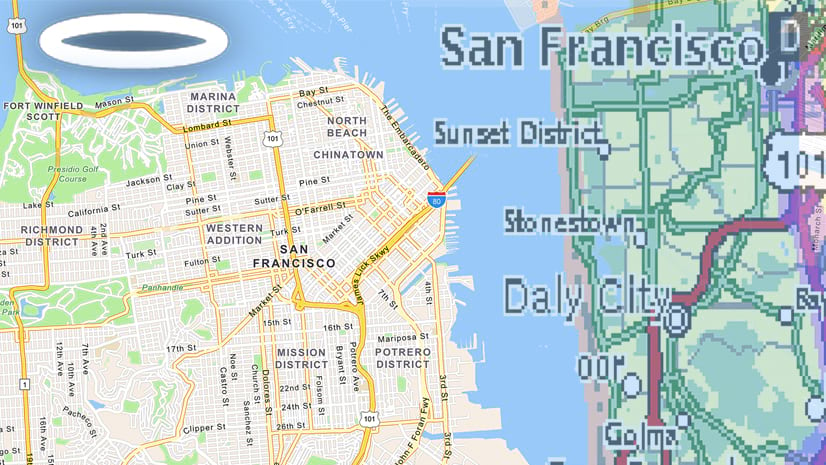
Take a look at one of our basemaps. Zoom in and out and stop to analyze what you are seeing at each scale. By definition, a basemap is something in the background, so when we are building it, we want the information to transition in a way that doesn’t draw your attention. We’re not always successful (we are limited sometimes by the data available), but in most cases we do a pretty good job. So how do we get there? Let’s look at what we are dealing with first:
The Structure
Most multi-scale maps are made up of 20 or more separate layers (Our Web-Mercator basemaps have 23). At each stage the scale is doubling, so that it takes the map from a world view to individual buildings (if the data is good enough).

Two things to watch out for as you prepare your data and map content:
Complexity
Chances are you don’t want, say, a coastline to have the same level of detail at Zoom 1 as you do at Zoom 10. You can if you want! – Screen resolution will deal with some of the issues at Zoom 1, but a country like Norway may be a bit overpowering if the fjords are filling in. Add to that problems with over-complex data that may affect the refresh-time.
The alternative is to cycle through different levels of generalization at different scales, but this may double or triple the number of layers you have to introduce. Have a look at one of our basemaps again, this time in the Vector Tile Style Editor (‘Layers’ view), to see how we deal with it. A lot of features exist on multiple layers with different scale ranges. It makes the structure very confusing if you haven’t worked with it before, but it’s the price of getting us the look that we want.
Density
Some features may benefit from being introduced gradually as the scale increases. With cities, for example, you want the important ones to appear first, and smaller ones to reveal themselves progressively as you zoom in. You may be able to do this with one set of data if you have enough control over it. You want the reveal to be smooth and gradual, so you may want to spend some time building that level of control into the data (In our basemap data we add a field so that we can score items based on the preferred intro zoom level).
The Style
You have worked with the data to give you the level of control that you need (or you have decided where you will make compromises), so it’s time to start attributing it.
For this exercise I’ve used the Vector Tile Style Editor to build a multi-scale version of the product shown above, the National Geographic Road Atlas. Many years ago I was part of the team that designed and built the first edition, so I know it well!
The order in which you build something like this is completely up to you. Some of us prefer to start at small scale and zoom in, and some prefer to go from large to small. One thing that may help is to identify a few key scales, establish their ‘look’, then figure out how to transition between them.
In this case I used the 3 styles of map in the Atlas (State, Metro and Downtown) as my starting point.

 -based basemap, showing equivalent State, Metro and Downtown designs.")
Having set those up at different scales I worked out my transitions.
My first compromise: Discrete colors for city polygons, used in the Road Atlas, are not included in my map. Primarily this is because we don’t have the data available in the basemap’s vector tile package. I could add it as a separate layer, but it would complicate construction, and it is not as critical in the online map. It is not trying to put a focus on specific cities.
‘Transition’ is the key word for the next stage! You may not be able to avoid a feature suddenly appearing as you zoom in, but there are ways of softening the blow.
Fade a color in (or out)
Sometimes it helps to introduce a feature a scale or two earlier than your functional requirement. Start at a color just slightly different to the background, then strengthen it progressively.
In ArcGIS Pro that means setting up alternate symbols and scale ranges. If you want a completely smooth progression you will need to set up a layer for each scale/zoom level of the transition. You may be able to compromise – maybe every other zoom level will be enough. For a single symbol, you will need to set up duplicate layers, adjust the scale ranges so that they appear in sequence, and change the color value on each. With the ‘unique values’ or ‘quantitative’ values’ options, you can set up scale controls in ‘Symbology’.
If you are working with Vector Tiles, use the Style Editor to establish control points (‘stops’) and the color will adjust automatically between them.

Increase line weights
This is something of a necessity.
At very small scales, a road, for example, may be little more than a hairline. By the time you are into the very large scales, you may be matching it to the width of the real feature. At small scales, a single line might suffice for a boundary. At larger scales, as other features crowd in on it, you may need to reinforce it with a background ribbon/tint band.

Labels
The jigsaw’ method of placing labels demonstrated in the first graphic is definitely not an option here! Even with higher resolutions, labels need to be bigger than they are in print maps. 9px is a good target-minimum size, and 7px is an absolute minimum. (In my road atlas days at Rand McNally it was not unknown for us to use 4.5pt labels on printed maps).
Multi-scale gives us other options though. Provided your data is flexible enough, you need only introduce a label when it fits comfortably with the features around it. Then you have the opportunity to increase its size as the map zooms in. As my sample map demonstrates, you don’t need, and shouldn’t use, anything like the density required for a printed map – there is always a larger scale that will show a label in a better context.

Transparency
Transparency can be very effective tool in this context, but it needs to be used carefully. As the symbol appears, you can set a high degree of transparency (low opacity), and adjust it as you zoom in. Watch out for how the symbol reacts with other features. It may not work well with area symbols if polygons overlap, but it can be used to add some subtlety to line and point symbols.

Now, use a combination of all 4 of these – color, line width, label size, and transparency, to create that smooth transition…
But what about a legend?
That’s a tricky one! Consider first that it is an online map, and your aim should be to build it in a way that functions without a legend! It can be difficult, but many online users make no effort to go looking for information away from the first view. As far as possible, your symbolization needs to be self-explanatory.
But even if the map is crystal clear, you should probably have a detailed description somewhere. Most likely that is a legend (There are alternatives, such as explanatory pop-ups or descriptions in accompanying text). If you do have a conventional legend, it may be that a change in the symbol is not enough of an issue for you to accommodate it.
Your legend may change with the scale, but it’s not essential that it does. For example, a legend item for the ‘major road’ symbol shown above, may only need one representative item. Width changes will not be perceived if you have designed the symbol carefully, and a change of symbol at different zoom levels may be more understandable when seen in context.
However, if you must, you can try building a multi-symbol entry. Unless you are really picky you don’t need to indicate scale range:

Beyond Basemaps
I’ve used a basemap here to demonstrate the concept, but the same applies to all aspects of building a multi-scale map.
You can use these methods to adjust your subject information by scale, allowing it to ‘breathe’ a little. Here is a map from Emily Meriam showing hurricane tracks. It is an example of how you can increase the effectiveness of symbols as the space opens up on a multi-scale map.
Also, you have the option of focusing on different aspects of your story at different scales. Here is an example from Esri Demographics using appropriate scale ranges to show US quantitative data at State, County, Tract and Block Group levels.
A note on the Web Map:
The basemap layer was converted from Esri’s Navigation Basemap with the Vector Tile Style Editor. It is combined with Esri’s World Hillshade layer using the ‘multiply’ blend tool. The World Hillshade Layer uses the ‘Hue Rotate’ Effect to adjust the color to something like that in the original Road Atlas.


Thank you for the process overview of creating a multiscale map and the resources. The NGRA map is very attractive and the Vector Tile Style Editor is a very rich resource. Is there a way to transition the projection on the zoom level and location? For instance, starting off with a equal area projection showing CONUS and then when zooming into Florida, you would get a Florida State Plane or if you zoom into California, you would get a California State Plane. If one was sticking with one projection, have the central meridian change to the State or country. Thanks.
Hi Brian. Sorry – There is no way of transitioning projections at the moment. I’m not aware of any plans to introduce this in the immediate future, but I’ll pass your query on.