Just because you can’t see evapotranspiration doesn’t mean you can’t map it. In fact, the Living Atlas of the World has long contained data about average annual evapotranspiration for the United States. Today that map is being deprecated and replaced by two global versions that show evaporative losses everywhere on Earth.
Evapotranpsiration is the measure of evaporative losses from the landscape. It includes both direct evaporation from lakes and soil, and transpiration, which is when plants take water up through their roots and release it from their leaves. Over 61% of rainfall is lost to evapotranspiration, so mapping its variance is an important part of understanding the global water cycle.
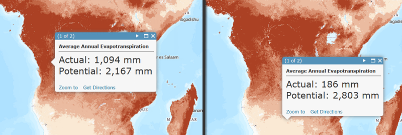
Potential evapotranspiration is the amount of evapotranspiration that would occur if water availability were unlimited. It is a meteorological variable that depends only on air temperature and solar radiation. So, for example, Scotland and Norway have a lower rate of evapotranspiration than the Congo, despite receiving just as much rain, because potential evapotranspiration is lower. There is not enough solar energy to vaporize all the water. Conversely, the Sahara Desert has a very high potential evapotranspiration, but receives little rain, so actual evapotranspiration is low and the unused solar energy heats the sand to over 170 degrees Fahrenheit. In the Congo River Basin, there is high potential evapotranspiration and ample precipitation, so less of the potential goes unused. The result is high actual evapotranspiration and a much more humid climate with abundant plant life.
These layers were built using the MOD16 Global Evapotranspiration Product, which is derived from satellite imagery by researchers at the University of Montana. Imagery is from the Moderate Resolution Imaging Spectroradiometer (MODIS), an instrument with 1-km resolution first launched in 1999 and carried by two NASA satellites. The MOD16 algorithm derives from raw imagery a number of secondary data products like land surface albedo, leaf area index, and net solar radiation. These intermediate data are used to solve the Penman-Monteith equation for total daily evapotranspiration, which is then aggregated into 8-day, monthly, and annual intervals. We calculated the average annual evapotranspiration over the 15 year period of record (2000 – 2014), both in terms of actual and potential ET, in order to build the layers above. If you want to access the monthly data, a toolbox you can use is available here.
What can you do with this data?
These layers are image services, so they can be used as input by your geoprocessing tools in Desktop. The “Zonal Statistics as Table” tool is particularly useful for calculating evaporative losses over a watershed, which is the first step towards calculating the water balance. If you subtract annual evapotranspiration from the annual rainfall you have a good estimate of available water, the sustainable supply of a watershed that must be split between human use, freshwater ecosystems, and groundwater recharge. For visualization purposes there is also a cached version of this map that has a hillshade burned in. When combined with the Hydro Reference Overlay it can be used to create a particularly beautiful basemap.


Commenting is not enabled for this article.