This is part one of a three-part blog extravaganza where I lay out how you might whip up a fantasy-style book-ish illustration-y map insert, in ArcGIS Pro. This technique, which is a total hack (but what isn’t, ultimately), can get you cranking out quill-scratched oak ink on parchment map inserts all in the cozy digital confines of your GIS.
If you’re feeling brave, download the source ArcGIS Pro project and follow along. You might even tease out the content of the next two blog posts.
There are three elements to this aesthetic: Mountainification, Sketchiness, and Texture. We are about to embark on an unexpected journey of Mountainification.
Mountainification is just a simple hijacking of the Vector Field symbology family. Applied to raster images, it is intended to be used as a handy shortcut for making those cool wind, weather, or current maps, covered in directional graphics. It’s a delicious Raster Function that eats up continuous raster surfaces and spits out awesome weathery sorts of maps.
But why constrain ourselves to the intended use of a tool?
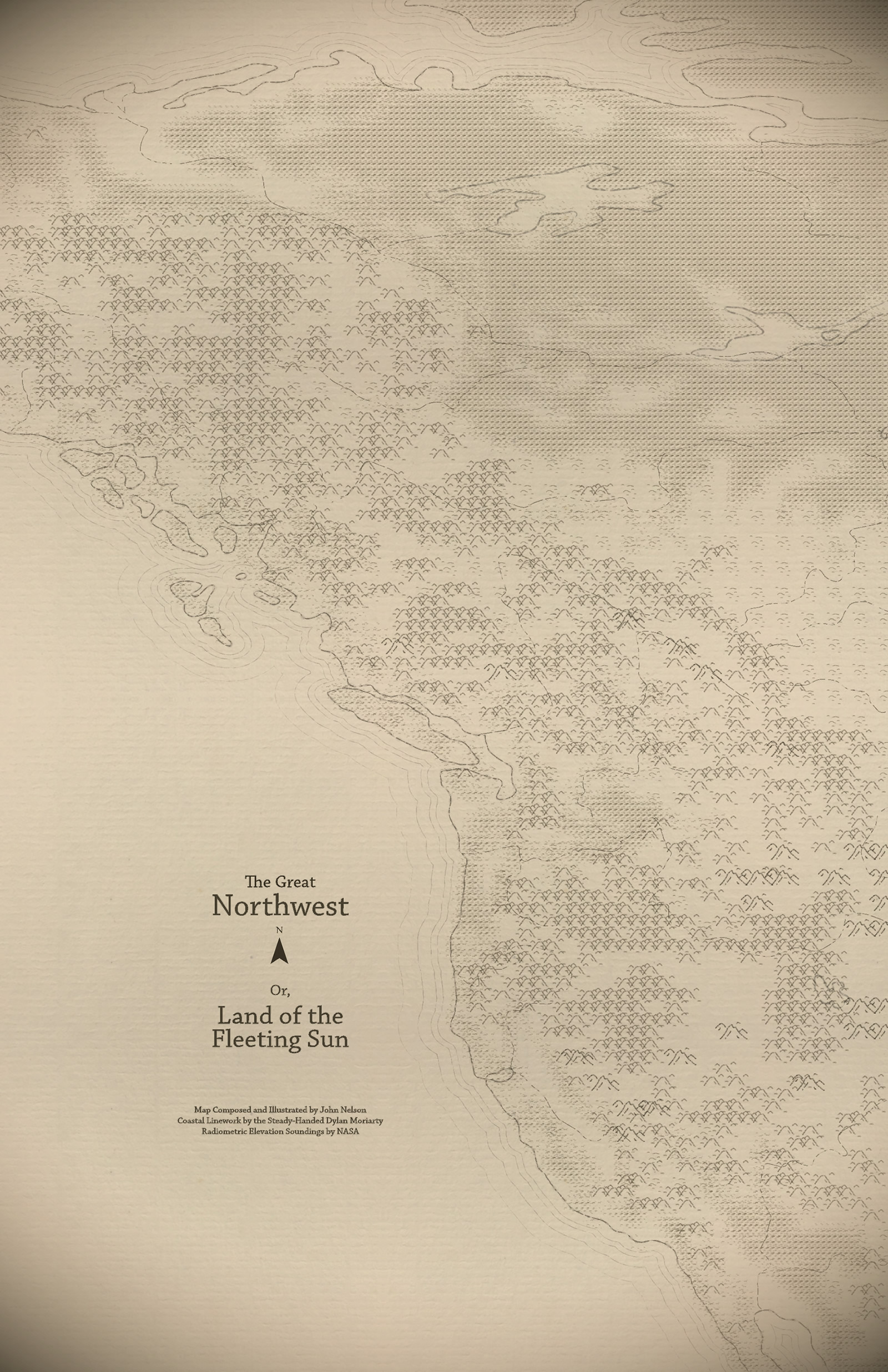
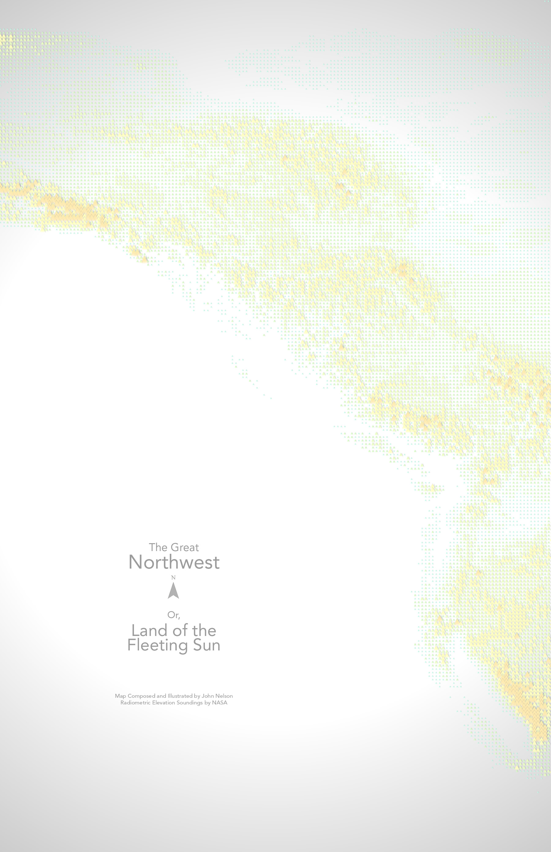
Here’s a Digital Elevation Model of The beautiful Pacific Northwest…
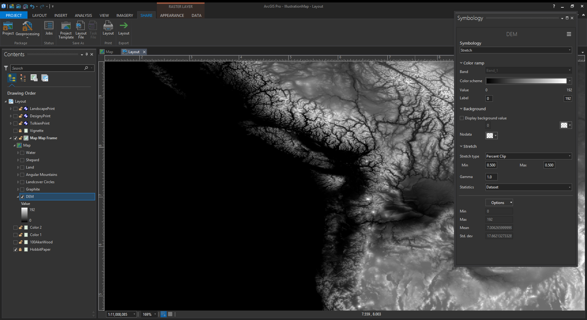
I like to play with all sorts of hacky ways of visualizing DEMs. I’d never tried out a Vector Field symbology before, though. But it’s right there, nice and easy…
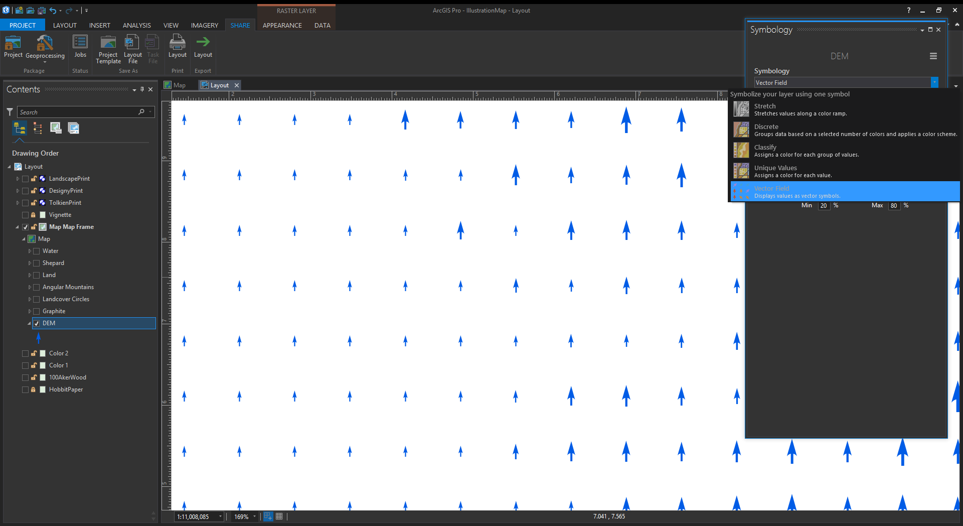
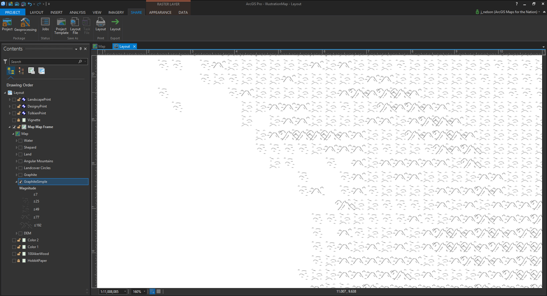
Oh wow, it worked. There is an array of symbols where there was once a DEM. There’s a “custom” option that breaks out the symbols into ranges of, in this case, elevation. This is promising…
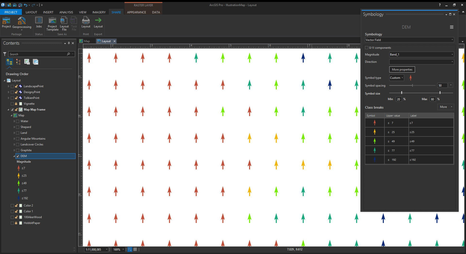
You can adjust the size of the symbols via a slider so that lower values look one way and higher values look another. Standard thematic mapping stuff. But what’s up with that “Symbol Spacing” slider…
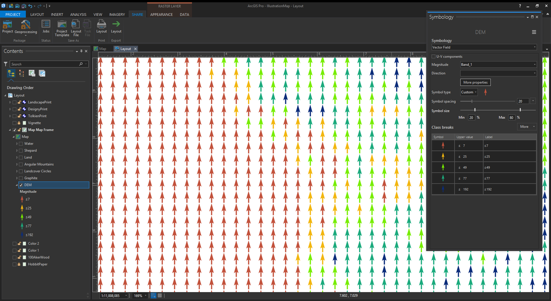
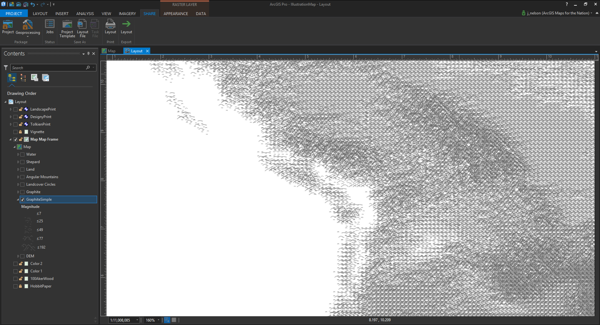
Hey now! The density of the vector field is increased so the symbols are packed in tighter. This is sort of reminding me of the early GIS use of ASCII characters to denote elevation. GIS has a rich history of creative hacks. So if turning up the density was good. Why not turn it up to eleven?
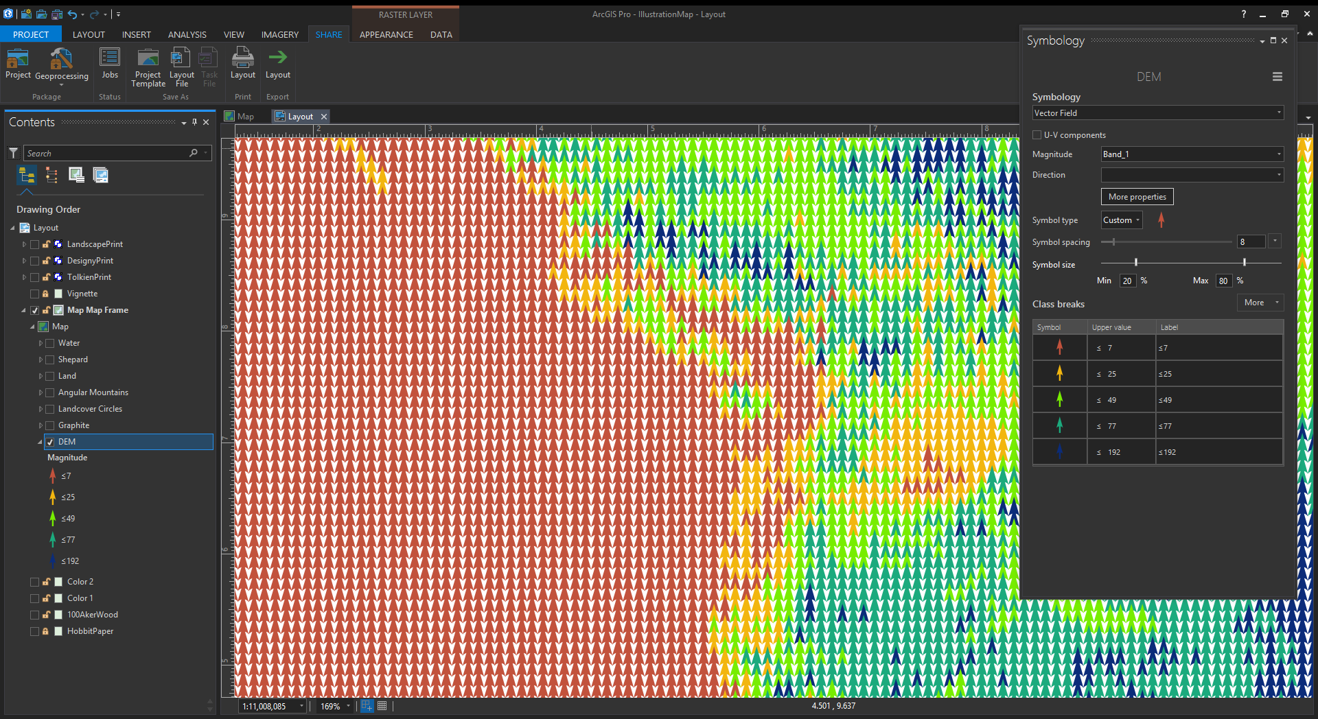
Behold! What have we awakened?? What ancient abomination have we uncovered from the depths of our vain pursuits of cartographic plundering? What madness is this?
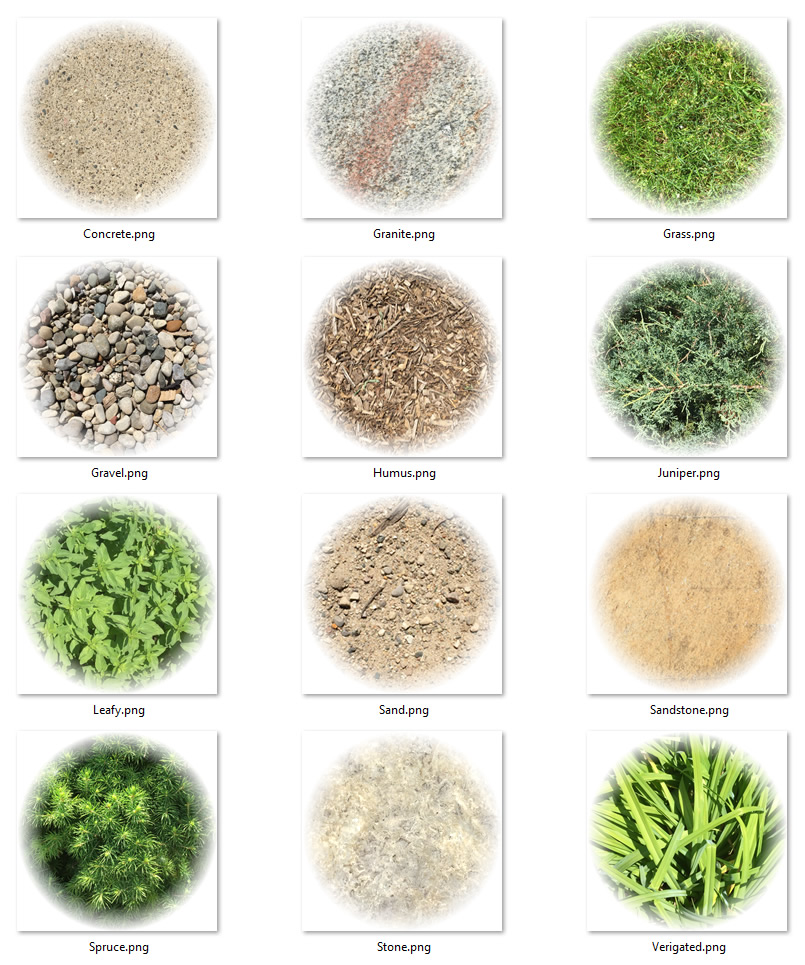
Ok, this method has some wheels. Time to roll up our sleeves and craft some symbols. Of course, we will obviously use this method to try out a Tolkienesque fantasy map. Here is a set of landcover graphics I hastily drew in Illustrator…
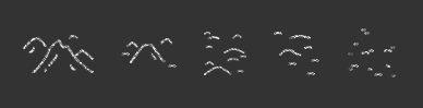
You can download these symbol images here. So, instead of the default arrows or whatever, you can click on the symbol and choose “Picture Marker.” I drew the picture symbol white (with a transparent background) because if the symbol is white, you can tint it to whatever color you want in ArcGIS Pro. Mega flexibility.
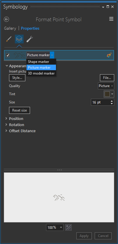
So, you just upload a picture marker corresponding to each range of elevation. Then you play with the symbol spacing to get something that looks reasonably somewhat slightly tangentially like the unknowably brilliant JRRT might have scratched it onto some parchment.
And the beauty is that it re-samples at any scale as you zoom in and out!
One drawback to this method is that the vector field will, by definition, result is a pretty regimented pattern. This regularity breaks up the hand-drawn effect a bit, but you can add some variation by copying many versions of the layer and vary their symbol spacing. Just play with it.
Generally, the larger the symbol spacing, the more grid-like your map will be. You can embrace that effect and make something like a Mario-style map if you like (you’ll get to draw some Mario landcover class symbols, which is not a bad way to spend an hour).
Or you can make the symbol spacing really small, and get a heavily-overlapped texture appearance. Each is fun. As with all of cartography -it’s a balance.
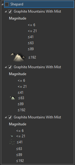
Here’s a version that is an homage to the great illustrator E. H. Shepard. As a map-person you are likely most familiar with his cartography of the fantastical domain of Christopher Robin’s 100 acre wood. In this map I used a finer paper stock, with slightly yellowed edges, and symbols that appear to be hand-tinted over a black print.
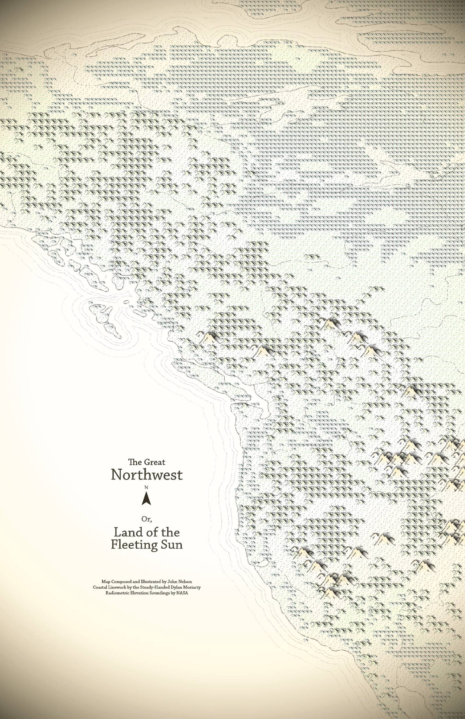
Could these symbols have been more Pooh-like trees or tufts of grass? Absolutely. And I think you should try that. In the meantime, you can use my shaded mountain symbol.

Remember, the whiteness can be keyed to a tint color in Pro. So in the symbology panel you can assign a range of colors based (and symbol sizes) on your DEM elevations. For this map, I separated the elevation ranges into a few layers so I could make their symbol spacing varied, and therefore less grid-looking. I also skipped some elevation ranges because in fantasy maps you make the rules.
There’s no reason you have to make your mountain features look hand drawn or even fantasy-map-ish at all. You can use this hack to make any sort of elevation -derived symbol map. Here’s one with simple triangle images, tinted and sized by the vector fields’ ranges of elevation.

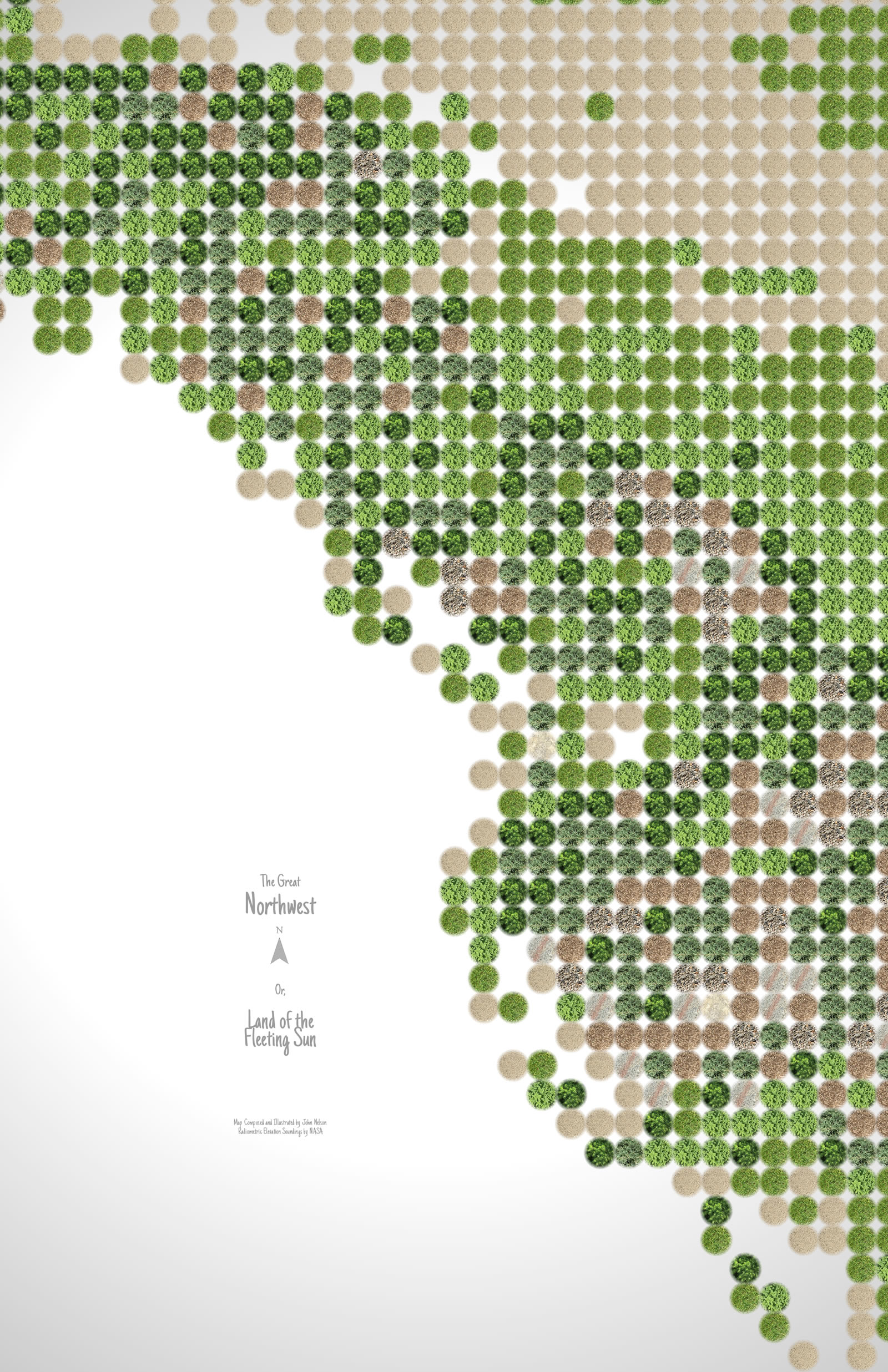
But who says you have to use drawn symbology or anything that resembles mountains? In this case, I walked outside and snapped some pictures of various beautiful surfaces of nature. You can download them here.
Which, when applied to a vector field of elevation, look a little like an architectural landscape plan or zen potted plant garden (it actually reminds me a bit of flying over central-pivot irrigated fields).
Ok, that was Part 1 for making fantasy illustration maps. We went over how to hijack the perfectly good and reasonable intentions of the “vector field” raster symbology option for our own crafty mountainification purposes. We the vector field symbology to a DEM layer to create a scale-independent mesh of landcover drawings by using picture symbols for the ranges. We learned about the visual impact of symbol spacing and sizing, and played with tint. We then got wild and tried the method out on some other images just for the sake of adventure.
In Part 2, I’ll talk about ways to make your maps look like they were scrawled with tangible ink onto a tangible surface. Get ready to live.
Happy Mapping, John

Article Discussion: