Public transit (like buses and subways) serves the people of a community. It connects people with their jobs, schools, healthcare, recreation, and more. However, typical fixed-route transit systems serve only the people and areas within a short distance of transit stops. Many maps inadvertently over-estimate the area and people served by the transit system. This blog talks about why that is and what can be done about it in order to help everyone better understand their transit system.
Understanding who, what, and where a transit system serves involves answering some pertinent questions:
- Which parts of town are served by the public transit system?
- How many people (or jobs or facilities) are within a short walk of a transit stop?
- What are the demographic characteristics of the people with access to the transit system?
In previous posts, we introduced the GTFS specification for public transit data and some tools for working with GTFS in ArcGIS. In this post, we’re going to discuss some ways to answer these questions.
Use Service Areas instead of buffers
To find the area served by your transit system, the first thing you might be tempted to do is to create a quarter-mile buffer around the transit lines. Please don’t do that! People can’t just jump on or off the bus or train as it rolls along. They have to use the designated stops. If you buffer around the lines, you will drastically overestimate the area served.
The next thing you might be tempted to do is to create circular buffers of a quarter mile or so around your transit stops. Although this is a little better than line buffers, it’s still not great. After all, people usually can’t walk in a straight line in every direction from the transit stop. They are constrained, for the most part, to walk along the streets or sidewalks. If you have to zig-zag through a warren of streets, your quarter mile will be expended before you reach a quarter mile as the crow files. You might also run into geographic or man-made features in the way, like a river or highway with no pedestrian crossing. So, circular buffers around stops can also drastically overestimate the area within a short walk of each stop, and, in turn, the area served by your transit system as a whole.
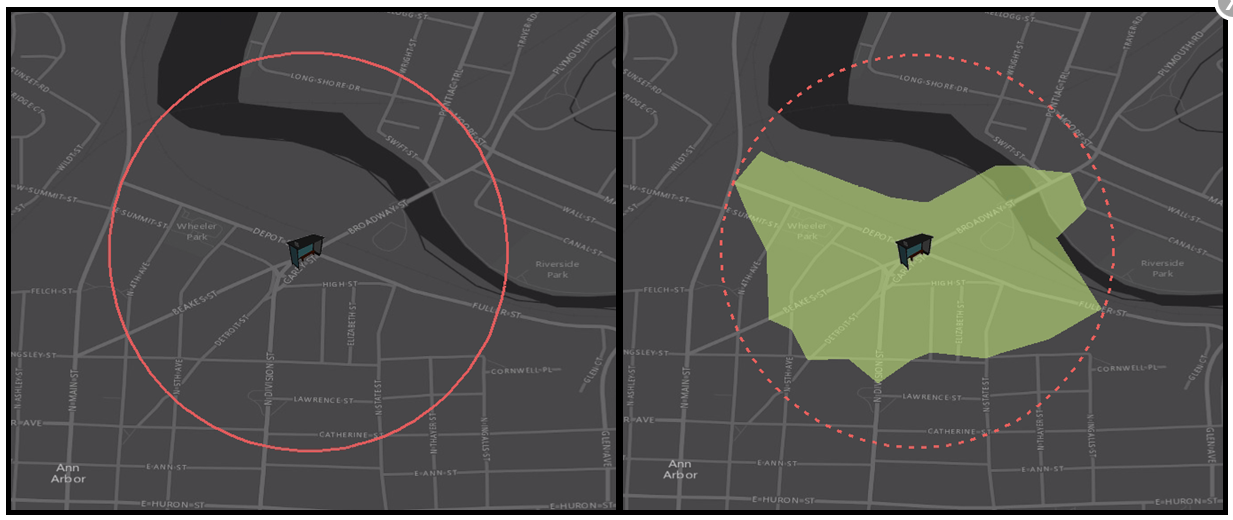
The solution is to use the Service Area tool. Service Areas, also known as isochrones or drive time polygons (or walk distance polygons, in our case) show the area reachable from a given location within a time or distance limit, assuming the traveler is constrained to a road network and subject to certain rules, like speed limits, oneways, or roads closed to pedestrians. If you calculate a Service Areas around each transit stop in your system, you will achieve a much more accurate estimate of the area served by your transit system.
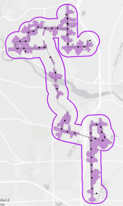
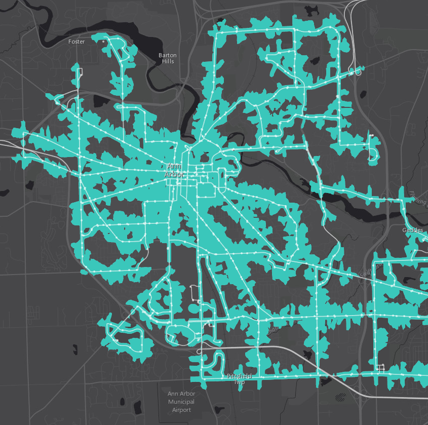
The image above shows a comparison of a quarter-mile circular buffer and network-constrained Service Area for a bus stop in Ann Arbor, MI. The image below shows Service Areas for all the stops in Ann Arbor. You can click either image to explore an interactive map.
To create Service Areas for your transit stops, you first need an accurate feature class of your transit stop locations. If you’re working with GTFS data, you can create a feature class of stops using the Display GTFS Stops tool in the Display GTFS in ArcGIS toolbox.
Once you have your stops, you can use ArcMap, ArcGIS Pro, or ArcGIS Online to calculate Service Areas around the stops (in ArcGIS Online, it’s called “Create Drive-Time Areas”). Read through the documentation and tutorials linked here to learn how to set up and run a Service Area analysis with the appropriate settings.
Incorporate demographic data
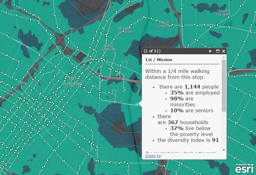
Once you have calculated the coverage of your transit system, you can do some demographic analysis to find out more about the people served by the transit system. The Enrich Layer tool in ArcGIS Pro or ArcGIS Online makes this particularly easy. You can choose from hundreds of demographic variables from Esri’s extensive demographic content, and the tool will summarize this demographic information for whatever polygons you feed it (like your transit system’s Service Area).
Actually, if the only thing you’re interested in is the demographics of the populations within a walk distance of each stop, and you don’t care about visualizing your transit system’s service area in a map, you can just enrich the stops directly without generating the polygons first. The Enrich Layer tool will calculate Service Areas on the fly if you choose “Walking time” or “Walking distance” in the “Define areas to enrich” parameter.
That’s all for now. Check back later to find out how you can add further value to your transit system coverage maps by incorporating the frequency of transit service available.

Commenting is not enabled for this article.