 Sometimes a simple idea leads to something quite fascinating. Since its publication in 2013 I was inspired by Louis Spirito’s Baseball’s Many Physical Dimensions poster. The poster shows the relationship between the 30 Major League Baseball ballparks in the USA and provides a fascinating picture of how their spatial dimensions differ. Positioning them in the same imaginary location at the same scale was a great way to juxtapose each ballpark and create something visually interesting and informative. So how might this approach work for other sports? How, for instance, might it work for football (a.k.a. soccer) where the pitch markings at first glance appear consistent with one another?
Despite the apparent regularity of the markings on a football pitch they do in fact differ considerably in overall size because pitch length and width can vary within certain minimum and maximum dimensions. Then there’s the orientation as pitches can align to any point on the compass. The question, then, was…what happens if you map the 92 pitches of English and Welsh professional football clubs accurately and then overlay them? Would it create something interesting? Would most pitches be the same size? Would they overlay neatly or not? The result proved fascinating and the way in which the eventual map produced used remarkably simple techniques in ArcGIS for Desktop.
The first task was to generate a set of pitch markings as a line feature class in ArcGIS. I used ArcGIS Pro but this job is just as easily done in ArcMap. I chose the largest pitch (Nottingham Forest’s) as the template. The external pitch lines were built using Create Feature tools to draw a rectangle. The internal lines were then added using specific lengths of line or other known dimensions such as the radius of a circle defined by Law 1 of the Laws of the Game of football. Lines were trimmed, polygons split and unnecessary construction lines discarded to leave just the pitch markings.
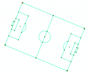
This set of lines were then grouped and could be copied and then positioned in place over a high resolution imagery basemap in ArcGIS Pro, zoomed into each of the 92 pitches in England and Wales. The grouped lines could then be rotated according to the correct angle of alignment for each pitch. With a bit of editing, the pitch markings are then modified to fit the specifics of the pitch in question. The key here is that editing required moving internal lines rather than just scaling all the lines. While external lines are different lengths, internal measurements are the same for every pitch. Snapping tools become incredibly useful while editing. Extraneous line segments at each corner were trimmed. Each pitch is different so each required manual editing of the pitch template to fit to the aerial imagery.
To build a graphic showing all overlayed pitches all of the 92 grouped sets of linework in the pitch marking feature class were selected and converted to graphics (this bit had to be done in ArcMap using Convert Features to Graphics). With them all selected they were then aligned horizontally and vertically (using the Align tools on the Draw toolbar) and…hey presto, they all sit atop one another, rotated around the centre spot.
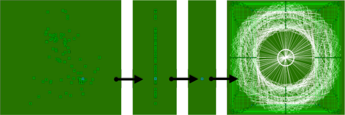
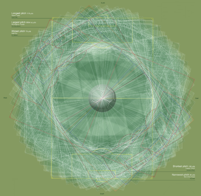
The pattern is similar to what you might get with a spirograph and the uniformity was surprising as there was no dominant orientation shared by the pitches. The final poster was created in a layout in ArcGIS Pro with the overlayed graphic positioned on the left with some pitches represented in different colours to show the largest, widest, longest, narrowest and shortest pitches. Pitch polygons were also added behind the main spirographic image. These were constructed using a set of rectangular polygons for each pitch intended to mimic the appearance of striped mown grass. They were converted to graphics and aligned in the same way as the pitch markings. Each pitch was displayed at 95% transparency to create the internal pattern of the overlapping mown grass. Just to be clear what sport is being represented in this abstract way, a football image was added to the same diameter as the pitch centre circle.
For the right side of the poster, it was simply a case of adding a map frame to the layout for each pitch, in order of area size, all at scales of 1:5,000.
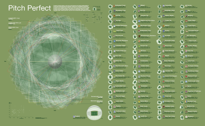
The use of small multiples and the addition of Ordnance Survey Open Map Local data to show the stadiums gives a sense of each pitch in isolation and in rank order from largest to smallest. The addition of the stadia shows that there really isn’t a relationship between the ‘big’ clubs and pitch size. It’s fascinating to see how some relatively minor clubs have large pitches and the game’s giants actually play on a smaller surface.
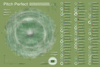
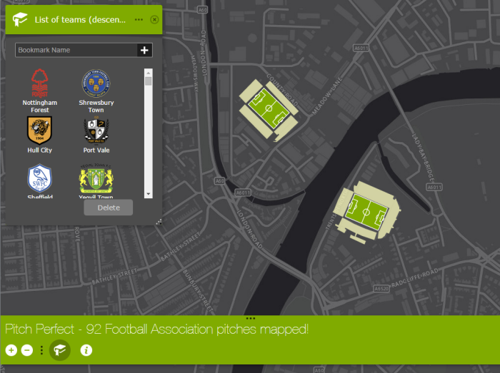
The final poster was completed with various text components to provide details of pitch dimensions and stadium miscellany, an explanatory paragraph, a pitch marking diagram and a scatter graph showing the relationship between pitch length and width. The full size poster is available as a download from ArcGIS Online here. There’s also a web version that simply allows you to use bookmarks to navigate to each of the 92 clubs here. and if you simply want to download and use the pitch marking data in your own projects then you can do so here.
This project started out as a ‘what if..?’ map experiment. Many do. It’s sometimes worthwhile re-thinking how spatial data of all types might be re-purposed in different ways to create something new and interesting. Happy map experimentation!

Article Discussion: