Introvert or extrovert? Dogs or cats? Beer or wine? Most things in life are actually not binary, but a spectrum. I am all for loosening up categories such as these, because often times my answer ranges from “somewhere in the middle” to “none of the above.”
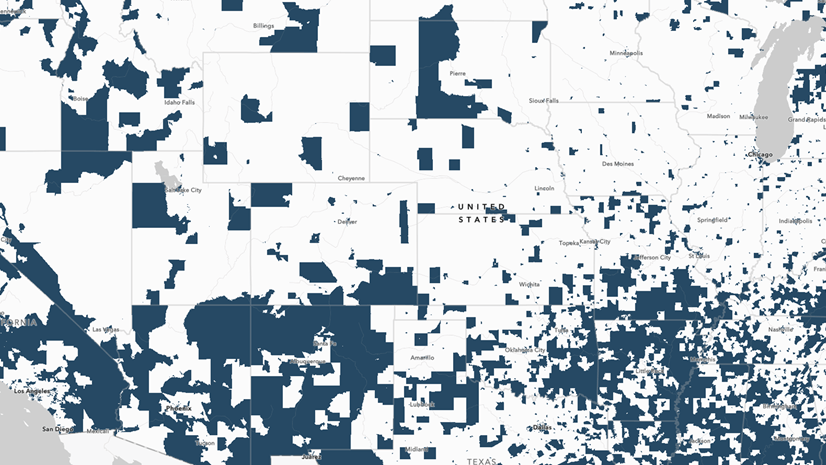
Some times though, binary categories are appropriate for two discrete categories such as approved or not, or completed or not. The Justice40 data from the Council of Environmental Quality classifies census tracts as disadvantaged or not disadvantaged across eight different categories, such as Clean Transit and Health Burdens. This information comes through in the attribute table as 1s and 0s: 1 if the tract is identified as disadvantaged, and 0 if not. This binary format is a data analyst’s dream. This blog post will walk you through ways to use this to your advantage, especially if you’re trying to use the Justice40 data in any kind of grant proposals to apply for funding.
Combining binary data with your own organization’s data
Many community-serving organizations who need funding have dozens if not hundreds of locations. These organizations can be anything from a large school district, to national non-profits like the YMCA, to a network of churches. For this example, we’ll use all the Catholic churches within the Diocese of San Bernardino. I created a feature layer of 101 points from a simple spreadsheet of addresses, and other information like the church’s website, and number of registered families.
Start by adding it on top of the Justice40 layers in Map Viewer Classic. There are too many locations for me to click on each one and view the pop-up. As an analyst supporting a grant application, I want a way to quickly identify which of the locations are in a disadvantaged tract, and I need that information to persist.

Perform analysis on the layer of churches by running Join Features. This will create a new layer of churches with attributes from the Justice40 layer joined to the attribute table.

The join can be based on either attributes or spatial relationships. In this case, the spatial relationship is simple: Intersects.
My resulting layer contains the 101 points of churches, now with a wider attribute table. The Justice40 attributes of the tract in which the church intersects have been joined onto the points layer.
How the binary format helps
The binary nature of the categorical fields will help us get quick statistics in no time.
See counts and percentages in field statistics
Let’s see how many of these churches are in tracts that have been identified as Affordable and Sustainable Housing Disadvantaged.
, calculate, or delete.")
The field statistics give us a sum and an average. With binary data formatted as 0s and 1s, that sum is the count we’re looking for. The average is the percentage. Well almost, it just needs to be multiplied by 100.
In this case, there are 18 out of these 101 churches located in a tract that has been identified as Affordable and Sustainable Housing Disadvantaged, or 17.82 percent of these churches.
, the sum of values (18), minimum (0), maximum (1), average (.1782), and standard deviation (.3846).")
The statistics I’m looking for are right there for me. From here, I can compare the eight categories and see which category has the highest count of churches located in disadvantaged tracts. Turns out, it’s Clean Energy and Energy Efficiency, with 36 churches. A close second was Training and Workforce Development, with 33. This can inform what types of Justice40 grants we might apply for, and what types of community services to build up.
However, the size of these churches varies widely. Let’s use that RegisteredFamilies field to learn more about the number of families attending churches in disadvantaged tracts.
Multiply and sum to answer more questions
How many families within this diocese go to a church in a disadvantaged tract? Within just a few simple calculations, I can find out. I’ll add an integer field named CleanEnergyFamilies, and calculate it by simply multiplying my RegisteredFamilies field with the binary field that contains data on whether or not the church is in a Clean Energy Disadvantaged tract. The binary nature of this field helps us out again here, since multiplying anything by zero is zero, and multiplying anything by 1 is itself.
Here’s a view of the two fields used to calculate the new field:

Now all I have to do is get the field statistics for my new field. There are 145,392 registered families among churches in a Clean Energy Disadvantaged tract. Doing the same thing for the Training and Workforce category, I know that there are 123,726 families registered at churches in a Training and Workforce Development Disadvantaged tract.
The beauty of binary data is that 0 and 1 add, average, and multiply with desirable properties for these types of calculations. I can’t do any of this if my data were stored as “True” vs. “False.” Statisticians and data analysts generally prefer 1s and 0s for the reasons stated above. The Justice40 layer has lots of binary attributes whose values are 1 or 0. This makes analysts’ lives a little easier, especially during stressful grant applications.
Take it further
If your organization has individual addresses of your constituents, you can use the approaches above to find out how many live in disadvantaged tracts across the eight different categories. Also, other analysis tools use proximity, such as creating buffers or drive time areas. Consider creating a small buffer around each site, say 2-3 miles or a 5 minute walk, and see whether any areas surrounding your sites fall into disadvantaged tracts. In this example, a church might not be in a disadvantaged tract, but could be just across the street from one.
Creating binary attributes
If you are in a role in which you create layers, consider creating binary fields when appropriate. Some ways I like to name these types of fields are either with an “is” prefix or a “flag” suffix. For example, if I have a points layer of hospitals, I can store binary information about which ones are teaching hospitals by using either of the following field names:
- isTeaching
- TeachingFlag
This can help when searching for field names, or programming against field names, if I know that every binary variable starts or ends with the same set of characters. It also helps communicate what this field is to others who may be using the layer. Go into more detail in the field aliases and descriptions, so that others have all their questions answered.
The beauty of binary data
This example highlighted churches, but could easily be applied to schools, libraries, hospitals, and more. While most things in life are not binary, some data such as the Justice40 “disadvantaged” categories are. When binary data is stored right, it can make analysis workflows a lot easier, or, dare I say, beautiful.


Nice article, thanks! I’ve created a field (String) in AGOL, and changed it’s settings to be binary. But it seems to continue accepting any values. How does one actually set up a binary attribute field and limit the inputs to the two desired values?