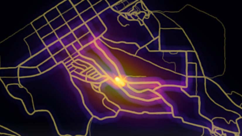
When people look at your map, what do you want them to notice first? Visual hierarchy is a design technique that lets people know which things on your map are important.
Which of the three maps below is best? That depends on which layer is the most important to the map’s purpose. Each one uses visual hierarchy to emphasize one layer over the others.

You probably already use visual hierarchy without realizing it: for example, if you made some map features a bright red color so they would stand out, or if you chose a gray basemap so it wouldn’t distract from your thematic data. However, the more you know about visual hierarchy, the easier it is to make effective and good looking maps.
Below are three short videos I made about visual hierarchy. In these videos I describe some of the more common visual variable principles, and share some techniques for how to use them in your maps.
.
.
If you want to follow along with the web maps shown in these videos, you can find them here:
The data used in these videos is from Halifax Open Data.

Article Discussion: