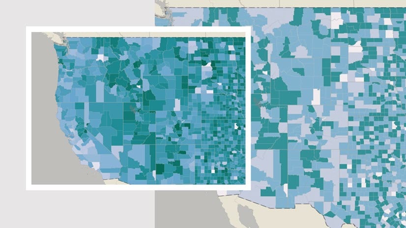
There are a lot of options for configuring choropleth maps. It’s tempting to just stick with the defaults and hope for the best.
 style options in ArcGIS Map Viewer")
But a little bit of experimentation with these options can really improve your map. So long as you have a clear sense of what your map’s goal is, you can make smart choices and great maps.

In the following video, I share five examples of choropleth maps made with a single dataset. It includes tips and techniques for designing maps with the Counts and Amounts (color) style in ArcGIS Map Viewer. Learn how to adjust a histogram, choose a color scheme, classify data, and, perhaps most importantly, assess how well your symbology works.
You can follow along with this video with the Maximum Building Height web map. The data used in the map and video is from Halifax Open Data.
If you liked this video, check out the others in the Quick Cartography video series:


Article Discussion: