This post was originally published on March 23, 2011, and has been updated. The last previous update was December 20, 2024.
Charts in pop-ups provide a visual, meaningful, and easy to understand way to display numeric attribute information. You can add pie charts, bar charts, column charts, and line charts to pop-ups.
For an overview, see Pop-ups: the essentials. This blog tutorial focuses on using pop-up chart elements, covering the essentials to enable you to get started.
Quick links
Use the links below to jump to sections of interest.
About the example map
The following sections use the Neighborhood Crime – Pop-up chart element examples map. Once you open the map, Sign In to save the map to your Content. You can also follow along without signing in.
Each pop-up configuration is presented in a unique layer within a group layer, with the layer name and title indicating how the pop-up has been configured.
Open the Layers pane from the Contents (dark) toolbar, open the group layer, then select and toggle the visibility for the desired layer. Click any feature to view the pop-up.
By default, pop-ups are undocked but can be docked to display more information. Click the Dock button in the upper right of the pop-up. Click it again to undock the pop-up.

To view the pop-up configuration, select the layer (a blue highlight bar will display along the left). Then click Pop-ups from the Settings (light) toolbar to see how the pop-up has been configured.
Note: Selecting and displaying the layer are independent actions, so make sure the current visible layer (the one you are viewing the pop-ups for) is also the selected layer to ensure you are looking at the correct pop-up configuration.

The example map focuses on crime statistics by neighborhood. The map contains five layers that are described below.
Default (not configured)
This layer has not been configured and can be used to follow along in this tutorial. The pop-up uses a Fields list element to display a list of fields and values.

Configuring charts in the layer pop-up can make this data much more understandable.
Random colors
An example of the default random chart colors. The random colors can be edited and changed. See sections below.

Single color
This pop-up chart is configured with a single color. This may be a good option over using random colors since it avoids confusing color use when exploring features in the map.

Predominant category matching color
This layer uses a Predominant category color style. When the same category fields are used for the chart, the colors will automatically match.

Chart media group
An example using a chart media group. Multiple charts, or multiple types of charts, can be added to a media group. Navigation is horizontal, using the arrows in the bottom right to advance or go back.

Tip: dock the pop-up so more of it can be seen.

Pop-up chart types
Pop-up chart elements support bar charts, line charts, and pie charts.
Bar charts are best used to show data in discrete categories. Spaces between the elements separate the values. Bar charts can be oriented vertically or horizontally.

Line charts can be used to show change over time or a progression. A line chart implies an inherent order, progressing from left to right.

Pie charts are effective for showing the parts of a whole. All the attributes shown in the pie should add up to 100 percent.

Add chart elements to pop-ups
Pop-ups are composed of different elements that are added and configured. To configure layer pop-ups, select the layer in the Layers pane in the Contents (dark) toolbar, then click Pop-ups on the Settings (light) toolbar.
Step 1 – Open the sample map and Sign In. You can also follow along without signing in.
Step 2 – Select the Default (not configured) layer. Ensure the layer is visible and selected.

Click a neighborhood to view the pop-up, the Default (unconfigured) layer uses a Fields list element to display attributes and values. In the steps below, charts will be added to deliver more meaning and reveal trends and patterns.
Step 3 – In the Settings (light) toolbar click Pop-ups.

Step 4 – The default Fields list element will not be needed, so it can be deleted. Click options (…), then Delete.

Step 5 – To add a chart element, click Add content, then choose Chart.

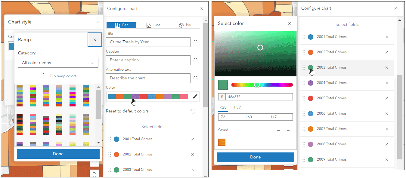
Step 6 – Configure the chart.
While each chart is different, the chart configuration pane is similar for each chart type. Bar charts are the default, but you can also choose Line or Pie charts.
a – Choose a title, caption, and alternative text for the chart (optional).
b – Click Select fields.

c – Choose the desired fields to populate the chart. In this example we will use the yearly count fields (2001 to 2010). A checkmark appears next to the selected field.

Click Done when finished selecting fields. When finished configuring the chart, click Done again. Note that you can hover over chart fields to view the names and values.

When you add charts to pop-ups, the appearance and default color scheme are determined by the chart type, how you configure the chart, and the layer’s smart mapping style.
Random colors are used in charts except when a predominant category style is used. With predominant category styles, the chart color will match the style colors if the same fields are chosen for the chart. Colors can be edited for all chart types regardless of layer style.
Step 7 – Change colors by changing the color ramp, or by changing individual field colors.
Step 8 – Add a media group by adding additional chart (or image) elements. Click the blue circle (+) from an existing media element to add another media element, which can be a different chart type or a chart using different fields. Note that media groups can also contain Image elements.

Examine the media group in the sample map to view an example of three charts: bar, line, and pie. These can be viewed by using the arrows for navigating the media group.

More information
For more information, see the following:
- Configure pop-ups (Help)
- View pop-ups (Help)
- Pop-ups: the essentials (ArcGIS Blog)

Commenting is not enabled for this article.