By Mamata Akella, Esri Design Cartographer, and Kenneth Field, Esri Research Cartographer
Online web mapping is fast becoming the de facto format for authoring, sharing and publishing authoritative geospatial information. With the introduction of platforms such as ArcGIS.com as well as Esri’s JavaScript, Flex, and Silverlight APIs, the mechanisms to create high quality web maps are in place and provide extensive tools for the design and production of great online content. As several members of the Mapping Center team played a significant role in the design and production of this map, we would like to begin telling you about the new Esri Canvas Maps. In the first of two blog entries we share with you the idea behind Canvas Maps: a new set of online basemaps specifically designed to give users a neutral ‘canvas’ on which to better display data. Here, we explain the philosophy behind the cartographic design of the Canvas Maps. In Part II we will illustrate some specific ways in which you can use the new Canvas Maps effectively.
Online mapping places demands on basemaps to provide the backdrop to user data and the operational overlays they want to map. Basemaps should provide a way of supporting communication of operational overlays which, in turn, is crucial in supporting effective delivery of the map’s message. From a designer’s perspective the goal is this: make a visually compelling map that tells a story about a place or a theme of information and that most importantly, helps its user’s understand the story being told. This is a core concept in designing maps whether they are for print or web and Canvas Maps are an exciting new way in which user data can shine more brightly.
In any map, the graphical structure of the map content goes a long way to determining how effective the map is. We achieve that by varying the relationship between a figural component (the foreground of the map) and the background contextual detail. We might also establish certain hierarchies amongst map components, modify symbols to make certain ones more visible in the composition or we might visually contrast certain components to modify a component’s visibility. This is often a complex iterative process and usually requires full control over all the layers of data to organize them effectively.
With online maps we’re often using a published basemap service which we have very little control over. Esri publishes a range of basemaps to support online web mapping. Many of these have been used very successfully but they do not function for all mapping needs. This limitation means many web maps contain too much information that competes for visual attention which makes it difficult to see all of the interesting patterns in the operational overlays. Not every theme of information is meant to be mashed-up with a street map or a topographic reference map both of which have specific uses. Canvas Maps are different in that they provide a way for users to build better graphical structure into their maps simply by using a different type of basemap. The cartography of the basemap has been designed to be subtle and provide a more effective basemap for operational overlays to shine. Let’s take a closer look over at the basemap deli counter and see what the new Canvas Maps look like.
Less is more…by design
The fundamental idea behind Canvas Maps is that less is more. Excluding information by design provides a true canvas from which you can start working. By using fewer colors as well as displaying and labeling fewer features, we’ve built into the basemap a way to support improved figure-ground relationships and visual contrast in relation to the operational overlays. The figure (important map object or theme) is reserved for your information while the ground (less important object or theme) is the basemap and this has the important function of drawing more attention to the map’s main theme. Because the colors in the first of our new Canvas Maps are toned down and based around a light gray palette this also assists in creating effective visual contrast between the basemap and operational overlays.
To illustrate this concept, figure 1 shows the Global Distribution of Seagrass overlaid on the World Street Map basemap (right) compared to the same data (and same symbols) overlaid on the new Canvas Maps Light Gray edition. With Canvas Maps Light Gray (left), the distribution of global Seagrass is clearly the” figure” and the base information sits unobtrusively in the “ground” while still providing geographic context to associate with the theme. There is a much improved contrast between the operational overlay and basemap which supports legibility. In contrast, Seagrass distribution lacks legibility and visibility on the World Street Map (right) because the basemap simply isn’t suited to display the data as it is too detailed and colorful.
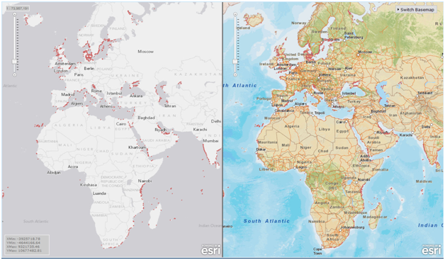
Figure 1: A comparison view of global seagrass distribution overlaid on Canvas Maps Light Gray (left) and World Street Map (right).
Figure 2 illustrates how we’ve drastically decreased the amount of content on Canvas Maps in comparison to our other online basemaps like the World Topographic Map. At each scale, we carefully selected colors, features, and labels that would provide a subtle background on top of which thematic information would ‘pop’; a term we use to describe how operational overlays can be made to be vibrant and immediately seen by the user.
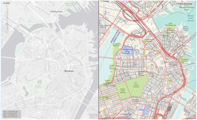
Figure 2: Feature and label density are greatly reduced with Canvas Maps
Canvas Maps still contain a lot of contextual detail though. They contain administrative boundaries, hydrography, transportation, and cultural features yet the detail has been carefully stripped down to the bare minimum to provide a relevant contextual backdrop for overlaid data. Figure 3 illustrates which basemap layers are used at a particular scale level. You’ll note that up until the caching scale of approximately 1:144,000 we do not include many local area features which supports thematic (particularly statistical) map design at mid and small scales. The feature and label content that is added at larger scales is symbolized in a subtle way so the basemap continues to serve as a canvas but with greater detail to give context to larger scale map of a local area (figure 4).
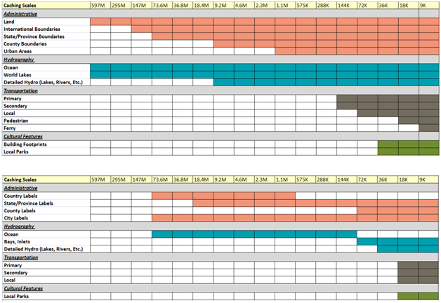
Figure 3: Feature and label patterns at each Canvas Map caching scale
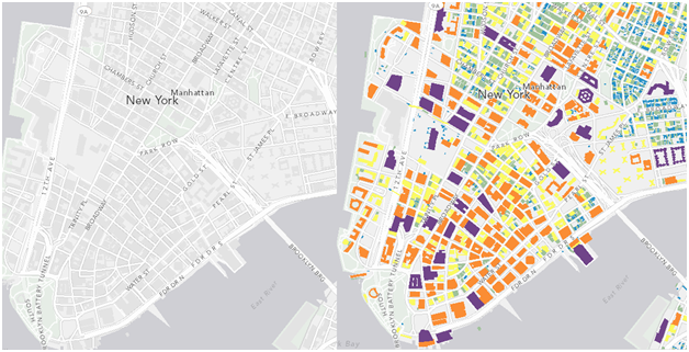
Figure 4: More content is added to the basemap at larger scales but symbolized in such a way to still support the effective depiction of operational overlays.
Canvas Map Light Gray uses a predominantly monochromatic color palette. By designing the map this way, we are promoting visual contrast between the basemap and operational overlay by design. By taking this approach we have opened a wider range of color space for use in operational overlay design. Quite simply, users have more colors to work with without fear of creating a clash with those on the basemap. Our blog post Designing Operational Overlays for the ArcMap and ArcGIS Online Basemap is a great resource to learn more about basemap and operational overlay design which discusses this philosophy. The Light Gray Canvas Map works particularly well with operational overlays that are symbolized using colors that are higher in saturation and/or lower in value. Such maps are clean and modern in appearance and work particularly well online to create eye-catching visualizations of your data.
Canvas Maps Anatomy
In a previous blog post about the Map Sandwich we described the release of our Terrain with Labels service on ArcGIS Online and how the design allowed you to insert data between a basemap and the textual components provided as separate services. Canvas Maps are also a type of Map Sandwich. The bottom map service depicts land, water, administrative boundaries, and labels for all features other than cities. The top map service holds city labels with thematic information (your operational overlays) sandwiched in between these two services – hence the sandwich metaphor. Consider the Canvas Maps as a development of a new range of artisan sandwiches…a sandwich for the connoisseur now available at the Esri basemap deli counter
Using this pattern, there is always geographic context associated with the operational overlay. Figure 5 is an example of the Light Gray Canvas Map mashed up with votes from the Esri FanMap Bracketography Edition web map application. Not only are we able to clearly see the patterns in voting due to the use of the Light Gray basemap, we also see voting patterns by city because the city labels sit on top of our theme.
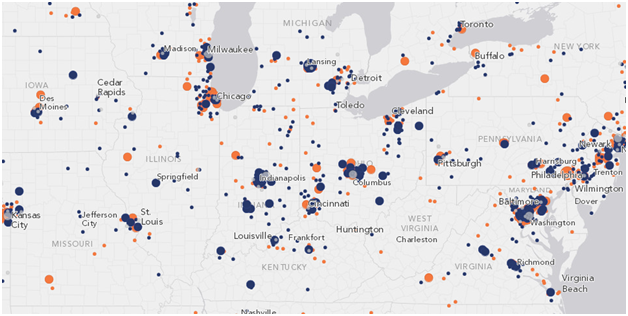
Figure 5: Canvas Map Light Gray as a new artisan styled map sandwich
One of the main uses for the Canvas Maps will be to support improved online thematic mapping for which topographic detail is rarely required. Statistical maps are often most useful when the basemap recedes into the background. The ability to show choropleths, proportional symbols, dot maps and other common thematic detail will be greatly supported by the ability to do so using the new Canvas Maps.
Availabilty
Currently, Canvas Map Light Gray covers the world to the caching scale of approximately 1:2,000,000. Coverage extends in North America to approximately 1:9,000. Over the next few months, we will add more coverage for the world to align with our other ArcGIS Online basemaps.
This web map will be added to the basemaps available in the ArcGIS.com map viewer and ArcGIS Explorer Online soon. Simply click one of those links to launch the interactive application of your choice, and then choose Light Gray Canvas from the basemap control to start using this service. In the meantime you can access Canvas Map Light Gray here. In the near future you will also find this service in the basemap gallery in ArcGIS Explorer Desktop and ArcGIS Desktop 10.
As we mentioned at the outset of the blog, Canvas Maps is a collection of maps and Light Gray is the first release. We are currently working on Canvas Maps Slate edition which many of you might have seen in some of Mapping Center’s recent web map applications including our Super Bowl FanMap and our FanMap Bracketography Edition. Canvas Maps Slate will follow the same design philosophy as Light Gray. The only difference between the two maps is the color palette used to symbolize the map to create a dark backdrop in support of those who wish to explore a more radical design approach. Figure 6 gives you a sneak preview of Canvas Maps Slate.
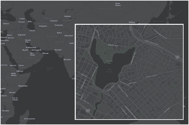
Figure 6. Forthcoming Canvas Maps Slate Edition showing small and large scale excerpts.
The best maps are about… the theme being mapped. For most themes, less is actually more and the basemap should be a support to the map, not detract from its ability to communicate. Canvas Maps have an elegant, clean and minimalist design that enables users to build, share and publish high quality web maps with a fresh appearance; and one that fundamentally supports figure-ground and visual contrast out-of-the-box. Let us know how you get on with this new basemap and look out for Part II of this blog that explores ways of using the Canvas Map Light Gray Edition to support your cartography.
Canvas Maps are created by Mamata Akella, Wesley Jones, Andrew Skinner, Corey LaMar, James Shimota, Jim Herries and Robert Jensen.
This project was a new venture so we got a lot of support from many others including Clint Brown, Allen Carroll, Charlie Frye, Deane Kensok, Kenny Ling, Damien Demaj, Kenneth Field, Bern Szukalski, Aileen Buckley, Tim Daly, Laurie Fitzpatrick, Elena Bulat, Carla Wheeler, Craig McCabe, David Asbury, Ginger McKay, Rupert Essinger, Keith Mann, Lisa Thouas, Maria Lomoro, Mark Smithgall, Owen Evans, Victoria Kouyoumjian and Vivek Gupta. Thanks!

Article Discussion: