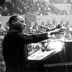
 In recognition of the theme of the 2017 Geography Awareness Week—the geography of civil rights movements—and because I wanted to further experiment with what our Story Maps team calls “cartobiographies”—we recently compiled a story on the life of Dr. Martin Luther King.
Our team frequently prepares story maps with considerable customizations and/or maps that have been compiled in ArcGIS Pro. For this story I wanted to demonstrate that effective stories can be created solely with our standard storytelling tools and the ArcGIS Online map viewer.
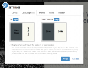
I chose the Story Map Journal app; it’s the most popular of our storytelling apps. I wanted to give the story a distinctive look, so I opened the “Settings” menu within the Journal builder and, in the Layout options tab, opted to have the side panel on the right, and to make it large, which splits the browser window 50-50 between side panel and main stage. I find the wide side panel to be especially appropriate if I’m going to be using rich media within the side panel, and if my main stage maps don’t require a lot of real estate for effective viewing.
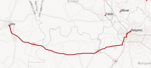
I chose the “Newspaper” basemap, available on the Living Atlas of the world, to give the story a monochromatic, period look and to complement the black-and-white, Creative Commons images I found via web searches.
I used “Map Notes” to create layers for locations on the map, which I manually entered as I assembled the story. I also used Map Notes to hand-draw a few items, including the route of the Detroit March and the Selma to Montgomery march. I decided to use bright red for these items, the map icons, and the story’s section titles to help unify the story. I find that touches like this—especially making the color palette of the maps match the color treatments in the narrative—can make a story map far more visually effective.
As I researched the story I was again struck, as so many of us have been, by Dr. King’s eloquence. So I decided to make key quotations from his speeches and sermons a prominent part of the story. I could have typed or copied the quotes directly into the side panel, but I wanted to control the look and feel of the quotes. So I used Photoshop (Illustrator or other desktop programs would have worked, too) to adjust fonts, color, and spacing, and saved them as PNGs, so that the side panel background tint would show through. I uploaded them, using the builder, just as if they were photographs.
We’re excited and gratified the see how widely story maps are being used in the classroom. We hope this portrayal of Dr. King’s life will be useful as an instructional tool. I was careful to list sources at the end of the story, knowing that teachers want their students to pursue their own research—and to learn how to cite their own sources.
I urge you to experiment with publishing visual and spatial biographies (and autobiographies!) in story map form. It’s engaging and effective, especially if you’re featuring an individual who traveled widely, as did Dr. Martin Luther King.
Commenting is not enabled for this article.