Now that you’ve had a few weeks to tinker and experiment with rich text Arcade content elements lets take a deeper dive into how to use Arcade to power charts and lists of fields.
If you’re finding this blog series for the first time I would recommend reading Part 1 first to get more context, because we’re about to jump right into the examples below.
Working with charts in Arcade content elements
Charts can be a great way to visualize data especially when trying to spot trends and relationships. Using Arcade to define a chart in your pop-up allows you to not only drive charts from the feature you’ve clicked on but also from other layers in your map. In the example below we’ll use a crime dataset to look at crime counts by category across a given precinct. To do that we’ll create a new Arcade content element and use the Chart template to save time. If you want to take a look for yourself here’s the map we’ve used in the example below.
var intersectPrecinct = Intersects(FeatureSetByName($datastore,"Crimes"), $feature)
var crimeList = groupBy(intersectPrecinct, 'ucrdesc',
                {name:'count', expression:'ucrdesc' , statistic:'COUNT'})

var sortedCrime = OrderBy(crimeList, 'count DSC')
var chartValues = {}
var chartNames = []
for (var f in sortedCrime) {
        chartValues[f.ucrdesc] = f.count
        Push(chartNames, f.ucrdesc)
    }

return {
    type: 'media',
    title : 'Crime by precinct',
    description : 'Chart showing total crime by crime category',
    attributes : chartValues,  // replace this dictionary with your own key-value pairs,
    mediaInfos: [{
        type : 'columnchart', //linechart | barchart | piechart | columnchart
        //title : '',
        //caption : '',
        altText : 'bar chart showing crime counts by category', //altText will be read by screen readers
        value : {
          fields: chartNames,  // choose what attributes to use in the chart
          //normalizeField : '',  // the name of the attribute to normalize by or value
        }
      }]
  }
In the example above we intersect the crime layer with the precinct layer. Then use the groupBy() function to get the total count of crime incidents grouped by category.
After we have that info, we can then use it to populate the attributes dictionary, and fields to use in the chart’s return object. Then finish it off by adding a title, description and altText.
Here’s what the pop-up should look like when you click on a precinct on the map. This example would have been very laborious and inefficient to do well using only attribute expressions and extremely difficult to preserve any kind of sorting. Arcade content elements give you flexibility and efficiency all at the same time.

Next let’s dive into another example that would have been (and I’ve seen many of you as users attempt to do it) very inefficient to do with just attribute expressions.
Working with lists of fields in arcade content elements
I’m going to preface this example with the statement that this example is one we want to continue to make easier in the future by expanding the pop-up to use visibility expressions like how forms work. Until then though, let’s walk through how we can build a list of fields where we only show the field if the value for that field is not Null and do some lite formatting along the way.
For this example, we’ll use the crimes layer directly. In this dataset , quite often fields used to store information about the crime are left blank because they are not always relevant to that crime incident. Showing those fields for every feature can add extra scrolling to the pop-up. We’re going to hide them. To get started add a new Arcade content element and chose the fields template. The expression we’ll be using is shown below. If you want to copy and paste the Arcade expression, its available through the map referenced earlier.
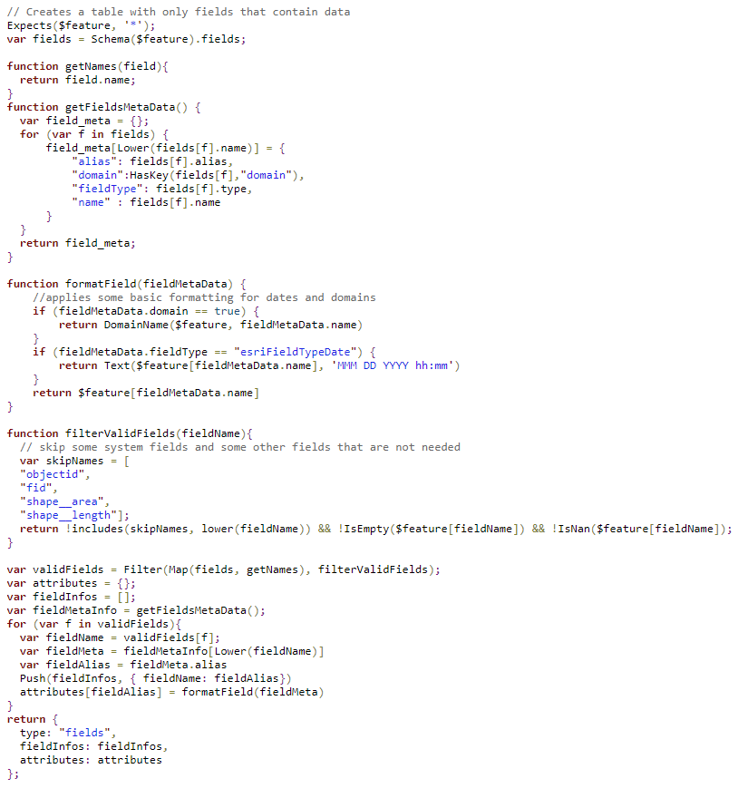
In this example we’ll leverage the Schema() function to get all the information we need about the fields. The basic steps of this expression are as follows
- Filter out the fields we don’t want to show (values that are null, and system fields) through the function filterValidFields
- Once we have a list of field names we loop through the fields and then get their metadata (alias, field Type and whether they have a domain associated with the field with getFieldMetaData()
- Do some basic formatting for Domains and Dates (Challenge: Can you alter the expression to also include number formatting?)
- Finally, we use that to build up the fieldInfos and attributes return object
The end result should look just like a regular fields list but as you click from feature to feature fields will hide or show based on their value. From here you could adapt the example to better handle the field order you desire or apply further formatting.

That’s all we have for Part 2, keep an eye out for more blogs and we can’t wait to see what you build next. Don’t forget to head over to the Arcade documentation to learn more about this new profile.

Commenting is not enabled for this article.