Creating customized pop-ups for your data is a quick and easy way to make your maps more interactive, fun, and informative. Over the last year, pop-ups have become more customizable and accessible than ever with the new Map Viewer. The following blog provides an overview of all the new enhancements made to pop-ups and it explores the different ways you can take advantage of them.
Content Titles and Descriptions
Providing context to your pop-up content elevates your pop-ups from good to great. With the introduction of content titles and descriptions, you can easily provide pre-formatted text for any pop-up content type. Prior to this enhancement, if you wanted to add a title and an introduction to a list of fields you would have had to author a rich text element and format the text yourself. Even with that workflow, you faced spacing issues that would make that information feel disconnected from the list. The new title and description simplifies that workflow.
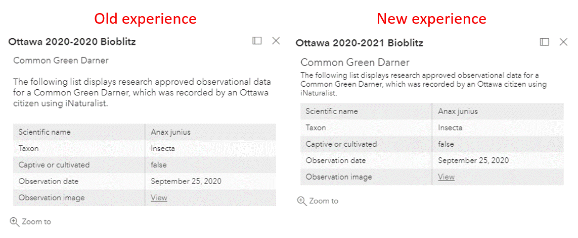

To start offering more informative pop-ups enter the Pop-ups pane in the new Map Viewer, click the Add content button, and enter a title and description for each of your content types.
Charts
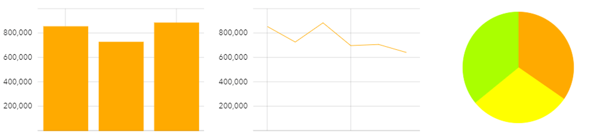
Pop-ups charts are a great way to compare numeric fields and highlight trends for a feature. If you want to make your pop-ups more impactful and eye-catching then check out Pop-up Charts are now Available in the new Map Viewer for authoring tips.
Cluster Pop-ups
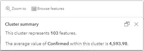
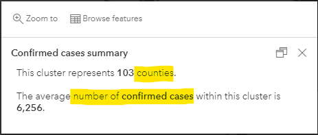
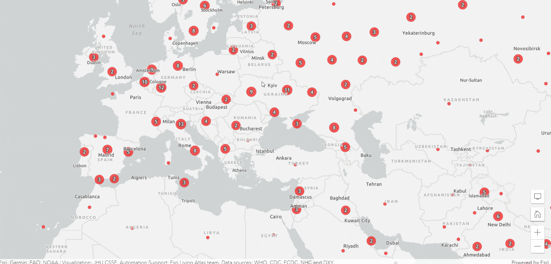
Clustering is an effective way to derive meaning from large point datasets. When you enable clustering on your layer, a default pop-up is automatically generated for each cluster. This pop-up summarizes the number of features and the most prominent value within the cluster. The most prominent value is based on the field used to render the layer if there is one. The following is the default cluster pop-up for the USA Covid-19 Cases Living Atlas layer, which uses confirmed cases as the rendering field.
Custom Cluster Pop-ups
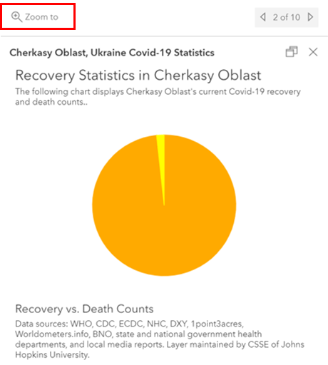
Although the default pop-up is a good first step, creating a custom pop-up for your clusters is even better. To customize your cluster pop-up, click the Cluster pop-ups button in the Clustering pane. Once there, you’ll see a rich text element that contains the default pop-up template that can be edited. In the Cluster pop-up pane you’ll also see an option to Add content. This allows you to add Fields lists, Charts, Images, and more Text elements to your pop-up.
Consider again the default cluster pop-up for confirmed COVID-19 cases in USA counties. It could use some fine tuning to ensure that the clusters clearly represent the average confirmed Covid-19 cases in a given number of counties. To properly portray this, I would update the pop-up to match the one below. Minor changes, such as the ones highlighted, help tie your pop-ups to your map’s story.
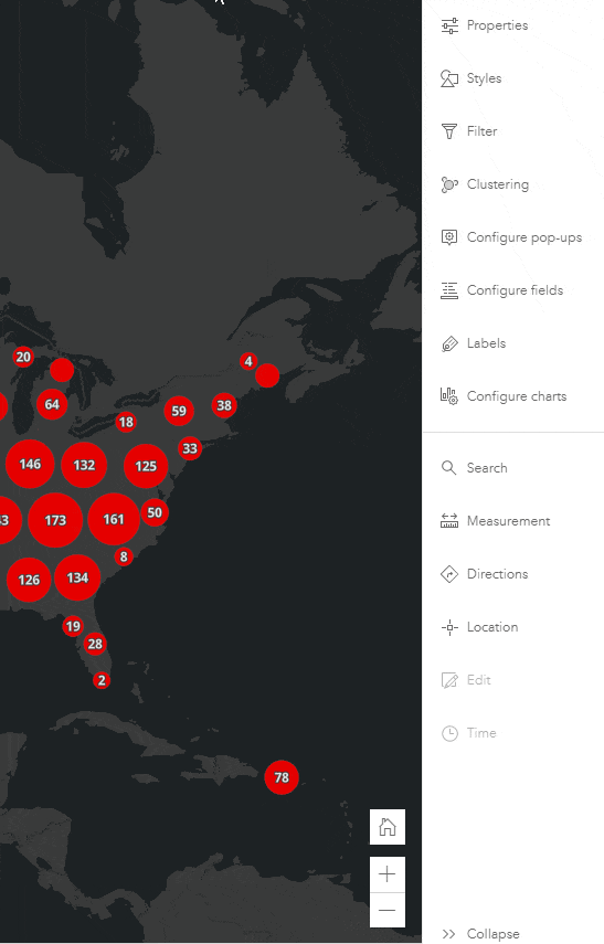
Browse Features
The Browse features button at the top of the docked cluster pop-up allows you to explore a list of features that comprise each cluster. Clicking on one of the listed features will open the pop-up for that feature. With that in mind, it’s important that you not only configure your cluster pop-up, but also the layer pop-up through the Configure pop-ups pane. Configuring both pop-ups ensures that people that view your map receive the best possible experience.
Zoom to
The Zoom to button on the pop-up will zoom the map extent to the selected cluster or feature. This is a useful tool for investigating the location of single features or the features that comprise a cluster.
Tips and Tricks
This section outlines features that will help you save time when creating and managing your pop-up content.
Duplicate Content
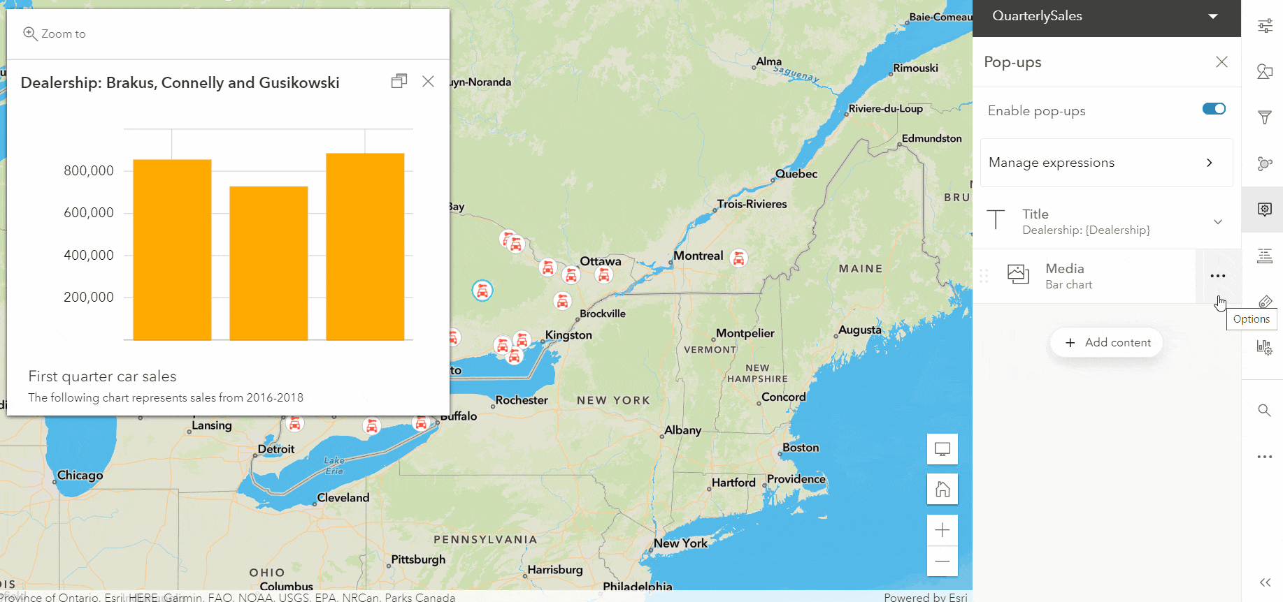
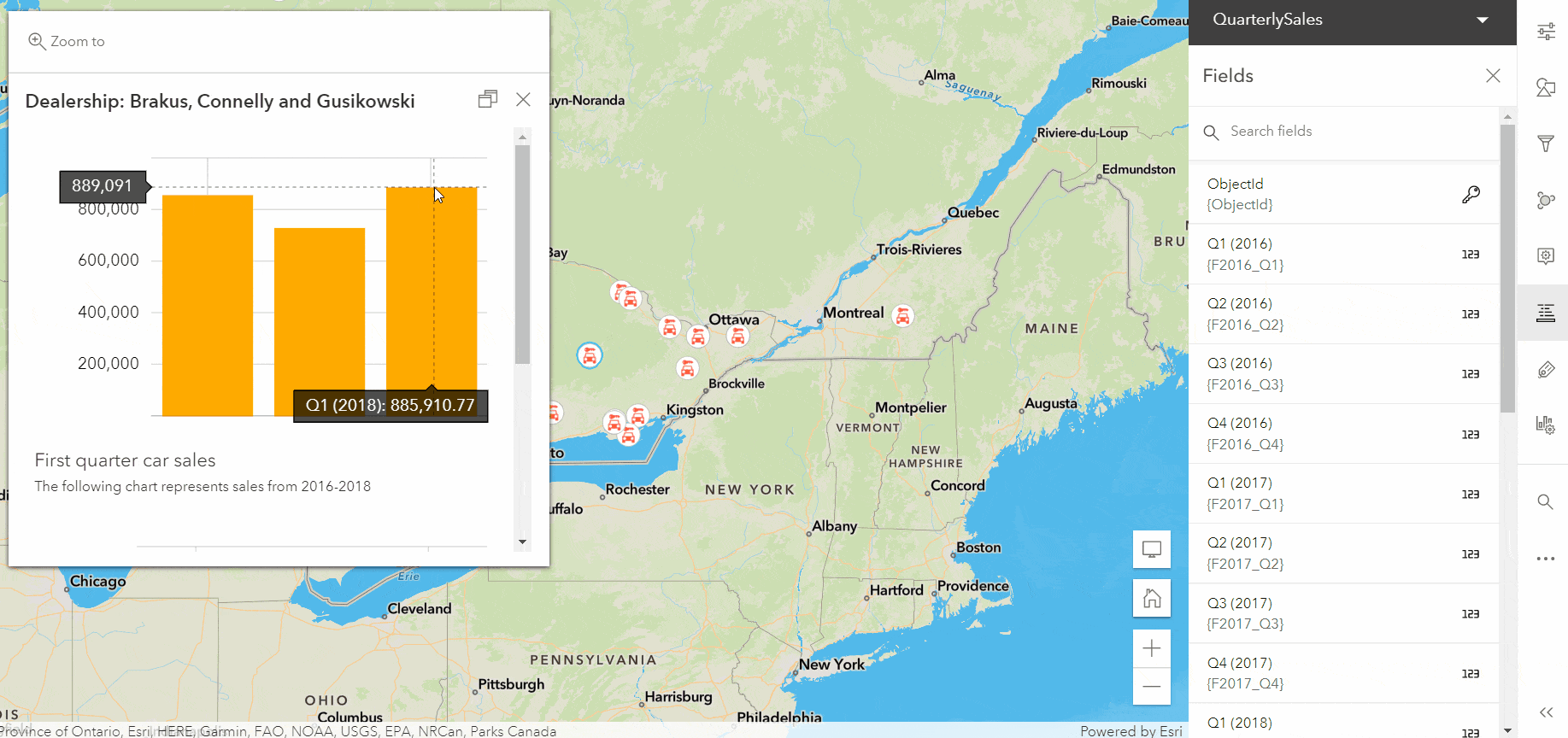
You might encounter instances where you need to create multiple content elements that are very similar. Rather than creating each content element from scratch, use the Duplicate feature to create a copy and simply modify the copy to make it unique. For example, below I have a map showing 2016-2018 car sales. I want to create a pop-up that compares each year’s quarterly sales. The best way to do this is by creating four bar charts, each representing car sales for a financial quarter. To speed up this process, I’ll create a bar chart for the first quarter then duplicate it and adjust the title and data to represent the second quarter sales. I’ll repeat those steps for the third and fourth quarter sales. The Duplicate feature saves me from having to author four similar charts from scratch.
Batch Formatting
Formatting fields, especially numbers and dates can be tedious to do one by one, but with batch formatting you can format your fields in just a few clicks. Continuing with the quarterly car sales example, I don’t feel it’s necessary to display the quarterly sales to the exact cent. To simplify the charts, I’ll format the sales fields so that no significant digits are shown.
Reorder Content
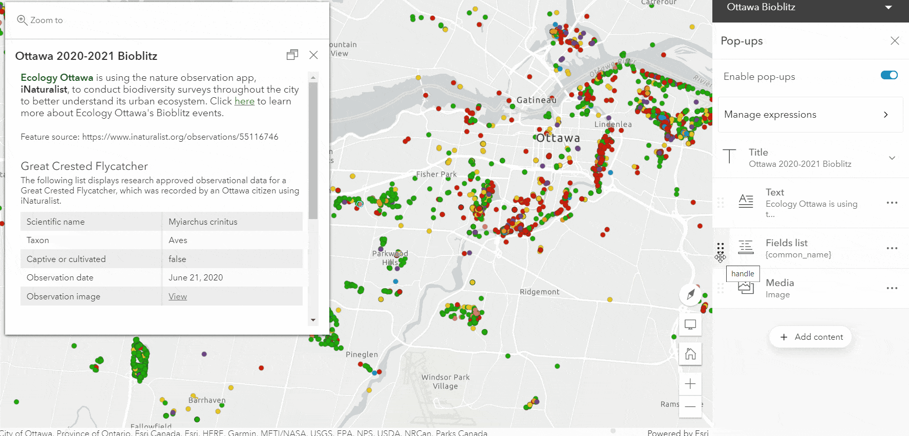
Your pop-up content is important for providing informative and engaging information. The order in which this content is presented plays a large role in how your data is perceived and understood. Luckily, in the new Map Viewer you can re-order your pop-up content so that you can provide your audience with the best possible experience. To re-order your content, use the drag handle to either move the content above or below other content. Keeping the preview pop-up open will provide you with instant feedback of your changes, helping you determine the ideal look and feel of your pop-up.
Backwards Compatibility
Pop-ups authored in Map Viewer Classic are compatible with the new Map Viewer. In a few cases, you’ll notice a loss of formatting to Custom Attribute Display Pop-ups (HTML) from Map Viewer Classic when edited in the new Map Viewer. This loss of formatting is specific to areas like table and images tags. This is an area we will continue to improve upon over future releases.
What’s Next?
A lot more is coming to pop-ups and cluster pop-ups in the new Map Viewer in coming releases, so keep an eye out for the following:
- HTML source editing
- Authoring pop-up content using Arcade
- Related records
- *Work with cluster features in Arcade
- *Define your own statistics using fields not used in the layer’s renderer
*Cluster pop-up enhancements

Article Discussion: