Diverging color ramps are very popular in mapping and are perfect when you have an “above-and-below” data story. These ramps have white or neutral in the middle values and are especially good when highlighting a critical value in the data or when the data have both positive and negative values. For example, we often want to highlight places that are above and below the national average. Or show the change in unemployment in the last 6 months (some places increase, others decrease). Or show the change in relative humidity in the last 24 hours. And we want to know the magnitude of the change, not just the direction. Diverging color ramps have been part of ArcGIS Online since the beginning, and millions of maps have been made using them because they can communicate this immediately.
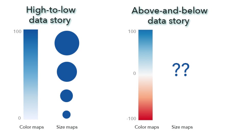
However, for size maps (aka proportional symbol maps), there has never been an equivalent to a diverging color ramp. Traditionally, proportional symbol maps can only show a high-to-low story because the semiotics is “small-to-large symbols stand for small-to-large numbers.” There’s been no way to encode negative numbers or a critical inflection point in that logic. While it has been possible to superimpose a diverging color ramp on top of the symbol colors of a univariate size map—where the colors and sizes simply encode the same data—that approach contradicts itself because the colors tell me things are diverging while the symbols say the data are sequential and increasing. Not surprisingly, this mashup just never quite worked. Clearly something better is needed!

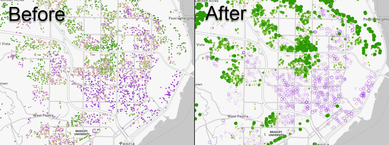
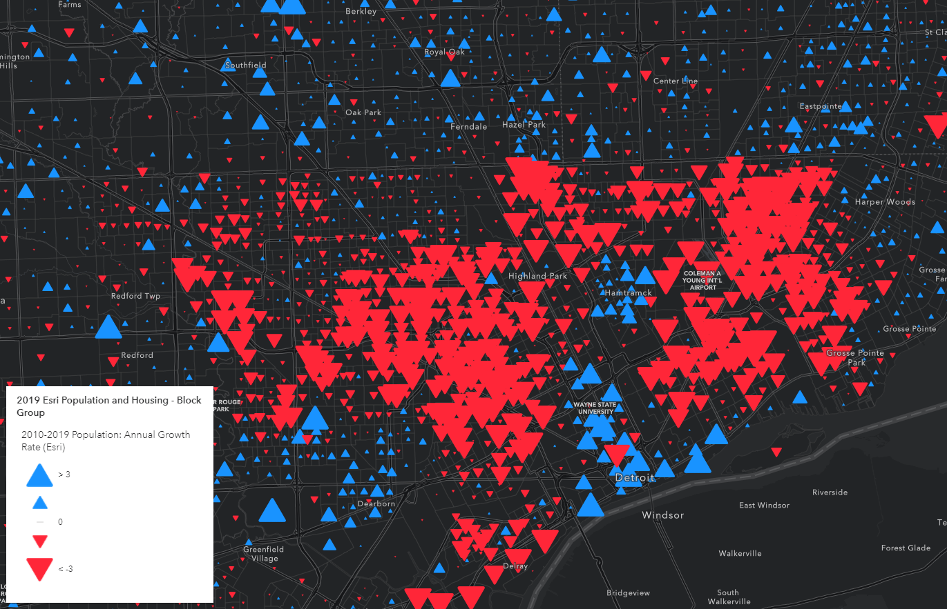
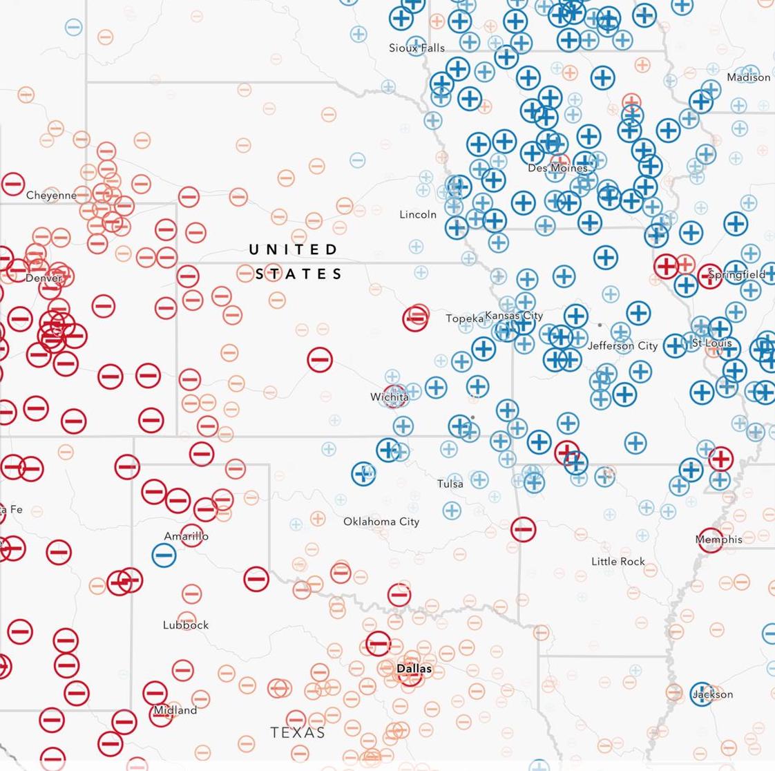
Examples of the new Above and below size maps
Let’s now dive into how easy it is to make these maps and then cover some additional enhancements to the Map Viewer in our latest release.
Color and Size Renderer: New Themes
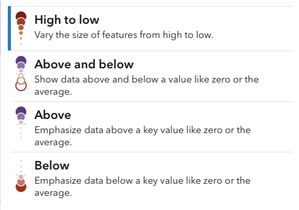
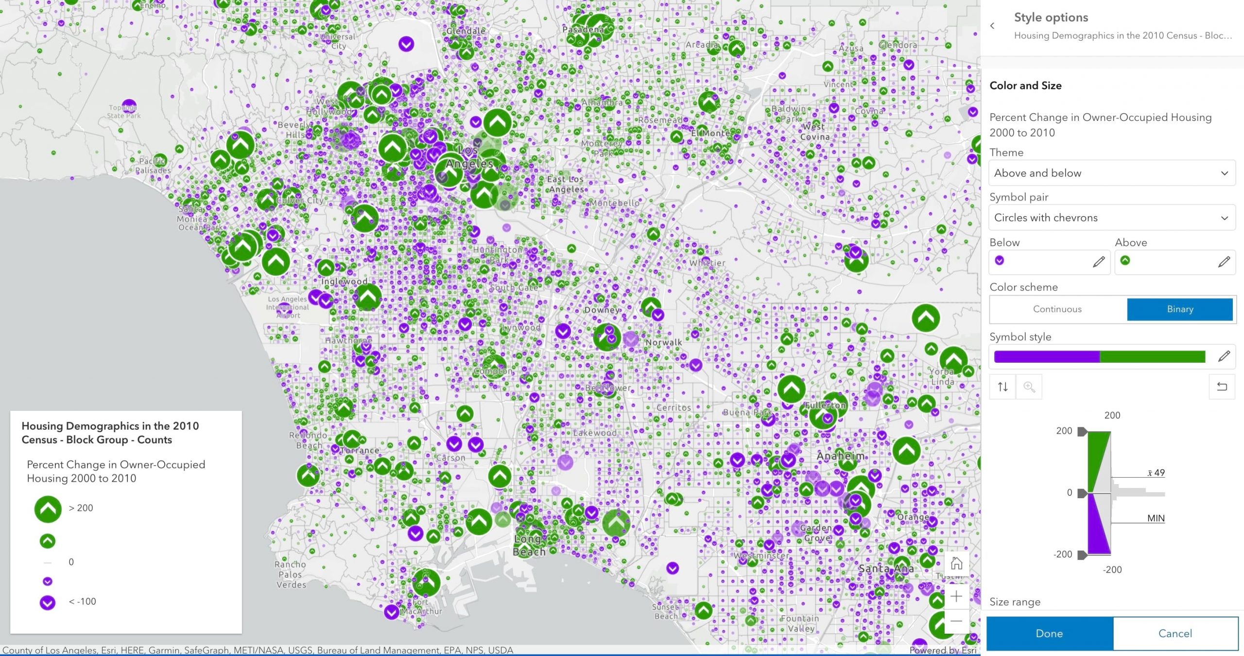
You can find the new Above and below theme in the Color and Size renderer (step 1). While this renderer has been around for a while, it can now be selected with only one attribute (previously, you needed two). More importantly, it also now features a new pulldown called Themes which expands on the original High to low with three new options: Above and below, Above, and Below (more about these other two in a minute!). By picking Above and below (step 2), the map is instantly transformed.
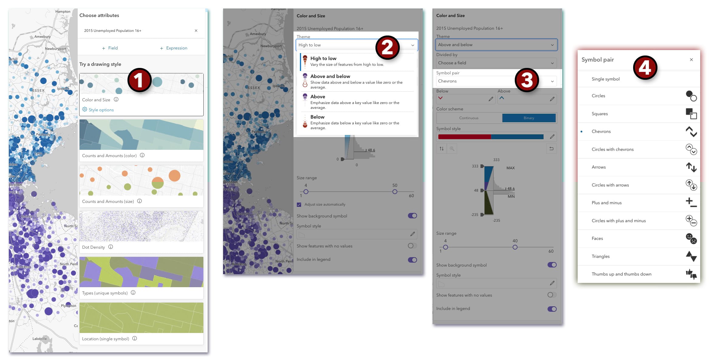
You may also notice that the familiar histogram slider now sports a third tuning handle in the middle for adjusting where the critical middle breakpoint value should be set (step 3). If you’ve used a diverging color ramp before in our other map styles, this middle handle will be very familiar. And it acts in exactly the same way here; it is the dividing line that splits the data in two.
How do we know where to set the handle positions initially? This choice is based on the data itself. If Map Viewer detects both positive and negative values, the middle handle is set to zero. In other cases it will set the middle handle to the mean of the data. A subtle but useful new enhancement is lines on the histogram showing MIN and MAX data values.
We strongly encourage you to experiment with all three handle position on the histogram to tune your map and really uncover the story it is trying to tell. One thing to be careful about: If the two outer handles are not equal distance from the middle handle, the size scaling of the symbols will be asymmetrical. That is not necessarily a bad thing, which is why the UI allows for this. But, if you want –10 units and +10 units to result in the same increase in the size of your map symbols, keep those handles symmetrically placed on either side of the middle handle.
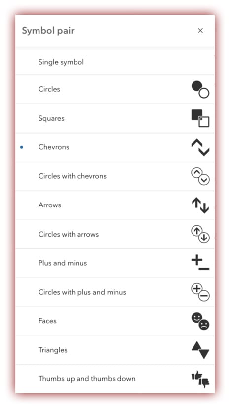
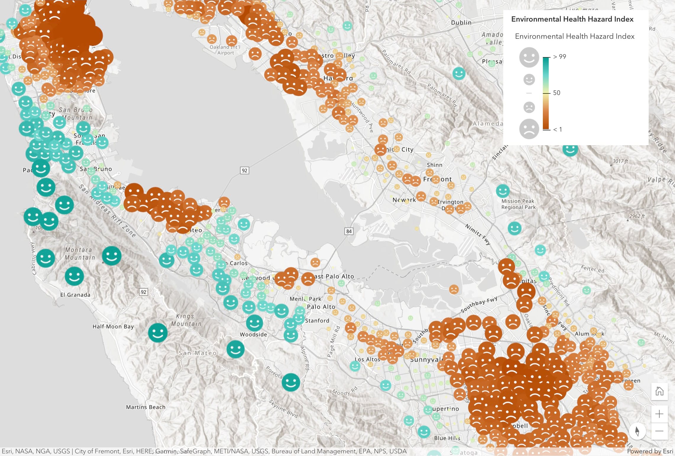
Shown here are the new Symbol pairs which have been custom designed to quickly convey the idea of “above” and “below.” In testing we’ve found people easily grasp the idea of up/down arrows, plus/minus symbols, solid/hollow circles, thumbs up/down, etc. without needing much explanation. And if they do want to know the details, there is a spiffy new compact map legend that explains all.
Just Above or Just Below
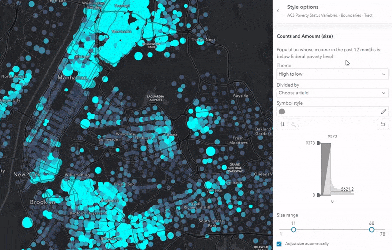
These two new Themes have been added to two of our mapping options: Counts and Amounts (size) and Color and Size. We have learned in the years since we released Smart Mapping that most maps need custom handle positions on the histogram, and manually adjusting them and watching the map update in real-time is a very satisfying form of data exploration.
For a few datasets, positioning the handles at either end of the histogram makes sense, especially if the data are highly skewed to the low small numbers. But for data that is normally distributed, or has a more complex distribution, these default handle positions just don’t work. The map gets “swamped” with medium-sized symbols, like we see below.
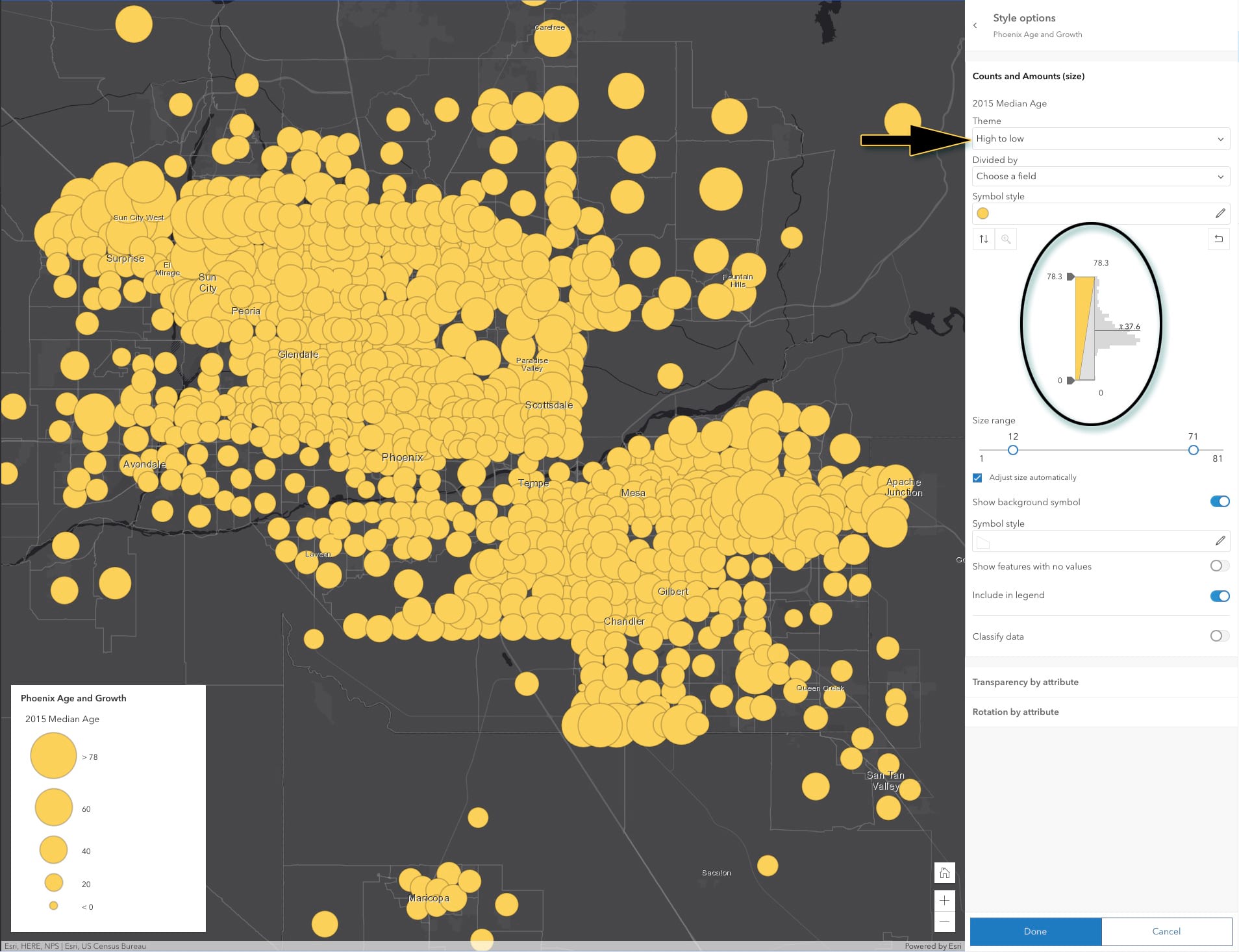
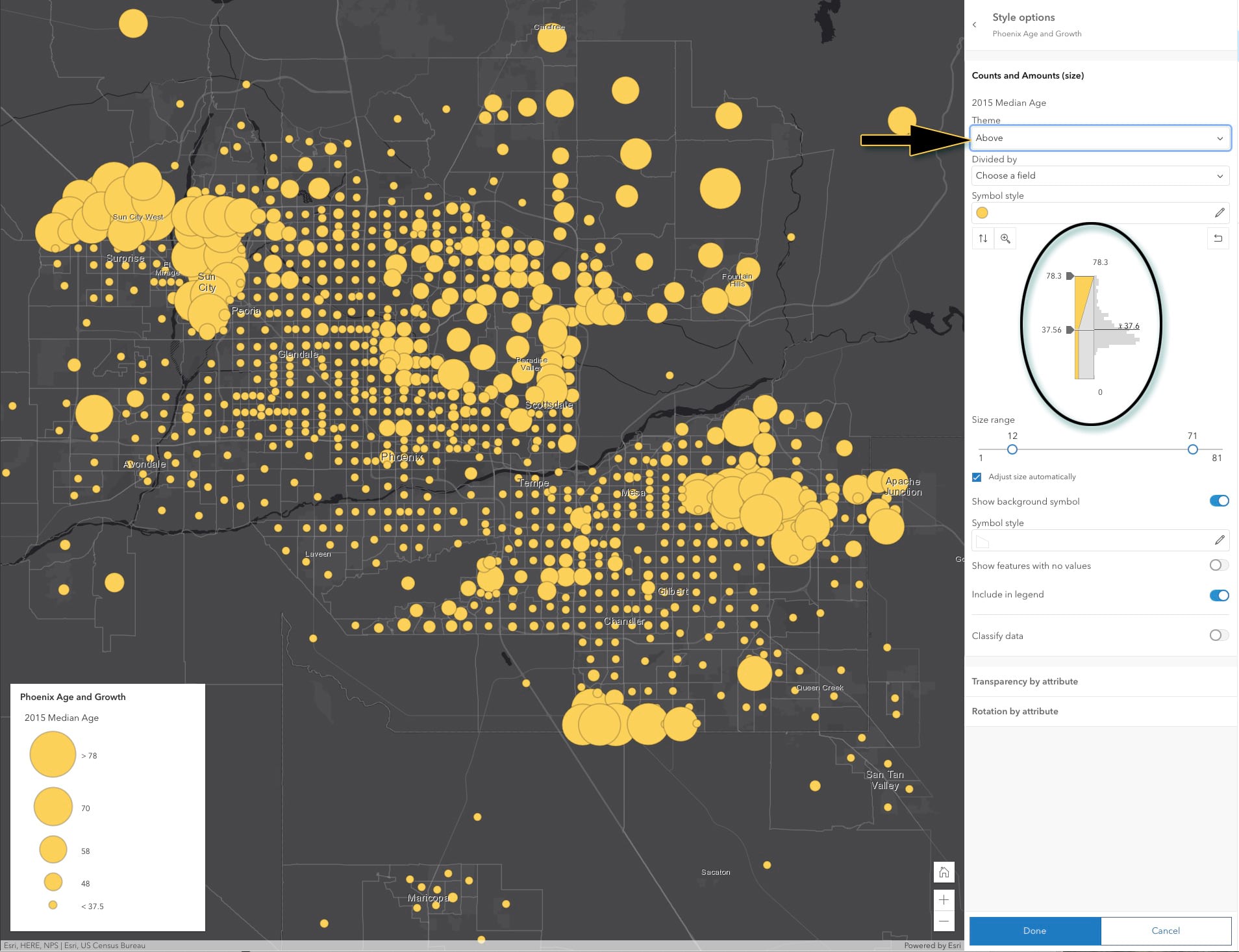
This first map of median age in Phoenix Arizona (2015) isn’t doing the data justice. Since I know this is a major retirement city with large retiree communities such as Sun City, it’s clear this geographic story is lost in the first map. But by picking the Above theme we immediately identify where the older residents are located. This works because the Above theme groups all of the locations below the mean into a single “small” class and allocates all of the size variation in the symbols to locations above the average. Suddenly the large retirement communities at the edge of the metroplex emerge (and in just one click!).
And as always, we encourage you to further fine-tune the map by manually adjusting those handle positions.
Continuous or Binary Color Ramps?
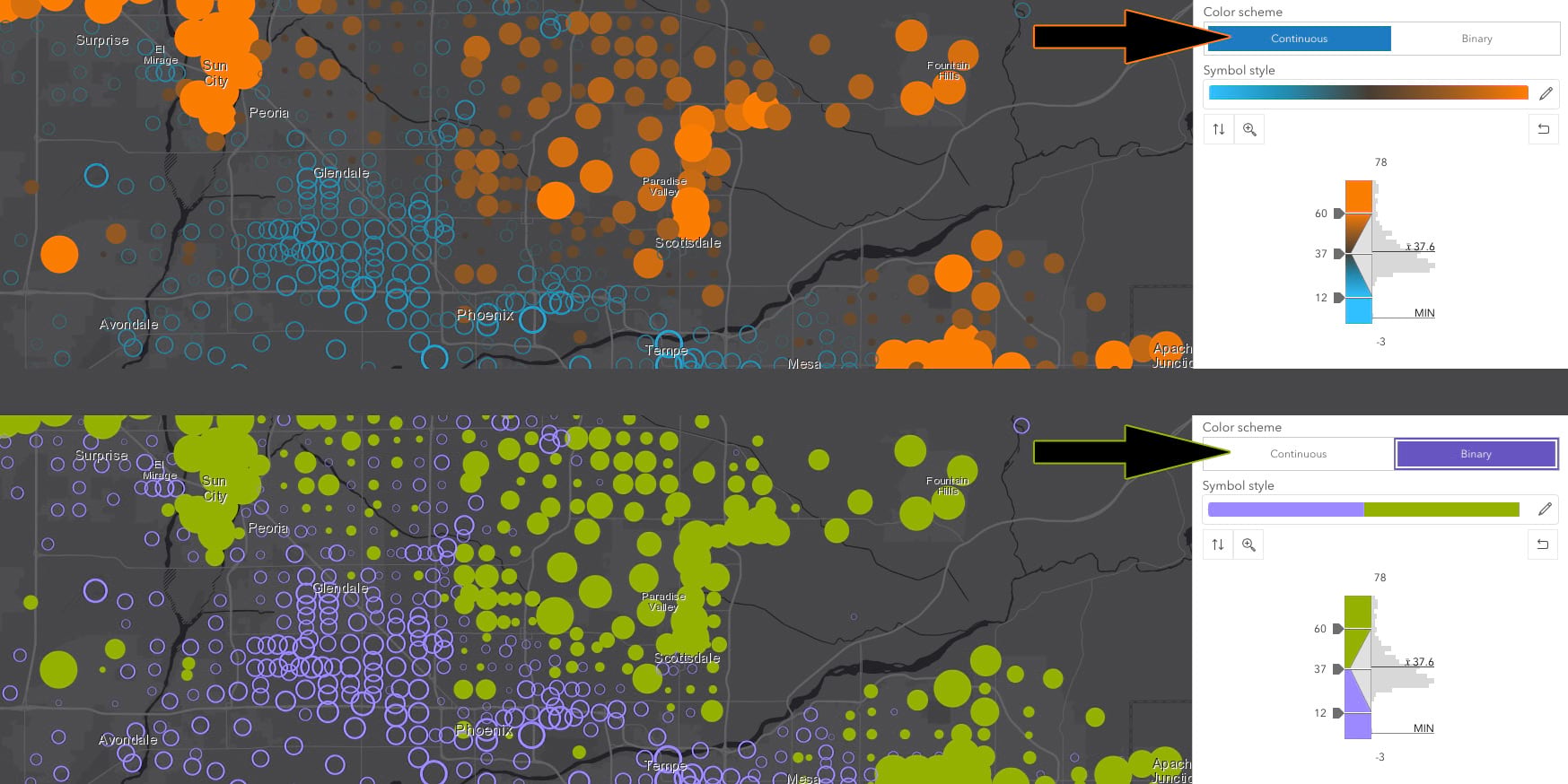
With the Above and below theme we quickly discovered that there are two general-use cases for color. In the first case, we wanted our data definitively grouped into just two color classes corresponding to the observations above and below the critical middle value. For this use case, think the “red state, blue state” you see in U.S. election maps; it’s either one or the other. In the second use case, we wanted color to mimic the continuous/smooth sizing of the symbols by applying a smooth diverging color ramp. Both are very useful, so experiment as you see fit.
Next Steps
I’m sure you’ve picked-up on a theme in this post: Don’t be afraid to experiment and please venture beyond the software defaults! While a lot of work has gone into creating intelligent defaults that are data driven, they are just a starting point for making great maps. Try a dark basemap, or a different color ramp, or one of the many new paired symbols. There’s a good chance some unexpected insights about your data will emerge when you do.
Happy mapping!
(Blog updated 4/16/2021 to reflect “Beta” being dropped from the Map Viewer name)


Article Discussion: