by Kenneth Field, Senior Cartographic Product Engineer
Typography is one of the most important elements in map design. Successfully lettering your map includes the selection of typographic elements, deciding what to include, what to omit, how to portray your type and then where to position it. There are a good many cartographic conventions that help us in making these decisions such as using size to create a hierarchy of importance amongst the features you label, using color and style (e.g. italics) to denote certain features such as water and positioning labels so they don’t conflict with other symbols. Lettering your map is often called a ‘necessary evil’ because labels don’t really exist in the real world – yet they are fundamental to how we recognize and describe places on our maps. With ArcGIS Pro, lettering your map just got a whole lot easier so let’s take a look at some of the new and improved capabilities you can use to help you make beautiful maps with well-honed typography.
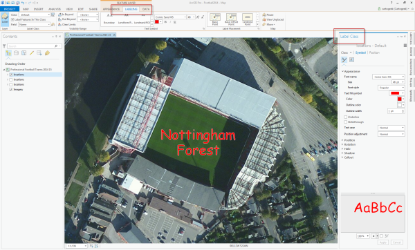
The first thing you’ll notice about how we’ve rebuilt the labeling features for ArcGIS Pro is there’s a labeling tab on the ribbon itself. Once you select a feature layer, the tab becomes active and you can apply all of your basic settings for the layer on the ribbon. The second thing you’ll notice is the speed with which labels are re-styled. Labeling is responsive in Pro because it occurs in another thread separate from the UI and also separate from other drawing. There’s also a Label Class pane but more of that in a moment.
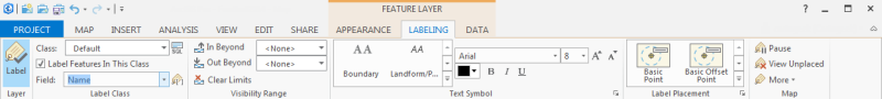
By default, ArcGIS Pro is set to use Maplex labeling engine which gives you direct access to its rich features through the Labeling tab (you can switch to the standard labeling engine should you prefer). Any changes you make on the Labeling tab update in the map…no more delving into multiple dialogs! On the labeling tab you can access and modify features for all labels, or by label classes you specify. You can also change label properties for multiple label classes at a time if you have to apply the same change across multiple label classes.
The labeling tab allows you to change the visibility range of your labels for the selected feature as well as choose your font and change its appearance (weight, color, underline, italics…all the usual properties). The font selection drop-down shows you the typeface of each font. You also have direct access to the basic label placement options (pre-sorted for your feature type) as well as controls for pausing label drawing and viewing unplaced labels.
The labeling tab will give most people direct access to all of the common tools you need to begin the process of lettering your map. For some, this will be enough to perform the labeling tasks they require and it’s also a useful way to take a first cut at labeling to see where you’re going to have to deal with positioning issues or conflicts a little more carefully. For those wanting greater control over their labeling it’s a small step to open the door to more advanced functionality by opening the Label Class pane.
Panes are a fundamental new way to work with your maps in ArcGIS Pro and the Label Class pane shows why they are going to transform your ability to work with your maps. Panes automatically dock to the side of the application’s window and allow you to modify different settings which either update the map on-the-fly or which simply require you to click Apply once you’ve changed your settings.
There isn’t scope to go into every single detail of the labeling options in the Label Class pane here so let’s just focus on a few of the new ways in which you can work with labels using the options in the Label Class pane.
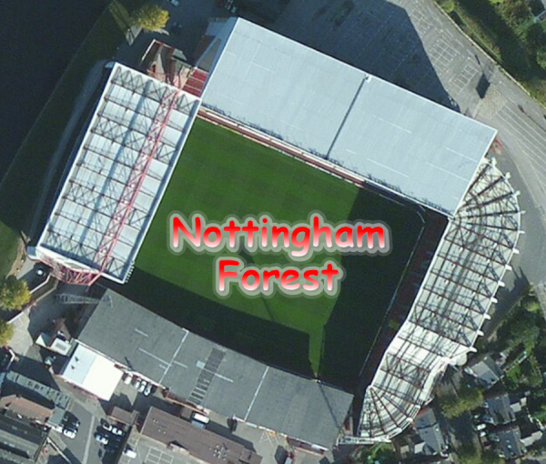
In addition to the font name, size and style you can now set a Text Fill Symbol which treats the text as enclosed polygons that can have fills and strokes. There are some preset options such as gradient fills or solid fills with an outline, or you can select from any other polygon fill color, pattern or style you wish, including picture fills and complex multi-layered symbols. The following example has a simple linear gradient fill applied along with an outline.
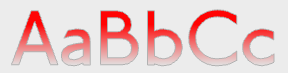
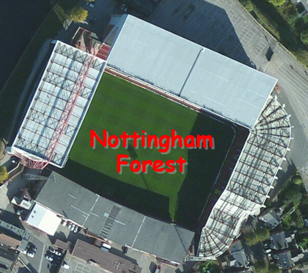
Halos are also supported but you can now go beyond simply using halos to mask out underlying features by applying some transparency to the halo fill and outline. The following example shows the label with a gradient fill, a thin grey outline and a halo that has a white fill with 60% transparency and a white halo outline with 85% transparency.
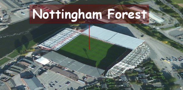
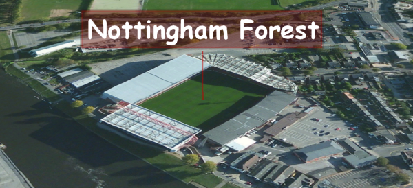
We’re not for one minute suggesting that labeling needs to be as complex, ornate or gaudy but the principle of labeling in ArcGIS Pro is simply that you have complete flexibility to design labeling effects simply and rapidly. This is particularly useful when dealing with the way in which labels print across the top of imagery so you can rapidly see how different effects look and which will be optimal for your map.
Prefer shadows?
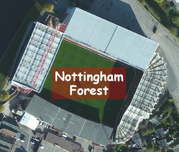
Or maybe add a callout with a background fill?
There’s plenty more options to control the look and feel of your labels including leader lines for callouts and the ability to control the gap (padding) between the feature and leader line.
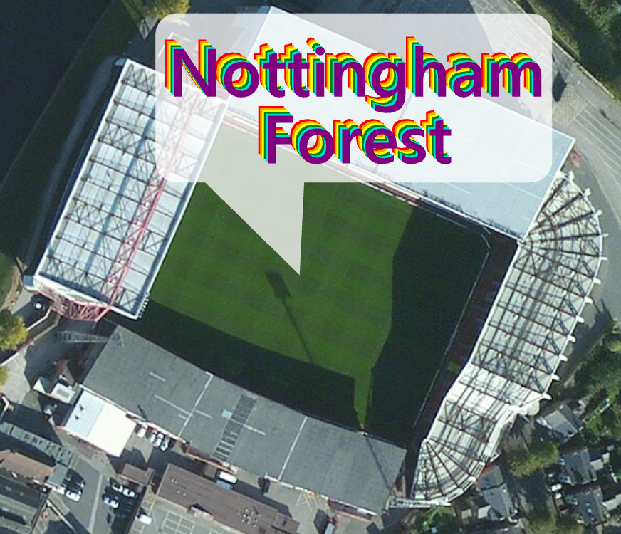
You can also go a little crazy and use the Text Fill Symbol option to apply some custom styles to your labels. How about a fashionable rainbow colored offset look, with metric kerning, inside a semi-transparent balloon callout (all with a heavy nod to irony)?
Labeling in Scenes is also supported with the same flexibility except by default labels in a Scene will billboard and rotate automatically as you move around a Scene. Here’s an example where we’ve positioned the label about 100m above the feature in the scene (by modifying its elevation properties) and added an extruded symbol to act as a leader line. The label sits centered on the point feature and will rotate around its y axis as you navigate the Scene.
These examples are deliberately extravagant purely for the purposes of this blog but all of these ways to style your typography gives you the ability to control every aspect of labeling for streets, rivers, areas, points and all of your other standard geographical naming requirements.
The Formatting options give you further control over word spacing, letter spacing, letter widths, line spacing and flip angles as well as check boxes to control how ligatures and kerning are handled. You can also draw glyphs as geometry and extrapolate baselines. The final example above includes a smaller line spacing setting for instance.
Position, fitting strategy and conflict resolution are also handled on the Label Class pane. Placement options abound as do ways in which you can modify the position of your labels to add an offset in point size or even as a percentage of the maximum offset. You can also specify how the offset is applied either from a simplified symbol, the exact geometry of the feature or the exact symbol outline. Rotation can be applied as a specified angle or from an attribute in your data, with alignment against that angle also capable of being specified as straight, horizontal or perpendicular. There are numerous options for configuring the fitting strategies and how labels behave when they reach certain limits. Perhaps you want to have your labels abbreviate automatically, or stack, or reduce in size? You may want to remove duplicate labels or create a buffer around the label to protect it from graphical conflicts with other labels and features and specify feature weights to ensure certain label classes draw in advance of others.
What we’ve looked at so far is how to style labels that you control from the labeling tab or the pane settings, concentrating on one label per feature. You can also access Label Expressions in the Label Class pane which gives you additional flexibility and scope to configure labels from multiple attributes and style and position components of your labels independently. You would use Python, VBScript or JScript Logic to code your expressions. You might create a label style that has the first letter capitalized regardless of how the text string is stored in your attribute field. You could format the label using ArcGIS Pro formatting tags which are special characters for changing the appearance of all or part of your labels.
For instance, the following labels are derived from a single attribute field but sized according to another attribute field value and colored according to yet another attribute value. We’ve simply used label expressions in ArcGIS Pro to control each characteristic of the label to give us a proportional symbol map where the labels themselves act as literal symbols. They go further though and we’ve used label Expressions to effectively encode three different pieces of information into the label creating a multivariate symbol. The label itself gives us the actual value (a percentage in this case), the size of the label shows us how many people voted and the color emphasizes the strength of vote. By thinking creatively about how you can use labels you can go beyond simply using them to name features. They can become the features themselves.
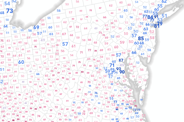
You can see how this map looks here in ArcGIS Online with scale visibility set to modify the number of labels you see at different scales.
With ArcGIS Pro you have a high-end map labeling capability with a rich feature set. The options for designing your labels to suit your map, your features and your individual elements are powerful. All of this functionality is available through the labeling tab or the Label Class pane and the changes are applied to your map as you work.
Bye bye nested dialog boxes. Tame your typography. Label like a Pro.

Article Discussion: