Exploring different types of thematic maps allows you to visualize different aspects of your data. The process of thematic mapping can help spark questions and uncover new spatial patterns. It’s a great way to get to know your data before deciding how to tell its story.
This blog article, the first in the Thematic Mapping 101 series, encourages you to use thematic maps to ask and answer questions about your data. Map Viewer in ArcGIS Online is full of smart mapping styles that make it easy to explore different thematic representations of your data. Once you have explored and defined the data’s story, thematic maps become an important tool in helping your audience learn about and engage with your insights.
What is a thematic map?
A thematic map shows information about a topic or theme as it applies to spatial features. This differs from reference maps, which show where spatial features are located.
For example, a reference map of the United States might show state boundaries and names.
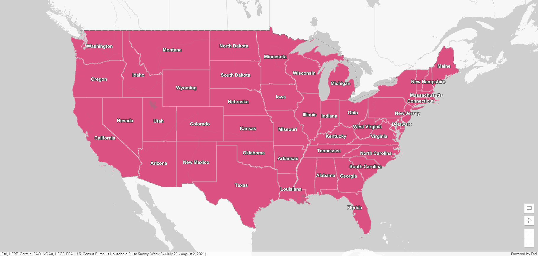
On the other hand, a thematic map of the U.S. shows something about the states and help answer questions about those locations.
For example, a thematic map about sea level trends might help answer the question “Which coastal areas are most at risk for flooding?” Or you could make a thematic map about commuting behaviors to help answer the question “What transportation infrastructure should be prioritized to help workers?”
Whatever your topic or data is, thematic mapping can help you tell that story. You can use a thematic map to explore one specific data attribute. You can also map two or more attributes to uncover more complex spatial patterns.
Ask questions of your data
Let’s say we want to explore sexual orientation and gender identity in the U.S., and we know that the United States Census Bureau has recently started tracking this information. We might begin by asking “How many LGBTQIA+ adults are there in the US?” We can use the Census data to map those numbers by state.
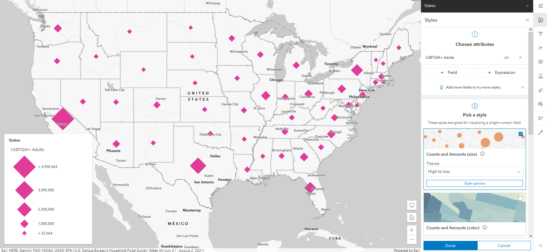
This is a proportional symbol map, created using the Counts and Amounts (size) smart mapping style in ArcGIS Online. Proportional symbols are sized in direct relation to the data value. Map Viewer suggested this style automatically because the data attribute we selected, LGBTQIA+ Adults, is an integer. Integers usually represent counts of things.
Proportional symbols are useful for comparing features based on counts and for seeing where the highest and lowest values are. This style can also identify which features are above or below a certain number, like an average. When Map Viewer picked Counts and Amounts (size), it also analyzed the data and instantly set many of the style options. These options can be customized later.
On this map, four states jump out as having high numbers of LGBTQIA+ residents: California, Texas, Florida, and New York. That makes us think these states might be great places to find LGBTQIA+ communities – strength in numbers!
Try different kinds of thematic maps
U.S. states have widely varying populations, and counts alone don’t tell us everything about the distribution of LGBTQIA+ adults in the U.S. We wonder how the map might become more meaningful if we look at percentages instead. We’ll swap the LGBTQIA+ Adults data attribute for a different one, Percent of adults who are LGBTQIA+.
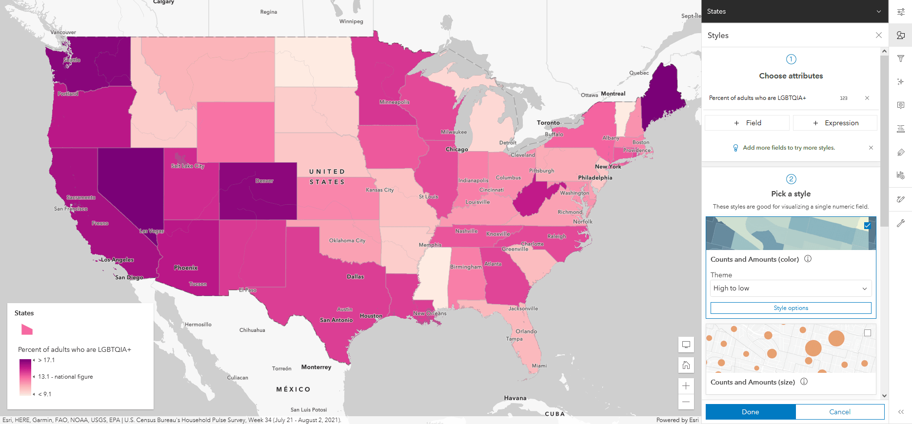
Since this data attribute is a decimal value rather than an integer, Map Viewer suggests the Counts and Amounts (color) style. This style creates a choropleth map, which shows numeric data as shaded areas. Choropleth maps work well for visualizing percentages, ratios, and rates.
We are surprised to see Washington, Maine, Nevada, and Colorado stand out on this map. These states did not jump out on the graduated symbols map. But the choropleth map shows that these states have a high percentage of adults who identify as LGBTQIA+. Even though the populations of these states are lower and their cities smaller, their LGBTQIA+ communities are more sizeable relative to the state’s total population.
Explore multiple data attributes
To see the full context, we want to show both the count and the percent attributes on the same map. We can do this by selecting both fields in the Choose attributes section of the Styles pane.
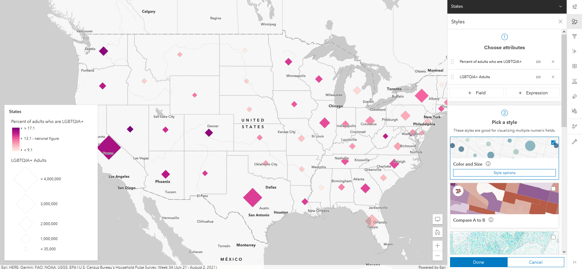
With these numeric data attributes selected, Map Viewer defaults to the Color and Size style. This style makes a bivariate map, combining choropleth and proportional symbology. Now we can see both data attributes in the same symbol. The symbol size reflects the count of LGBTQIA+ adults in the state, and its color reflects the percent value.
While we are thinking about mapping multiple variables, we realize that the LGBTQIA+ umbrella includes a lot of identities. These identities include both sexual orientation and gender identities. For this map, we’ll focus only on sexual orientation.
The U.S. Census has five categories that describe non-heterosexual sexual orientation: gay or lesbian, bisexual, something not listed, those who don’t know their sexual orientation, and those who did not report a sexual orientation. We can show all five of these attributes at once using a dot density map to help humanize the topic.
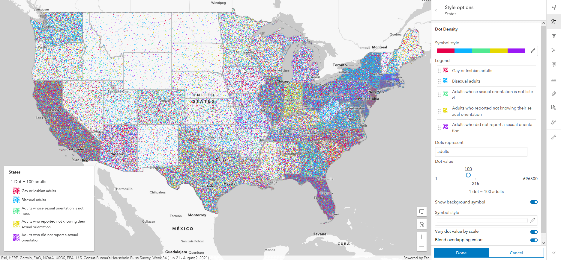
Each dot on the map represents a count of adults by how they identify, which helps us understand the human density of these communities. In this map, for example, one red dot = 100 adults who identify as gay or lesbian.
The dot density reveals patterns in more detail than the other map styles. For example, this map helps us notice that many people in Indiana report not knowing their sexual orientation. We also see lots of blue across the country, especially densely in New York and West Virginia. This indicates that many people identify as bisexual. These details are lost in another map style, like choropleth, while the dot density map surfaces the human diversity in this numeric data.
Next up: storytelling with thematic maps
After exploring the Census data using thematic maps, our questions have gotten more complex. Is there something about the states with high percentages of LGBTQIA+ adults that make them especially friendly or safe places to be? Are there cultural, geographic, or historical reasons these regions have high proportions of LGBTQIA+ adults? After getting curious about this data and visualizing it with different types of thematic maps, we can tell that there is a story here.
In the next Thematic Mapping 101 blog article, we will go deeper into this example and explore how thematic maps can bring narratives to the forefront of your data. In the meantime, check out these resources to learn more about thematic mapping in ArcGIS Online:


Article Discussion: