We all have favorite maps that we think are great, but rather than just saying a map looks great, how many of us are able to take a critical look at it, evaluate it, and explain why it looks great? Having the ability to reflect on and evaluate maps as information products is important to understanding effective cartographic design so you can optimize communication of the intended message in your own maps as well as be able to understand why other maps work. In this blog entry, we’ll briefly look at some static maps and a web map to see what we think makes them great and then show you how using a checklist gives you the tools to reflect on maps in the same way.
At the 2010 Esri International User Conference (Esri UC) Map Gallery, the map in figure 1 was well received, and people liked what they saw. But why did it work so well and capture people’s imagination?
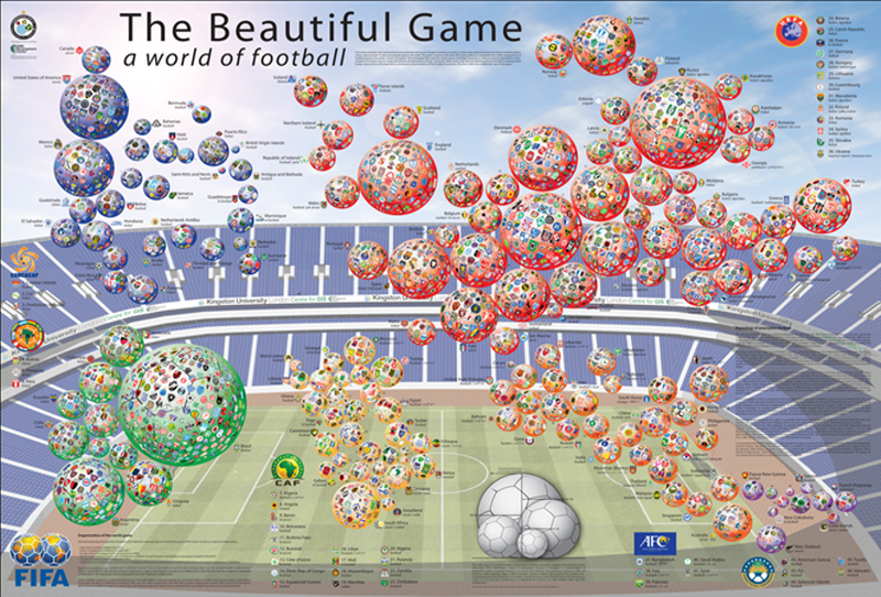
Figure 1. The Beautiful Game: A world of football
It worked because it told a great story, relevant to the time and the intended audience. During the 2010 Esri UC, the Football World Cup was played in South Africa. People were talking about football (or “soccer,” if you talked to an American), so a map based on the theme of football was certain to attract attention. But once that attention was captured, it still had to inspire people and work as a map. This one was vibrant and designed with highly saturated colors so it would work as a poster in a large Map Gallery space and grab people’s attention from a distance. The colors are harmonious—they work well together so no single color dominates. The world map is displayed as a cartogram, demonstrating an engaging, alternative way of presenting data that encourages further interest. Upon closer inspection, you can see that each symbol is a football that acts as a 3D sphere containing a patchwork of individual football club badges. The map includes recognizable logos, details on the etymology of the game in each country, and explanatory text. The result is a compilation of complementary map components working in harmony to tell a story.
By capturing attention at a distance, the map encourages people to inspect it closely and search for their own country and, perhaps, the team they support. The map creates a connection at an individual level. Here we’re getting into the psychology of mapmaking: techniques to make a map that enthuses an audience and encourages people to spend time reading it. When we connect with people at an individual level, the map will have a greater chance of success. At a conference with 14,000 people from dozens of different countries, what better way is there to ensure the success of a world map than to base it on a global game?.
Of course, if presented on a white background, the cartograms wouldn’t have been nearly as effective as they were on a stadium backdrop with a cloudscape. This design gives the layout depth and heightens the visual interest as well as accentuates the 3D footballs used for the map itself. Subtle textual components make use of available space around the main map and provide additional information. This is important. The map isn’t just about displaying data; it’s about compiling a range of pieces to tell the story through clever arrangement of complementary graphic components. The map displays good visual contrast among the map components. It creates a visual hierarchy both across different map components (such as the football symbols and text) and within components (for instance, the title, subtitle, and explanatory text), and a clear relationship is built between what exists in the foreground and the background: what is most important and what is of lesser importance. The map is well structured, balanced, and pleasing to the eye.
We can see the same principles working in other examples of great cartography. In figure 2, the same attention has been paid to the structure of the map to ensure that important components are seen more readily than others. The colors work harmoniously and effectively at displaying biomes to give the impression of different landscape types and elevations. The typography, in particular, shows excellent visual hierarchy so we see country names first; the more subtle typeface treatment for physical regions and oceanic labels adds to the well-crafted labeling structure. Black country borders have been replaced with white, which suits the overall display more readily. Black lines would have dominated the map, and while international borders are important at this scale, they would have broken up the symbology of the physical regions.

Figure 2. Telegram World Map (extract)
And what of web maps? In many ways, the process of evaluation is no different. The medium is the only aspect that differs between a print map and a web map, though it is true that each brings with it unique possibilities and constraints. For instance, a print map is inherently static, so you have to be clear about precisely what data to show and how to show it; often it’s necessary to arrange it in a way that suits a particular scale or perhaps uses inset maps for detailed, crowded areas. With web maps, having multiscale characteristics means that you can design the map to work in various ways at different scales, restricting scale selection where necessary and using pop-up windows and other interactive components to provide access to data through the map’s interface. Print maps and web maps require similar design considerations: start with a great story and authoritative source data, use the medium of your map to your advantage, and design the map with a specific user in mind.
Exploring a recent Esri story map shows how one approach taken in print mapping works for web mapping as well. The story of the Titanic resonates globally. It’s both romantic and tragic, an account that still captures people’s imaginations even though it’s been 100 years since the ship sank after hitting an iceberg. So in Titanic, you have a ready-made story. Figure 3 illustrates a still image from the web map (viewable at storymaps.esri.com/stories/titanic/), which you can click to go directly to the web map.
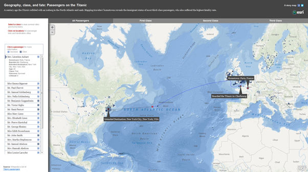
Figure 3. Geography, class, and fate: Passengers on the Titanic
The raw numbers of those who perished and those who survived are illustrated using very simple graphics. A simple line denotes the route, and a cross shows the location of the sinking. The subtle proportional symbols show the location of passengers’ hometowns, which users can click to see who hailed from each city. We get a sense of the spatial pattern of passengers’ home towns and destination cities, and the ability to explore the data by class designation (first, second, and third) reveals some insight into the proportion of deaths per class. Clicking names reveals personal histories, and labels pop up to focus our attention on a specific aspect of the data. It would be impossible to present personalized data like this on a static map, but the web map format is uniquely suited to do so. As an information product, the web map successfully combines traditional cartographic elements (a clear basemap, line symbology, and proportional symbols) with graphic and textual information and a clean, simple, intuitive user interface. The user interface is important. If well designed, it will allow map users to engage effortlessly with your map and support them as they naturally want to zoom and click across the map to reveal content. A poorly designed user interface will provide an invisible wall that hinders map use. On the Titanic map, the interactive components are obvious and visible. As an example of web mapping, it shows clearly how evaluating the map in terms of its story, audience, and construction can support the development of a strong information product built around a map.
Using a checklist
We’ve looked briefly at three maps and described a little of what makes them work well in telling a story cartographically, but how can we transfer the experience of creating great maps across to the wider mapping community? This is where our checklist comes in, to encourage you to do the following: think about your map as an inspirational story, make good use of authoritative datasets, regard your work as an information product built around your map or maps, create a connection with your audience to inspire or evoke interest, and reflect on the medium of production and take advantage of what it offers for your particular mapping project.
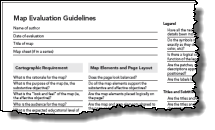
Understanding the mechanics of making a map doesn’t always translate into creating a great map, because what might be intuitive for an experienced professional cartographer is not necessarily so for everyone. But we all start somewhere. Using a checklist approach developed by experienced cartographers is one way the wider mapping community can benefit from the efforts of those who have gone before; you can use it to reflect on your own work and improve your chances of making a great map. Figure 4 shows the checklist we’ve developed to promote thinking in this way. Download the Map Evaluation guidelines as a PDF here (or click the image below).
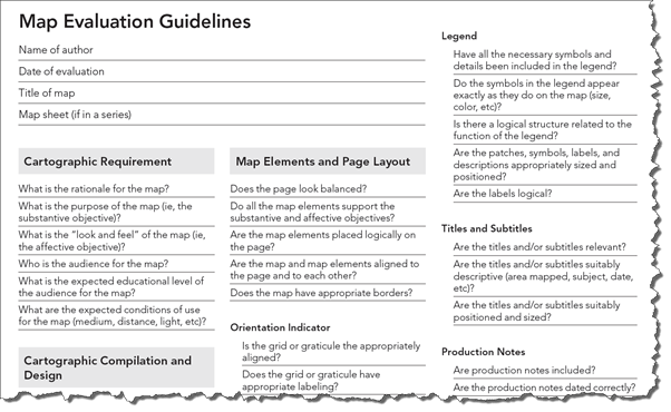
Figure 4. Map evaluation checklist
The checklist provides a resource to allow people to gain confidence in map evaluation and develop a knowledge of the process that we go through, which you can use, develop, and share rather than having to seek out a professional cartographer. But what about experienced cartographers? We hope the same approach reminds them that evaluation is a constant part of the cartographic process. The checklist is self-explanatory but we will be exploring it in more detail in future blog entries. Let us know how you use it or if you have feedback to help us refine it!
The checklist can be just as valuable for identifying what works well on your maps or what might need improvement. It allows you to break down the task of evaluation into steps that focus on individual map components as well as the bigger picture. This approach will lead you to appreciate what actions you need to take to improve your map. The checklist can be downloaded from the mapping resource center, and we encourage you to take a look and begin to apply it to your own work. Not all aspects will be equally useful for all mapping tasks, but using the checklist encourages reflection. In fact, apply it to maps that you like. It’s a fantastic way to begin to understand why some great maps are . . . well, great!

Commenting is not enabled for this article.