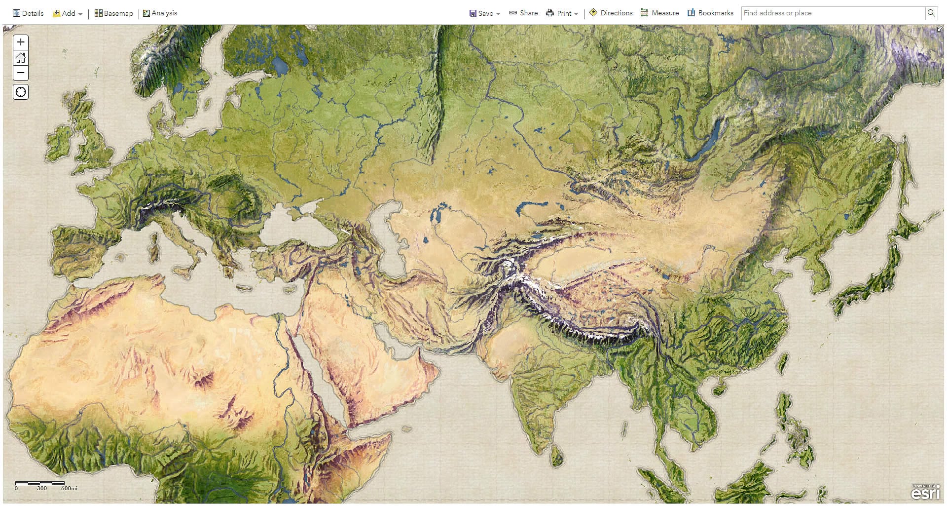
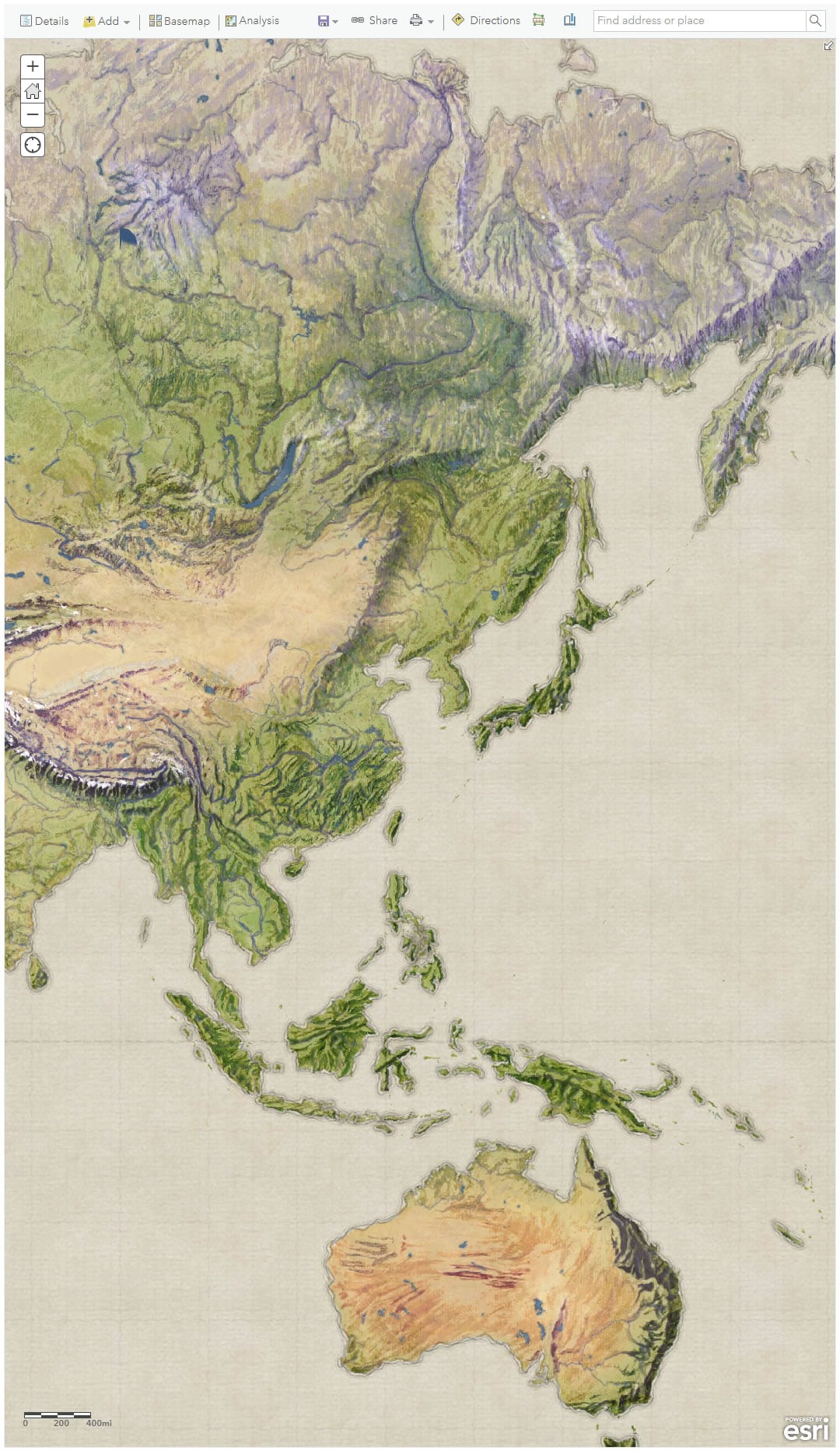
This Vintage Shaded Relief Map is a painterly physical geography basemap just waiting to be used for all sorts of cartographic adventures (you can hit the basemap deets directly, here).
The ShadedReliefArchive provides an eyewatering array of hand-painted hillshade plates from cartography’s yesteryear, all in the public domain…just waiting to be scooped up by mappers. You can learn more about the original experiment in blending these wonderful vintage shaded relief plates with modern satellite imagery here.
In the meantime, here’s a quick behind-the-scenes look at how this basemap was made…
With helpful geographic data sourced from Natural Earth, oceans were given a papery texture, coasts and graticules got a sketchy pencil stroke, and lakes and rivers were given watercolor fills. You can use this ArcGIS Pro watercolor style for yourself, available here.
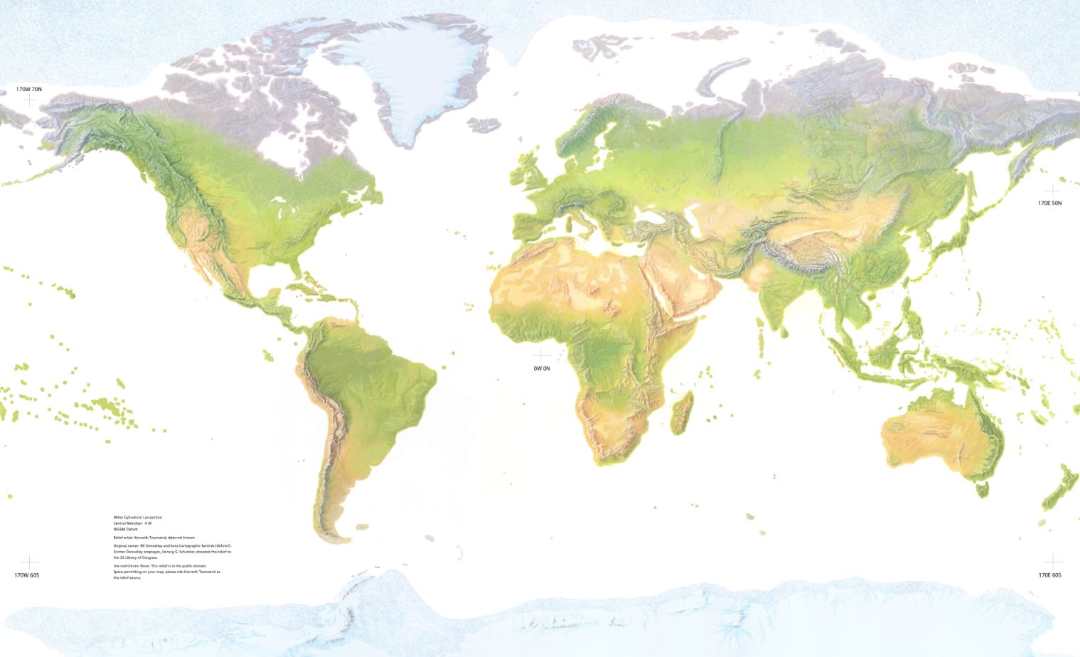
Now for some hillshade! I downloaded this gorgeous shaded relief plate (as a geoTIFF) hand-painted by Kenneth Townsend…
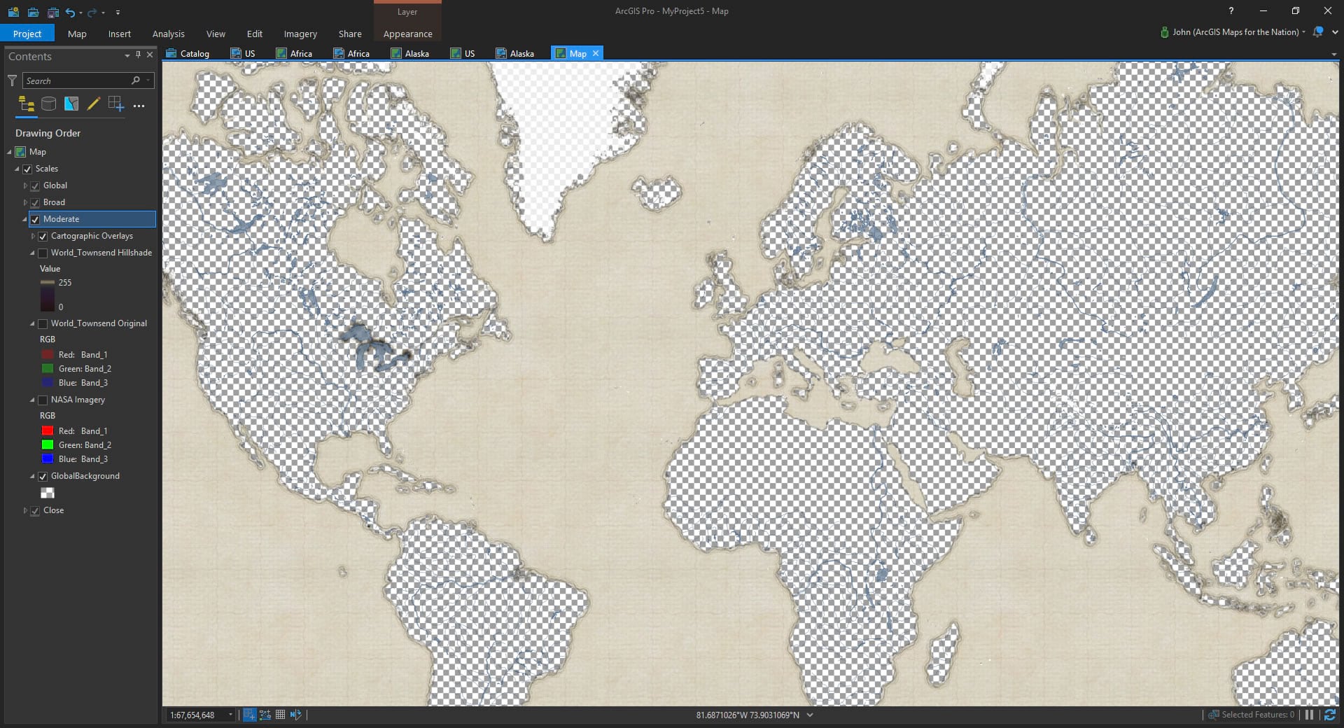
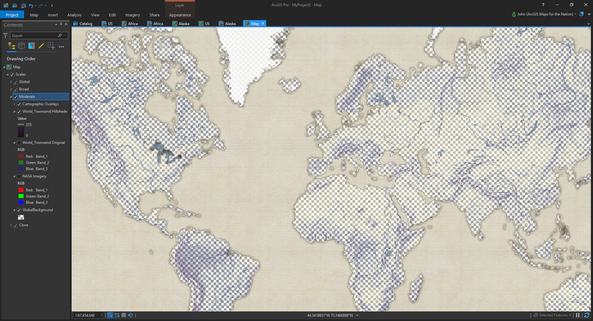
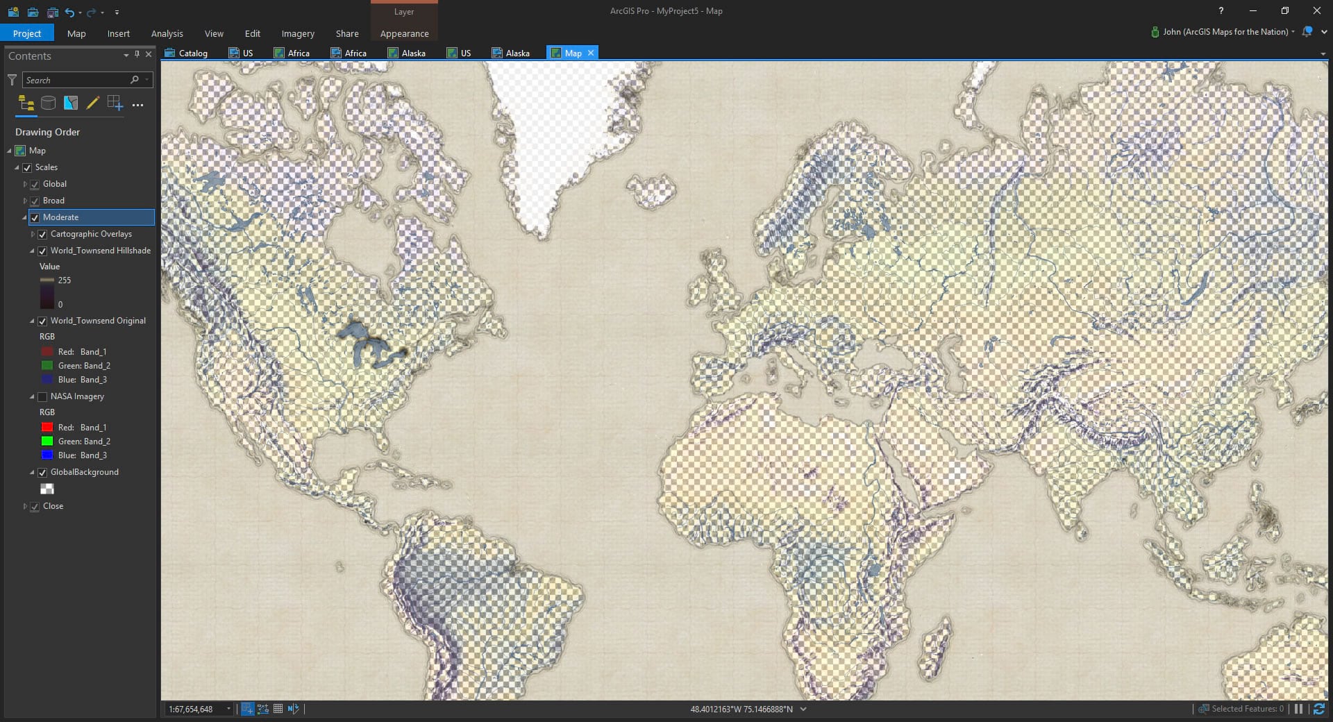
Then in ArcGIS Pro I adjusted the color scheme to use only the green color band, applied a stretch coloration, and re-tinted the shadows and highlights leaving the intermediate tones fully invisible. This extracted the shadows and highlights of the painting for use as a hillshade overlay.
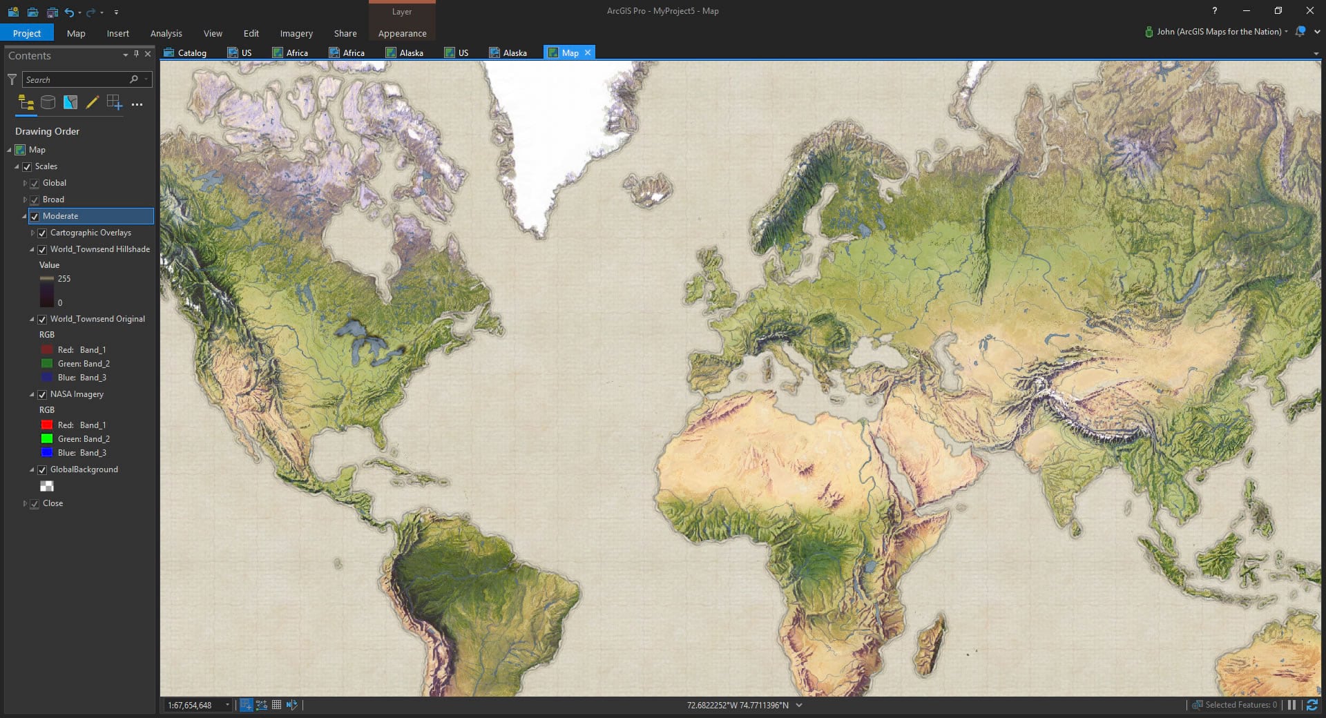
Next, I brought back the original Townsend plate, retaining its full color palette, but reduced its layer opacity way down to only about 15% (85% transparent). This returns some of the beautiful hues and textures of Townsend’s map. But very subtly.
Lastly, I brought in some global cloud-free mosaic images from the NASA Blue Marble project’s Visible Earth imagery. I really like this imagery. I pushed the gamma up to 2 to lighten it up so it wouldn’t swallow the painterly overlays. And pow!
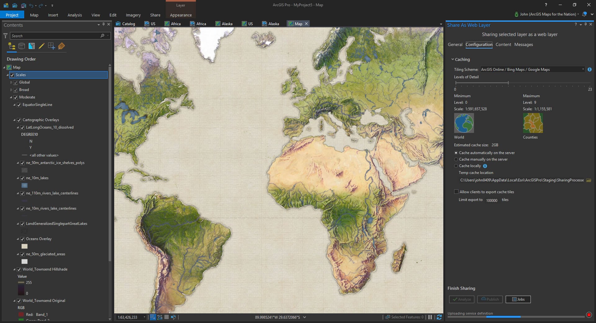
And it was so cool and fun. I created four different versions for different scales, feathering out the painted hillshade more as you zoom in. Then I cranked out a bunch of basemap tiles so you can use it in your projects if you dare…
I have to say, I spent a bit of time just panning and zooming around in the result. Marveling at the skilled hand of Townsend. I hope you enjoy it as well!
Happy Vintage Mapping! John Nelson

Commenting is not enabled for this article.