
Last week the Esri story maps team published “Big Dams: Boon or Bane?” featuring a gallery of the world’s largest dams. Although our team’s main role is to create and update Story Map apps for the benefit of our growing user community, we like to publish our own stories, for several reasons:
• To experiment with new functions and user experiences
• To provide storytelling examples and inspiration to our users
• To collaborate with organizations, especially non-profits, to help them get in the habit of producing story maps
In the case of Big Dams, I wanted to feature Esri’s imagery basemap, and to publish a story without any customization. We’ve found that imagery-based stories are almost always popular—lots of people, myself included, love to look at the Earth from above. I considered using the Story Map Cascade app, but decided on Story Map Journal because of its versatility; I also wanted to use “story actions” here and there to emphasize specific locations.
In compiling the story I used Wikipedia’s lists of largest dams—and learned that there are several ways to measure how big a dam is. I decided that was interesting, and used size of dam, size of reservoir, size of hydro plant, and height of dam as a way of organizing the story. But I also wanted to spotlight some dams that pose, or have posed, a safety threat, and to show how some rivers have been dammed multiple times.
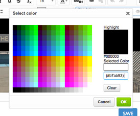
So I used all-caps lead-ins to the section titles to make the story’s structure clear. I also used colored type to lend a consistent look to the story. I chose a buff color from the lead photo and copied the hex value (#b7ab93) into the “Select color” function in the Journal builder:
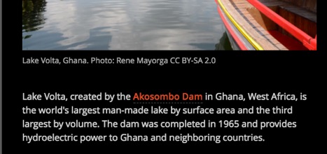
I frequently add color to text to give a story a unified look. In the dams story, the running text is light gray rather than white, which I think is easier to read. I also made the story actions bold and red to make them more visually prominent.
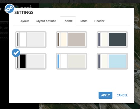
And of course I chose the option for light type on black background in the Settings > Theme menu. Somehow the black theme works effectively with the imagery in this story.
The maps showing locations of the largest dams in each category were produced in ArcGIS Online. It’s a single web map with separate layers for each of the four categories of “biggest”. For each layer I created a simple CSV file with dam name, country, size, and lat-long coordinates. I used ArcGIS Online’s smart mapping function to assign graduated circle sizes and colors.
I also wanted to locate each of the dams featured in the story. I used Adobe graphics software to generate simple, static maps, and saved them as PNG files so that they would blend into the black background.

I hope you find these pointers helpful the next time you create a journal story.

Article Discussion: