In ArcGIS Pro 3.1, the Charts development team introduced the ability to configure charts with Arcade expressions. Now you can use expressions to tweak your data visualizations on the fly without needing to update your dataset or schema. Currently, Arcade expressions are available to configure bar charts, pie charts, line charts, histograms, and scatter plots. Arcade is a powerful expression language that opens countless possibilities for visualizing your data in Pro, and in this blog I’ll show three cases where charts are configured using Arcade expressions.
Reformatting Text
Let’s start with a simple example. Suppose you create this bar chart to see which states have had the most bigfoot sightings (download data here—but note that I’ve altered some fields for demo purposes). You quickly discover that the category labels are formatted in all caps:
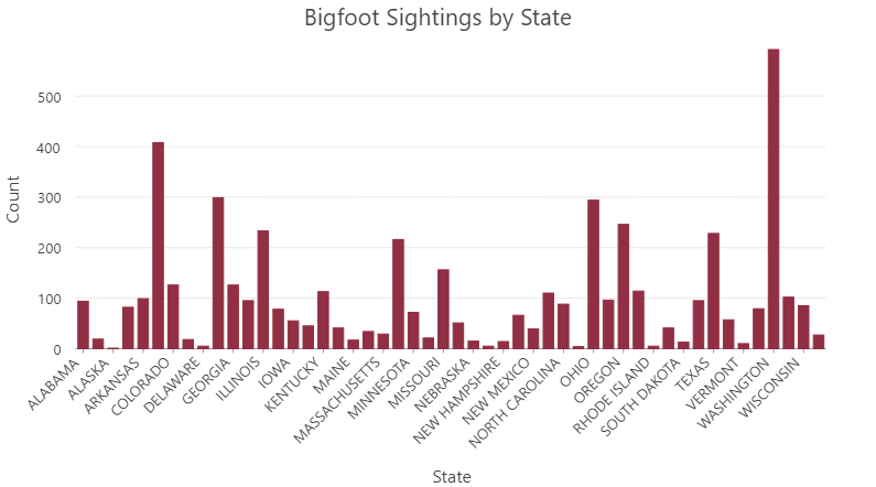
You’re worried that this chart will appear aggressive and shouty, but you’re also unable to update the attribute table to reformat the category labels because the dataset is read-only. Fortunately, you can use Arcade to reformat these values without needing to update the attribute table. First, click the Arcade expression button to the right of the Category or Date dropdown:
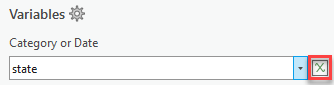
An Expression Window opens and here you can enter the title of your expression as well as your expression code:
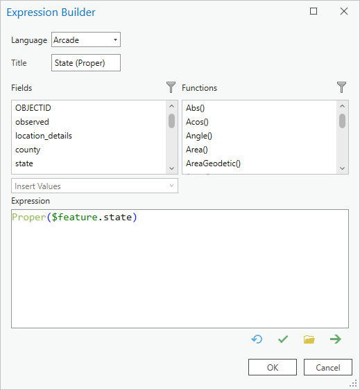
This expression uses the Proper Arcade function to format the text to title case:
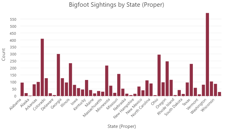
That looks much nicer—and it was possible with a single line of Arcade code, without needing to update our dataset.
Converting Data
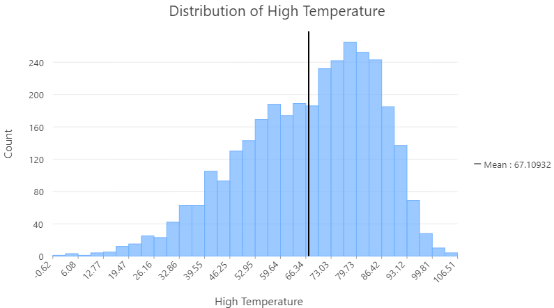
Unit conversion is another common data preparation task that can many times be handled with Arcade. Our dataset has a field that reflects the high temperature on the day of each bigfoot sighting, and we’d like to see the distribution of these values using a histogram. However, we realize that the values are given in Fahrenheit and we’re presenting the chart to an international audience that is more accustomed to Celsius:
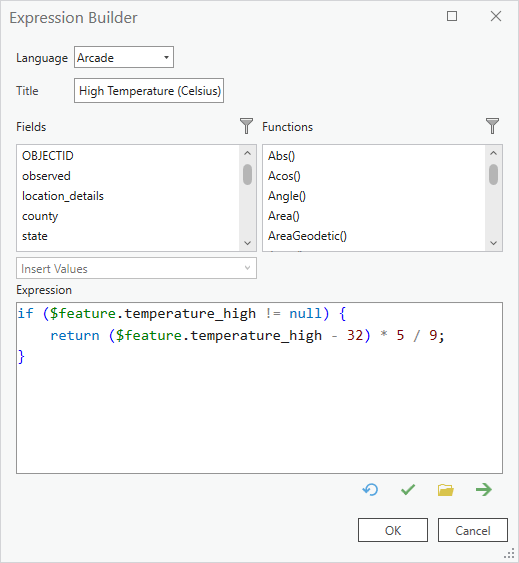
Using Arcade we can convert the data to Celsius using basic mathematical operations to calculate the Fahrenheit-to-Celsius formula:
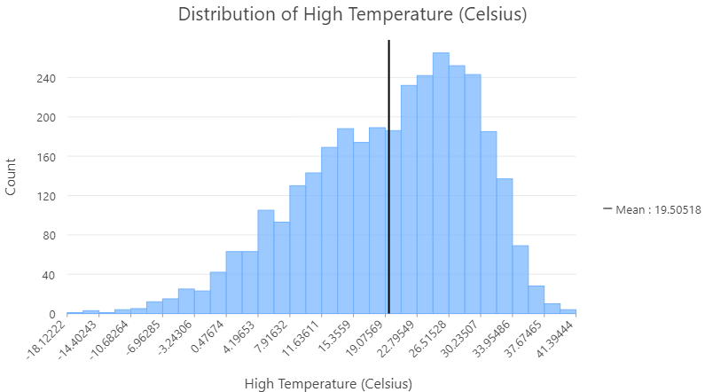
And now we have a histogram that displays the temperature distribution in Celsius:
Reclassifying Data
Finally, let’s look at a more advanced example. Data often needs to be wrangled to prepare it for visualization, particularly when dealing with categorical values. For instance, here is a chart showing noise complaints over time for Montgomery County, Maryland (download data here). The chart is split by the Case_Type field so that each line reflects noise complaints for a specific type:
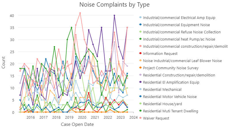
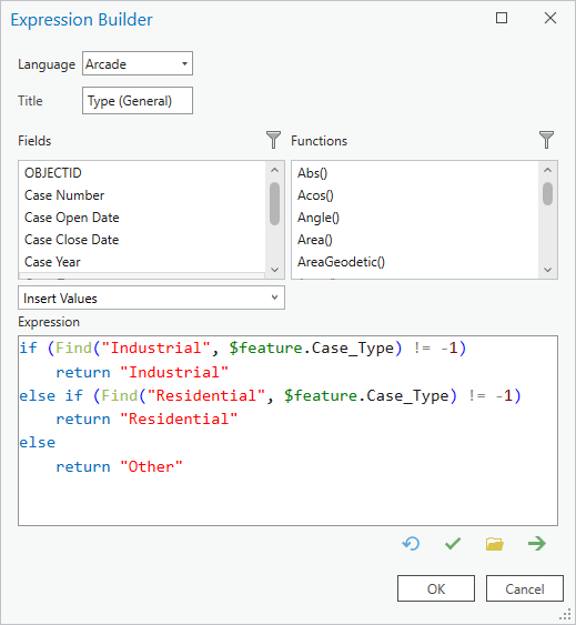
This chart is a mess of lines that’s nearly impossible to interpret; this is mainly because the categories are too granular. We really only need to see a general breakdown of noise complaints. Fortunately, we can easily reclassify the values by creating an expression for the Split by variable. The following expression uses logical statements and the Find function to determine whether each category value contains the text “Industrial” or “Residential”—the expression reclassifies each value accordingly. If the category does not contain either keyword, the value is classified as Other:
And here’s the chart using the reclassification expression we’ve created:

Now that we’ve reclassified the data, the patterns are much clearer. For instance, we see that both Residential and Industrial noise complaints tend to be seasonal and spike during the summer months. For Residential complaints, we see a particularly large spike during the summer of 2020. This was during the peak of COVID stay-at-home orders, so you could hypothesize that people were more likely to complain about residential noise because they were spending many hours at home.
Arcade is a powerful tool for preparing and massaging data for visualization, but it comes with one caveat. Because Arcade expressions are calculated on the fly, they may impact chart performance. Therefore, proceed with caution when dealing with large datasets or performing intense operations—in such cases it may be advisable to use the field calculator to calculate new field values stored in the dataset if possible.
We hope that this blog post gives you a glimpse into what’s possible when using Arcade to configure charts in Pro. We encourage you to find creative ways to incorporate Arcade expressions into your next data visualization project!

Article Discussion: