What?? Dot Density is en-Pro-ified? Wow, this is good news. I immediately had to drop everything that I was doing, and crank out a dot density map. No external request for a dot density map? Who can wait for that! No new data set that is begging to be dot densified? Who needs that! Here is a map of the first plausibly interesting attribute that I found…
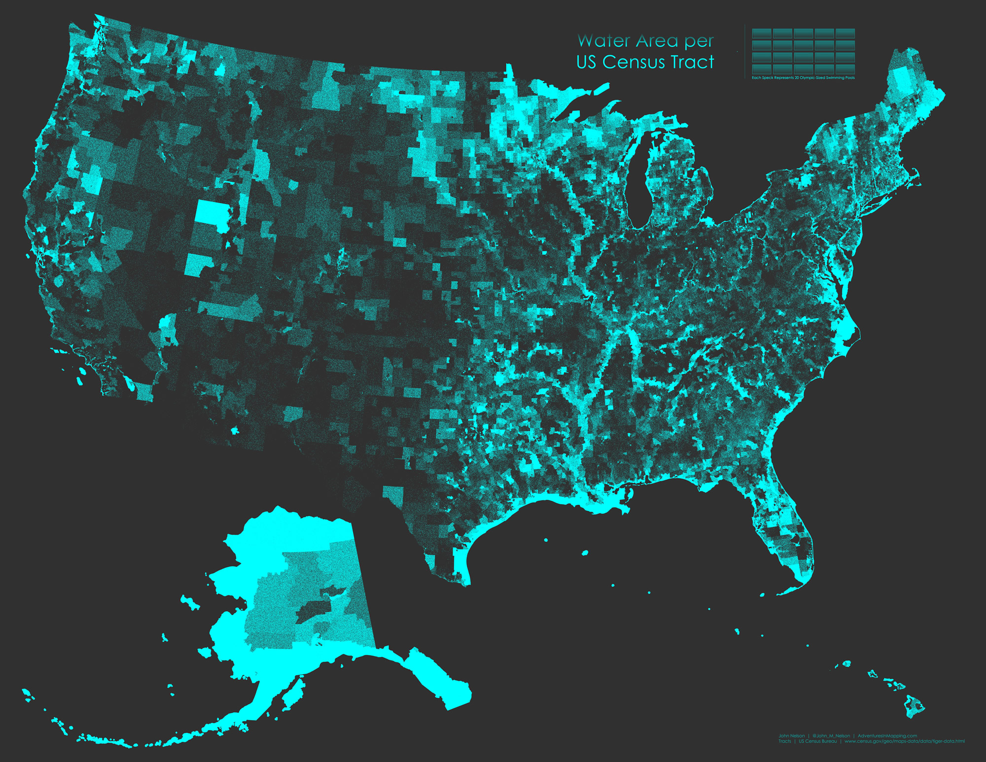
Water Area
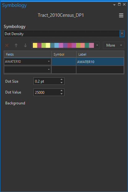
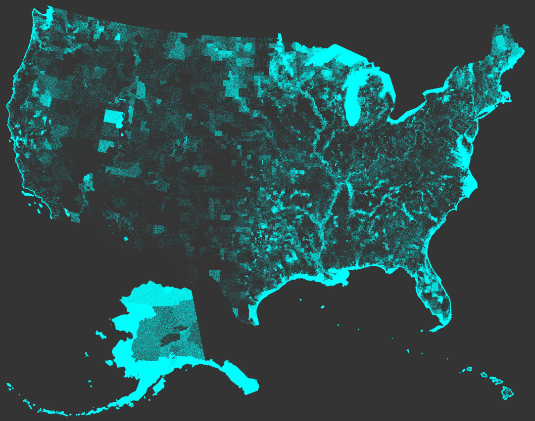
Specifically, it is a dot density map (equal area projection, of course) of census tracts showing how watery the place is. Each little speck represents the surface-area equivalent of 20 competition-sized swimming pools.

Sort of interesting how major river systems come to life, as do Minnesota, Maine, and any tract near the coast! This is a lot of dots. I was impressed with how quickly they rendered, considering there are 74,000 tracts and I don’t know how many million points.
Big Numbers Are Weird
First, let’s have a chat about units. I, an American, am metric-blind and cannot visualize 25,000 square meters (that’s the surface area of 20 competition-sized pools, by the way). I imagine metrically-minded folks would have a nearly as-difficult time, too. But I can kind-of/sort-of imagine 20 pools. I recommend that if your map uses awkwardly large or small units, translate them into something a person can imagine. That way you knock down a bit of the abstraction of thematic mapping and give your readers a tangible mental reference. And your map will be a whole lot more fun.
Setting Up the Dot Density
If you are used to making dot density maps in ArcGIS Desktop, then the experience will be delightfully familiar to you. Now, in addition to the choropleth and graduated symbology options, you’ll see good old dot density.
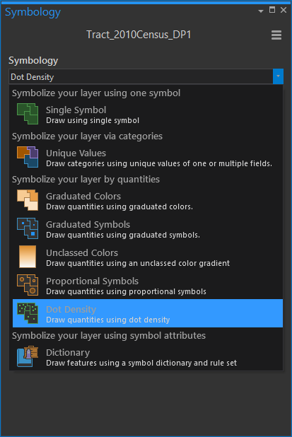
Choose an attribute, and a value-per-symbol, and you are off to the races.
Pruning the Data
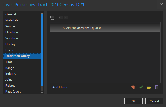
The first thing I noticed in my census tiger shapefile was all the water-only tracts over coastal water areas. We can quickly hide these from our map using a Definition Query.
Here, I’ve told Pro to only show tracts with land (area of land isn’t zero).
Building a Layout
Did you notice how I have little Alaska and Hawaii insets in my layout? To do that, you just make duplications of your map (copy/paste via the handy Catalog Pane) and change the projections to something appropriate for that region. Then, in your layout, insert them wherever you like.
Trying to get rid of the default black outline around all the map frames in your layout? Me too! In the map frame’s properties, you can set the precise position, and change things like background color and outline style.
Anyway, at the end of it all you get a fun little dot density map of water.
Absurd Map
Sure, we’ve seen a dot density map of water. But what about a dot density map of land? I’m glad you asked…
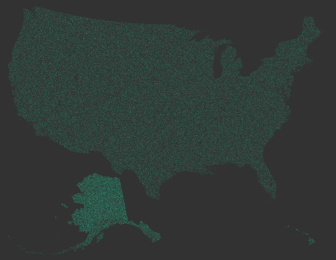
A dot density map of the area of land in each census tract, in an equal area projection, is effectively a test of how equal your equal area projection is. It ought to be a consistent density throughout. In this case, I’ve scaled down Alaska to fit in my layout so the dots appear denser. Isn’t that fun? Geography is great.
A Private Letter to My Old Friend, Dot Density
The following tender message is meant only for the digital eyes of the Esri Dot Density robot. Please, honor our privacy and don’t read it.
Dear Dot Density,
Oh, Dot Density, how I have longed to have you back in my cartographic reach. I reveled in your glorious pseudo-random point distribution algorithm since we first wielded it in my introduction to computerized cartography class so long ago. It was where we first met. We had some adventures, you and I. Like visualizing the commuting preference of suburban Seattleites. And how could I forget the time we swiped Kirk Goldsberry’s pointillist technique to map the 2008 presidential election?
Yes, we grew apart for a time. I, keen to explore the new opportunities of ArcGIS Pro, was heady with opacity gradients, powerful style libraries, and of course 3D. But I thought about you often. No, I didn’t forget our adventures together. And I missed you. Oh how I missed you. I wondered to myself, I bet Dot Density would render blazingly fast here in the 64-bit multithreaded green field of Pro. I knew that you would simply shine in an environment like this.
The more time that went by the brighter my candle burned with hope that you would find your way to Pro and we would be together once more. Just rendering dots with abandon. I didn’t care what the world might say, that you and I were too exclusive or that I tended to drift to you instinctively any time I had a new set of data or phenomenon to understand. Why fight it? I feel like we were meant to be together. Me, setting your representation ratio and defining exclusion zones, you flickering with multi-categorical hues and thumbing your nose at thematic methods that require areal normalization.
And now you have come to call Pro your home, just as I have. You and me; making maps just like we did for all those years! I struggle to find the right words to tell you how wonderful that is. I assure you, now that you are in Pro that we will get into so many cartographic adventures together. Anything can happen!
Love,
John

Article Discussion: